玻璃切片觀察窗:時尚美妝產品戰役海報
上下兩人對內凝視 + 中間信息帶,只在局部網格疊真實光學玻璃(折射/位移/選擇性銳化)。眼罩、手錶、耳機、香氛都測過——高定時尚/美妝/產品 KV 可直接換品牌槽。
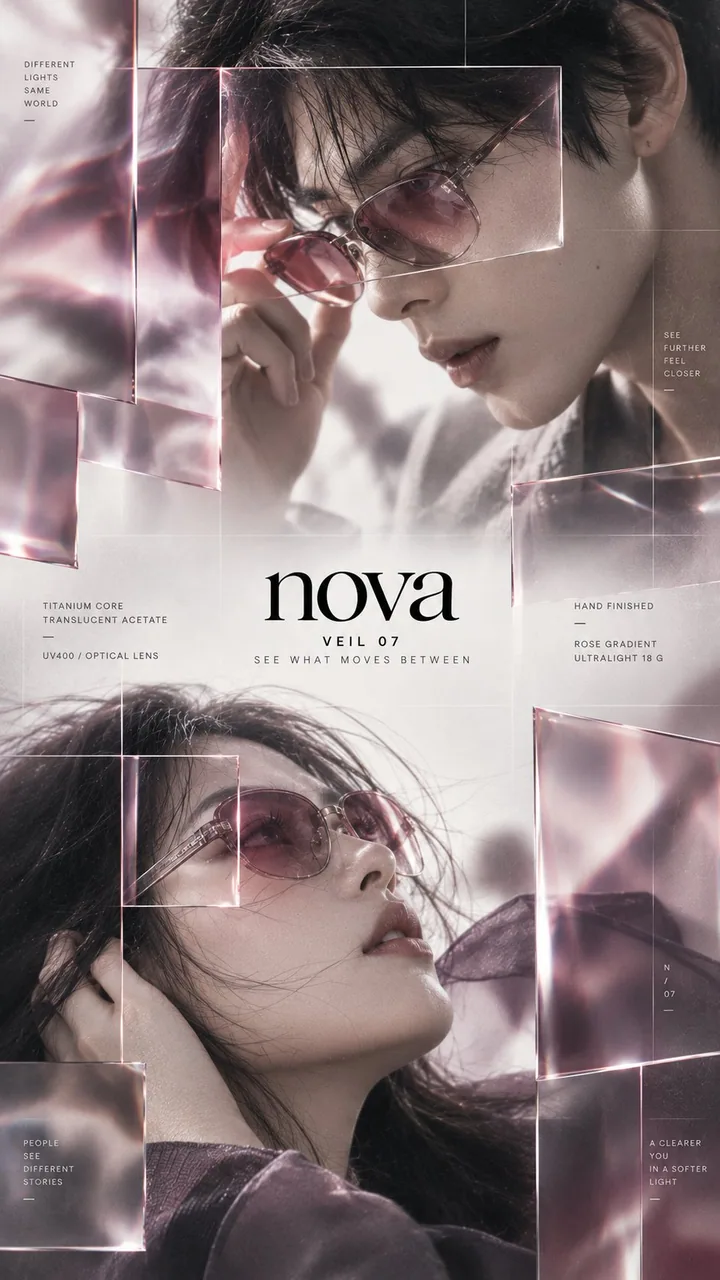
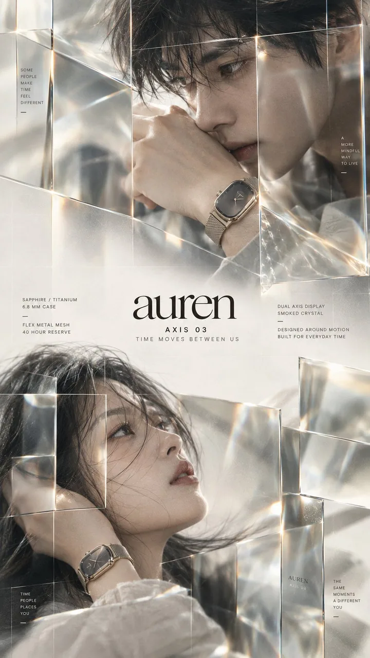
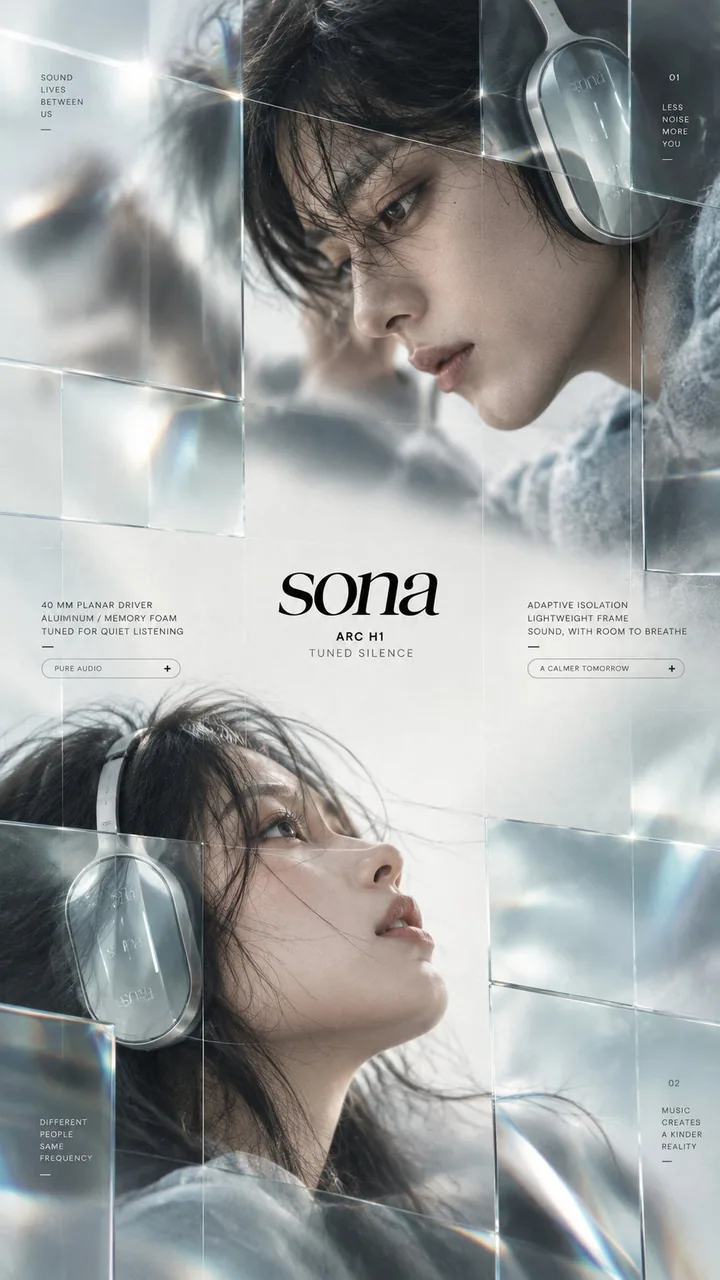
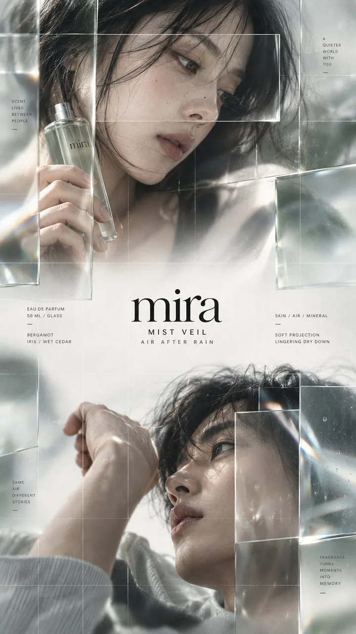
提示詞
Brand: [BRAND NAME]
Product: [PRODUCT]
Theme: [CAMPAIGN THEME]
Accent palette: [COLOR PALETTE]
Product details: [MATERIAL / FEATURES]

Create a premium 9:16 editorial campaign poster with two adult fashion models arranged vertically, one in the upper section and one in the lower section.

Both subjects must face inward toward the center: the upper portrait looks diagonally down toward the middle, while the lower portrait looks diagonally upward toward the middle. Keep them asymmetrically positioned rather than vertically centered.

Leave a clean editorial information band between the two portraits for the brand name, product name, short campaign line and minimal technical copy.

Use extreme close-up fashion photography with natural skin texture, shallow depth of field, soft motion blur and intentionally out-of-focus areas.

Overlay only a few selected grid sections with real optical glass panels. Mix clear glass, lightly tinted glass, smoked glass and subtle magnification. The glass should physically affect the image behind it through refraction, slight displacement, selective sharpening, soft distortion and restrained edge reflections.

Some areas behind the glass become noticeably sharper while the surrounding photography stays blurred, creating a strong contrast between soft imagery and precise observation windows.

Add an extremely fine modular grid across the entire composition. Keep the lines subtle and low-contrast.

Use refined high-contrast serif typography for the brand and very small spaced sans-serif typography for product details. Keep the layout minimal, airy and editorial rather than UI-heavy.

Match the glass tint, product materials and accent colors to the chosen theme. Keep most of the poster light and restrained, using darker tones only as controlled visual weight.

The final image should feel like a high-end independent fashion, beauty or product campaign: cinematic, tactile, photographic and contemporary.

Avoid generic luxury ads, centered portraits, subjects facing outward, excessive glass panels, heavy UI graphics, thick grid lines, cyberpunk styling, excessive lens flare, plastic skin, CGI faces and overly sharp photography.
中文翻譯
品牌:[BRAND NAME]
產品:[PRODUCT]
主題:[CAMPAIGN THEME]
點綴色板:[COLOR PALETTE]
產品細節:[MATERIAL / FEATURES]

創建一張高端的 9:16 編輯類廣告海報,兩位成年時裝模特呈縱向排列,一位位於上部區域,一位位於下部區域。

兩位主體都必須朝向中心:上方肖像沿對角線俯視中間,下方肖像沿對角線仰視中間。讓他們保持非對稱分佈,而不是垂直居中。

在兩張肖像之間留出一條乾淨的編輯信息帶,用於放置品牌名、產品名、簡短廣告語和極簡的技術性文案。

使用極致特寫的時尚攝影,具有自然的皮膚質感、淺景深、柔和的動態模糊和刻意失焦的區域。

僅用真實的光學玻璃板覆蓋少數選定的網格區域。混合使用透明玻璃、淺色玻璃、煙燻玻璃和輕微的放大效果。玻璃應通過折射、輕微位移、選擇性銳化、柔和畸變和剋制的邊緣反射,在物理上影響其背後的圖像。

玻璃後方的某些區域會明顯更銳利,而周圍攝影仍保持模糊,在柔和影像與精確觀察窗之間形成強烈對比。

在整個構圖上添加極其細密的模塊化網格。線條保持微妙且低對比。

品牌使用精緻的高對比襯線字體,產品細節使用極小、字距拉開的無襯線字體。佈局保持極簡、通透、編輯感,而不是 UI 感過重。

讓玻璃色調、產品材質和點綴色與所選主題相匹配。海報大部分保持明亮剋制,僅把較暗的色調用作受控的視覺重量。

最終圖像應讓人感覺像高端的獨立時裝、美妝或產品廣告大片:電影感、可觸摸、攝影感、當代。

避免通用的奢華廣告、居中的肖像、主體朝外、過多的玻璃板、厚重的 UI 圖形、粗網格線、賽博朋克風格、過多鏡頭光斑、塑料感皮膚、CGI 面孔和過度銳化的攝影。
溯源
- 原作者
- MrLarus
- 發佈日期
- 2026-09-20
- 原始出處
- 查看原帖 ↗
- 收錄來源
- xianyu110/awesome-gpt-image2.5 · 2101644997460213894 · MIT