製品が人より先:海鮮ECの俯瞰トレイヒーロー構図
やや俯瞰で超特大の円形冷凍トレイをレンズ前に突き出し、作業員は画面下半分に抑える——鮮度がまず目を打ち、人は「丁寧な取り扱い」を証明するだけ。食品/生鮮KVにおける製品優先ヒエラルキーの教科書。
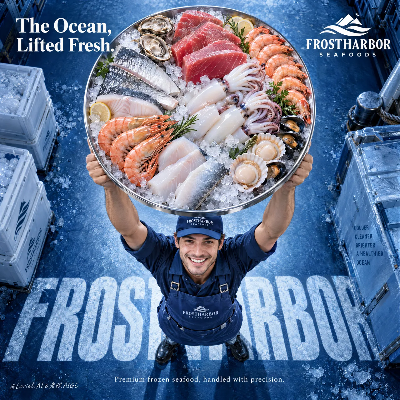
プロンプト
A freshness claim is stronger when the camera puts the product before the person.
🧊 a slightly overhead view with one oversized circular tray lifted toward the lens, occupying the upper-middle frame
The seafood arrives first: ice sparkle, steel rim, tuna, shrimp, squid, and fillets are all readable before you notice the worker.
🪽 place the worker low in frame with a believable upward lift, then embed the brand name as cropped frozen typography beneath their feet
The person proves careful handling; the floor type anchors the campaign without competing with the tray.

GPT- image 2.5 prompt👇
Create a premium frozen seafood advertising poster for a fictional international brand named FROSTHARBOR SEAFOODS, designed as a single vertical commercial key visual with a strong top-down camera perspective and a radically clear product-first hierarchy. Preserve the structural strength of the reference as pure composition logic: one delivery worker positioned near the lower-center, lifting an oversized circular tray of frozen seafood high above his head toward the camera, so the tray becomes the absolute dominant visual object. The final image must merge Orbit, Transit, and Port into one refined campaign: emotionally immediate, materially rich, and compositionally reduced to a bold iconic statement.

The product hero is the tray itself. Make it large enough that it feels almost thrust into the viewer’s space, occupying a commanding portion of the upper-middle frame. The tray is a premium stainless-steel round platter filled with a tightly curated arrangement of frozen seafood: thick ruby tuna cuts, translucent squid tubes and tentacles, pale white fish portions, silver-skinned fillets, shrimp with vivid orange-pink shell accents, shellfish, and luminous crushed ice. The arrangement must feel luxurious, clean, abundant, and intentional, not like a busy market heap. Every ingredient should be distinct, appetizing, and premium, with convincing cold-chain realism, subtle frost bloom, clean moisture sheen, and elegant color separation.

The worker is secondary but important. He stands below the tray in a proud, uplifting pose, smiling up toward camera with honest energy and clean commercial warmth. He wears a streamlined branded cap, apron, and workwear uniform in refined marine-blue tones. Anatomy must be correct and natural: realistic shoulders, believable arm lift under weight, proper elbows, wrists, and hands, five fingers, clear finger separation, and grounded stance. He must feel trustworthy and human, but the tray must visually overpower him. His role is to deliver the ocean upward, not become the focus.

The camera is slightly overhead and compressed enough to exaggerate the round tray’s scale while preserving believable perspective on the body. The background is a premium frozen-marine blue floor or studio surface with subtle crystalline frost texture and a deep cobalt-to-ice-blue gradient. Use large integrated floor typography beneath the figure as a graphic anchor, but keep it cleaner and more reduced than the source. Let the letters feel embedded into the surface, almost like frozen shadow typography underfoot, reinforcing the brand without cluttering the frame.

Visible text must be sparse, high-end, and entirely in English. At the upper-right, place a minimal brand lockup: "FROSTHARBOR SEAFOODS". At the upper-left, place one strong campaign line only, such as "The Ocean, Lifted Fresh." or another equally elevated phrase. Across the floor beneath the worker, integrate one giant typographic base in bold condensed uppercase, such as "FROSTHARBOR", partially cropped by the figure and perspective. In the lower area, add only one short commercial line, for example: "Premium frozen seafood, handled with precision." Keep all typography art-directed, crisp, and spacious. No dense body copy, no brochure clutter, no excessive sales lines.

Lighting must be bright, controlled, and appetizing. Use a soft overhead-front key light that makes the seafood tray glow with freshness: wet reflections on tuna, icy sparkle on crushed ice, soft translucency in squid, crisp shell highlights on shrimp, and controlled steel reflections on the tray rim. Add gentle fill on the worker’s face and uniform, and enough edge separation to keep the tray clearly cut out from the blue background. The whole image should feel premium, fresh, cold, and authoritative without becoming sterile.

Color hierarchy: 60% marine cobalt, frozen blue, and icy cyan environment; 30% seafood flesh tones, silver ice neutrals, and steel highlights; 10% white typography and selective warm accents from shrimp, tuna, and skin. Keep the palette clean and commercial, with strong contrast between cool frozen atmosphere and warm living seafood tones.

Material semantics must be explicit and luxurious: crushed ice sparkle, stainless steel rim reflection, tuna marbling, squid skin translucency, shrimp shell gloss, frosted fish surface, matte apron fabric, embroidered cap logo texture, cold studio floor grain, and subtle water condensation. The whole image should feel like a world-class food-retail campaign that turns one tray into a spectacular icon of freshness.

Rendering target: photoreal luxury food advertising, product-dominant hierarchy, clean top-down energy, refined typography integration, cold-chain material realism, controlled negative space, and world-class print finish.

Quality control and structured exclusions: photoreal only, correct human anatomy, realistic shoulders, arms, hands, and five fingers, no hand deformation, no extra fingers, no missing fingers, no fused fingers, no broken wrists, no warped tray shape, no duplicated seafood items, no muddy ice, no dirty fish texture, no blood, no chaotic market clutter, no cheap supermarket flyer look, no unreadable typography, no garbled letters, no random brand plagiarism, no cluttered background, no style drift, no AI slop.
日本語訳
カメラが人より製品を前に置くとき、鮮度の主張はより強くなる。
🧊 やや俯瞰気味のアングルで、特大の円形トレイをレンズに向かって掲げ、画面の上中段を占める
海鮮が先に届く。氷のきらめき、スチールの縁、マグロ、エビ、イカ、切り身——作業員に気づく前に、すべてが読み取れる。
🪽 作業員は画面の下方に配置し、説得力のある上方への持ち上げ動作を取らせ、その足元にブランド名をクロップされた凍結タイポグラフィとして埋め込む
人は丁寧な取り扱いを証明し、床のタイポグラフィはトレイと競合することなくキャンペーンを支える。

GPT- image 2.5 のプロンプト👇
架空の国際ブランド FROSTHARBOR SEAFOODS のプレミアム冷凍海鮮広告ポスターを作成する。強い俯瞰カメラパースペクティブと、徹底的に明確な製品優先のヒエラルキーを備えた、単一の縦型コマーシャルキービジュアルとしてデザインすること。参照の構造的な強さを、純粋な構図ロジックとして保持すること。配達作業員を1名、画面中央下寄りに配置し、冷凍海鮮を載せた特大の円形トレイを頭の上高く、カメラに向かって掲げる。それによりトレイが絶対的に支配的な視覚オブジェクトとなる。最終的な画像は Orbit、Transit、Port を1つの洗練されたキャンペーンへと統合しなければならない。感情的に即効性があり、素材感が豊かで、構図的には大胆なアイコニック・ステートメントへと削ぎ落とされていること。

製品の主役はトレイそのもの。視聴者の空間にほとんど突き出されていると感じられるほど大きくし、画面の上中段の大部分を占めさせる。トレイはプレミアムなステンレス製の丸い大皿で、厳選された冷凍海鮮が隙間なく盛り付けられている。厚切りのルビー色のマグロ、半透明のイカの胴とゲソ、淡い白の魚の切り身、銀皮のフィレ、鮮やかなオレンジピンクの殻が映えるエビ、貝類、そして光を放つクラッシュアイス。盛り付けは、雑然とした市場の山ではなく、豪華で清潔、豊かで意図的であると感じさせなければならない。すべての食材は際立って食欲をそそり、プレミアムであること。説得力のあるコールドチェーンのリアリズム、かすかな霜のブルーム、清潔な水分の艶、上品な色の分離を備えること。

作業員は二次的だが重要。トレイの下で誇らしげに掲げるポーズをとり、誠実なエネルギーと清潔な商業的温かみを伴ってカメラを見上げて微笑む。洗練されたマリンブルーのトーンの、すっきりしたブランドロゴ入りキャップ、エプロン、作業服を着用する。解剖学は正確かつ自然でなければならない。リアルな肩、重量下での説得力のある腕の持ち上げ、正しい肘・手首・手、5本の指、明確な指の分離、地に足のついた立ち姿。信頼でき、人間らしく感じられること。ただし、トレイが視覚的に彼を圧倒しなければならない。彼の役割は海を上へ届けることであり、焦点になることではない。

カメラはやや俯瞰で、体の説得力あるパースペクティブを保ちつつ、丸いトレイのスケールを誇張するのに十分な圧縮感を持たせる。背景はプレミアムな冷凍マリンブルーの床、またはスタジオサーフェスで、かすかな結晶状の霜のテクスチャと、深いコバルトからアイスブルーへのグラデーションを備える。人物の下に、グラフィックのアンカーとして大きく統合された床のタイポグラフィを用いるが、元のソースより清潔で、より簡素に保つこと。文字は表面に埋め込まれているように、まるで足元に凍りついた影のタイポグラフィのように感じさせ、画面を煩雑にすることなくブランドを補強すること。

可視テキストは最小限でハイエンド、そしてすべて英語でなければならない。右上にミニマルなブランドロックアップ「FROSTHARBOR SEAFOODS」を配置する。左上には強いキャンペーンコピーを1行だけ、たとえば「The Ocean, Lifted Fresh.」、あるいは同程度に格調高いフレーズを配置する。作業員の下の床全体にわたり、太字のコンデンス体大文字による巨大なタイポグラフィのベースを1つ統合する。たとえば「FROSTHARBOR」で、人物とパースペクティブによって部分的にクロップされる。下部エリアには短い商業コピーを1行だけ加える。例:「Premium frozen seafood, handled with precision.」すべてのタイポグラフィはアートディレクションされた、鮮明で余白のあるものにすること。密な本文コピー、パンフレットのような雑然さ、過剰なセールスコピーは避ける。

ライティングは明るく、コントロールされ、食欲をそそるものでなければならない。柔らかな上方正面からのキーライトで、海鮮トレイが鮮度を放って輝くようにする。マグロの濡れた反射、クラッシュアイスの氷のきらめき、イカの柔らかな半透明感、エビの殻のくっきりしたハイライト、トレイの縁のコントロールされたスチール反射。作業員の顔と制服には穏やかなフィルを加え、トレイが青い背景から明確に切り抜かれるよう、十分なエッジの分離を確保する。画像全体はプレミアムで新鮮、冷たく、権威がありながら、無菌的にならないこと。

色のヒエラルキー:60%はマリンコバルト、フローズンブルー、アイシーシアンの環境。30%は海鮮の身の色調、銀色の氷のニュートラル、スチールのハイライト。10%は白いタイポグラフィと、エビ・マグロ・肌からの選択的な暖色アクセント。パレットは清潔で商業的に保ち、冷たい冷凍の雰囲気と、温かい生きた海鮮の色調との間に強いコントラストを生むこと。

素材のセマンティクスは明確で豪華でなければならない。クラッシュアイスのきらめき、ステンレス製の縁の反射、マグロの霜降り、イカの皮の半透明感、エビの殻の光沢、霜のついた魚の表面、マットなエプロン生地、刺繍されたキャップのロゴのテクスチャ、冷たいスタジオの床の木目、そしてかすかな結露。画像全体は、1つのトレイを鮮度の壮観なアイコンへと変える、世界水準の食品小売キャンペーンのように感じられること。

レンダリング目標:フォトリアルなラグジュアリー食品広告、製品支配のヒエラルキー、清潔な俯瞰のエネルギー、洗練されたタイポグラフィの統合、コールドチェーンの素材リアリズム、コントロールされたネガティブスペース、世界水準のプリント仕上げ。

品質管理と構造的除外:フォトリアルのみ、正確な人体解剖学、リアルな肩・腕・手と5本の指、手の変形なし、指の過剰なし、指の欠落なし、指の癒合なし、手首の破綻なし、トレイ形状の歪みなし、海鮮アイテムの重複なし、濁った氷なし、汚れた魚のテクスチャなし、血なし、混沌とした市場の雑然さなし、安っぽいスーパーのチラシ風なし、読めないタイポグラフィなし、文字化けなし、無作為なブランド剽窃なし、雑然とした背景なし、スタイルの逸脱なし、AIスロップなし。
出典
- 原作者
- ou_zhen599
- 公開日
- 2026-09-21
- 原典
- 元の投稿を見る ↗
- 収録元
- xianyu110/awesome-gpt-image2.5 · 2101964323094745493 · MIT