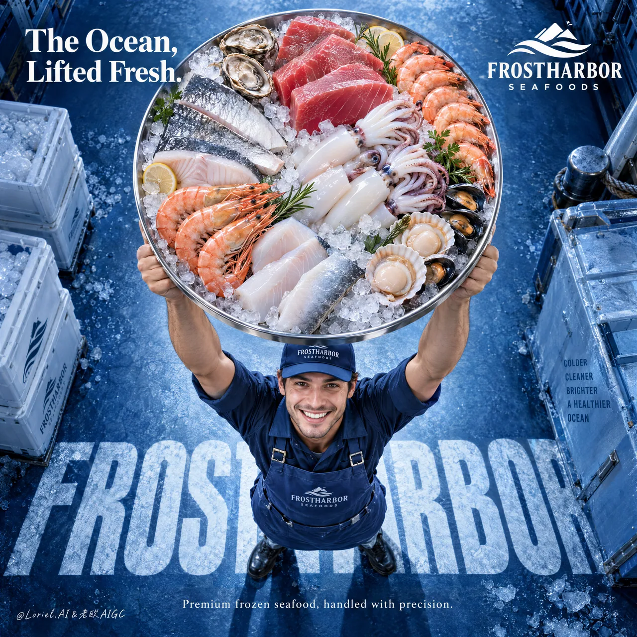
제품이 사람보다 먼저: 해산물 이커머스 오버헤드 트레이 히어로 구도
약간 부감으로 초대형 원형 냉장 트레이를 카메라 앞으로 밀어 넣고, 작업자는 화면 아래쪽으로 눌러 배치한다——신선함이 먼저 시선을 때리고, 사람은 '조심스러운 취급'을 증명할 뿐이다. 식품/신선 KV의 제품 우선 위계 교과서.
프롬프트
A freshness claim is stronger when the camera puts the product before the person.
🧊 a slightly overhead view with one oversized circular tray lifted toward the lens, occupying the upper-middle frame
The seafood arrives first: ice sparkle, steel rim, tuna, shrimp, squid, and fillets are all readable before you notice the worker.
🪽 place the worker low in frame with a believable upward lift, then embed the brand name as cropped frozen typography beneath their feet
The person proves careful handling; the floor type anchors the campaign without competing with the tray.

GPT- image 2.5 prompt👇
Create a premium frozen seafood advertising poster for a fictional international brand named FROSTHARBOR SEAFOODS, designed as a single vertical commercial key visual with a strong top-down camera perspective and a radically clear product-first hierarchy. Preserve the structural strength of the reference as pure composition logic: one delivery worker positioned near the lower-center, lifting an oversized circular tray of frozen seafood high above his head toward the camera, so the tray becomes the absolute dominant visual object. The final image must merge Orbit, Transit, and Port into one refined campaign: emotionally immediate, materially rich, and compositionally reduced to a bold iconic statement.

The product hero is the tray itself. Make it large enough that it feels almost thrust into the viewer’s space, occupying a commanding portion of the upper-middle frame. The tray is a premium stainless-steel round platter filled with a tightly curated arrangement of frozen seafood: thick ruby tuna cuts, translucent squid tubes and tentacles, pale white fish portions, silver-skinned fillets, shrimp with vivid orange-pink shell accents, shellfish, and luminous crushed ice. The arrangement must feel luxurious, clean, abundant, and intentional, not like a busy market heap. Every ingredient should be distinct, appetizing, and premium, with convincing cold-chain realism, subtle frost bloom, clean moisture sheen, and elegant color separation.

The worker is secondary but important. He stands below the tray in a proud, uplifting pose, smiling up toward camera with honest energy and clean commercial warmth. He wears a streamlined branded cap, apron, and workwear uniform in refined marine-blue tones. Anatomy must be correct and natural: realistic shoulders, believable arm lift under weight, proper elbows, wrists, and hands, five fingers, clear finger separation, and grounded stance. He must feel trustworthy and human, but the tray must visually overpower him. His role is to deliver the ocean upward, not become the focus.

The camera is slightly overhead and compressed enough to exaggerate the round tray’s scale while preserving believable perspective on the body. The background is a premium frozen-marine blue floor or studio surface with subtle crystalline frost texture and a deep cobalt-to-ice-blue gradient. Use large integrated floor typography beneath the figure as a graphic anchor, but keep it cleaner and more reduced than the source. Let the letters feel embedded into the surface, almost like frozen shadow typography underfoot, reinforcing the brand without cluttering the frame.

Visible text must be sparse, high-end, and entirely in English. At the upper-right, place a minimal brand lockup: "FROSTHARBOR SEAFOODS". At the upper-left, place one strong campaign line only, such as "The Ocean, Lifted Fresh." or another equally elevated phrase. Across the floor beneath the worker, integrate one giant typographic base in bold condensed uppercase, such as "FROSTHARBOR", partially cropped by the figure and perspective. In the lower area, add only one short commercial line, for example: "Premium frozen seafood, handled with precision." Keep all typography art-directed, crisp, and spacious. No dense body copy, no brochure clutter, no excessive sales lines.

Lighting must be bright, controlled, and appetizing. Use a soft overhead-front key light that makes the seafood tray glow with freshness: wet reflections on tuna, icy sparkle on crushed ice, soft translucency in squid, crisp shell highlights on shrimp, and controlled steel reflections on the tray rim. Add gentle fill on the worker’s face and uniform, and enough edge separation to keep the tray clearly cut out from the blue background. The whole image should feel premium, fresh, cold, and authoritative without becoming sterile.

Color hierarchy: 60% marine cobalt, frozen blue, and icy cyan environment; 30% seafood flesh tones, silver ice neutrals, and steel highlights; 10% white typography and selective warm accents from shrimp, tuna, and skin. Keep the palette clean and commercial, with strong contrast between cool frozen atmosphere and warm living seafood tones.

Material semantics must be explicit and luxurious: crushed ice sparkle, stainless steel rim reflection, tuna marbling, squid skin translucency, shrimp shell gloss, frosted fish surface, matte apron fabric, embroidered cap logo texture, cold studio floor grain, and subtle water condensation. The whole image should feel like a world-class food-retail campaign that turns one tray into a spectacular icon of freshness.

Rendering target: photoreal luxury food advertising, product-dominant hierarchy, clean top-down energy, refined typography integration, cold-chain material realism, controlled negative space, and world-class print finish.

Quality control and structured exclusions: photoreal only, correct human anatomy, realistic shoulders, arms, hands, and five fingers, no hand deformation, no extra fingers, no missing fingers, no fused fingers, no broken wrists, no warped tray shape, no duplicated seafood items, no muddy ice, no dirty fish texture, no blood, no chaotic market clutter, no cheap supermarket flyer look, no unreadable typography, no garbled letters, no random brand plagiarism, no cluttered background, no style drift, no AI slop.
한국어 번역
신선도 주장은 카메라가 사람보다 제품을 앞세울 때 더 강력해진다.
🧊 렌즈를 향해 들어 올린 초대형 원형 트레이 하나가 화면 중상단을 차지하는, 약간 부감의 시점
해산물이 먼저 도착한다: 얼음의 반짝임, 스틸 테두리, 참치, 새우, 오징어, 필렛이 모두 읽힌 다음에야 작업자가 눈에 들어온다.
🪽 작업자는 설득력 있게 위로 들어 올리는 자세로 화면 아래쪽에 두고, 브랜드명은 발밑에 잘린 서리 타이포그래피로 박아 넣는다
사람은 조심스러운 취급을 증명하고, 바닥 타이포는 트레이와 경쟁하지 않으면서 캠페인을 붙잡아 준다.

GPT- image 2.5 prompt👇
FROSTHARBOR SEAFOODS라는 가상의 국제 브랜드를 위한 프리미엄 냉동 해산물 광고 포스터를 만들어라. 강한 탑다운 카메라 시점과 철저히 명확한 제품 우선 위계를 갖춘 단일 세로형 상업 키 비주얼로 디자인한다. 참조 이미지의 구조적 강점은 순수한 구도 논리로서 유지하라: 배송 작업자 한 명이 화면 중앙 아래쪽에 위치해, 냉동 해산물이 담긴 초대형 원형 트레이를 카메라를 향해 머리 위로 높이 들어 올리며, 그 결과 트레이가 절대적으로 지배적인 시각적 오브젝트가 된다. 최종 이미지는 Orbit, Transit, Port를 하나의 세련된 캠페인으로 융합해야 한다: 감정적으로 즉각적이고, 재질감이 풍부하며, 구도적으로 대담한 아이코닉 선언으로 축약된.

제품의 주인공은 트레이 그 자체다. 거의 관람자의 공간 속으로 밀려 들어온 듯 느껴질 만큼 크게 만들어, 화면 중상단의 압도적인 부분을 차지하게 하라. 트레이는 프리미엄 스테인리스 스틸 원형 플레터이며, 엄선해 촘촘히 배치한 냉동 해산물로 채운다: 두툼한 루비빛 참치 토막, 반투명한 오징어 몸통과 다리, 옅은 흰 살코기 생선 포션, 은빛 껍질의 필렛, 선명한 주황-분홍 껍질 포인트가 있는 새우, 조개류, 그리고 빛나는 잘게 부순 얼음. 배치는 사치스럽고 깨끗하고 풍성하며 의도적으로 느껴져야 하고, 분주한 시장 더미처럼 보여서는 안 된다. 모든 재료는 뚜렷하고 식욕을 돋우며 프리미엄이어야 하고, 설득력 있는 콜드체인 리얼리즘, 은은한 서리 결정, 깨끗한 수분 광택, 우아한 색 분리를 갖춰야 한다.

작업자는 부차적이지만 중요하다. 그는 트레이 아래에 서서 당당하고 고양된 자세를 취하며, 정직한 에너지와 깨끗한 상업적 온기를 담아 카메라를 향해 미소 짓는다. 세련된 마린 블루 톤의 브랜드 캡, 앞치마, 작업복 유니폼을 착용한다. 해부학은 정확하고 자연스러워야 한다: 사실적인 어깨, 무게 아래에서 설득력 있게 들어 올린 팔, 올바른 팔꿈치·손목·손, 다섯 개의 손가락, 뚜렷한 손가락 분리, 안정된 자세. 그는 신뢰할 수 있고 인간적으로 느껴져야 하지만, 트레이가 시각적으로 그를 압도해야 한다. 그의 역할은 바다를 위로 들어 올리는 것이지, 초점이 되는 것이 아니다.

카메라는 약간 부감이며, 원형 트레이의 규모를 과장할 만큼 압축되면서도 신체에 대한 설득력 있는 원근을 유지한다. 배경은 은은한 결정질 서리 질감과 딥 코발트에서 아이스 블루로 이어지는 그라데이션이 있는 프리미엄 냉동 마린 블루 바닥 또는 스튜디오 표면이다. 인물 아래 바닥에 크게 통합된 타이포그래피를 그래픽 앵커로 사용하되, 원본보다 더 깨끗하고 더 축약된 상태로 유지하라. 글자가 표면에 박힌 듯, 발밑의 얼어붙은 그림자 타이포그래피처럼 느껴지게 해 프레임을 어지럽히지 않으면서 브랜드를 강화하라.

가시적 텍스트는 드물고 하이엔드하며 전적으로 영어여야 한다. 오른쪽 상단에는 미니멀한 브랜드 락업을 배치한다: "FROSTHARBOR SEAFOODS". 왼쪽 상단에는 단 하나의 강력한 캠페인 문구만 배치한다. 예: "The Ocean, Lifted Fresh." 또는 그에 못지않게 격조 있는 다른 문구. 작업자 아래 바닥 전체에 걸쳐, 굵은 컨덴스드 대문자의 거대한 타이포그래피 베이스를 하나 통합하라. 예: "FROSTHARBOR". 인물과 원근에 의해 부분적으로 잘린다. 하단 영역에는 짧은 상업 문구를 하나만 추가한다. 예: "Premium frozen seafood, handled with precision." 모든 타이포그래피는 아트 디렉션되어 있고, 선명하고, 여유 있어야 한다. 빽빽한 본문 카피, 브로슈어식 잡동사니, 과도한 세일즈 문구는 없다.

조명은 밝고 통제되며 식욕을 돋워야 한다. 해산물 트레이가 신선함으로 빛나게 하는 부드러운 오버헤드-프론트 키 라이트를 사용하라: 참치의 젖은 반사, 잘게 부순 얼음의 얼음빛 반짝임, 오징어의 부드러운 반투명함, 새우의 선명한 껍질 하이라이트, 트레이 테두리의 통제된 스틸 반사. 작업자의 얼굴과 유니폼에는 부드러운 필을 더하고, 트레이가 파란 배경에서 선명하게 분리되도록 충분한 엣지 분리를 준다. 전체 이미지는 살균된 느낌 없이 프리미엄하고 신선하고 차갑고 권위 있게 느껴져야 한다.

색 위계: 60% 마린 코발트, 냉동 블루, 아이시 시안 환경; 30% 해산물 살색 톤, 은빛 얼음 뉴트럴, 스틸 하이라이트; 10% 흰색 타이포그래피와 새우·참치·피부에서 오는 선택적 따뜻한 악센트. 팔레트는 깨끗하고 상업적으로 유지하며, 차가운 냉동 분위기와 따뜻한 살아 있는 해산물 톤 사이에 강한 대비를 둔다.

재질 의미는 명시적이고 호화로워야 한다: 잘게 부순 얼음의 반짝임, 스테인리스 스틸 테두리 반사, 참치 마블링, 오징어 껍질의 반투명함, 새우 껍질 광택, 서리 낀 생선 표면, 매트한 앞치마 원단, 자수 캡 로고 질감, 차가운 스튜디오 바닥 결, 은은한 물방울 응결. 전체 이미지는 하나의 트레이를 신선함의 장관적인 아이콘으로 바꾸는 세계적 수준의 식품 리테일 캠페인처럼 느껴져야 한다.

렌더링 목표: 포토리얼 럭셔리 식품 광고, 제품 지배적 위계, 깨끗한 탑다운 에너지, 세련된 타이포그래피 통합, 콜드체인 재질 리얼리즘, 통제된 네거티브 스페이스, 세계적 수준의 인쇄 마감.

품질 관리 및 구조적 배제: 포토리얼만, 올바른 인체 해부학, 사실적인 어깨·팔·손과 다섯 손가락, 손 변형 없음, 여분 손가락 없음, 손가락 누락 없음, 손가락 융합 없음, 부러진 손목 없음, 뒤틀린 트레이 형태 없음, 중복된 해산물 없음, 흐린 얼음 없음, 더러운 생선 질감 없음, 피 없음, 혼란스러운 시장 잡동사니 없음, 싸구려 슈퍼마켓 전단 느낌 없음, 읽을 수 없는 타이포그래피 없음, 깨진 글자 없음, 무작위 브랜드 표절 없음, 어수선한 배경 없음, 스타일 표류 없음, AI slop 없음.
출처
- 원작자
- ou_zhen599
- 게시일
- 2026-09-21
- 원문 출처
- 원문 보기 ↗
- 수록 출처
- xianyu110/awesome-gpt-image2.5 · 2101964323094745493 · MIT