ヴィンテージ旅行日記風フォトコラージュ
GPT Image 2 用のプロンプト。アップロードした写真を、ミニマルでレトロな旅行手帳風のコラージュに変換します。画面は二つの部分に分かれ、上半分は元の写真を保持し、下半分は同じシーンのフラットな水彩イラストになります。
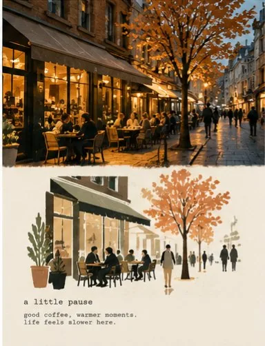
プロンプト
Transform the uploaded photograph into a minimalist vintage travel-journal collage. Match the provided two-panel reference style as closely as possible.

CANVAS:
Vertical 3:4 composition with two horizontal sections of approximately equal height.

TOP HALF — ORIGINAL PHOTO:
Preserve the uploaded photograph and its original composition, location, architecture, objects, colors, and perspective. Keep the image photographic, natural, slightly soft-focused, and cinematic. Do not turn the top half into an illustration.

BOTTOM HALF — SIMPLE FLAT ILLUSTRATION:
Create a deliberately simplified, minimalist watercolor-and-ink illustration of the EXACT SAME SCENE.

IMPORTANT: The bottom illustration must look like the simple, faded illustration in the reference image, NOT a detailed watercolor painting.

Use:

Simplified architectural silhouettes

Flat, translucent watercolor washes

Minimal outlines and loose brushwork

Faded terracotta and dusty blue

Muted olive green and charcoal

Large areas of empty cream paper

Simple human silhouettes

Very few architectural details

Soft, imperfect edges

Do not reproduce every photographic detail. Preserve only the most recognizable elements of the original scene.

The illustration should feel understated, airy, slightly faded, and hand-painted on vintage paper.

LAYOUT:
Keep the photograph in the upper half and the illustration in the lower half. Separate them with a simple, subtly irregular horizontal edge. Avoid elaborate torn-paper effects.

PAPER:
Warm ivory paper with subtle natural grain and a matte finish. The lower section should have plenty of empty space.

TEXT:
At the bottom of the illustrated section, add a small lowercase typewriter-style heading followed by two short lines of reflective text relevant to the scene.

Use dark gray monospaced letters, slightly faded ink, and generous spacing. Keep the text small and understated.

STRICT STYLE RULES:
The top must remain a photograph.
The bottom must remain a simple flat illustration.
Do not make the bottom photorealistic.
Do not use highly detailed watercolor rendering.
Do not fill the entire paper with paint.
Do not add extra panels, borders, decorative elements, or random text.
Preserve the original scene's recognizable identity.

The final image must resemble a minimalist travel-journal page with a photograph above and a simple illustrated interpretation below.

Aspect ratio: 3:4 vertical.
日本語訳
アップロードされた写真を、ミニマルでヴィンテージな旅行日記風のコラージュに変換してください。提供された二分割の参照スタイルにできる限り忠実に合わせること。

キャンバス:
縦位置3:4の構図で、ほぼ同じ高さの横方向のセクションを二つ配置する。

上半分 — 元の写真:
アップロードされた写真と、その元の構図、場所、建築、オブジェクト、色、遠近感を保持すること。画像は写真的で自然、わずかにソフトフォーカスで映画的なままに保つこと。上半分をイラストにしてはならない。

下半分 — シンプルなフラットイラスト:
まったく同じシーンを、意図的に簡略化したミニマルな水彩とインクのイラストで描く。

重要:下半分のイラストは、参照画像にあるシンプルで色あせたイラストのように見える必要があり、細密な水彩画であってはならない。

使用する要素:

簡略化された建築のシルエット

フラットで半透明の水彩の淡い塗り

最小限の輪郭線と自由な筆致

色あせたテラコッタとダスティブルー

落ち着いたオリーブグリーンとチャコール

クリーム色の紙の余白を大きく取る

シンプルな人物のシルエット

ごくわずかな建築的ディテール

柔らかく不完全なエッジ

写真のディテールをすべて再現してはならない。元のシーンで最も認識しやすい要素だけを保持すること。

イラストは、控えめで、空気感があり、わずかに色あせて、ヴィンテージ紙に手描きされたような雰囲気であるべき。

レイアウト:
写真を上半分に、イラストを下半分に保つこと。両者はシンプルで、かすかに不規則な水平の境界線で分ける。凝ったちぎり紙のエフェクトは避けること。

紙:
暖かみのあるアイボリーの紙で、かすかな自然な紙の目とマットな仕上げ。下部のセクションには十分な余白を取ること。

テキスト:
イラストのセクションの下部に、小さな小文字のタイプライター風の見出しを加え、その後にシーンに関連する短い2行の思索的なテキストを続ける。

ダークグレーの等幅フォント、わずかに色あせたインク、ゆったりとした字間を使うこと。テキストは小さく控えめに保つ。

厳格なスタイルルール:
上部は写真のままでなければならない。
下部はシンプルなフラットイラストのままでなければならない。
下部をフォトリアルにしてはならない。
細密すぎる水彩のレンダリングを使わないこと。
紙全体を絵の具で埋め尽くさないこと。
余分なパネル、枠線、装飾要素、ランダムなテキストを追加しないこと。
元のシーンの認識できる同一性を保つこと。

最終的な画像は、上に写真、下にシンプルなイラスト的解釈を配置した、ミニマルな旅行日記のページのように見える必要がある。

アスペクト比:3:4 縦位置。
出典
- 原作者
- Laraib Fatima
- 公開日
- 2026-10-16
- 原典
- 元の投稿を見る ↗
- 収録元
- YouMind-OpenLab/awesome-gpt-image-2 · 36539 · CC-BY-4.0