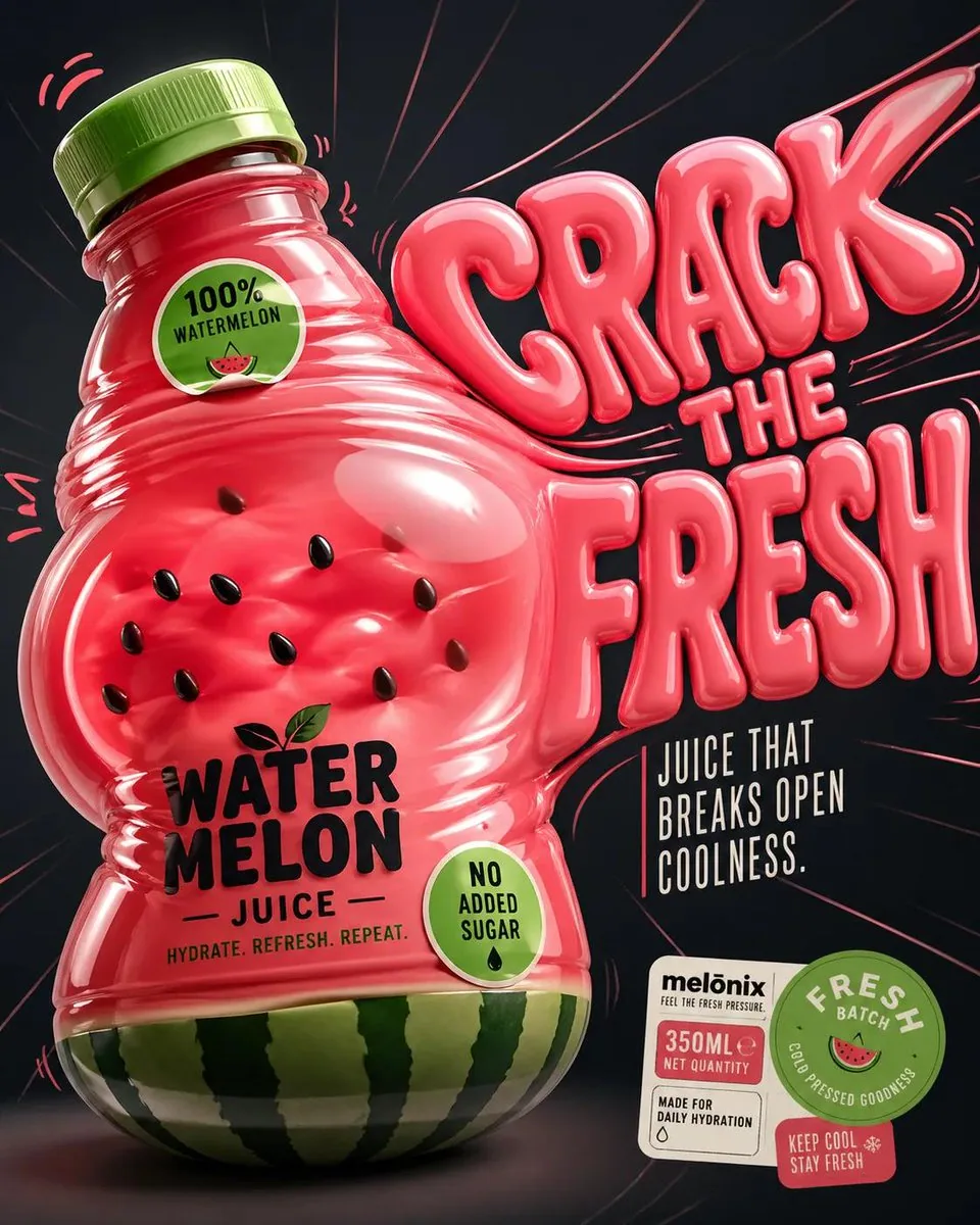
Perfect for the summers GPT Image 2 on ChatGPT Prompt: Design a '4:5' product poster for an 'orange' juice 3d bottle using playful inflatable-plastic packaging surrealism where the bottle behaves like a squeezed toy object mid-pressure. The poster should communicate juiciness, tension, and tactile freshness through a bottle that visibly bulges, stretches, and compresses like a soft object being squeezed from the inside out. SUBJECT: A single bottle dominates the center-left, illustrated in a semi-3D stylized form (not photoreal). The bottle is visibly distorted—its midsection bulges outward while the neck is slightly compressed, as if internal juice pressure is pushing against the container walls. The liquid inside exaggerates this effect, forming rounded convex surfaces pressing against the plastic. The cap is slightly tilted from pressure. The bottle feels elastic, alive, and reactive rather than rigid. COMPOSITION: The composition mechanic is “internal pressure distortion”. The eye enters through the most inflated part of the bottle (center bulge), then follows curved tension lines outward toward stretched typography on the right side. The camera uses a slightly low, close-up perspective with mild fisheye distortion, amplifying the sense of pressure and expansion. The bottle leans diagonally into the frame as if pushing against invisible resistance. Negative space on the right is intentionally stretched and warped, echoing the bottle’s deformation. TYPOGRAPHY: Headline: “SQUEEZE BACK” in thick, rounded, inflated lettering that mimics air-filled plastic. The type is physically distorted—letters stretch horizontally near the bottle and compress toward the edges, as if affected by the same pressure force. The headline sits to the right of the bottle but partially overlaps its bulging edge. Subheadline: “Juice that pushes back.” in a narrow condensed sans, straight and rigid, contrasting the soft headline. Small circular microcopy labels (e.g., “100% organic”, “no added sugar”) appear like printed stickers slightly warped by the surface tension. LIGHTING / GRAPHIC TREATMENT: Soft studio lighting adapted for stylized rendering—broad diffused highlights across curved surfaces, subtle specular streaks that follow the deformation. No realistic reflections—only controlled, simplified highlight bands that emphasize volume and elasticity. COLORS: 'orange' juice bottle color and 3d header text. Small accents of 'bright lime green' for sticker elements. High contrast between glowing orange and dark surroundings. BACKGROUND: A smooth dark gradient field with subtle radial tension lines expanding outward from the bottle, like invisible pressure waves. No texture clutter—clean but dynamically warped space. STYLE: Neo-pop surreal product illustration with inflatable material logic, playful distortion, and high-impact commercial clarity. FINISH: Soft plastic-like rendering, clean edges, controlled gradient transitions, no noise or grain, polished but intentionally stylized surface behavior. FOOTER: A compact floating sticker cluster in the bottom-right corner containing a small brand placeholder, a circular “fresh batch” seal, and minimal product info arranged like packaging labels. NEGATIVE: Avoid realistic photography, static bottle poses, generic splash effects, centered symmetry, rigid typography, template layouts, clutter, excessive gloss, low detail, and stock advertising aesthetics.
한국어 번역
여름에 어울리는 GPT Image 2 on ChatGPT 프롬프트: '4:5' 비율의 '오렌지' 주스 3d 병 제품 포스터를 디자인하세요. 장난스러운 공기주입 비닐 포장 초현실주의를 활용해, 병이 압력을 받아 짜이는 장난감 오브젝트처럼 행동하게 하세요. 포스터는 병이 안쪽에서 바깥으로 짜이는 부드러운 물체처럼 눈에 띄게 부풀고, 늘어나고, 압축되는 모습을 통해 과즙감, 긴장감, 촉각적인 신선함을 전달해야 합니다. SUBJECT: 병 하나가 중앙 왼쪽을 지배하며, 반입체(semi-3D) 스타일화된 형태(실사 아님)로 묘사됩니다. 병은 눈에 띄게 왜곡되어 있습니다—가운데 부분은 바깥으로 부풀고 목 부분은 약간 눌려 있어, 마치 내부의 주스 압력이 용기 벽을 밀어내는 듯합니다. 내부의 액체가 이 효과를 과장해, 플라스틱을 밀어내는 둥근 볼록 면을 형성합니다. 뚜껑은 압력 때문에 살짝 기울어져 있습니다. 병은 딱딱하기보다 탄력 있고 살아 있으며 반응하는 느낌이어야 합니다. COMPOSITION: 구도 메커니즘은 “내부 압력 왜곡”입니다. 시선은 병에서 가장 부풀어 오른 부분(중앙의 볼록한 곳)으로 들어와, 곡선의 긴장선을 따라 오른쪽의 늘어난 타이포그래피를 향해 바깥으로 이동합니다. 카메라는 약간 낮은 클로즈업 시점과 완만한 어안 왜곡을 사용해 압력과 팽창감을 증폭시킵니다. 병은 보이지 않는 저항을 밀어내듯 프레임 안으로 대각선으로 기울어 있습니다. 오른쪽의 여백은 의도적으로 늘어나고 뒤틀려 병의 변형을 반영합니다. TYPOGRAPHY: 헤드라인: “SQUEEZE BACK” — 공기를 채운 플라스틱을 모방한 두껍고 둥근, 부푼 글자체. 글자는 물리적으로 왜곡되어—병 근처에서는 가로로 늘어나고 가장자리로 갈수록 압축되어, 마치 같은 압력의 영향을 받은 듯합니다. 헤드라인은 병 오른쪽에 위치하지만 부풀어 오른 병의 가장자리와 부분적으로 겹칩니다. 서브헤드라인: “Juice that pushes back.” — 좁고 응축된 산세리프로, 곧고 딱딱해 부드러운 헤드라인과 대비됩니다. 작은 원형 마이크로카피 라벨(예: “100% organic”, “no added sugar”)은 인쇄된 스티커처럼 표면 장력에 의해 살짝 뒤틀려 보입니다. LIGHTING / GRAPHIC TREATMENT: 스타일화된 렌더링에 맞춘 부드러운 스튜디오 조명—곡면 전체에 넓게 퍼진 하이라이트, 변형을 따라가는 미묘한 스페큘러 줄무늬. 사실적인 반사는 없습니다—부피감과 탄성을 강조하는 절제되고 단순화된 하이라이트 띠만 사용합니다. COLORS: '오렌지' 주스 병 색상과 3d 헤더 텍스트. 스티커 요소에는 '밝은 라임 그린'의 작은 포인트. 빛나는 오렌지색과 어두운 주변부 사이의 높은 대비. BACKGROUND: 병에서 바깥으로 퍼져 나가는 미묘한 방사형 긴장선이 있는 매끄러운 어두운 그라데이션 배경, 마치 보이지 않는 압력파처럼. 질감의 잡다함은 없이—깔끔하지만 역동적으로 뒤틀린 공간. STYLE: 공기주입 소재의 논리를 지닌 네오팝 초현실 제품 일러스트레이션, 장난스러운 왜곡, 강렬한 상업적 명료함. FINISH: 부드러운 플라스틱 같은 렌더링, 깔끔한 가장자리, 절제된 그라데이션 전환, 노이즈나 그레인 없음, 세련되지만 의도적으로 스타일화된 표면 표현. FOOTER: 오른쪽 하단 모서리에 떠 있는 작은 스티커 클러스터로, 작은 브랜드 자리표시자, 원형 “fresh batch” 씰, 패키지 라벨처럼 배치된 최소한의 제품 정보를 포함합니다. NEGATIVE: 사실적인 사진, 정적인 병 포즈, 일반적인 스플래시 효과, 중앙 대칭, 경직된 타이포그래피, 템플릿 레이아웃, 잡다함, 과도한 광택, 낮은 디테일, 스톡 광고 미학을 피하세요.