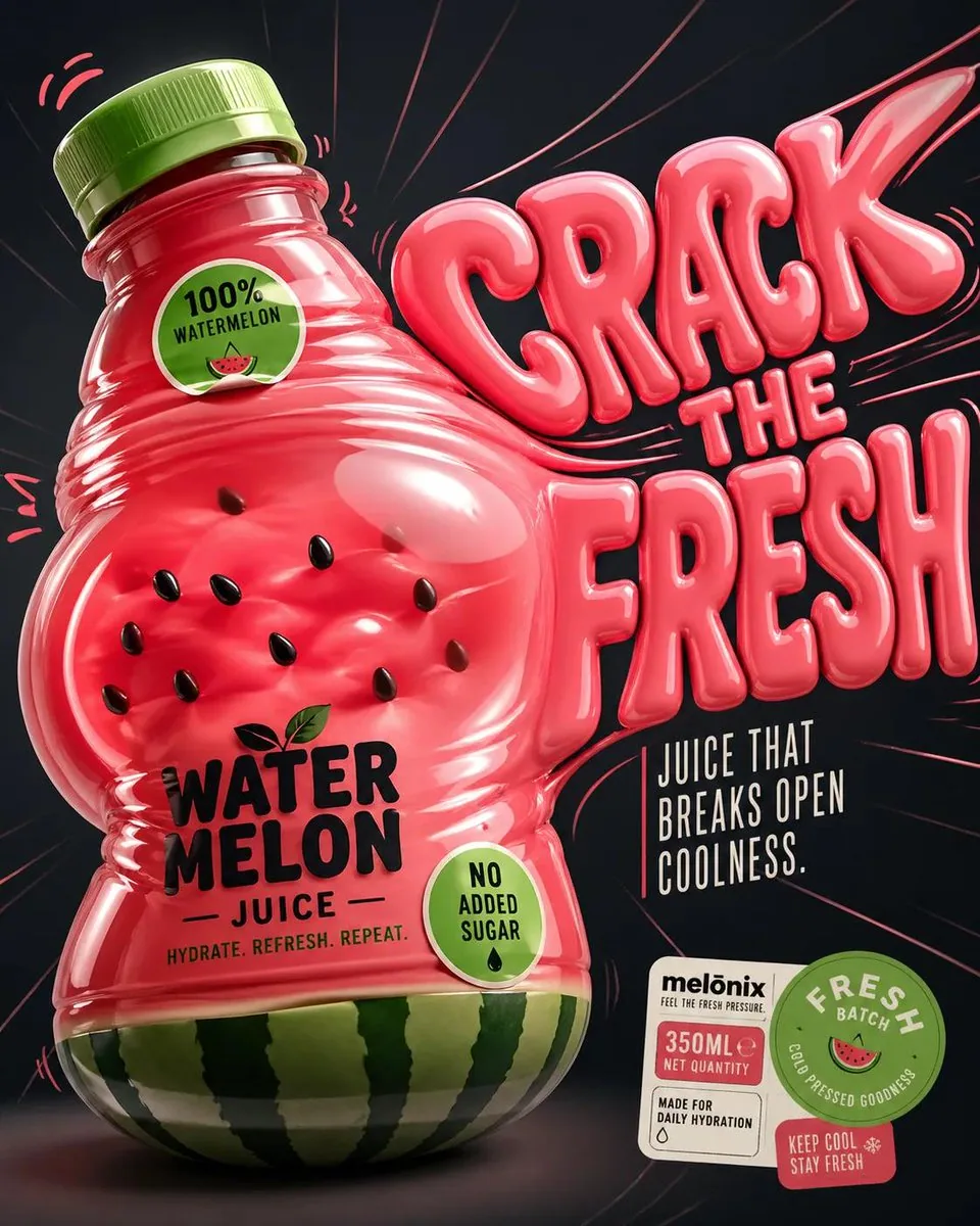
Perfect for the summers GPT Image 2 on ChatGPT Prompt: Design a '4:5' product poster for an 'orange' juice 3d bottle using playful inflatable-plastic packaging surrealism where the bottle behaves like a squeezed toy object mid-pressure. The poster should communicate juiciness, tension, and tactile freshness through a bottle that visibly bulges, stretches, and compresses like a soft object being squeezed from the inside out. SUBJECT: A single bottle dominates the center-left, illustrated in a semi-3D stylized form (not photoreal). The bottle is visibly distorted—its midsection bulges outward while the neck is slightly compressed, as if internal juice pressure is pushing against the container walls. The liquid inside exaggerates this effect, forming rounded convex surfaces pressing against the plastic. The cap is slightly tilted from pressure. The bottle feels elastic, alive, and reactive rather than rigid. COMPOSITION: The composition mechanic is “internal pressure distortion”. The eye enters through the most inflated part of the bottle (center bulge), then follows curved tension lines outward toward stretched typography on the right side. The camera uses a slightly low, close-up perspective with mild fisheye distortion, amplifying the sense of pressure and expansion. The bottle leans diagonally into the frame as if pushing against invisible resistance. Negative space on the right is intentionally stretched and warped, echoing the bottle’s deformation. TYPOGRAPHY: Headline: “SQUEEZE BACK” in thick, rounded, inflated lettering that mimics air-filled plastic. The type is physically distorted—letters stretch horizontally near the bottle and compress toward the edges, as if affected by the same pressure force. The headline sits to the right of the bottle but partially overlaps its bulging edge. Subheadline: “Juice that pushes back.” in a narrow condensed sans, straight and rigid, contrasting the soft headline. Small circular microcopy labels (e.g., “100% organic”, “no added sugar”) appear like printed stickers slightly warped by the surface tension. LIGHTING / GRAPHIC TREATMENT: Soft studio lighting adapted for stylized rendering—broad diffused highlights across curved surfaces, subtle specular streaks that follow the deformation. No realistic reflections—only controlled, simplified highlight bands that emphasize volume and elasticity. COLORS: 'orange' juice bottle color and 3d header text. Small accents of 'bright lime green' for sticker elements. High contrast between glowing orange and dark surroundings. BACKGROUND: A smooth dark gradient field with subtle radial tension lines expanding outward from the bottle, like invisible pressure waves. No texture clutter—clean but dynamically warped space. STYLE: Neo-pop surreal product illustration with inflatable material logic, playful distortion, and high-impact commercial clarity. FINISH: Soft plastic-like rendering, clean edges, controlled gradient transitions, no noise or grain, polished but intentionally stylized surface behavior. FOOTER: A compact floating sticker cluster in the bottom-right corner containing a small brand placeholder, a circular “fresh batch” seal, and minimal product info arranged like packaging labels. NEGATIVE: Avoid realistic photography, static bottle poses, generic splash effects, centered symmetry, rigid typography, template layouts, clutter, excessive gloss, low detail, and stock advertising aesthetics.
中文翻譯
非常適合夏天的 GPT Image 2 on ChatGPT 提示詞:爲一款 'orange' 果汁 3D 瓶子設計一張 '4:5' 產品海報,採用俏皮的充氣塑料包裝超現實主義,瓶子表現得像處於受擠壓中途的玩具物件。海報應通過一個明顯鼓脹、拉伸和壓縮、如同從內向外被擠壓的柔軟物體般的瓶子,傳達多汁感、張力與觸覺上的新鮮感。主體:單個瓶子佔據中偏左位置,以半 3D 風格化形式呈現(非照片寫實)。瓶子明顯變形——其中段向外鼓起,而瓶頸略微被壓縮,彷彿內部的果汁壓力正推擠着容器壁。內部的液體放大了這一效果,形成圓潤的凸面擠壓着塑料。瓶蓋因壓力而略微傾斜。瓶子感覺富有彈性、有生命感且能做出反應,而非僵硬死板。構圖:構圖機制是“內部壓力變形”。視線從瓶子最鼓脹的部分(中央鼓起處)進入,然後沿着彎曲的張力線向外,朝右側被拉伸的字體延伸。鏡頭採用略微低角度的近距離視角,帶輕微魚眼畸變,放大壓力與膨脹感。瓶子以對角線方向傾入畫面,彷彿在推擠看不見的阻力。右側的負空間被刻意拉伸和扭曲,與瓶子的變形相呼應。字體排版:主標題:“SQUEEZE BACK”,採用粗厚、圓潤、充氣感的字體,模仿充滿空氣的塑料。字形被物理性扭曲——字母在靠近瓶子處水平拉伸,並向邊緣壓縮,彷彿受到同一股壓力作用。主標題位於瓶子右側,但部分與瓶子鼓起的邊緣重疊。副標題:“Juice that pushes back.”,採用窄長的壓縮無襯線字體,筆直而剛性,與柔軟的主標題形成對比。小型圓形微文案標籤(例如 “100% organic”、“no added sugar”)看起來像印刷貼紙,因表面張力而略微翹曲。光線 / 圖形處理:柔和影棚光線,經調整以適配風格化渲染——寬廣的漫射高光橫跨曲面,微妙的鏡面光痕順着變形走向。不要寫實的反射——只用受控、簡化的高光帶,強調體積感與彈性。色彩:'orange' 果汁瓶子顏色和 3D 標題文字。以 'bright lime green' 作爲貼紙元素的小面積點綴。發光的橙色與深色環境之間形成高對比。背景:平滑的深色漸變場,帶有從瓶子向外擴張的微妙徑向張力線,如同看不見的壓力波。不要雜亂的肌理——乾淨但被動態扭曲的空間。風格:新波普超現實產品插畫,具有充氣材質的邏輯、俏皮的變形,以及高衝擊力的商業清晰度。成品效果:柔和的類塑料渲染、乾淨的邊緣、受控的漸變過渡、無噪點或顆粒,表面表現精緻但刻意風格化。頁腳:右下角一個緊湊的懸浮貼紙組合,包含一個小型品牌佔位符、一枚圓形 “fresh batch” 印章,以及以包裝標籤方式排布的極簡產品信息。負面:避免寫實攝影、靜止的瓶子姿態、通用的飛濺效果、居中對稱、僵硬排版、模板化佈局、雜亂、過度光澤、低細節,以及圖庫廣告美學。