건축 사진 → 하프톤 여행 포스터: 상하 분할 템플릿
상단은 실사 구조를 유지하고, 하단은 찢긴 종이 조각 + ASCII + 복사 하프톤으로 같은 건축물을 재구성. 부동산 / 관광 대량 제작, 분할 포맷 고정으로 재사용 가능.
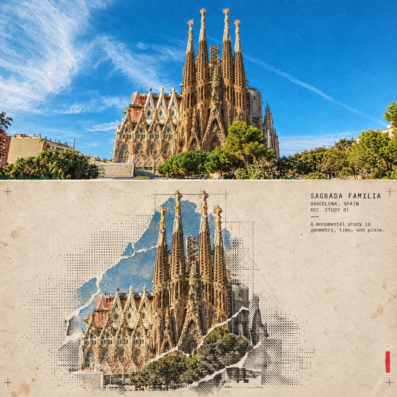
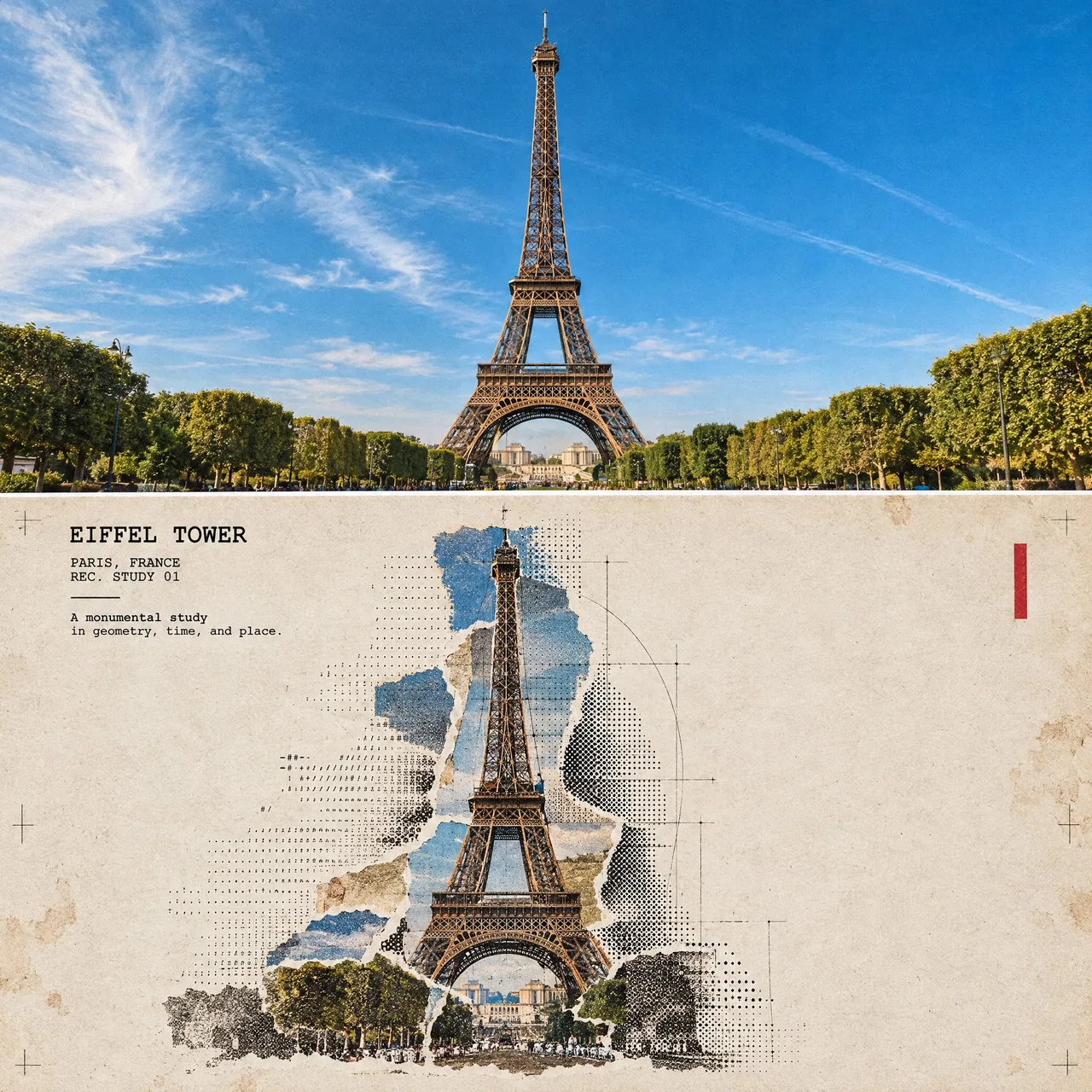
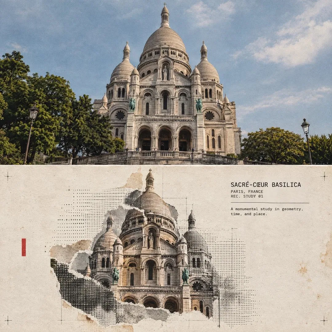
프롬프트
Turn this structure photo into a single high-end halftone architectural travel-collage poster. Output one poster per uploaded photo — never merge multiple structures or photos into one frame.

FORMAT

3:4 vertical canvas. Split into two roughly equal zones — real architectural photo on top, printed reconstruction below — divided by one clean, sharp horizontal line.

Do not stretch, warp, tilt, or unnaturally reposition the structure to force the proportions.

TOP HALF — THE REAL SHOT

Preserve the original structure faithfully: same architecture, proportions, perspective, distinctive details, surrounding elements, natural light and shadow, and original color mood.

Keep recognizable features such as:

* façade
* windows and arches
* towers or domes
* doors and structural details
* roofline
* surrounding landscape or street elements

Add only a subtle high-end color grade and the faintest film grain. Do not redesign or reinterpret the architecture.

BOTTOM HALF — THE PRINTED RECONSTRUCTION

Rebuild the same structure as an experimental printed architectural collage using:

torn photographic fragments + fixed-width ASCII character fields + photocopy halftone dots + architectural linework.

The structure must remain immediately recognizable.

* Torn-edge photographic fragments preserve the most important architectural details.
* Brick, stone, glass, metal, shadows, windows, and surrounding textures gradually dissolve outward into ASCII characters, black halftone dots, fragmented print grain, and fine architectural drafting lines.
* Use thin technical construction lines to subtly trace the structure’s geometry.
* Let selected areas break apart into paper fibers and halftone fragments, creating the feeling that the building is emerging from an archival print.
* Keep the main silhouette strong and readable.
* Texture: rough white paper-fiber edges, subtle photocopy imperfections, slight print misregistration, faded ink, old-paper stains, a few restrained crop marks, and one small red calibration bar.
* Color: warm gray old-paper background + black ink + the structure’s original muted colors + a single restrained red accent.
* Never fully desaturate the structure.

The structure should occupy roughly 60–88% of the frame width, scaled according to what reads best for the architecture.

Leave 22–38% of the paper visibly untouched and empty, creating generous negative space so the poster feels like an archival architectural specimen rather than a packed digital screen.

TYPOGRAPHY

Add one clean, readable fixed-width architectural title based on the structure:

[STRUCTURE NAME]

Below it include:

[CITY, COUNTRY]
REC. STUDY 01

Add one short observational caption related to the architecture, such as:

“A monumental study in geometry, time, and place.”

Typography should feel like an old architectural archive mixed with an underground experimental design journal.

A few loose ASCII glyphs may trace the outer silhouette or architectural edges as texture only — never use ASCII to invent windows, doors, structural details, or technical specifications.

MOOD

Early digital systems × analog photocopy × architectural archive × underground zine × modern travel editorial.

The structure should feel like it is surfacing from an old printed document — half photograph, half architectural drawing, half experimental print.

Sophisticated, minimal, tactile, intellectual, slightly mysterious, and highly collectible.

AVOID

Solid black terminal backgrounds, dense walls of code, cyberpunk neon, excessive ASCII, distorted architecture, impossible geometry, invented architectural details, fake technical specifications, random symbols with no meaning, garbled text, excessive colors, brand logos, QR codes, watermarks, author credits, or tourist-poster clichés.

Priority: Preserve the structure’s identity and architectural accuracy first. The experimental halftone/ASCII treatment should enhance the architecture, not hide it.
한국어 번역
이 구조물 사진을 하나의 하이엔드 하프톤 건축 여행 콜라주 포스터로 만들어 주세요. 업로드된 사진당 하나의 포스터를 출력 — 여러 구조물이나 사진을 한 프레임에 절대 합치지 마세요.

형식

3:4 세로 캔버스. 거의 동일한 두 구역으로 분할 — 위에는 실제 건축 사진, 아래에는 인쇄 재구성 — 하나의 깔끔하고 날카로운 가로선으로 나눕니다.

비율을 억지로 맞추기 위해 구조물을 늘리거나, 왜곡하거나, 기울이거나, 부자연스럽게 재배치하지 마세요.

상단 절반 — 실제 촬영본

원본 구조물을 충실히 보존하세요: 같은 건축, 비율, 원근, 독특한 디테일, 주변 요소, 자연광과 그림자, 원래의 색감.

다음과 같이 알아볼 수 있는 특징을 유지하세요:

* 파사드
* 창문과 아치
* 타워 또는 돔
* 문과 구조적 디테일
* 지붕선
* 주변 풍경 또는 거리 요소

은은한 하이엔드 컬러 그레이딩과 아주 미세한 필름 그레인만 추가하세요. 건축물을 재디자인하거나 재해석하지 마세요.

하단 절반 — 인쇄 재구성

다음 재료로 같은 구조물을 실험적 인쇄 건축 콜라주로 재구성하세요:

찢긴 사진 조각 + 고정폭 ASCII 문자 필드 + 복사 하프톤 도트 + 건축 라인워크.

구조물은 즉시 알아볼 수 있어야 합니다.

* 찢긴 가장자리의 사진 조각이 가장 중요한 건축 디테일을 보존합니다.
* 벽돌, 석재, 유리, 금속, 그림자, 창문, 주변 텍스처가 바깥쪽으로 점차 ASCII 문자, 검은 하프톤 도트, 조각난 인쇄 그레인, 섬세한 건축 제도선으로 녹아듭니다.
* 얇은 기술 제도선으로 구조물의 기하학을 은은하게 따라 그리세요.
* 선택된 영역이 종이 섬유와 하프톤 조각으로 흩어지게 하여, 건물이 아카이브 인쇄물에서 떠오르는 듯한 느낌을 만드세요.
* 메인 실루엣은 강하고 읽기 쉽게 유지하세요.
* 질감: 거친 흰 종이 섬유 가장자리, 은은한 복사 결함, 약간의 인쇄 어긋남, 바랜 잉크, 오래된 종이 얼룩, 절제된 크롭 마크 몇 개, 작은 빨간 캘리브레이션 바 하나.
* 색상: 따뜻한 회색 오래된 종이 배경 + 검은 잉크 + 구조물의 원래 절제된 색상 + 절제된 빨간 포인트 하나.
* 구조물을 완전히 탈색하지 마세요.

구조물은 프레임 너비의 약 60–88%를 차지해야 하며, 해당 건축물에 가장 잘 읽히는 크기에 맞춰 조정하세요.

종이의 22–38%는 눈에 띄게 비워 두어 넉넉한 여백을 만들고, 포스터가 빽빽한 디지털 화면이 아니라 아카이브 건축 표본처럼 느껴지게 하세요.

타이포그래피

구조물을 바탕으로 한 깔끔하고 읽기 쉬운 고정폭 건축 제목을 하나 추가하세요:

[STRUCTURE NAME]

그 아래에 포함:

[CITY, COUNTRY]
REC. STUDY 01

건축물과 관련된 짧은 관찰 캡션을 하나 추가하세요, 예를 들어:

“기하학과 시간, 그리고 장소에 관한 기념비적 연구.”

타이포그래피는 오래된 건축 아카이브와 언더그라운드 실험 디자인 저널이 섞인 느낌이어야 합니다.

느슨한 ASCII 글리프 몇 개가 텍스처로만 바깥 실루엣이나 건축 모서리를 따라갈 수 있습니다 — ASCII로 창문, 문, 구조적 디테일, 기술 사양을 절대 만들어내지 마세요.

분위기

초기 디지털 시스템 × 아날로그 복사 × 건축 아카이브 × 언더그라운드 진 × 현대 여행 에디토리얼.

구조물은 오래된 인쇄 문서에서 떠오르는 듯한 느낌이어야 합니다 — 절반은 사진, 절반은 건축 도면, 절반은 실험적 인쇄.

세련되고, 미니멀하고, 질감이 살아 있고, 지적이며, 약간 신비롭고, 소장 가치가 높게.

피해야 할 것

단색 검정 터미널 배경, 빽빽한 코드의 벽, 사이버펑크 네온, 과도한 ASCII, 왜곡된 건축, 불가능한 기하학, 지어낸 건축 디테일, 가짜 기술 사양, 의미 없는 무작위 기호, 깨진 텍스트, 과도한 색상, 브랜드 로고, QR 코드, 워터마크, 제작자 크레딧, 관광 포스터 상투적 표현.

우선순위: 구조물의 정체성과 건축적 정확성을 먼저 보존하세요. 실험적 하프톤/ASCII 처리는 건축물을 돋보이게 해야지 가려서는 안 됩니다.
출처
- 원작자
- Naiknelofar788
- 게시일
- 2026-09-16
- 원문 출처
- 원문 보기 ↗
- 수록 출처
- xianyu110/awesome-gpt-image2.5 · 2100067049288634730 · MIT