와시 테이프 여행 콜라주: 교체 가능한 장소 템플릿
[COUNTRY / LOCATION / SUBJECT]를 임의의 목적지로 바꾸고, washi tape 10~18조각으로 랜드마크를 구성합니다. 관광/문구 브랜드용 3:4 세로형이며, 완전한 교체 가능 템플릿 prompt를 포함합니다.
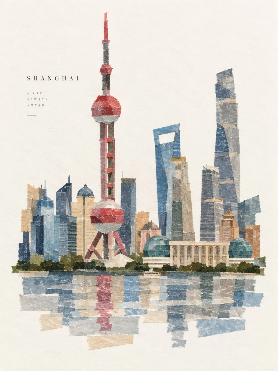
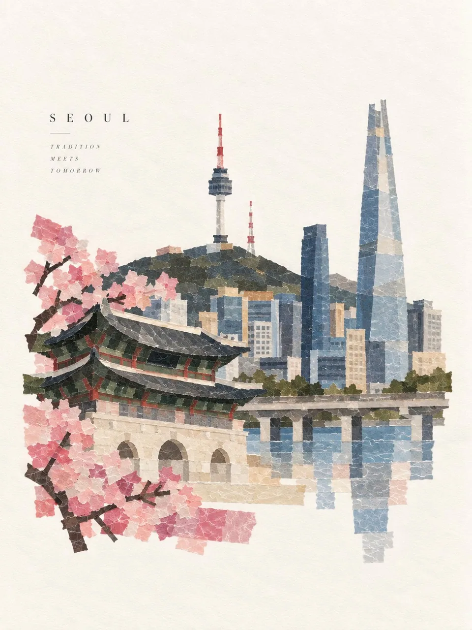
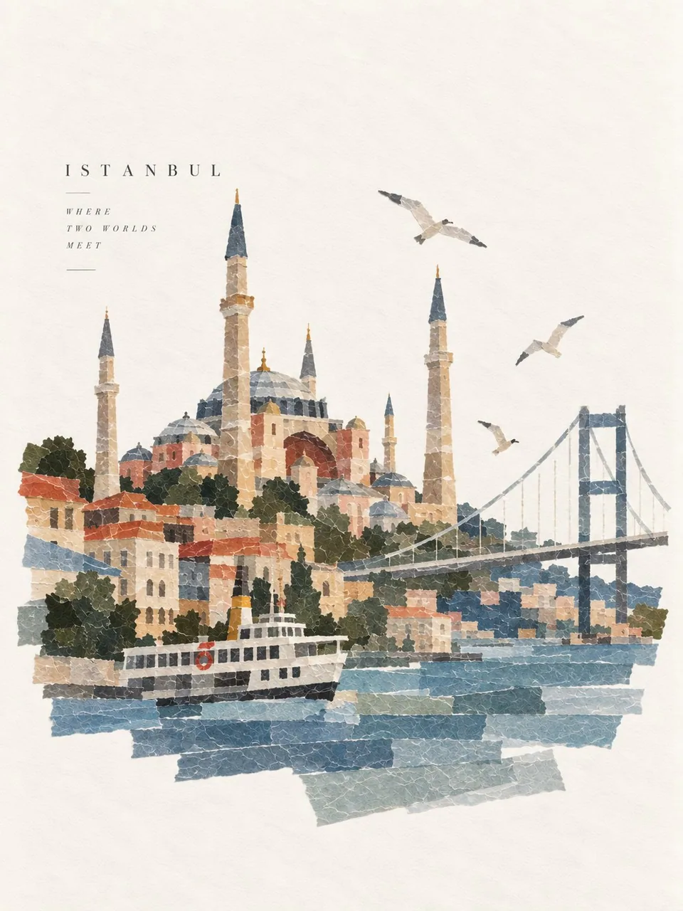
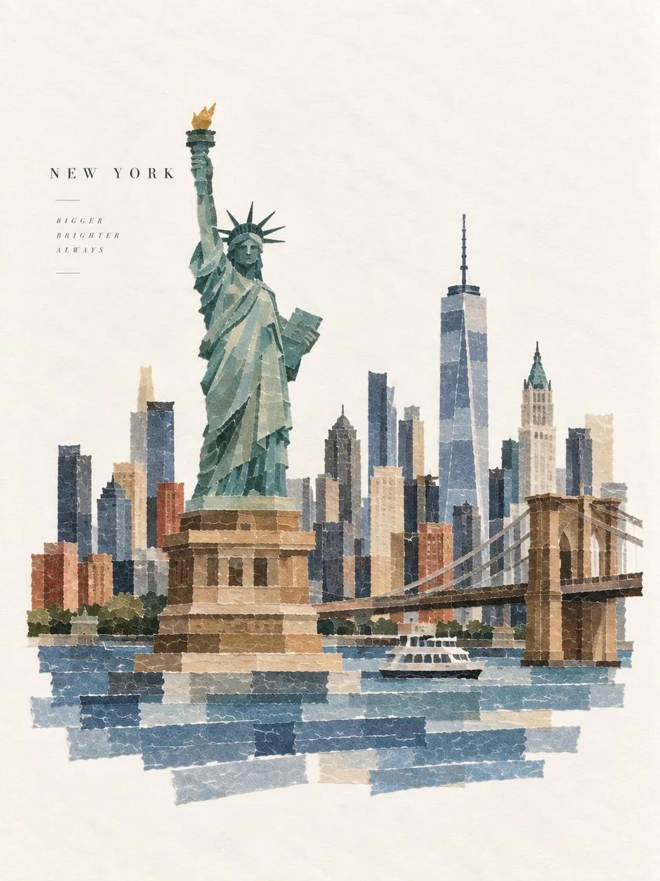
프롬프트
Create one premium 3:4 vertical washi-tape collage artwork for [COUNTRY / LOCATION / SUBJECT].

TEXT-TO-IMAGE GENERATION ONLY. Generate the complete artwork from “[COUNTRY / LOCATION / SUBJECT]” alone. No reference image or additional visual input is required.

MAIN CONCEPT

Automatically interpret [COUNTRY / LOCATION / SUBJECT] and identify its most recognizable subject, silhouette, structure, pose, colors, shapes, and defining visual characteristics.

Reconstruct that subject entirely from approximately 10–18 pieces of Japanese washi tape, using different widths, lengths, directions, cuts, and overlaps to form one instantly recognizable flat collage.

The tape arrangement should feel intentionally handmade while accurately expressing the identity of [COUNTRY / LOCATION / SUBJECT].

WASHI TAPE MATERIAL

Use authentic Japanese washi tape characteristics:

Slight translucency and natural overlapping

Fine paper-fiber texture

Soft paper thickness

Irregular hand-torn edges

Subtle contact shadows

Simple solid colors or understated basic patterns

Natural layering and slight imperfections

Avoid complex patterns and excessive decoration.

COLOR

Automatically select a refined palette based on the visual identity of [COUNTRY / LOCATION / SUBJECT].

Use a limited number of clear, harmonious colors that make the subject recognizable. Allow overlapping translucent tape to naturally create subtle color variations.

COMPOSITION

Place the completed washi-tape subject prominently on a clean warm-white journal-paper background.

Maintain generous negative space around the artwork.

Keep the composition elegant, balanced, minimal, and carefully designed—like a premium Japanese stationery brand, independent design magazine, or gallery-quality handmade collage.

Do not fill the entire canvas.

BACKGROUND

Use warm white, ivory, or natural off-white paper with extremely subtle paper fibers and gentle material variation.

Keep the background clean, smooth, and low-contrast.

No stains, yellowed-paper effect, heavy aging, repetitive textures, or distracting details.

TYPOGRAPHY

Automatically create one short English title of 1–3 words inspired by [COUNTRY / LOCATION / SUBJECT].

Keep it small and secondary to the collage.

Use refined, minimal typography and position it where it naturally balances the composition. Remove the title entirely if it would weaken the design.

FINAL AESTHETIC

Create a sophisticated combination of:

Japanese washi tape × handmade paper craft × minimalist editorial design × tactile collage × premium stationery aesthetic.

The artwork should feel clean, delicate, contemporary, handmade, and highly intentional, while the subject remains immediately recognizable.

AVOID

No stickers, cards, stamps, tickets, envelopes, tape rolls, scissors, hands, desks, craft tools, scrapbook clutter, heavy shadows, 3D plastic, oil painting, cartoon rendering, dirty backgrounds, excessive decoration, or photorealistic objects.

STRICT 3:4 VERTICAL | TEXT-ONLY GENERATION | 10–18 WASHI TAPE PIECES | CLEAN WARM-WHITE BACKGROUND | GENEROUS NEGATIVE SPACE | PREMIUM JAPANESE EDITORIAL DESIGN.

Generate everything autonomously from [COUNTRY / LOCATION / SUBJECT] alone. Do not request or require an image.
한국어 번역
[COUNTRY / LOCATION / SUBJECT]를 위한 프리미엄 3:4 세로형 와시 테이프 콜라주 아트워크 한 점을 생성하세요.

텍스트-투-이미지 생성 전용. “[COUNTRY / LOCATION / SUBJECT]”만으로 완성된 아트워크를 생성하세요. 참조 이미지나 추가 시각 입력은 필요하지 않습니다.

메인 컨셉

[COUNTRY / LOCATION / SUBJECT]를 자동으로 해석하고, 가장 잘 알려진 피사체, 실루엣, 구조물, 포즈, 색상, 형태 및 특징적인 시각적 요소를 파악하세요.

약 10~18조각의 일본식 와시 테이프만으로 그 피사체를 재구성하되, 서로 다른 폭, 길이, 방향, 절단, 겹침을 활용해 한눈에 알아볼 수 있는 평면 콜라주를 만드세요.

테이프 배치는 의도적으로 수작업한 느낌을 주면서도 [COUNTRY / LOCATION / SUBJECT]의 정체성을 정확히 표현해야 합니다.

와시 테이프 재질

정통 일본식 와시 테이프의 특성을 사용하세요:

약간의 반투명함과 자연스러운 겹침

고운 종이 섬유 질감

부드러운 종이 두께

불규칙하게 손으로 찢은 가장자리

은은한 접촉 그림자

단순한 단색 또는 절제된 기본 패턴

자연스러운 레이어링과 약간의 불완전함

복잡한 패턴과 과도한 장식은 피하세요.

색상

[COUNTRY / LOCATION / SUBJECT]의 시각적 정체성을 바탕으로 세련된 팔레트를 자동으로 선택하세요.

피사체를 알아볼 수 있게 하는 명확하고 조화로운 색상을 제한된 수로 사용하세요. 겹치는 반투명 테이프가 자연스럽게 은은한 색상 변화를 만들어내도록 하세요.

구도

완성된 와시 테이프 피사체를 깨끗한 따뜻한 흰색 저널 용지 배경 위에 두드러지게 배치하세요.

아트워크 주변에 넉넉한 여백을 유지하세요.

프리미엄 일본 문구 브랜드, 독립 디자인 매거진, 갤러리 수준의 수제 콜라주처럼 우아하고 균형 잡히고 미니멀하며 세심하게 설계된 구도를 유지하세요.

캔버스를 가득 채우지 마세요.

배경

아주 은은한 종이 섬유와 부드러운 재질 변화가 있는 따뜻한 흰색, 아이보리 또는 자연스러운 미색 용지를 사용하세요.

배경은 깨끗하고 매끄럽고 대비가 낮게 유지하세요.

얼룩, 누렇게 변색된 종이 효과, 심한 세월의 흔적, 반복적인 질감, 시선을 끄는 디테일은 없어야 합니다.

타이포그래피

[COUNTRY / LOCATION / SUBJECT]에서 영감을 받은 1~3단어의 짧은 영어 제목을 자동으로 하나 만드세요.

작게 유지하고 콜라주보다 부차적으로 보이게 하세요.

세련되고 미니멀한 타이포그래피를 사용하고 구도를 자연스럽게 균형 잡아 주는 위치에 배치하세요. 디자인을 약화시킬 경우 제목을 완전히 제거하세요.

최종 미학

다음의 정교한 조합을 만드세요:

일본 와시 테이프 × 수제 종이 공예 × 미니멀 편집 디자인 × 촉각적 콜라주 × 프리미엄 문구 미학.

아트워크는 깨끗하고 섬세하며 현대적이고 수작업 느낌이면서 의도가 분명하게 느껴져야 하며, 피사체는 즉시 알아볼 수 있어야 합니다.

피할 것

스티커, 카드, 스탬프, 티켓, 봉투, 테이프 롤, 가위, 손, 책상, 공예 도구, 스크랩북 잡동사니, 강한 그림자, 3D 플라스틱, 유화, 카툰 렌더링, 지저분한 배경, 과도한 장식, 사실적인 사물은 넣지 마세요.

엄격한 3:4 세로 비율 | 텍스트만으로 생성 | 와시 테이프 10~18조각 | 깨끗한 따뜻한 흰색 배경 | 넉넉한 여백 | 프리미엄 일본 편집 디자인.

[COUNTRY / LOCATION / SUBJECT]만으로 모든 것을 자율적으로 생성하세요. 이미지를 요청하거나 필요로 하지 마세요.
출처
- 원작자
- Goodmanprotocol
- 게시일
- 2026-09-17
- 원문 출처
- 원문 보기 ↗
- 수록 출처
- xianyu110/awesome-gpt-image2.5 · 2100452165416374277 · MIT