和紙膠帶旅行拼貼:可替換地點模板
把 [COUNTRY / LOCATION / SUBJECT] 換成任意目的地,10–18 條 washi tape 拼出地標;文旅/文具品牌向 3:4 豎版,附完整可替換模板 prompt。
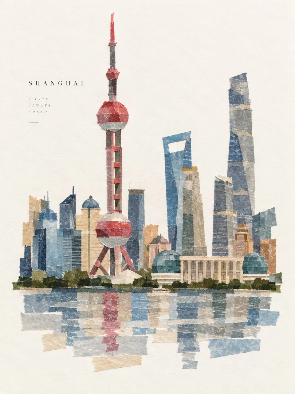
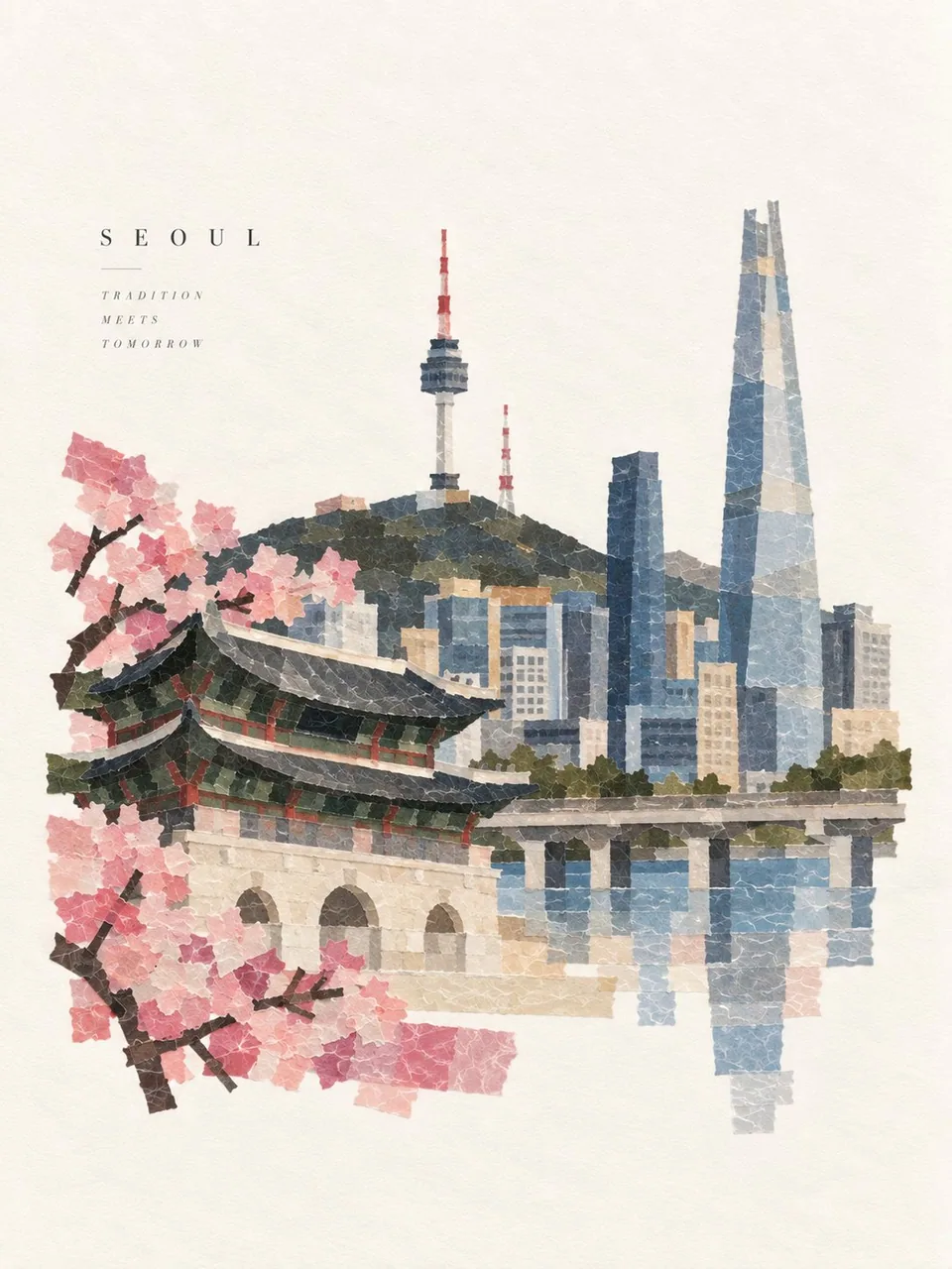
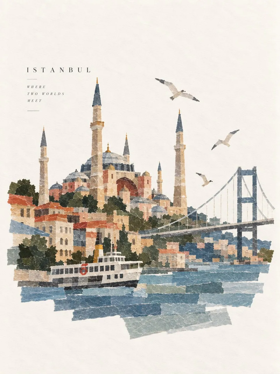
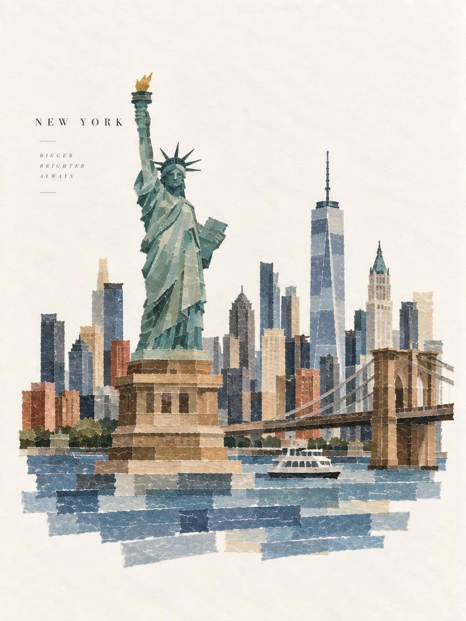
提示詞
Create one premium 3:4 vertical washi-tape collage artwork for [COUNTRY / LOCATION / SUBJECT].

TEXT-TO-IMAGE GENERATION ONLY. Generate the complete artwork from “[COUNTRY / LOCATION / SUBJECT]” alone. No reference image or additional visual input is required.

MAIN CONCEPT

Automatically interpret [COUNTRY / LOCATION / SUBJECT] and identify its most recognizable subject, silhouette, structure, pose, colors, shapes, and defining visual characteristics.

Reconstruct that subject entirely from approximately 10–18 pieces of Japanese washi tape, using different widths, lengths, directions, cuts, and overlaps to form one instantly recognizable flat collage.

The tape arrangement should feel intentionally handmade while accurately expressing the identity of [COUNTRY / LOCATION / SUBJECT].

WASHI TAPE MATERIAL

Use authentic Japanese washi tape characteristics:

Slight translucency and natural overlapping

Fine paper-fiber texture

Soft paper thickness

Irregular hand-torn edges

Subtle contact shadows

Simple solid colors or understated basic patterns

Natural layering and slight imperfections

Avoid complex patterns and excessive decoration.

COLOR

Automatically select a refined palette based on the visual identity of [COUNTRY / LOCATION / SUBJECT].

Use a limited number of clear, harmonious colors that make the subject recognizable. Allow overlapping translucent tape to naturally create subtle color variations.

COMPOSITION

Place the completed washi-tape subject prominently on a clean warm-white journal-paper background.

Maintain generous negative space around the artwork.

Keep the composition elegant, balanced, minimal, and carefully designed—like a premium Japanese stationery brand, independent design magazine, or gallery-quality handmade collage.

Do not fill the entire canvas.

BACKGROUND

Use warm white, ivory, or natural off-white paper with extremely subtle paper fibers and gentle material variation.

Keep the background clean, smooth, and low-contrast.

No stains, yellowed-paper effect, heavy aging, repetitive textures, or distracting details.

TYPOGRAPHY

Automatically create one short English title of 1–3 words inspired by [COUNTRY / LOCATION / SUBJECT].

Keep it small and secondary to the collage.

Use refined, minimal typography and position it where it naturally balances the composition. Remove the title entirely if it would weaken the design.

FINAL AESTHETIC

Create a sophisticated combination of:

Japanese washi tape × handmade paper craft × minimalist editorial design × tactile collage × premium stationery aesthetic.

The artwork should feel clean, delicate, contemporary, handmade, and highly intentional, while the subject remains immediately recognizable.

AVOID

No stickers, cards, stamps, tickets, envelopes, tape rolls, scissors, hands, desks, craft tools, scrapbook clutter, heavy shadows, 3D plastic, oil painting, cartoon rendering, dirty backgrounds, excessive decoration, or photorealistic objects.

STRICT 3:4 VERTICAL | TEXT-ONLY GENERATION | 10–18 WASHI TAPE PIECES | CLEAN WARM-WHITE BACKGROUND | GENEROUS NEGATIVE SPACE | PREMIUM JAPANESE EDITORIAL DESIGN.

Generate everything autonomously from [COUNTRY / LOCATION / SUBJECT] alone. Do not request or require an image.
中文翻譯
爲 [COUNTRY / LOCATION / SUBJECT] 創作一件高級的 3:4 豎版和紙膠帶拼貼藝術作品。

僅限文生圖(TEXT-TO-IMAGE)。僅憑“[COUNTRY / LOCATION / SUBJECT]”生成完整的藝術作品。無需參考圖或任何額外的視覺輸入。

主要概念

自動解讀 [COUNTRY / LOCATION / SUBJECT],識別其最具辨識度的主體、輪廓、結構、姿態、色彩、形狀與標誌性視覺特徵。

完全用約 10–18 片日本和紙膠帶重構該主體,通過不同的寬度、長度、走向、裁切方式與疊壓關係,構成一幅一眼即可辨認的平面拼貼。

膠帶的排布應帶有刻意手作的質感,同時準確表達 [COUNTRY / LOCATION / SUBJECT] 的身份特徵。

和紙膠帶材質

採用正宗日本和紙膠帶的特徵:

輕微的半透明感與自然的疊壓

細膩的紙張纖維質感

柔和的紙張厚度

不規則的手撕邊緣

微妙的接觸陰影

簡單的純色或低調的基礎圖案

自然的層疊與輕微的不完美

避免複雜的圖案與過度的裝飾。

色彩

根據 [COUNTRY / LOCATION / SUBJECT] 的視覺識別自動選擇精緻的配色方案。

使用數量有限、清晰且和諧的色彩,使主體易於辨認。讓半透明膠帶的疊壓自然形成微妙的色彩變化。

構圖

將完成後的和紙膠帶主體醒目地置於乾淨的暖白色手賬紙背景上。

在作品四周保留充裕的留白。

保持構圖優雅、平衡、極簡且精心設計——如同高級日本文具品牌、獨立設計雜誌或畫廊級的手工拼貼。

不要填滿整個畫面。

背景

使用暖白、象牙白或自然的米白色紙張,帶有極其細微的紙張纖維與柔和的材質變化。

保持背景乾淨、平滑、低對比。

無污漬、無紙張泛黃效果、無重度做舊、無重複紋理、無分散注意力的細節。

字體排版

根據 [COUNTRY / LOCATION / SUBJECT] 自動創作一個 1–3 個單詞的簡短英文標題。

使其尺寸小巧,處於拼貼的次要地位。

使用精緻、極簡的字體排版,並將其置於能自然平衡構圖的位置。若標題會削弱設計,則完全移除標題。

最終美學

打造一種精緻的融合:

日本和紙膠帶 × 手工紙藝 × 極簡編輯設計 × 觸感拼貼 × 高級文具美學。

作品應顯得乾淨、精緻、當代、手工感強且極具刻意經營之感,同時主體仍一眼可辨。

避免

無貼紙、卡片、印章、票券、信封、膠帶卷、剪刀、手、桌面、手工工具、剪貼簿雜物、濃重陰影、3D 塑料感、油畫、卡通渲染、髒污背景、過度裝飾或照片級寫實物體。

嚴格 3:4 豎版 | 純文本生成 | 10–18 片和紙膠帶 | 乾淨的暖白背景 | 充裕留白 | 高級日式編輯設計。

僅憑 [COUNTRY / LOCATION / SUBJECT] 自主生成全部內容。不要請求或需要圖像。
溯源
- 原作者
- Goodmanprotocol
- 發佈日期
- 2026-09-17
- 原始出處
- 查看原帖 ↗
- 收錄來源
- xianyu110/awesome-gpt-image2.5 · 2100452165416374277 · MIT