스낵 포스터: 'gooey'라고 쓰지 말고, 면이 늘어나는 구조를 써라
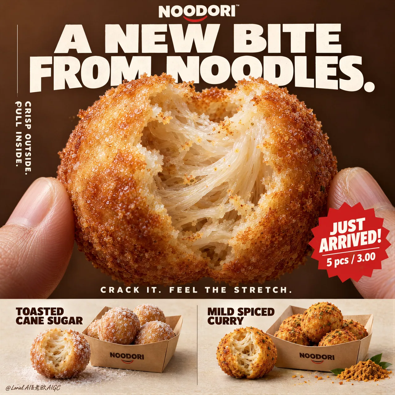
베어 문 단면에 반투명한 전분 가닥과 탄성 있는 늘어남이 드러난다 — '끈적한 속'이라고 쓰면 치즈 빵이 되어버린다. NOODORI 가상 브랜드 KV 전체 롱 프롬프트, 식품 이커머스 포스터에 구조를 그대로 차용 가능.
프롬프트
Don’t write “gooey filling.” That turns this into cheese bread.
🧊 a naturally torn bite edge revealing translucent noodle strands, layered starch threads, and elastic pull inside the shell
This makes the center read as a real noodle structure—not a generic soft crumb.
🍊 thin blistered golden crust with fine fried granularity, light oil sheen, and a sharp material contrast against the pale interior
The bite becomes instantly legible: crisp outside, stretch inside.

A hyper-real premium poster advertisement for a fictional snack brand called NOODORI, designed in an Orbit-plus-Port direction: a bold product-launch key visual with one monumental macro food hero, highly controlled graphic typography, and a refined lower product strip. The core product is a fried noodle-dough snack ball called "Noodle Puff", presented as an ultra-real edible object with intense tactile realism and a surprising internal structure. One giant bitten snack ball dominates the center of the frame, delicately held between two natural human fingertips entering from the lower left and lower right edges. The bite opening reveals an airy fibrous interior with visible noodle-like stretch, layered starch threads, and a soft elastic pull inside a thin crisp golden shell. The product is the absolute visual hero.

Framing and composition: vertical poster layout, strong central macro composition, oversized hero product cropped large enough to feel immediate and almost architectural. Keep the upper field as a warm chestnut-brown poster plane with large white typographic mass, a cleaner vertical support text column on the left, one sharp promotional badge on the lower right of the hero area, and a highly disciplined product information strip running across the bottom. Preserve the original retail-poster logic, but reduce noise and make the entire page more sculptural, gallery-like, and premium. The fingers act only as scale and human interaction cues, never competing with the food.

Product design: the hero snack is a perfectly round fried noodle puff with a thin blistered golden crust, subtle fried granularity, light oil sheen, and a naturally torn bite edge exposing a mochi-like noodle matrix inside. The interior should feel surprising, soft, and layered rather than bread-like. In the bottom product strip, present two flavor variants in a clean side-by-side system: one pale sugar-dusted version and one deeper warm curry-spiced version. Each flavor sits beside a simple folded kraft takeaway tray with a few neatly arranged full snack balls. The lower strip must feel tidy, retail-ready, and secondary to the hero bite.

Lighting and color: soft but directional premium food lighting from upper front-right, gentle warm fill from the left, crisp readability inside the torn interior, elegant highlights on the crust, and subtle shadows under the bottom flavor presentations. Build stronger light-dark separation than a typical snack poster so the shell volume, interior fibers, and headline typography gain sculptural force. Palette balance: 60% chestnut brown, toasted amber, and warm golden crust; 30% creamy ivory interior and kraft-paper neutrals; 10% saturated red promotion accents and spice-yellow flavor notes. No muddy browns, no dead black patches, no greasy over-darkness.

Materials and finish: hyper-real food photography fused with premium Japanese-style poster design. Show crisp fried crust grain, delicate starch translucency in the inner layers, realistic soft tear fibers, matte paper tray texture, natural fingertip skin texture, and clean print-like typography integration. The final finish should feel like a Cannes-level convenience-food launch poster: tactile, surprising, minimal yet commercially explosive.

Typography: all visible copy in English only, highly art-directed and integrated into the poster. Top brand mark reads exactly: "NOODORI". Main headline at the top reads exactly: "A NEW BITE FROM NOODLES." Left vertical support line reads exactly: "CRISP OUTSIDE. PULL INSIDE." Small excitement line above the bottom strip reads exactly: "CRACK IT. FEEL THE STRETCH." Promotional burst on the lower right of the hero area reads exactly: "JUST ARRIVED!" and beneath it exactly: "5 pcs / 3.00". In the bottom strip, the left flavor label reads exactly: "TOASTED CANE SUGAR" and the right flavor label reads exactly: "MILD SPICED CURRY". Typography should be bold, soft-edged, graphic, and beautifully spaced, with large white forms against the brown field and restrained red accents.

Output and constraints: polished premium snack poster, product-first hierarchy, no copied source text, no real brand names, no extra props, no cluttered background scene, no people beyond the partial fingertips. Keep the hands anatomically correct with natural finger joints and correct finger count. Keep the hero snack spherical and believable, the bite natural, the lower strip orderly, and the overall page clean and high-end. Avoid fused fingers, swollen joints, broken snack geometry, messy crumb explosions, excessive oil, warped trays, duplicated snack balls, unreadable text, plastic-looking crust, oversharpening, AI gibberish text, muddy color cast, or drift away from premium commercial food realism.
한국어 번역
“gooey filling”이라고 쓰지 마라. 그러면 이건 치즈 빵이 되어버린다.
🧊 자연스럽게 찢긴 한입 단면에서 반투명한 면 가닥, 층층이 쌓인 전분 실, 껍질 안쪽의 탄성 있는 늘어남이 드러난다
이렇게 하면 중심부가 평범한 부드러운 부스러기가 아니라 실제 면 구조로 읽힌다.
🍊 얇게 부풀어 오른 황금빛 껍질, 고운 튀김 입자, 은은한 기름 광택, 그리고 창백한 속살과의 날카로운 재질 대비
한입 단면이 즉시 읽힌다: 겉은 바삭, 속은 쭉 늘어남.

NOODORI라는 가상 스낵 브랜드를 위한 초실사 프리미엄 포스터 광고로, Orbit-plus-Port 방향으로 디자인한다: 하나의 거대한 매크로 음식 히어로, 매우 통제된 그래픽 타이포그래피, 세련된 하단 제품 스트립을 갖춘 대담한 제품 출시 키 비주얼. 핵심 제품은 "Noodle Puff"라는 튀긴 면 반죽 스낵 볼로, 강렬한 촉각적 사실감과 놀라운 내부 구조를 지닌 초현실적 식용 오브제로 제시된다. 한입 베어 문 거대한 스낵 볼 하나가 프레임 중앙을 지배하며, 왼쪽 아래와 오른쪽 아래 모서리에서 들어오는 두 사람 손끝 사이에 섬세하게 놓여 있다. 베어 문 입구는 얇고 바삭한 황금빛 껍질 안쪽의 공기감 있는 섬유질 내부를 드러내며, 눈에 보이는 면 같은 늘어남, 층층이 쌓인 전분 실, 부드러운 탄성 늘어남이 보인다. 제품이 절대적인 시각적 히어로다.

프레이밍과 구도: 세로형 포스터 레이아웃, 강한 중앙 매크로 구도, 즉각적이고 거의 건축적으로 느껴질 만큼 크게 크롭된 대형 히어로 제품. 상단 영역은 따뜻한 밤갈색 포스터 평면으로 유지하고 큰 흰색 타이포그래피 덩어리, 왼쪽의 더 깔끔한 세로 보조 텍스트 컬럼, 히어로 영역 오른쪽 아래의 날카로운 프로모션 배지 하나, 하단을 가로지르는 매우 절제된 제품 정보 스트립을 배치한다. 원래의 리테일 포스터 논리는 유지하되 노이즈를 줄이고 전체 페이지를 더 조각적이고 갤러리처럼, 그리고 프리미엄하게 만든다. 손가락은 오직 크기와 인간적 상호작용의 단서로만 작용하며, 음식과 경쟁하지 않는다.

제품 디자인: 히어로 스낵은 완벽하게 둥근 튀긴 면 퍼프로, 얇게 부풀어 오른 황금빛 껍질, 은은한 튀김 입자, 가벼운 기름 광택, 그리고 자연스럽게 찢긴 한입 단면이 안쪽의 모찌 같은 면 매트릭스를 드러낸다. 내부는 빵 같기보다 놀랍고 부드럽고 층이 있어야 한다. 하단 제품 스트립에는 두 가지 맛 변형을 깔끔한 나란히 배치 시스템으로 제시한다: 창백한 설탕 코팅 버전 하나와 더 깊고 따뜻한 카레 향 버전 하나. 각 맛은 몇 개의 가지런히 정렬된 온전한 스낵 볼과 함께 간단히 접힌 크라프트 테이크아웃 트레이 옆에 놓인다. 하단 스트립은 정돈되고 리테일 즉시 사용 가능하며 히어로 한입보다 부차적으로 느껴져야 한다.

조명과 색: 위쪽 정면 오른쪽에서 오는 부드럽지만 방향성 있는 프리미엄 음식 조명, 왼쪽의 은은한 따뜻한 필, 찢긴 내부의 선명한 가독성, 껍질 위의 우아한 하이라이트, 하단 맛 제시 아래의 미묘한 그림자. 일반적인 스낵 포스터보다 더 강한 명암 분리를 구축해 껍질의 부피, 내부 섬유, 헤드라인 타이포그래피가 조각적 힘을 얻도록 한다. 팔레트 균형: 60% 밤갈색, 토스트한 앰버, 따뜻한 황금빛 껍질; 30% 크림빛 아이보리 내부와 크라프트지 뉴트럴; 10% 채도 높은 빨강 프로모션 악센트와 향신료 노랑 맛 노트. 탁한 갈색, 죽은 검정 패치, 기름진 과도한 어둠은 없다.

재질과 마감: 초현실 음식 사진과 프리미엄 일본식 포스터 디자인의 융합. 바삭한 튀김 껍질 입자, 내부 층의 섬세한 전분 반투명성, 사실적인 부드러운 찢김 섬유, 무광 종이 트레이 질감, 자연스러운 손끝 피부 질감, 깔끔한 인쇄물 같은 타이포그래피 통합을 보여준다. 최종 마감은 칸 수준의 편의식품 출시 포스터처럼 느껴져야 한다: 촉각적이고, 놀랍고, 미니멀하지만 상업적으로 폭발적.

타이포그래피: 모든 보이는 카피는 영어만 사용하며, 고도로 아트 디렉팅되어 포스터에 통합된다. 상단 브랜드 마크는 정확히 다음과 같이 읽힌다: "NOODORI". 상단의 메인 헤드라인은 정확히: "A NEW BITE FROM NOODLES." 왼쪽 세로 보조 라인은 정확히: "CRISP OUTSIDE. PULL INSIDE." 하단 스트립 위의 작은 흥분 라인은 정확히: "CRACK IT. FEEL THE STRETCH." 히어로 영역 오른쪽 아래의 프로모션 버스트는 정확히: "JUST ARRIVED!" 그리고 그 아래 정확히: "5 pcs / 3.00". 하단 스트립에서 왼쪽 맛 라벨은 정확히: "TOASTED CANE SUGAR", 오른쪽 맛 라벨은 정확히: "MILD SPICED CURRY". 타이포그래피는 대담하고 부드러운 모서리, 그래픽적이며 아름답게 자간이 조정되어야 하고, 갈색 평면 위에 큰 흰색 형태와 절제된 빨강 악센트를 사용한다.

출력 및 제약: 세련된 프리미엄 스낵 포스터, 제품 우선 위계, 복사된 원본 텍스트 없음, 실제 브랜드명 없음, 추가 소품 없음, 어수선한 배경 장면 없음, 부분 손끝 외의 사람 없음. 손은 자연스러운 손가락 관절과 올바른 손가락 개수로 해부학적으로 정확하게 유지한다. 히어로 스낵은 구형이고 믿을 수 있게, 한입은 자연스럽게, 하단 스트립은 정돈되게, 전체 페이지는 깔끔하고 하이엔드하게 유지한다. 융합된 손가락, 부어오른 관절, 깨진 스낵 기하학, 지저분한 부스러기 폭발, 과도한 기름, 뒤틀린 트레이, 중복된 스낵 볼, 읽을 수 없는 텍스트, 플라스틱처럼 보이는 껍질, 과도한 샤프닝, AI 횡설수설 텍스트, 탁한 색조, 프리미엄 상업 음식 사실감에서 벗어나는 것을 피한다.
출처
- 원작자
- ou_zhen599
- 게시일
- 2026-09-17
- 원문 출처
- 원문 보기 ↗
- 수록 출처
- xianyu110/awesome-gpt-image2.5 · 2100554719274119461 · MIT