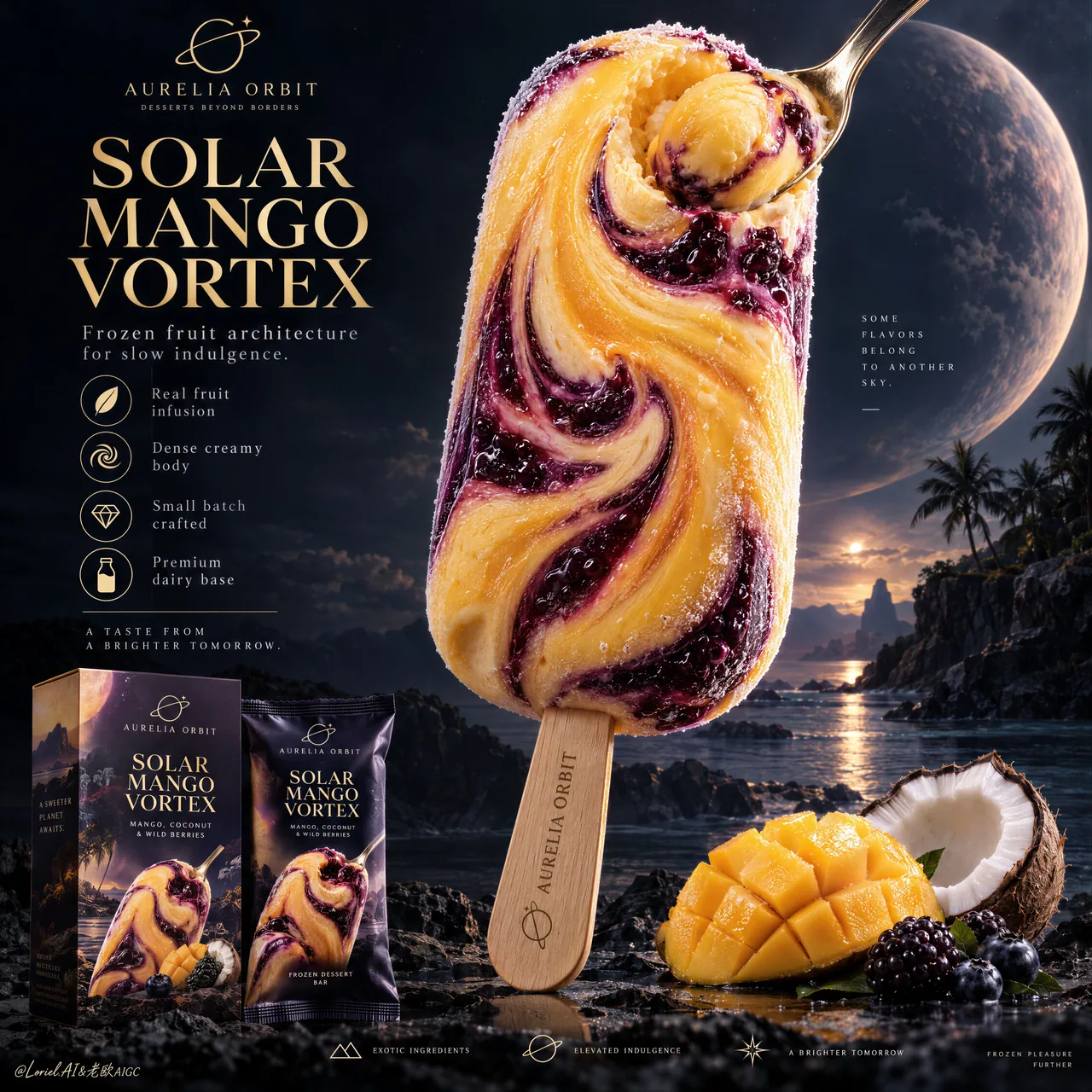
芒果漩涡雪糕海报:双食材表面物理写死
芒果金霜褶 vs 莓紫果浆黏度分区控漩涡,再套奢品海报信息架构。食品广告别只写「好吃」——用表面行为控材质。
Prompt
You see a cosmic vortex. The prompt is really controlling two edible materials with different surface behavior.
🥭 broad mango-gold frozen-cream folds spiraling into one off-center core, with dense body and fine frost crystals
The bar gains a clear visual pull while still reading as solid, cold ice cream.
🫐 thick berry-violet ribbons with glossy fruit viscosity, darker pockets, and visible berry inclusions against the matte cream
The contrast makes the swirl feel infused rather than painted onto the surface.

GPT- image 2.5 prompt👇
Create a Cannes-level ultra-premium ice cream advertising poster for a fictional dessert house called AURELIA ORBIT, preserving the exact structural logic of a luxury cosmic-product campaign while merging narrative atmosphere, forensic frozen-dessert realism, and curatorial restraint. The composition is vertical and highly disciplined: one monumental stick ice cream dominates the right-center of the frame, a refined editorial information column occupies the upper-left quadrant, premium retail packaging anchors the lower-left corner, a small curated ingredient cluster supports the lower-right base, and a minimal icon strip resolves the bottom edge. The final image must feel colder, more luxurious, and more controlled than a conventional fantasy dessert poster.

Core composition: place one towering hero ice cream bar in the right-center, vertically oriented with a slight sculptural tilt, occupying most of the upper-middle frame. The bar must remain the unquestioned visual leader. In the upper-left quadrant, build a clean editorial text architecture with one small brand line, one large stacked campaign title, one short premium descriptor line, and a vertical row of restrained feature icons. In the lower-left corner, place one product carton and one matching wrapper with clear retail readability. Along the lower-right base, keep only a compact flavor still life: a scored mango cheek, one cracked coconut half, and a few dark berries. Finish with a very minimal bottom feature strip. Preserve generous negative space and strong hierarchy.

Orbit atmosphere: the image should feel like a tropical flavor object discovered on a distant celestial coast. The hero bar reads as an edible star relic, suspended between indulgence and wonder. The dark background should not be busy or overly cosmic; instead it should feel like a calm deep-sky dessert horizon with faint atmospheric glow, remote planetary depth, and a quiet sense of luxury. The emotional tone must be dreamlike, sensual, and elevated, with the flavor vortex suggesting a slow gravitational pull rather than explosive fantasy.

Transit realism: render every edible and retail surface with world-class commercial precision. The ice cream body must show dense frozen cream, subtle chill bloom, microscopic frost crystals, smooth mango-gold areas, and thick berry-violet fruit ribbons with believable viscosity and marbled depth. The spiral center should feel physically edible, not abstract, with soft compression and creamy rotational logic. The small spoon embedded into or resting against the swirl must have polished metallic reflections and carry a compact mango sphere or cream jewel with vivid pulp realism. The wooden stick must show authentic grain, soft matte dryness, and precise engraved branding. The mango fruit should reveal juicy fiber structure and natural gloss; the coconut should show shell roughness, white flesh density, and fibrous edges; the berries should carry taut skin, bloom, and subtle translucency. The packaging must show crisp print registration, believable carton edges, fine matte-laminate texture, and premium retail finish.

Port restraint: simplify the visual system into a more gallery-like premium advertisement. Remove excess celestial clutter, decorative particles, and unnecessary ingredient abundance. Keep only one hero bar, one left-side title stack, one vertical icon list, one compact packaging group, one small ingredient cluster, and one discreet bottom icon band. Let scale, color contrast, and negative space create the luxury. The frame should feel curated, not overloaded.

Hero dessert design: create a signature product for AURELIA ORBIT called “SOLAR MANGO VORTEX”. The bar should feature a smooth mango-gold frozen cream body marbled with deep blackberry-purple and dark berry-indigo swirls spiraling inward toward a luminous flavor core. The surface must feel expensive and sculptural, with a controlled balance between matte frozen cream and glossy fruit-ripple passages. The spoon detail should emphasize the product’s dense creamy center without distracting from the full bar silhouette.

Typography and left-column layout: in the upper-left quadrant, place a small elegant brand line such as “AURELIA ORBIT” with a discreet insignia, then a large stacked title reading “SOLAR / MANGO / VORTEX”. Beneath it, add one refined supporting line such as “Frozen fruit architecture for slow indulgence.” Below that, place a vertical icon list with concise descriptors like “Real fruit infusion”, “Dense creamy body”, “Small batch crafted”, and “Premium dairy base”. Add one short boxed or separated emotional copy line beneath the list, restrained and cinematic. All typography must feel international, elegant, and premium, never loud or overly promotional.

Packaging design: place one premium carton and one matching wrapper in the lower-left corner, both echoing the hero bar artwork and color logic. The packaging must be fully believable as a retail object, with sophisticated layout, restrained branding, crisp typography, subtle embossing or ink contrast, and strong shelf appeal. Keep the packaging clearly readable but visually subordinate to the main bar.

Lighting: use an ultra-controlled hybrid setup. A soft premium key light from the upper-left shapes the hero bar, packaging, and fruit with crisp readability and elegant falloff. A subtle inner radiance from the fruit swirl gives the center of the bar a quiet magnetic glow. The mango-gold zones should appear warm and creamy, while the berry-violet passages hold cooler depth and richer shadow detail. Avoid theatrical bloom, muddy blacks, and cheap fantasy glow.

Color hierarchy: 60% mango gold, frozen cream ivory, and deep twilight-violet; 30% blackberry purple, dark berry-indigo, cocoa-brown terrain neutrals, and packaging shadow tones; 10% fresh mango yellow, coconut white, and restrained metallic highlights. The palette must feel tropical, cinematic, and luxuriously controlled.

Design intent: the final poster must preserve the exact impact logic of the reference structure—giant hero bar, left editorial title-and-benefits column, lower-left retail packaging, lower-right flavor support, and bottom feature row—while merging Orbit atmosphere, Transit realism, and Port curatorial restraint into one resolved luxury frozen-dessert campaign. The hero bar remains the only true focal monument, and everything else exists to intensify its flavor mythology and retail desirability.

Rendering style: ultra-photoreal luxury ice cream advertising, cinematic tropical-cosmic dessert editorial, premium packaging integration, exceptional frozen-texture realism, restrained fantasy atmosphere, elegant graphic hierarchy, world-class commercial retouching, immaculate print-ready finish.

Negative prompt: copied source text, real brand names, cartoon ice cream, plastic-looking frozen surface, low-detail packaging, fake fruit, muddy purple shadows, excessive cosmic clutter, loud glow effects, warped bar silhouette, distorted stick, unreadable box text, messy ingredient pile, black blotches, watermark
Attribution
- Author
- ou_zhen599
- Published
- 2026-09-14
- Original post
- View original ↗
- Collected from
- xianyu110/awesome-gpt-image2.5 · 2099500153598341578 · MIT