マンゴー渦のアイスバー・ポスター:二つの食材の表面物理で描き切る
マンゴーの金色の霜の褶 vs ベリー紫の果肉の粘度で領域を分けて渦を制御し、さらに高級ポスターの情報設計を重ねる。食品広告は「おいしい」と書くだけでは不十分——表面の挙動で質感を制御せよ。
プロンプト
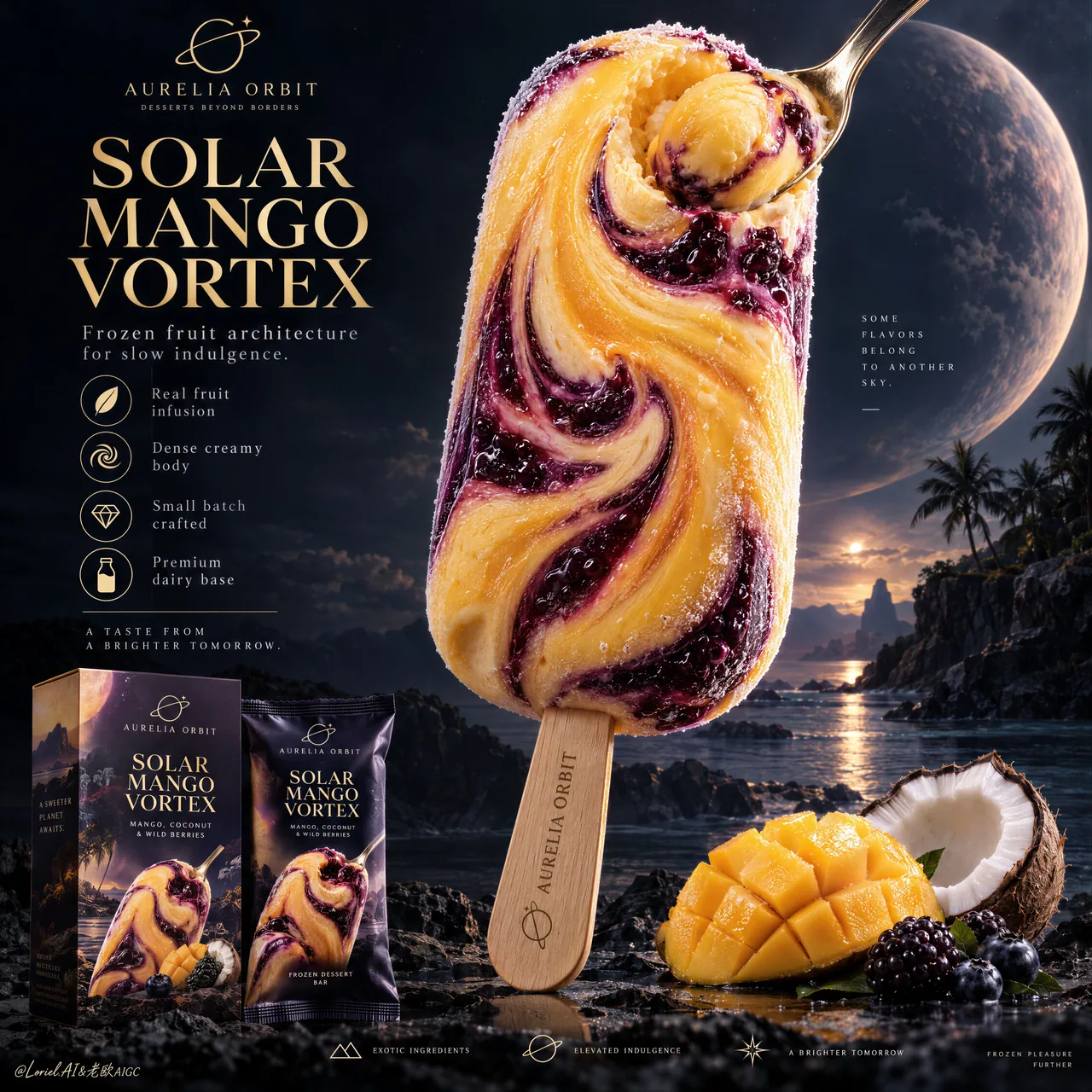
You see a cosmic vortex. The prompt is really controlling two edible materials with different surface behavior.
🥭 broad mango-gold frozen-cream folds spiraling into one off-center core, with dense body and fine frost crystals
The bar gains a clear visual pull while still reading as solid, cold ice cream.
🫐 thick berry-violet ribbons with glossy fruit viscosity, darker pockets, and visible berry inclusions against the matte cream
The contrast makes the swirl feel infused rather than painted onto the surface.

GPT- image 2.5 prompt👇
Create a Cannes-level ultra-premium ice cream advertising poster for a fictional dessert house called AURELIA ORBIT, preserving the exact structural logic of a luxury cosmic-product campaign while merging narrative atmosphere, forensic frozen-dessert realism, and curatorial restraint. The composition is vertical and highly disciplined: one monumental stick ice cream dominates the right-center of the frame, a refined editorial information column occupies the upper-left quadrant, premium retail packaging anchors the lower-left corner, a small curated ingredient cluster supports the lower-right base, and a minimal icon strip resolves the bottom edge. The final image must feel colder, more luxurious, and more controlled than a conventional fantasy dessert poster.

Core composition: place one towering hero ice cream bar in the right-center, vertically oriented with a slight sculptural tilt, occupying most of the upper-middle frame. The bar must remain the unquestioned visual leader. In the upper-left quadrant, build a clean editorial text architecture with one small brand line, one large stacked campaign title, one short premium descriptor line, and a vertical row of restrained feature icons. In the lower-left corner, place one product carton and one matching wrapper with clear retail readability. Along the lower-right base, keep only a compact flavor still life: a scored mango cheek, one cracked coconut half, and a few dark berries. Finish with a very minimal bottom feature strip. Preserve generous negative space and strong hierarchy.

Orbit atmosphere: the image should feel like a tropical flavor object discovered on a distant celestial coast. The hero bar reads as an edible star relic, suspended between indulgence and wonder. The dark background should not be busy or overly cosmic; instead it should feel like a calm deep-sky dessert horizon with faint atmospheric glow, remote planetary depth, and a quiet sense of luxury. The emotional tone must be dreamlike, sensual, and elevated, with the flavor vortex suggesting a slow gravitational pull rather than explosive fantasy.

Transit realism: render every edible and retail surface with world-class commercial precision. The ice cream body must show dense frozen cream, subtle chill bloom, microscopic frost crystals, smooth mango-gold areas, and thick berry-violet fruit ribbons with believable viscosity and marbled depth. The spiral center should feel physically edible, not abstract, with soft compression and creamy rotational logic. The small spoon embedded into or resting against the swirl must have polished metallic reflections and carry a compact mango sphere or cream jewel with vivid pulp realism. The wooden stick must show authentic grain, soft matte dryness, and precise engraved branding. The mango fruit should reveal juicy fiber structure and natural gloss; the coconut should show shell roughness, white flesh density, and fibrous edges; the berries should carry taut skin, bloom, and subtle translucency. The packaging must show crisp print registration, believable carton edges, fine matte-laminate texture, and premium retail finish.

Port restraint: simplify the visual system into a more gallery-like premium advertisement. Remove excess celestial clutter, decorative particles, and unnecessary ingredient abundance. Keep only one hero bar, one left-side title stack, one vertical icon list, one compact packaging group, one small ingredient cluster, and one discreet bottom icon band. Let scale, color contrast, and negative space create the luxury. The frame should feel curated, not overloaded.

Hero dessert design: create a signature product for AURELIA ORBIT called “SOLAR MANGO VORTEX”. The bar should feature a smooth mango-gold frozen cream body marbled with deep blackberry-purple and dark berry-indigo swirls spiraling inward toward a luminous flavor core. The surface must feel expensive and sculptural, with a controlled balance between matte frozen cream and glossy fruit-ripple passages. The spoon detail should emphasize the product’s dense creamy center without distracting from the full bar silhouette.

Typography and left-column layout: in the upper-left quadrant, place a small elegant brand line such as “AURELIA ORBIT” with a discreet insignia, then a large stacked title reading “SOLAR / MANGO / VORTEX”. Beneath it, add one refined supporting line such as “Frozen fruit architecture for slow indulgence.” Below that, place a vertical icon list with concise descriptors like “Real fruit infusion”, “Dense creamy body”, “Small batch crafted”, and “Premium dairy base”. Add one short boxed or separated emotional copy line beneath the list, restrained and cinematic. All typography must feel international, elegant, and premium, never loud or overly promotional.

Packaging design: place one premium carton and one matching wrapper in the lower-left corner, both echoing the hero bar artwork and color logic. The packaging must be fully believable as a retail object, with sophisticated layout, restrained branding, crisp typography, subtle embossing or ink contrast, and strong shelf appeal. Keep the packaging clearly readable but visually subordinate to the main bar.

Lighting: use an ultra-controlled hybrid setup. A soft premium key light from the upper-left shapes the hero bar, packaging, and fruit with crisp readability and elegant falloff. A subtle inner radiance from the fruit swirl gives the center of the bar a quiet magnetic glow. The mango-gold zones should appear warm and creamy, while the berry-violet passages hold cooler depth and richer shadow detail. Avoid theatrical bloom, muddy blacks, and cheap fantasy glow.

Color hierarchy: 60% mango gold, frozen cream ivory, and deep twilight-violet; 30% blackberry purple, dark berry-indigo, cocoa-brown terrain neutrals, and packaging shadow tones; 10% fresh mango yellow, coconut white, and restrained metallic highlights. The palette must feel tropical, cinematic, and luxuriously controlled.

Design intent: the final poster must preserve the exact impact logic of the reference structure—giant hero bar, left editorial title-and-benefits column, lower-left retail packaging, lower-right flavor support, and bottom feature row—while merging Orbit atmosphere, Transit realism, and Port curatorial restraint into one resolved luxury frozen-dessert campaign. The hero bar remains the only true focal monument, and everything else exists to intensify its flavor mythology and retail desirability.

Rendering style: ultra-photoreal luxury ice cream advertising, cinematic tropical-cosmic dessert editorial, premium packaging integration, exceptional frozen-texture realism, restrained fantasy atmosphere, elegant graphic hierarchy, world-class commercial retouching, immaculate print-ready finish.

Negative prompt: copied source text, real brand names, cartoon ice cream, plastic-looking frozen surface, low-detail packaging, fake fruit, muddy purple shadows, excessive cosmic clutter, loud glow effects, warped bar silhouette, distorted stick, unreadable box text, messy ingredient pile, black blotches, watermark
日本語訳
あなたが見ているのは宇宙の渦。このプロンプトが実際に制御しているのは、表面の挙動が異なる二つの可食物質だ。
🥭 広がるマンゴーゴールドの冷菓クリームの褶が、偏心したひとつのコアへと渦を巻いていく。密度の高いボディと細かな霜の結晶をともなって
バーには明確な視覚的求心力が生まれ、それでいて固体の冷たいアイスクリームとして読める。
🫐 濃厚なベリー・バイオレットのリボンは、艶やかな果実の粘性、より暗いポケット、目に見えるベリーの粒をまとって、マットなクリームと対比する
このコントラストによって、渦は表面に塗られたのではなく、内部に注入されたように感じられる。

GPT- image 2.5 prompt👇
カンヌ級の超プレミアム・アイスクリーム広告ポスターを、架空のデザートハウス「AURELIA ORBIT」のために制作する。ラグジュアリーなコズミック・プロダクトキャンペーンの構造論理を正確に踏襲しつつ、物語的な雰囲気、凍ったデザートの法医学的なリアリズム、キュレトリアルな抑制を融合させること。構図は縦位置で、高度に統制されている。フレームの右中央を1本の記念碑的なスティックアイスが占め、洗練されたエディトリアルな情報コラムが左上の象限に置かれ、高級小売パッケージが左下隅を支え、厳選された小さな素材クラスターが右下の基部を補強し、最小限のアイコンストリップが下端をまとめる。最終的な画像は、一般的なファンタジー・デザートポスターよりも、より冷たく、よりラグジュアリーで、より統制された印象でなければならない。

コア構図:そびえ立つ主役のアイスクリームバーを右中央に配置し、わずかに彫刻的な傾きをつけて垂直に立て、フレームの上中央の大部分を占めさせる。バーは疑いようのない視覚的リーダーであり続けなければならない。左上の象限には、クリーンなエディトリアル・テキスト構造を構築する。小さなブランドライン1本、積み重ねた大きなキャンペーンタイトル1つ、短いプレミアム・ディスクリプター1行、そして抑制の効いたフィーチャーアイコンの縦一列。左下隅には、商品カートン1つと、それに合わせたラッパー1つを、小売として明確に読める形で置く。右下の基部には、コンパクトなフレーバーのスティルライフのみを残す。切り込みを入れたマンゴーの頬、割ったココナッツの半身、そしていくつかの暗い色のベリー。仕上げに、ごく最小限の下部フィーチャーストリップ。ゆとりのあるネガティブスペースと強いヒエラルキーを保つこと。

オービットの雰囲気:遠い天体の海岸で発見されたトロピカルなフレーバーの物体のように感じられること。主役のバーは、官能と驚異のあわいに浮かぶ、食べられる星の遺物として読める。暗い背景は雑然としていたり、過度に宇宙的であってはならない。代わりに、かすかな大気の輝き、遠くの惑星の奥行き、静かなラグジュアリー感をそなえた、穏やかな深空のデザートの地平線のように感じられるべき。感情的トーンは夢幻的で、官能的で、高貴でなければならず、フレーバーの渦は爆発的なファンタジーではなく、ゆっくりとした重力の引きを思わせること。

トランジットのリアリズム:すべての可食物と小売の表面を、世界水準の商業的精度で描画する。アイスクリームのボディは、密度の高い凍ったクリーム、かすかなチルブルーム、微視的な霜の結晶、滑らかなマンゴーゴールドの領域、そして説得力のある粘性とマーブル状の奥行きをもつ濃厚なベリー・バイオレットのフルーツリボンを見せなければならない。螺旋の中心は抽象的ではなく、物理的に食べられるように感じられ、柔らかな圧縮とクリーミーな回転の論理をそなえること。渦に埋め込まれた、あるいは寄り添う小さなスプーンは、磨かれた金属の反射をもち、鮮やかな果肉のリアリズムをたたえたコンパクトなマンゴー球またはクリームの宝石を載せていること。木の棒は本物の木目、柔らかなマットの乾き、精密に刻印されたブランディングを見せること。マンゴー果実は瑞々しい繊維構造と自然な艶を露わにし、ココナッツは殻の粗さ、白い果肉の密度、繊維質の縁を見せること。ベリーは張りのある皮、ブルーム、かすかな半透明感をそなえること。パッケージは、くっきりした印刷の見当合わせ、説得力のあるカートンのエッジ、細かなマットラミネートの質感、プレミアムな小売の仕上げを見せること。

ポートの抑制:視覚システムをよりギャラリー的なプレミアム広告へと簡素化する。過剰な天体の雑多な要素、装飾的な粒子、不要な素材の豊富さを取り除く。残すのは、主役のバー1本、左側のタイトルスタック1つ、縦のアイコンリスト1つ、コンパクトなパッケージ群1つ、小さな素材クラスター1つ、控えめな下部アイコンバンド1つだけ。スケール、色のコントラスト、ネガティブスペースにラグジュアリーを生ませること。フレームは詰め込みすぎず、キュレーションされた印象であること。

主役デザートの設計:AURELIA ORBITのためのシグネチャー商品「SOLAR MANGO VORTEX」を制作する。バーは滑らかなマンゴーゴールドの冷凍クリームのボディをそなえ、深いブラックベリー・パープルと暗いベリー・インディゴの渦がマーブル状に、輝くフレーバーコアへと内側に向かって渦巻く。表面は高価で彫刻的に感じられ、マットな冷凍クリームと艶やかなフルーツリップルの箇所との間に統制されたバランスがあること。スプーンのディテールは、バー全体のシルエットの邪魔をすることなく、商品の密度の高いクリーミーな中心を強調するべき。

タイポグラフィと左カラムのレイアウト:左上の象限に、「AURELIA ORBIT」のような小さくエレガントなブランドラインを控えめな徽章とともに置き、その後に「SOLAR / MANGO / VORTEX」と読める大きな積み重ねタイトルを置く。その下に、「ゆっくりと味わうための、凍れる果実の建築。」のような洗練されたサポートラインを1行加える。さらにその下に縦のアイコンリストを置き、「本物の果実の注入」「濃密なクリーミーなボディ」「少量生産の手仕事」「プレミアムな乳原料」といった簡潔なディスクリプターを添える。リストの下に、ボックス化または分離された短い情緒的コピーを1行加える。抑制が効いていて映画的に。すべてのタイポグラフィは国際的でエレガント、そしてプレミアムに感じられなければならず、決して騒がしく、過度に宣伝的であってはならない。

パッケージデザイン:左下隅に、プレミアムなカートン1つと、それに合うラッパー1つを置き、どちらも主役バーのアートワークと色彩論理を反響させる。パッケージは小売の物体として完全に説得力をもたなければならず、洗練されたレイアウト、抑制されたブランディング、くっきりしたタイポグラフィ、繊細なエンボスまたはインクのコントラスト、そして強い棚映えをそなえること。パッケージは明確に読めるようにしつつも、視覚的にはメインのバーに従属させること。

ライティング:高度に統制されたハイブリッドなセットアップを用いる。左上からの柔らかなプレミアム・キーライトが、主役のバー、パッケージ、果実を、くっきりした可読性とエレガントな減衰で形づくる。フルーツの渦からの繊細な内部の輝きが、バーの中心に静かな磁力的な光を与える。マンゴーゴールドの領域は暖かくクリーミーに見え、ベリー・バイオレットの箇所はより冷たい奥行きと豊かな影のディテールを保つこと。演劇的なブルーム、濁った黒、安っぽいファンタジーの輝きは避ける。

色のヒエラルキー:60%をマンゴーゴールド、凍ったクリームのアイボリー、深いトワイライト・バイオレット。30%をブラックベリー・パープル、暗いベリー・インディゴ、ココアブラウン系の地形ニュートラル、パッケージの影の色調。10%をフレッシュなマンゴーイエロー、ココナッツホワイト、抑制された金属的なハイライト。パレットはトロピカルで、映画的で、ラグジュアリーに統制された感じでなければならない。

デザイン意図:最終的なポスターは、参照構造のインパクトの論理を正確に保たなければならない——巨大な主役バー、左側のエディトリアルなタイトル&ベネフィットのカラム、左下の小売パッケージ、右下のフレーバーサポート、下部のフィーチャー行——そのうえでオービットの雰囲気、トランジットのリアリズム、ポートのキュレトリアルな抑制を、ひとつの解決されたラグジュアリーな冷凍デザート・キャンペーンへと融合させる。主役バーは唯一の真の焦点となる記念碑であり続け、それ以外のすべてはそのフレーバー神話と小売での欲求を強めるために存在する。

レンダリングスタイル:超フォトリアルなラグジュアリー・アイスクリーム広告、映画的なトロピカル・コズミック・デザート・エディトリアル、プレミアムパッケージの統合、卓越した冷凍テクスチャのリアリズム、抑制されたファンタジー雰囲気、エレガントなグラフィック・ヒエラルキー、世界水準の商業レタッチ、完璧な印刷対応の仕上げ。

ネガティブプロンプト:コピーされたソーステキスト、実在のブランド名、漫画的なアイスクリーム、プラスチックのような冷凍表面、ディテールの乏しいパッケージ、偽の果実、濁った紫の影、過剰な宇宙的雑多さ、騒がしいグロー効果、歪んだバーのシルエット、変形した棒、読めない箱の文字、散らかった素材の山、黒い染み、ウォーターマーク
出典
- 原作者
- ou_zhen599
- 公開日
- 2026-09-14
- 原典
- 元の投稿を見る ↗
- 収録元
- xianyu110/awesome-gpt-image2.5 · 2099500153598341578 · MIT