芒果漩渦雪糕海報:雙食材表面物理寫死
芒果金霜褶 vs 莓紫果漿黏度分區控漩渦,再套奢品海報信息架構。食品廣告別隻寫「好喫」——用表面行爲控材質。
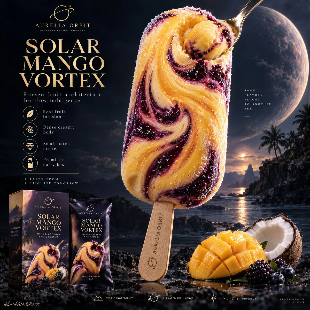
提示詞
You see a cosmic vortex. The prompt is really controlling two edible materials with different surface behavior.
🥭 broad mango-gold frozen-cream folds spiraling into one off-center core, with dense body and fine frost crystals
The bar gains a clear visual pull while still reading as solid, cold ice cream.
🫐 thick berry-violet ribbons with glossy fruit viscosity, darker pockets, and visible berry inclusions against the matte cream
The contrast makes the swirl feel infused rather than painted onto the surface.

GPT- image 2.5 prompt👇
Create a Cannes-level ultra-premium ice cream advertising poster for a fictional dessert house called AURELIA ORBIT, preserving the exact structural logic of a luxury cosmic-product campaign while merging narrative atmosphere, forensic frozen-dessert realism, and curatorial restraint. The composition is vertical and highly disciplined: one monumental stick ice cream dominates the right-center of the frame, a refined editorial information column occupies the upper-left quadrant, premium retail packaging anchors the lower-left corner, a small curated ingredient cluster supports the lower-right base, and a minimal icon strip resolves the bottom edge. The final image must feel colder, more luxurious, and more controlled than a conventional fantasy dessert poster.

Core composition: place one towering hero ice cream bar in the right-center, vertically oriented with a slight sculptural tilt, occupying most of the upper-middle frame. The bar must remain the unquestioned visual leader. In the upper-left quadrant, build a clean editorial text architecture with one small brand line, one large stacked campaign title, one short premium descriptor line, and a vertical row of restrained feature icons. In the lower-left corner, place one product carton and one matching wrapper with clear retail readability. Along the lower-right base, keep only a compact flavor still life: a scored mango cheek, one cracked coconut half, and a few dark berries. Finish with a very minimal bottom feature strip. Preserve generous negative space and strong hierarchy.

Orbit atmosphere: the image should feel like a tropical flavor object discovered on a distant celestial coast. The hero bar reads as an edible star relic, suspended between indulgence and wonder. The dark background should not be busy or overly cosmic; instead it should feel like a calm deep-sky dessert horizon with faint atmospheric glow, remote planetary depth, and a quiet sense of luxury. The emotional tone must be dreamlike, sensual, and elevated, with the flavor vortex suggesting a slow gravitational pull rather than explosive fantasy.

Transit realism: render every edible and retail surface with world-class commercial precision. The ice cream body must show dense frozen cream, subtle chill bloom, microscopic frost crystals, smooth mango-gold areas, and thick berry-violet fruit ribbons with believable viscosity and marbled depth. The spiral center should feel physically edible, not abstract, with soft compression and creamy rotational logic. The small spoon embedded into or resting against the swirl must have polished metallic reflections and carry a compact mango sphere or cream jewel with vivid pulp realism. The wooden stick must show authentic grain, soft matte dryness, and precise engraved branding. The mango fruit should reveal juicy fiber structure and natural gloss; the coconut should show shell roughness, white flesh density, and fibrous edges; the berries should carry taut skin, bloom, and subtle translucency. The packaging must show crisp print registration, believable carton edges, fine matte-laminate texture, and premium retail finish.

Port restraint: simplify the visual system into a more gallery-like premium advertisement. Remove excess celestial clutter, decorative particles, and unnecessary ingredient abundance. Keep only one hero bar, one left-side title stack, one vertical icon list, one compact packaging group, one small ingredient cluster, and one discreet bottom icon band. Let scale, color contrast, and negative space create the luxury. The frame should feel curated, not overloaded.

Hero dessert design: create a signature product for AURELIA ORBIT called “SOLAR MANGO VORTEX”. The bar should feature a smooth mango-gold frozen cream body marbled with deep blackberry-purple and dark berry-indigo swirls spiraling inward toward a luminous flavor core. The surface must feel expensive and sculptural, with a controlled balance between matte frozen cream and glossy fruit-ripple passages. The spoon detail should emphasize the product’s dense creamy center without distracting from the full bar silhouette.

Typography and left-column layout: in the upper-left quadrant, place a small elegant brand line such as “AURELIA ORBIT” with a discreet insignia, then a large stacked title reading “SOLAR / MANGO / VORTEX”. Beneath it, add one refined supporting line such as “Frozen fruit architecture for slow indulgence.” Below that, place a vertical icon list with concise descriptors like “Real fruit infusion”, “Dense creamy body”, “Small batch crafted”, and “Premium dairy base”. Add one short boxed or separated emotional copy line beneath the list, restrained and cinematic. All typography must feel international, elegant, and premium, never loud or overly promotional.

Packaging design: place one premium carton and one matching wrapper in the lower-left corner, both echoing the hero bar artwork and color logic. The packaging must be fully believable as a retail object, with sophisticated layout, restrained branding, crisp typography, subtle embossing or ink contrast, and strong shelf appeal. Keep the packaging clearly readable but visually subordinate to the main bar.

Lighting: use an ultra-controlled hybrid setup. A soft premium key light from the upper-left shapes the hero bar, packaging, and fruit with crisp readability and elegant falloff. A subtle inner radiance from the fruit swirl gives the center of the bar a quiet magnetic glow. The mango-gold zones should appear warm and creamy, while the berry-violet passages hold cooler depth and richer shadow detail. Avoid theatrical bloom, muddy blacks, and cheap fantasy glow.

Color hierarchy: 60% mango gold, frozen cream ivory, and deep twilight-violet; 30% blackberry purple, dark berry-indigo, cocoa-brown terrain neutrals, and packaging shadow tones; 10% fresh mango yellow, coconut white, and restrained metallic highlights. The palette must feel tropical, cinematic, and luxuriously controlled.

Design intent: the final poster must preserve the exact impact logic of the reference structure—giant hero bar, left editorial title-and-benefits column, lower-left retail packaging, lower-right flavor support, and bottom feature row—while merging Orbit atmosphere, Transit realism, and Port curatorial restraint into one resolved luxury frozen-dessert campaign. The hero bar remains the only true focal monument, and everything else exists to intensify its flavor mythology and retail desirability.

Rendering style: ultra-photoreal luxury ice cream advertising, cinematic tropical-cosmic dessert editorial, premium packaging integration, exceptional frozen-texture realism, restrained fantasy atmosphere, elegant graphic hierarchy, world-class commercial retouching, immaculate print-ready finish.

Negative prompt: copied source text, real brand names, cartoon ice cream, plastic-looking frozen surface, low-detail packaging, fake fruit, muddy purple shadows, excessive cosmic clutter, loud glow effects, warped bar silhouette, distorted stick, unreadable box text, messy ingredient pile, black blotches, watermark
中文翻譯
你看到的是一個宇宙漩渦。這條 prompt 實際上在控制兩種可食用材質,它們具有不同的表面行爲。
🥭 寬闊的芒果金色凍奶油褶皺盤旋成一個偏離中心的漩渦核心,質地緻密,帶有細密的霜晶
雪糕棒由此獲得明確的視覺牽引力,同時依然讀起來是紮實、冰冷的冰淇淋。
🫐 濃稠的漿果紫色緞帶,帶有光澤的水果黏稠感、更深的暗部凹陷,以及在啞光奶油底色上清晰可見的漿果顆粒
這種對比讓漩渦看起來像是被注入其中,而不是塗在表面。

GPT- image 2.5 prompt👇
爲一家名爲 AURELIA ORBIT 的虛構甜品品牌創作一張戛納級別的超高端冰淇淋廣告海報,在保留奢華宇宙感產品廣告精確結構邏輯的同時,融合敘事氛圍、法醫級的冷凍甜點寫實感與策展式的剋制。構圖採用豎版且高度嚴謹:一支巨型雪糕棒佔據畫面右中部,一欄精緻的雜誌式信息文字位於左上象限,高端零售包裝錨定左下角,一個小巧而精心陳列的原料組合支撐右下部,底部邊緣由一條極簡圖標帶收尾。最終畫面必須比常規的奇幻甜品海報更冷峻、更奢華、更具控制力。

核心構圖:將一支高聳的主角雪糕棒置於右中部,豎直擺放並帶有輕微雕塑般的傾斜,佔據畫面中上部的大部分區域。雪糕棒必須始終是毫無爭議的視覺主體。在左上象限,建立一個乾淨的雜誌式文字架構:一行小號品牌文字、一個大型堆疊式廣告標題、一行簡短的高端描述語,以及一列剋制的功能圖標。在左下角放置一個產品紙盒和一件與之配套的包裝紙,具備清晰的零售可讀性。沿右下部僅保留一組緊湊的口味靜物:一塊切花刀的芒果果肉、半個裂開的椰子,以及幾顆深色漿果。最後以一條極簡的底部功能區收尾。保留充裕的留白與強烈的層級關係。

Orbit 氛圍:畫面應像是一枚在遙遠天界海岸被發現的熱帶風味造物。主角雪糕棒如同一件可食用的星辰遺物,懸置於縱情與驚嘆之間。深色背景不應繁亂或過度宇宙化,而應像是一片寧靜的深空甜點地平線,帶有微弱的大氣輝光、遼遠的行星縱深感,以及一種安靜的高級感。情緒基調必須夢幻、感官化且高雅,風味漩渦應暗示一種緩慢的引力牽引,而非爆炸式的奇幻。

Transit 寫實:以世界級的商業精修水準渲染每一處可食用表面與零售表面。冰淇淋主體必須呈現緻密的冷凍奶油、細微的冷霜白化、微觀霜晶、順滑的芒果金色區域,以及濃稠的漿果紫色果醬緞帶,具有可信的黏稠度與大理石般的層次深度。漩渦中心應當感覺在物理上可食用,而非抽象,帶有柔和的擠壓感與奶油般的旋轉邏輯。嵌入漩渦中或倚靠在漩渦旁的小勺必須具備拋光金屬反光,並托着一顆緊湊的芒果球或奶油寶珠,果肉寫實感鮮明。木棒必須呈現真實的木紋、柔和的啞光乾燥質感,以及精確的刻印品牌標識。芒果果肉應展現多汁的纖維結構與自然光澤;椰子應呈現外殼的粗糙、白色果肉的緻密與纖維狀邊緣;漿果應帶有緊繃的果皮、果霜與微妙的半透明感。包裝必須呈現清晰的印刷套準、可信的紙盒邊緣、細膩的啞光覆膜質感與高端的零售完成度。

Port 剋制:將視覺系統簡化爲更具畫廊感的高端廣告。移除多餘的天體雜物、裝飾性粒子與不必要的原料堆砌。僅保留一支主角雪糕棒、一組左側標題堆疊、一列豎向圖標、一組緊湊的包裝、一個小巧的原料組合,以及一條低調的底部圖標帶。讓尺度、色彩對比與留白來營造奢華感。畫面應顯得經過策展,而非堆砌。

主角甜點設計:爲 AURELIA ORBIT 打造一款名爲“SOLAR MANGO VORTEX”的招牌產品。雪糕棒應具備順滑的芒果金色凍奶油主體,其間大理石般交織着深黑莓紫與深漿果靛藍的漩渦,並向內盤旋匯聚至一個發光的核心風味。表面必須顯得昂貴且具雕塑感,在啞光凍奶油與光澤果園波紋之間保持受控的平衡。小勺細節應強調產品緻密的奶油內芯,同時不幹擾雪糕棒整體的輪廓剪影。

字體與左欄排版:在左上象限放置一行小號優雅的品牌文字,如“AURELIA ORBIT”,並配以一枚低調的品牌徽記,其下是一個大型堆疊標題“SOLAR / MANGO / VORTEX”。在標題下方,添加一行精緻的輔助文案,例如“爲慢享而生的冷凍水果建築。”。再往下,放置一列豎向圖標列表,配以簡潔的描述詞,如“真實果肉注入”“緻密奶油質地”“小批量製作”與“高端乳基”。在列表下方添加一行簡短的、以方框分隔或獨立隔開的情緒文案,剋制且富有電影感。所有字體都必須顯得國際化、優雅且高端,絕不能喧鬧或過度促銷。

包裝設計:在左下角放置一個高端紙盒和一件配套包裝紙,二者均呼應主角雪糕棒的圖案與色彩邏輯。包裝必須作爲零售物件完全可信,具備考究的版式、剋制的品牌標識、清晰的字體、微妙的壓紋或油墨對比,以及強烈的貨架吸引力。包裝需保持清晰可讀,但在視覺上從屬於主體雪糕棒。

光照:採用超精細控制的混合布光。來自左上方的一束柔和高端主光塑造主角雪糕棒、包裝與水果,具備清晰的讀感與優雅的衰減。來自水果漩渦的微妙內部輝光爲雪糕棒中心帶來安靜而富有磁性的光暈。芒果金色區域應顯得溫暖而奶潤,漿果紫色區域則保持更冷的縱深與更豐富的暗部細節。避免戲劇化的光暈溢出、渾濁的黑色與廉價的奇幻光效。

色彩層級:60% 芒果金、凍奶油象牙白與深暮紫色;30% 黑莓紫、深漿果靛藍、可可棕地貌中性色與包裝陰影色;10% 新鮮芒果黃、椰白與剋制的金屬高光。調色板必須顯得熱帶、電影感且奢華受控。

設計意圖:最終海報必須保留參考結構的確切衝擊力邏輯——巨型主角雪糕棒、左側雜誌式標題與賣點欄、左下零售包裝、右下口味支撐,以及底部功能行——同時將 Orbit 氛圍、Transit 寫實與 Port 策展式剋制融合爲一場完整成型的奢華冷凍甜點廣告。主角雪糕棒始終是唯一的真正焦點豐碑,其餘一切都爲強化其風味神話與零售吸引力而存在。

渲染風格:超寫實奢華冰淇淋廣告,電影感熱帶宇宙甜點雜誌大片,高端包裝融入,卓越的冷凍質感寫實,剋制的奇幻氛圍,優雅的平面層級,世界級商業修圖,完美無瑕的印刷級完成度。

負面 prompt:照抄的源文本、真實品牌名、卡通冰淇淋、塑料感的冷凍表面、細節不足的包裝、假水果、渾濁的紫色陰影、過度的宇宙雜物、刺眼的光暈效果、變形的雪糕棒輪廓、扭曲的木棒、無法辨認的盒面文字、雜亂的原料堆、黑色斑塊、水印
溯源
- 原作者
- ou_zhen599
- 發佈日期
- 2026-09-14
- 原始出處
- 查看原帖 ↗
- 收錄來源
- xianyu110/awesome-gpt-image2.5 · 2099500153598341578 · MIT