Apple 級のスマホポスター、コピペ可能な prompt
プロダクトポスターを直接出力、prompt はそのまま流用可。デジタル/3C の紹介カバーを作るときに言葉を練る 30 分を節約。
プロンプト
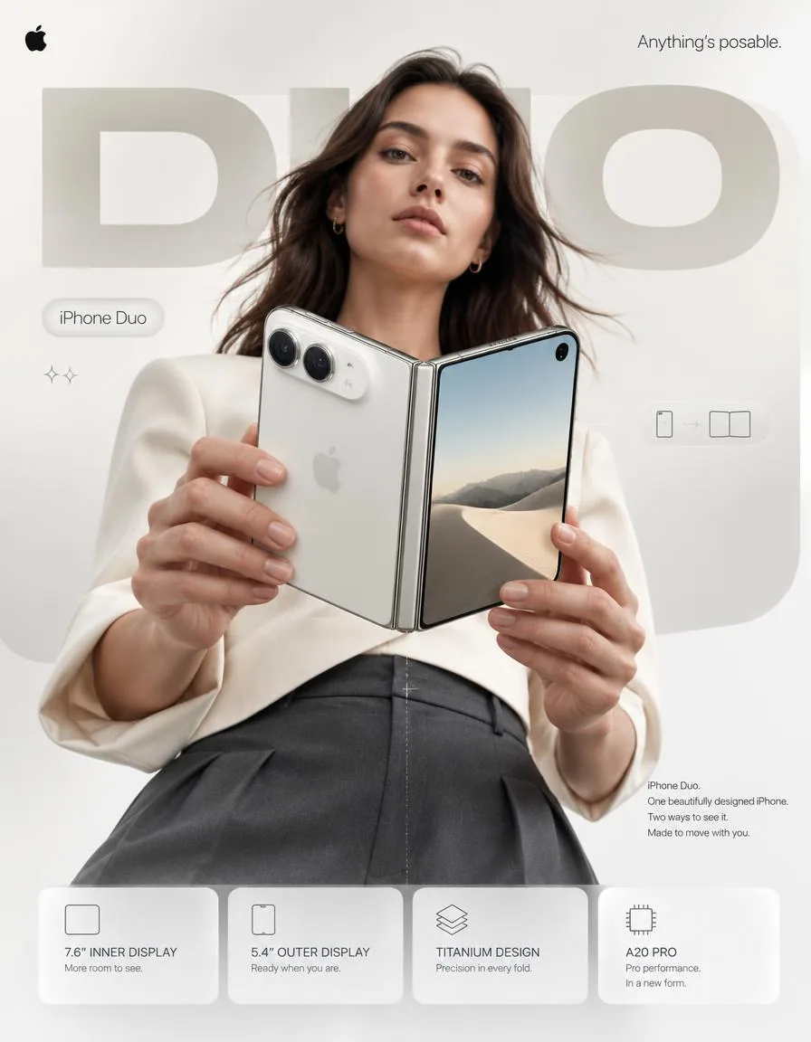
4:5 vertical premium smartphone campaign poster, ultra-high resolution (8K), global OOH + digital + social ready
Style: Apple-level art direction × contemporary product photography × bold editorial composition × hyper-real commercial photography

🧠 CORE INTENT:
“ANYTHING’S POSABLE.”

One iPhone.
More ways to see it.
More ways to use it.
More ways to make it yours.

Effortless flexibility.
Physical intelligence.
One device that adapts to the moment.

🎬 SCENE COMPOSITION:

BACKGROUND:
Pure matte white architectural studio environment with a dominant oversized rounded rectangle block in ultra-soft warm silver gradient (top-left → bottom-right illumination)

The background block creates a subtle dimensional stage behind the subject and product.

GIANT TYPOGRAPHY (BACKGROUND LAYER):
“DUO”

* ultra-bold geometric sans-serif
* stretched wide kerning
* partially cropped by frame edges
* soft shadow depth
* color: very light warm grey
* subtle embossed / debossed effect
* typography positioned behind the subject and product
* large enough to function as an architectural graphic element

👤 SUBJECT (HUMAN ELEMENT):

Female model, clean contemporary editorial look, Apple-style casting

* neutral expression
* confident, calm, effortless
* natural skin texture
* hair: natural flow, slightly wind-touched
* minimal makeup
* understated styling

OUTFIT:
→ sculptural off-white tailored top
→ deep graphite trousers
→ minimal accessories
→ no visible branding
→ sophisticated contemporary styling

POSE:

* Shot from slightly low angle (hero perspective)
* Body slightly angled toward camera
* One hand holding iPhone Duo in its compact closed configuration
* Other hand lightly supporting the device as it opens
* iPhone Duo positioned prominently between viewer and subject
* Face aligned toward viewer
* direct eye contact
* relaxed posture
* pose communicates control rather than excitement

📱 PRODUCT (HERO FOCUS):

DEVICE:
iPhone Duo

FINISH:
Premium titanium finish with physically accurate metallic surface response

POSITION:
Extreme foreground (forced perspective)
Slightly rotated toward camera to reveal the thin profile, hinge construction and display relationship

The device must remain the dominant visual object.

PRODUCT CONFIGURATION:
iPhone Duo shown transitioning from compact outer-display mode into its expansive unfolded configuration.

One continuous physical device.
No impossible geometry.
No duplicated products.
No floating components.

DETAILING:

* ultra-thin titanium frame
* precision hinge construction
* seamless folding display
* extremely thin bezels
* hyper-sharp camera system
* lens reflections physically accurate
* brushed titanium edge highlights
* subtle micro-scratches
* realistic fingerprints / material response kept extremely subtle
* Apple logo centered with restrained reflective gloss
* physically accurate display reflections
* realistic hinge shadow and contact points

The unfolded display should feel expansive and architectural rather than simply “larger.”

REFLECTION:

* soft studio reflection across titanium edges
* subtle screen reflections
* controlled highlight around hinge
* micro light bloom around metallic edges

✨ LIGHTING SYSTEM:

MAIN LIGHT:
Soft studio key light (front-left)
→ smooth skin tones
→ clean product highlights
→ controlled white-to-silver transitions

RIM LIGHT:
Cool-white edge light from right
→ enhances phone silhouette
→ separates titanium edges from white background
→ reveals the thinness of the device

ACCENT LIGHT:
Very subtle warm-silver glow from background architectural block

SHADOW:
Soft drop shadow beneath subject + phone
Soft contact shadow around hinge
(no harsh contrast)

🎨 COLOR SYSTEM:

* Primary: clean Apple white
* Secondary: titanium silver / warm metallic grey
* Accent: subtle graphite
* Background: warm neutral white
* Contrast: deep micro-shadows

No over-saturation.
No neon.
No unnecessary color effects.
Controlled premium palette.

✨ GRAPHIC ELEMENTS:

* Minimal sparkle icons ✦ (2 only)
* One subtle translucent UI pill floating near the unfolded display
* Thin technical construction line following the phone’s folding axis
* Very subtle grain for realism
* Minimal geometric indicators showing the transition between closed and open states

All graphic elements remain secondary to the product.

✍️ TYPOGRAPHY SYSTEM:

TOP LEFT:
Apple logo (black, small, clean)

TOP RIGHT:
“Anything’s posable.” (thin sans-serif)

MID LEFT (pill):
“iPhone Duo”

CENTER DOMINANT:
“DUO” (background type)

BOTTOM RIGHT (body text):
Small paragraph:

“iPhone Duo.
One beautifully designed iPhone.
Two ways to see it.
Made to move with you.”

📊 FEATURE STRIP (BOTTOM GRID):

4 rounded cards (glass-white panels):

1. 7.6″ INNER DISPLAY
    “More room to see.”
2. 5.4″ OUTER DISPLAY
    “Ready when you are.”
3. TITANIUM DESIGN
    “Precision in every fold.”
4. A20 PRO
    “Pro performance. In a new form.”

Icons minimal line style.

Cards must feel integrated into the poster rather than appearing as a generic technology specification panel.

📐 COMPOSITION GRID:

* Top: brand + statement
* Mid: subject + product (dominant)
* Background: giant “DUO” typography layer
* Bottom: feature modules

Strong vertical hierarchy.

The product overlaps the background typography.

The model creates secondary depth behind the phone.

Eye flow:
Face → Phone → Hinge → “DUO” → Features

The iPhone Duo must remain the first visual priority.

🎥 CAMERA SPECS:

* ARRI Alexa Mini LF
* 50mm premium anamorphic lens
* shallow depth of field around subject
* product maintained in extremely high optical clarity
* HDR rendering
* ultra-real skin + titanium material detail
* subtle lens distortion for realism
* physically accurate reflections
* controlled cinematic highlight roll-off
* realistic depth separation
* premium commercial product photography

Slightly low camera position for a subtle hero perspective.

No extreme wide-angle distortion.
No exaggerated perspective.
No artificial CGI appearance.

🎯 FINAL ART DIRECTION:

Apple-level campaign restraint with enough visual tension to feel contemporary and editorial.

The poster should communicate that iPhone Duo is not simply a phone that folds.

Its ability to change position becomes the central visual language of the campaign.

Premium.
Precise.
Human.
Physical.
Confident.

No generic foldable-phone aesthetic.
No futuristic sci-fi environment.
No excessive holograms.
No neon.
No cyberpunk styling.
No random floating UI.
No distorted hands.
No malformed device geometry.
No impossible hinge.
No duplicated cameras.
No fake Apple branding.
No clutter.
No cheap AI-rendered appearance.

FINAL OUTPUT:
4:5 vertical
8K
hyper-real commercial photography
premium Apple campaign art direction
global advertising quality
OOH billboard ready
social media ready
Behance-level visual design
日本語訳
4:5 縦位置のプレミアムスマートフォンキャンペーンポスター、超高解像度(8K)、グローバル OOH +デジタル+ソーシャル対応
スタイル:Apple 級のアートディレクション × 現代のプロダクトフォトグラフィー × 大胆なエディトリアル構図 × 超リアルなコマーシャルフォトグラフィー

🧠 コアインテント:
「ANYTHING’S POSABLE.」

1 台の iPhone。
見る方法はもっと。
使う方法はもっと。
自分らしくする方法ももっと。

 effortless な柔軟性。
フィジカルインテリジェンス。
その瞬間に合わせて変化する 1 台。

🎬 シーン構成:

背景:
純粋なマットホワイトの建築的スタジオ環境。超ソフトなウォームシルバーのグラデーション(左上 → 右下への照明)をまとった、圧倒的に大きな角丸長方形のブロック

背景のブロックが、被写体と製品の背後に繊細な奥行きのあるステージを作り出す。

巨大なタイポグラフィ(背景レイヤー):
「DUO」

* 超ボールドのジオメトリックサンセリフ
* 大きく伸ばしたカーニング
* フレーム端で部分的にトリミング
* 柔らかな影の奥行き
* 色:非常に明るいウォームグレー
* 繊細なエンボス/デボス効果
* タイポグラフィは被写体と製品の背後に配置
* 建築的なグラフィック要素として機能するほど大きい

👤 被写体(人物要素):

女性モデル、クリーンで現代的なエディトリアルルック、Apple 流のキャスティング

* ニュートラルな表情
* 自信に満ち、穏やかで、力みがない
* 自然な肌のテクスチャ
* 髪:自然な流れ、わずかに風を感じさせる
* 最小限のメイク
* 控えめなスタイリング

衣装:
→ 彫刻的なオフホワイトのテーラードトップス
→ 深いグラファイトのトラウザー
→ 最小限のアクセサリー
→ 目に見えるブランディングなし
→ 洗練された現代的なスタイリング

ポーズ:

* ややローアングルから撮影(ヒーローパースペクティブ)
* 身体はわずかにカメラ側へ角度をつける
* 片手で iPhone Duo をコンパクトに閉じた状態で持つ
* もう一方の手で、開くデバイスを軽く支える
* iPhone Duo は視聴者と被写体の間に目立つ形で配置
* 顔は視聴者側に向ける
* 直接的なアイコンタクト
* リラックスした姿勢
* 興奮ではなくコントロールを伝えるポーズ

📱 製品(ヒーローフォーカス):

デバイス:
iPhone Duo

仕上げ:
プレミアムなチタン仕上げ、物理的に正確な金属表面の反応

位置:
最前面(強制遠近法)
カメラ側へわずかに回転させ、薄いプロファイル、ヒンジ構造、ディスプレイの関係を見せる

デバイスは支配的な視覚オブジェクトであり続けなければならない。

製品構成:
iPhone Duo は、コンパクトな外側ディスプレイモードから、大きく展開した状態へ移行する様子を描く。

1 台の連続した物理デバイス。
不可能な形状は不可。
製品の重複は不可。
浮遊する部品は不可。

ディテール:

* 超薄型のチタンフレーム
* 精密なヒンジ構造
* シームレスな折りたたみディスプレイ
* 極めて薄いベゼル
* 超シャープなカメラシステム
* 物理的に正確なレンズ反射
* ブラッシュドチタンのエッジハイライト
* 繊細なマイクロスクラッチ
* リアルな指紋/素材の反応は極めて控えめに
* Apple ロゴは中央に、抑制の効いた反射光沢で
* 物理的に正確なディスプレイの映り込み
* リアルなヒンジの影と接触点

展開したディスプレイは、単に「大きい」のではなく、広がりがあり建築的であると感じられるべき。

反射:

* チタンのエッジを横切る柔らかなスタジオ反射
* 繊細な画面の映り込み
* ヒンジ周りのコントロールされたハイライト
* 金属エッジ周囲の微かな光のブルーム

✨ ライティングシステム:

メインライト:
柔らかなスタジオキーライト(前方左)
→ 滑らかな肌のトーン
→ クリーンな製品ハイライト
→ コントロールされたホワイトからシルバーへの移行

リムライト:
右側からのクールホワイトのエッジライト
→ スマホのシルエットを強調
→ チタンのエッジを白い背景から分離
→ デバイスの薄さを際立たせる

アクセントライト:
背景の建築ブロックからの、ごく控えめなウォームシルバーの光

シャドウ:
被写体+スマホの下に柔らかなドロップシャドウ
ヒンジ周りの柔らかなコンタクトシャドウ
(強いコントラストは不可)

🎨 カラーシステム:

* プライマリ:クリーンな Apple ホワイト
* セカンダリ:チタンシルバー/ウォームメタリックグレー
* アクセント:控えめなグラファイト
* 背景:ウォームニュートラルホワイト
* コントラスト:深いマイクロシャドウ

彩度を上げすぎない。
ネオンは不可。
不要なカラーエフェクトは不可。
コントロールされたプレミアムパレット。

✨ グラフィック要素:

* ミニマルなスパークルアイコン ✦(2 つのみ)
* 展開したディスプレイの近くに浮かぶ、繊細な半透明の UI ピルを 1 つ
* スマホの折りたたみ軸に沿った細いテクニカル構成線
* リアリティのためのごく繊細なグレイン
* 閉じた状態と開いた状態の移行を示す、ごく控えめな幾何学的インジケーター

すべてのグラフィック要素は製品に対して二次的であり続ける。

✍️ タイポグラフィシステム:

左上:
Apple ロゴ(黒、小さく、クリーンに)

右上:
「Anything’s posable.」(細字のサンセリフ)

中段左(ピル):
「iPhone Duo」

中央の支配的要素:
「DUO」(背景タイポ)

右下(本文テキスト):
小さな段落:

「iPhone Duo.
One beautifully designed iPhone.
Two ways to see it.
Made to move with you.」

📊 特徴ストリップ(下部グリッド):

4 つの角丸カード(グラスホワイトのパネル):

1. 7.6″ INNER DISPLAY
    「More room to see.」
2. 5.4″ OUTER DISPLAY
    「Ready when you are.」
3. TITANIUM DESIGN
    「Precision in every fold.」
4. A20 PRO
    「Pro performance. In a new form.」

アイコンはミニマルなラインスタイル。

カードは、ありきたりな技術仕様パネルに見えるのではなく、ポスターに統合されていると感じられる必要がある。

📐 構図グリッド:

* 上部:ブランド+ステートメント
* 中間:被写体+製品(支配的)
* 背景:巨大な「DUO」タイポグラフィレイヤー
* 下部:特徴モジュール

強い垂直階層。

製品は背景のタイポグラフィに重なる。

モデルはスマホの背後に二次的な奥行きを生み出す。

視線の流れ:
顔 → スマホ → ヒンジ → 「DUO」 → 特徴

iPhone Duo は常に第一の視覚的優先事項でなければならない。

🎥 カメラスペック:

* ARRI Alexa Mini LF
* 50mm プレミアムアナモルフィックレンズ
* 被写体周りの浅い被写界深度
* 製品は極めて高い光学明瞭度を保つ
* HDR レンダリング
* 超リアルな肌+チタン素材のディテール
* リアリティのための繊細なレンズディストーション
* 物理的に正確な反射
* コントロールされたシネマティックなハイライトのロールオフ
* リアルな深度の分離
* プレミアムなコマーシャルプロダクトフォトグラフィー

繊細なヒーローパースペクティブのため、やや低いカメラ位置。

極端な広角ディストーションは不可。
誇張されたパースペクティブは不可。
人工的な CGI の見た目は不可。

🎯 最終アートディレクション:

Apple 級のキャンペーン的な抑制と、現代的でエディトリアルに感じられるだけの視覚的緊張感。

ポスターは、iPhone Duo が単に折りたたみ式のスマホではないことを伝えるべき。

位置を変えられる能力が、このキャンペーンの中心的視覚言語となる。

プレミアム。
精密。
人間的。
フィジカル。
自信。

ありきたりな折りたたみスマホの美学は不可。
未来的な SF 環境は不可。
過剰なホログラムは不可。
ネオンは不可。
サイバーパンク風のスタイリングは不可。
ランダムに浮かぶ UI は不可。
歪んだ手は不可。
壊れたデバイス形状は不可。
ありえないヒンジは不可。
カメラの重複は不可。
偽の Apple ブランディングは不可。
雑然さは不可。
安っぽい AI レンダリングの見た目は不可。

最終出力:
4:5 縦位置
8K
超リアルなコマーシャルフォトグラフィー
プレミアムな Apple キャンペーンのアートディレクション
グローバル広告品質
OOH ビルボード対応
ソーシャルメディア対応
Behance レベルのビジュアルデザイン
出典
- 原作者
- Diplomeme
- 公開日
- 2026-09-10
- 原典
- 元の投稿を見る ↗
- 収録元
- xianyu110/awesome-gpt-image2.5 · 2097978468642480487 · MIT