Apple급 스마트폰 포스터, 복사 가능한 프롬프트
제품 포스터 바로 출력, 프롬프트 복사 가능. 디지털/3C 추천 커버를 만들 때 문구 다듬는 30분을 아껴줍니다.
프롬프트
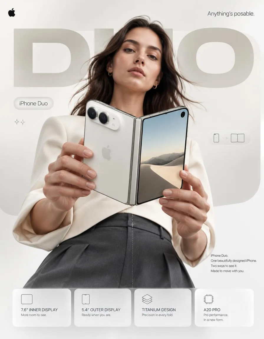
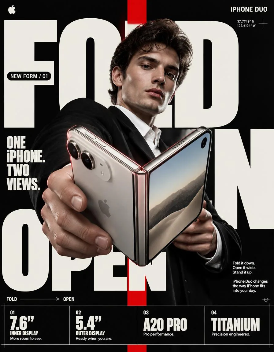
4:5 vertical premium smartphone campaign poster, ultra-high resolution (8K), global OOH + digital + social ready
Style: Apple-level art direction × contemporary product photography × bold editorial composition × hyper-real commercial photography

🧠 CORE INTENT:
“ANYTHING’S POSABLE.”

One iPhone.
More ways to see it.
More ways to use it.
More ways to make it yours.

Effortless flexibility.
Physical intelligence.
One device that adapts to the moment.

🎬 SCENE COMPOSITION:

BACKGROUND:
Pure matte white architectural studio environment with a dominant oversized rounded rectangle block in ultra-soft warm silver gradient (top-left → bottom-right illumination)

The background block creates a subtle dimensional stage behind the subject and product.

GIANT TYPOGRAPHY (BACKGROUND LAYER):
“DUO”

* ultra-bold geometric sans-serif
* stretched wide kerning
* partially cropped by frame edges
* soft shadow depth
* color: very light warm grey
* subtle embossed / debossed effect
* typography positioned behind the subject and product
* large enough to function as an architectural graphic element

👤 SUBJECT (HUMAN ELEMENT):

Female model, clean contemporary editorial look, Apple-style casting

* neutral expression
* confident, calm, effortless
* natural skin texture
* hair: natural flow, slightly wind-touched
* minimal makeup
* understated styling

OUTFIT:
→ sculptural off-white tailored top
→ deep graphite trousers
→ minimal accessories
→ no visible branding
→ sophisticated contemporary styling

POSE:

* Shot from slightly low angle (hero perspective)
* Body slightly angled toward camera
* One hand holding iPhone Duo in its compact closed configuration
* Other hand lightly supporting the device as it opens
* iPhone Duo positioned prominently between viewer and subject
* Face aligned toward viewer
* direct eye contact
* relaxed posture
* pose communicates control rather than excitement

📱 PRODUCT (HERO FOCUS):

DEVICE:
iPhone Duo

FINISH:
Premium titanium finish with physically accurate metallic surface response

POSITION:
Extreme foreground (forced perspective)
Slightly rotated toward camera to reveal the thin profile, hinge construction and display relationship

The device must remain the dominant visual object.

PRODUCT CONFIGURATION:
iPhone Duo shown transitioning from compact outer-display mode into its expansive unfolded configuration.

One continuous physical device.
No impossible geometry.
No duplicated products.
No floating components.

DETAILING:

* ultra-thin titanium frame
* precision hinge construction
* seamless folding display
* extremely thin bezels
* hyper-sharp camera system
* lens reflections physically accurate
* brushed titanium edge highlights
* subtle micro-scratches
* realistic fingerprints / material response kept extremely subtle
* Apple logo centered with restrained reflective gloss
* physically accurate display reflections
* realistic hinge shadow and contact points

The unfolded display should feel expansive and architectural rather than simply “larger.”

REFLECTION:

* soft studio reflection across titanium edges
* subtle screen reflections
* controlled highlight around hinge
* micro light bloom around metallic edges

✨ LIGHTING SYSTEM:

MAIN LIGHT:
Soft studio key light (front-left)
→ smooth skin tones
→ clean product highlights
→ controlled white-to-silver transitions

RIM LIGHT:
Cool-white edge light from right
→ enhances phone silhouette
→ separates titanium edges from white background
→ reveals the thinness of the device

ACCENT LIGHT:
Very subtle warm-silver glow from background architectural block

SHADOW:
Soft drop shadow beneath subject + phone
Soft contact shadow around hinge
(no harsh contrast)

🎨 COLOR SYSTEM:

* Primary: clean Apple white
* Secondary: titanium silver / warm metallic grey
* Accent: subtle graphite
* Background: warm neutral white
* Contrast: deep micro-shadows

No over-saturation.
No neon.
No unnecessary color effects.
Controlled premium palette.

✨ GRAPHIC ELEMENTS:

* Minimal sparkle icons ✦ (2 only)
* One subtle translucent UI pill floating near the unfolded display
* Thin technical construction line following the phone’s folding axis
* Very subtle grain for realism
* Minimal geometric indicators showing the transition between closed and open states

All graphic elements remain secondary to the product.

✍️ TYPOGRAPHY SYSTEM:

TOP LEFT:
Apple logo (black, small, clean)

TOP RIGHT:
“Anything’s posable.” (thin sans-serif)

MID LEFT (pill):
“iPhone Duo”

CENTER DOMINANT:
“DUO” (background type)

BOTTOM RIGHT (body text):
Small paragraph:

“iPhone Duo.
One beautifully designed iPhone.
Two ways to see it.
Made to move with you.”

📊 FEATURE STRIP (BOTTOM GRID):

4 rounded cards (glass-white panels):

1. 7.6″ INNER DISPLAY
    “More room to see.”
2. 5.4″ OUTER DISPLAY
    “Ready when you are.”
3. TITANIUM DESIGN
    “Precision in every fold.”
4. A20 PRO
    “Pro performance. In a new form.”

Icons minimal line style.

Cards must feel integrated into the poster rather than appearing as a generic technology specification panel.

📐 COMPOSITION GRID:

* Top: brand + statement
* Mid: subject + product (dominant)
* Background: giant “DUO” typography layer
* Bottom: feature modules

Strong vertical hierarchy.

The product overlaps the background typography.

The model creates secondary depth behind the phone.

Eye flow:
Face → Phone → Hinge → “DUO” → Features

The iPhone Duo must remain the first visual priority.

🎥 CAMERA SPECS:

* ARRI Alexa Mini LF
* 50mm premium anamorphic lens
* shallow depth of field around subject
* product maintained in extremely high optical clarity
* HDR rendering
* ultra-real skin + titanium material detail
* subtle lens distortion for realism
* physically accurate reflections
* controlled cinematic highlight roll-off
* realistic depth separation
* premium commercial product photography

Slightly low camera position for a subtle hero perspective.

No extreme wide-angle distortion.
No exaggerated perspective.
No artificial CGI appearance.

🎯 FINAL ART DIRECTION:

Apple-level campaign restraint with enough visual tension to feel contemporary and editorial.

The poster should communicate that iPhone Duo is not simply a phone that folds.

Its ability to change position becomes the central visual language of the campaign.

Premium.
Precise.
Human.
Physical.
Confident.

No generic foldable-phone aesthetic.
No futuristic sci-fi environment.
No excessive holograms.
No neon.
No cyberpunk styling.
No random floating UI.
No distorted hands.
No malformed device geometry.
No impossible hinge.
No duplicated cameras.
No fake Apple branding.
No clutter.
No cheap AI-rendered appearance.

FINAL OUTPUT:
4:5 vertical
8K
hyper-real commercial photography
premium Apple campaign art direction
global advertising quality
OOH billboard ready
social media ready
Behance-level visual design
한국어 번역
4:5 세로형 프리미엄 스마트폰 캠페인 포스터, 초고해상도 (8K), 글로벌 OOH + 디지털 + 소셜 즉시 사용 가능
스타일: Apple급 아트 디렉션 × 현대적 제품 사진 × 대담한 에디토리얼 구성 × 하이퍼리얼 커머셜 사진

🧠 핵심 의도:
“무엇이든 포즈가 된다.”

iPhone 하나.
그것을 보는 더 많은 방식.
그것을 쓰는 더 많은 방식.
나만의 것으로 만드는 더 많은 방식.

힘들이지 않는 유연함.
물리적 지능.
그 순간에 맞춰 적응하는 하나의 기기.

🎬 장면 구성:

배경:
순수한 매트 화이트 건축 스튜디오 환경, 초부드러운 따뜻한 실버 그라데이션(좌상단 → 우하단 조명)의 압도적으로 큰 모서리 둥근 사각형 블록

배경 블록은 피사체와 제품 뒤에 은은한 입체감의 무대를 만듭니다.

거대 타이포그래피 (배경 레이어):
“DUO”

* 울트라 볼드 지오메트릭 산세리프
* 넓게 늘어난 자간
* 프레임 가장자리에 의해 부분적으로 잘림
* 부드러운 그림자 깊이
* 색상: 매우 밝은 따뜻한 회색
* 은은한 양각 / 음각 효과
* 타이포그래피는 피사체와 제품 뒤에 배치
* 건축적 그래픽 요소로 기능할 만큼 충분히 큼

👤 피사체 (인간 요소):

여성 모델, 깔끔한 현대적 에디토리얼 룩, Apple 스타일 캐스팅

* 무표정
* 자신감 있고 차분하며 힘들이지 않는
* 자연스러운 피부 질감
* 헤어: 자연스러운 흐름, 바람에 살짝 날린
* 최소한의 메이크업
* 절제된 스타일링

의상:
→ 조형적인 오프화이트 테일러드 상의
→ 딥 그래파이트 팬츠
→ 최소한의 액세서리
→ 눈에 띄는 브랜딩 없음
→ 세련된 현대적 스타일링

포즈:

* 살짝 낮은 앵글에서 촬영 (히어로 원근)
* 몸을 카메라 쪽으로 살짝 기울임
* 한 손은 컴팩트하게 접힌 상태의 iPhone Duo를 들고 있음
* 다른 손은 기기가 펼쳐질 때 가볍게 받치고 있음
* iPhone Duo는 보는 사람과 피사체 사이에 두드러지게 위치
* 얼굴은 보는 사람 쪽으로 정렬
* 직접적인 눈맞춤
* 편안한 자세
* 흥분이 아니라 통제력을 전달하는 포즈

📱 제품 (히어로 포커스):

기기:
iPhone Duo

마감:
물리적으로 정확한 금속 표면 반응을 지닌 프리미엄 티타늄 마감

위치:
극단적인 전경 (강제 원근)
얇은 프로파일, 힌지 구조, 디스플레이 관계를 드러내도록 카메라 쪽으로 살짝 회전

기기는 지배적인 시각적 오브젝트로 남아 있어야 합니다.

제품 구성:
iPhone Duo가 컴팩트한 외부 디스플레이 모드에서 넓게 펼쳐진 구성으로 전환되는 모습.

하나의 연속된 물리적 기기.
불가능한 기하학 없음.
중복된 제품 없음.
떠 있는 부품 없음.

디테일:

* 초박형 티타늄 프레임
* 정밀 힌지 구조
* 이음새 없는 폴딩 디스플레이
* 극도로 얇은 베젤
* 초선명 카메라 시스템
* 물리적으로 정확한 렌즈 반사
* 브러시드 티타늄 모서리 하이라이트
* 은은한 미세 스크래치
* 사실적인 지문 / 재질 반응은 극도로 은은하게 유지
* 절제된 반사 광택과 함께 중앙에 배치된 Apple 로고
* 물리적으로 정확한 디스플레이 반사
* 사실적인 힌지 그림자와 접촉점

펼쳐진 디스플레이는 단순히 “더 큰” 것이 아니라 넓고 건축적으로 느껴져야 합니다.

반사:

* 티타늄 모서리를 가로지르는 부드러운 스튜디오 반사
* 은은한 화면 반사
* 힌지 주변의 통제된 하이라이트
* 금속 모서리 주변의 미세한 빛 번짐

✨ 조명 시스템:

메인 라이트:
부드러운 스튜디오 키 라이트 (전면 좌측)
→ 매끄러운 피부 톤
→ 깔끔한 제품 하이라이트
→ 통제된 화이트-투-실버 전환

림 라이트:
우측에서 오는 쿨화이트 엣지 라이트
→ 폰 실루엣 강화
→ 티타늄 모서리를 흰 배경과 분리
→ 기기의 얇음을 드러냄

액센트 라이트:
배경 건축 블록에서 오는 매우 은은한 따뜻한 실버 글로우

그림자:
피사체 + 폰 아래의 부드러운 드롭 섀도
힌지 주변의 부드러운 접촉 그림자
(강한 대비 없음)

🎨 색상 시스템:

* 주 색상: 깨끗한 Apple 화이트
* 보조 색상: 티타늄 실버 / 따뜻한 메탈릭 그레이
* 액센트: 은은한 그래파이트
* 배경: 따뜻한 뉴트럴 화이트
* 대비: 깊은 마이크로 섀도

과도한 채도 없음.
네온 없음.
불필요한 색상 효과 없음.
통제된 프리미엄 팔레트.

✨ 그래픽 요소:

* 최소한의 반짝임 아이콘 ✦ (2개만)
* 펼쳐진 디스플레이 근처에 떠 있는 은은한 반투명 UI 알약
* 폰의 접힘 축을 따라가는 얇은 테크니컬 구성선
* 사실감을 위한 매우 은은한 그레인
* 닫힘과 열림 상태 사이의 전환을 보여주는 최소한의 기하학적 인디케이터

모든 그래픽 요소는 제품에 종속되어야 합니다.

✍️ 타이포그래피 시스템:

좌상단:
Apple 로고 (블랙, 작게, 깔끔하게)

우상단:
“무엇이든 포즈가 된다.” (얇은 산세리프)

중앙 좌측 (알약):
“iPhone Duo”

중앙 지배 요소:
“DUO” (배경 타이포)

우하단 (본문 텍스트):
작은 문단:

“iPhone Duo.
아름답게 디자인된 하나의 iPhone.
그것을 보는 두 가지 방식.
당신과 함께 움직이도록 만들어졌습니다.”

📊 기능 스트립 (하단 그리드):

4개의 둥근 카드 (글래스 화이트 패널):

1. 7.6″ 내부 디스플레이
    “볼 공간이 더 넓어집니다.”
2. 5.4″ 외부 디스플레이
    “준비되면 언제든.”
3. 티타늄 디자인
    “모든 접힘에 정밀함을.”
4. A20 PRO
    “프로 성능. 새로운 형태로.”

아이콘은 최소한의 라인 스타일.

카드는 일반적인 기술 사양 패널처럼 보이지 않고 포스터에 통합된 느낌이어야 합니다.

📐 구성 그리드:

* 상단: 브랜드 + 메시지
* 중단: 피사체 + 제품 (지배적)
* 배경: 거대한 “DUO” 타이포그래피 레이어
* 하단: 기능 모듈

강한 수직 위계.

제품이 배경 타이포그래피와 겹칩니다.

모델은 폰 뒤에 이차적 깊이를 만듭니다.

시선 흐름:
얼굴 → 폰 → 힌지 → “DUO” → 기능

iPhone Duo는 첫 번째 시각적 우선순위로 남아야 합니다.

🎥 카메라 사양:

* ARRI Alexa Mini LF
* 50mm 프리미엄 아나모픽 렌즈
* 피사체 주변의 얕은 심도
* 제품은 극도로 높은 광학 선명도 유지
* HDR 렌더링
* 초현실적인 피부 + 티타늄 재질 디테일
* 사실감을 위한 은은한 렌즈 왜곡
* 물리적으로 정확한 반사
* 통제된 시네마틱 하이라이트 롤오프
* 사실적인 심도 분리
* 프리미엄 커머셜 제품 사진

은은한 히어로 원근을 위한 살짝 낮은 카메라 위치.

극단적인 광각 왜곡 없음.
과장된 원근 없음.
인위적인 CGI 느낌 없음.

🎯 최종 아트 디렉션:

현대적이고 에디토리얼하게 느껴질 만큼의 시각적 긴장을 갖춘 Apple급 캠페인 절제미.

포스터는 iPhone Duo가 단순히 접히는 폰이 아니라는 점을 전달해야 합니다.

위치를 바꿀 수 있는 능력이 캠페인의 중심 시각 언어가 됩니다.

프리미엄.
정밀함.
인간적.
물리적.
자신감.

일반적인 폴더블 폰 미학 없음.
미래적 SF 환경 없음.
과도한 홀로그램 없음.
네온 없음.
사이버펑크 스타일링 없음.
무작위로 떠 있는 UI 없음.
왜곡된 손 없음.
잘못된 기기 형상 없음.
불가능한 힌지 없음.
중복된 카메라 없음.
가짜 Apple 브랜딩 없음.
어수선함 없음.
값싼 AI 렌더 느낌 없음.

최종 출력:
4:5 세로
8K
하이퍼리얼 커머셜 사진
프리미엄 Apple 캠페인 아트 디렉션
글로벌 광고 품질
OOH 빌보드 사용 가능
소셜 미디어 사용 가능
Behance급 비주얼 디자인
출처
- 원작자
- Diplomeme
- 게시일
- 2026-09-10
- 원문 출처
- 원문 보기 ↗
- 수록 출처
- xianyu110/awesome-gpt-image2.5 · 2097978468642480487 · MIT