Apple 級手機海報,可複製 prompt
產品海報直出,prompt 可抄。做數碼/3C 種草封面時省半小時磨詞。
提示詞
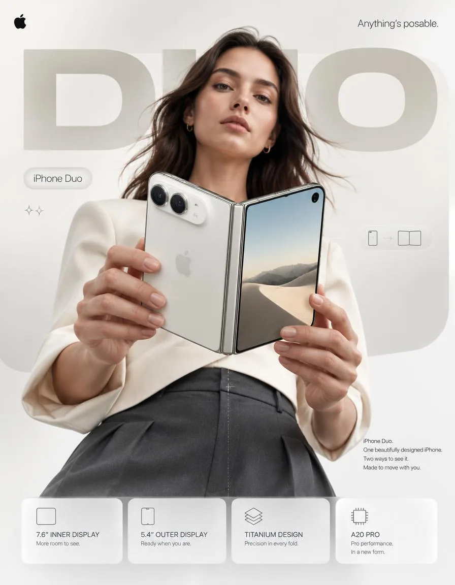
4:5 vertical premium smartphone campaign poster, ultra-high resolution (8K), global OOH + digital + social ready
Style: Apple-level art direction × contemporary product photography × bold editorial composition × hyper-real commercial photography

🧠 CORE INTENT:
“ANYTHING’S POSABLE.”

One iPhone.
More ways to see it.
More ways to use it.
More ways to make it yours.

Effortless flexibility.
Physical intelligence.
One device that adapts to the moment.

🎬 SCENE COMPOSITION:

BACKGROUND:
Pure matte white architectural studio environment with a dominant oversized rounded rectangle block in ultra-soft warm silver gradient (top-left → bottom-right illumination)

The background block creates a subtle dimensional stage behind the subject and product.

GIANT TYPOGRAPHY (BACKGROUND LAYER):
“DUO”

* ultra-bold geometric sans-serif
* stretched wide kerning
* partially cropped by frame edges
* soft shadow depth
* color: very light warm grey
* subtle embossed / debossed effect
* typography positioned behind the subject and product
* large enough to function as an architectural graphic element

👤 SUBJECT (HUMAN ELEMENT):

Female model, clean contemporary editorial look, Apple-style casting

* neutral expression
* confident, calm, effortless
* natural skin texture
* hair: natural flow, slightly wind-touched
* minimal makeup
* understated styling

OUTFIT:
→ sculptural off-white tailored top
→ deep graphite trousers
→ minimal accessories
→ no visible branding
→ sophisticated contemporary styling

POSE:

* Shot from slightly low angle (hero perspective)
* Body slightly angled toward camera
* One hand holding iPhone Duo in its compact closed configuration
* Other hand lightly supporting the device as it opens
* iPhone Duo positioned prominently between viewer and subject
* Face aligned toward viewer
* direct eye contact
* relaxed posture
* pose communicates control rather than excitement

📱 PRODUCT (HERO FOCUS):

DEVICE:
iPhone Duo

FINISH:
Premium titanium finish with physically accurate metallic surface response

POSITION:
Extreme foreground (forced perspective)
Slightly rotated toward camera to reveal the thin profile, hinge construction and display relationship

The device must remain the dominant visual object.

PRODUCT CONFIGURATION:
iPhone Duo shown transitioning from compact outer-display mode into its expansive unfolded configuration.

One continuous physical device.
No impossible geometry.
No duplicated products.
No floating components.

DETAILING:

* ultra-thin titanium frame
* precision hinge construction
* seamless folding display
* extremely thin bezels
* hyper-sharp camera system
* lens reflections physically accurate
* brushed titanium edge highlights
* subtle micro-scratches
* realistic fingerprints / material response kept extremely subtle
* Apple logo centered with restrained reflective gloss
* physically accurate display reflections
* realistic hinge shadow and contact points

The unfolded display should feel expansive and architectural rather than simply “larger.”

REFLECTION:

* soft studio reflection across titanium edges
* subtle screen reflections
* controlled highlight around hinge
* micro light bloom around metallic edges

✨ LIGHTING SYSTEM:

MAIN LIGHT:
Soft studio key light (front-left)
→ smooth skin tones
→ clean product highlights
→ controlled white-to-silver transitions

RIM LIGHT:
Cool-white edge light from right
→ enhances phone silhouette
→ separates titanium edges from white background
→ reveals the thinness of the device

ACCENT LIGHT:
Very subtle warm-silver glow from background architectural block

SHADOW:
Soft drop shadow beneath subject + phone
Soft contact shadow around hinge
(no harsh contrast)

🎨 COLOR SYSTEM:

* Primary: clean Apple white
* Secondary: titanium silver / warm metallic grey
* Accent: subtle graphite
* Background: warm neutral white
* Contrast: deep micro-shadows

No over-saturation.
No neon.
No unnecessary color effects.
Controlled premium palette.

✨ GRAPHIC ELEMENTS:

* Minimal sparkle icons ✦ (2 only)
* One subtle translucent UI pill floating near the unfolded display
* Thin technical construction line following the phone’s folding axis
* Very subtle grain for realism
* Minimal geometric indicators showing the transition between closed and open states

All graphic elements remain secondary to the product.

✍️ TYPOGRAPHY SYSTEM:

TOP LEFT:
Apple logo (black, small, clean)

TOP RIGHT:
“Anything’s posable.” (thin sans-serif)

MID LEFT (pill):
“iPhone Duo”

CENTER DOMINANT:
“DUO” (background type)

BOTTOM RIGHT (body text):
Small paragraph:

“iPhone Duo.
One beautifully designed iPhone.
Two ways to see it.
Made to move with you.”

📊 FEATURE STRIP (BOTTOM GRID):

4 rounded cards (glass-white panels):

1. 7.6″ INNER DISPLAY
    “More room to see.”
2. 5.4″ OUTER DISPLAY
    “Ready when you are.”
3. TITANIUM DESIGN
    “Precision in every fold.”
4. A20 PRO
    “Pro performance. In a new form.”

Icons minimal line style.

Cards must feel integrated into the poster rather than appearing as a generic technology specification panel.

📐 COMPOSITION GRID:

* Top: brand + statement
* Mid: subject + product (dominant)
* Background: giant “DUO” typography layer
* Bottom: feature modules

Strong vertical hierarchy.

The product overlaps the background typography.

The model creates secondary depth behind the phone.

Eye flow:
Face → Phone → Hinge → “DUO” → Features

The iPhone Duo must remain the first visual priority.

🎥 CAMERA SPECS:

* ARRI Alexa Mini LF
* 50mm premium anamorphic lens
* shallow depth of field around subject
* product maintained in extremely high optical clarity
* HDR rendering
* ultra-real skin + titanium material detail
* subtle lens distortion for realism
* physically accurate reflections
* controlled cinematic highlight roll-off
* realistic depth separation
* premium commercial product photography

Slightly low camera position for a subtle hero perspective.

No extreme wide-angle distortion.
No exaggerated perspective.
No artificial CGI appearance.

🎯 FINAL ART DIRECTION:

Apple-level campaign restraint with enough visual tension to feel contemporary and editorial.

The poster should communicate that iPhone Duo is not simply a phone that folds.

Its ability to change position becomes the central visual language of the campaign.

Premium.
Precise.
Human.
Physical.
Confident.

No generic foldable-phone aesthetic.
No futuristic sci-fi environment.
No excessive holograms.
No neon.
No cyberpunk styling.
No random floating UI.
No distorted hands.
No malformed device geometry.
No impossible hinge.
No duplicated cameras.
No fake Apple branding.
No clutter.
No cheap AI-rendered appearance.

FINAL OUTPUT:
4:5 vertical
8K
hyper-real commercial photography
premium Apple campaign art direction
global advertising quality
OOH billboard ready
social media ready
Behance-level visual design
中文翻譯
4:5 豎版高端智能手機廣告海報,超高分辨率(8K),適配全球 OOH + 數字 + 社交媒體
風格:Apple 級藝術指導 × 當代產品攝影 × 大膽編輯式構圖 × 超寫實商業攝影

🧠 核心意圖:
“一切皆可擺出姿態。”

一部 iPhone。
更多種觀看方式。
更多種使用方式。
更多種讓它成爲你的方式。

毫不費力的靈活。
物理智能。
一臺隨此刻而變的設備。

🎬 場景構圖:

背景:
純啞光白建築感影棚環境,主導元素爲一塊超大圓角矩形體塊,呈極柔和暖銀色漸變(左上 → 右下打光)

背景體塊在人物與產品之後營造出微妙的立體舞臺感。

巨型字體(背景層):
“DUO”

* 超粗幾何無襯線
* 拉寬的寬字距
* 被畫面邊緣部分裁切
* 柔和陰影層次
* 顏色:極淺暖灰色
* 微妙的浮雕 / 凹雕效果
* 字體位於人物與產品之後
* 尺寸足夠大,可作爲建築圖形元素

👤 人物(人的元素):

女性模特,乾淨的當代編輯式氣質,Apple 式選角

* 中性表情
* 自信、平靜、毫不費力
* 自然皮膚質感
* 頭髮:自然垂落,略帶風吹感
* 極簡妝容
* 低調造型

服裝:
→ 雕塑感米白色剪裁上衣
→ 深石墨色長褲
→ 極簡配飾
→ 無可見品牌標識
→ 精緻當代造型

姿態:

* 從略低角度拍攝(英雄視角)
* 身體略微側向鏡頭
* 一隻手握着處於緊湊閉合形態的 iPhone Duo
* 另一隻手在設備展開時輕輕托住
* iPhone Duo 醒目地位於觀者與人物之間
* 面部朝向觀者
* 直接的眼神接觸
* 放鬆的體態
* 姿態傳達的是掌控感,而非興奮

📱 產品(視覺主體):

設備:
iPhone Duo

表面處理:
高端鈦金屬質感,具備物理準確的金屬表面反射

位置:
極前景(強制透視)
略微朝向鏡頭旋轉,以展現纖薄側面、鉸鏈結構與屏幕關係

設備必須始終是畫面中佔主導的視覺對象。

產品形態:
iPhone Duo 呈現從緊湊外屏模式過渡到完全展開形態的過程。

一臺連續完整的實體設備。
沒有不可能的幾何結構。
沒有重複的產品。
沒有懸浮部件。

細節:

* 超薄鈦金屬邊框
* 精密鉸鏈結構
* 無縫摺疊屏幕
* 極窄邊框
* 超銳利相機系統
* 鏡頭反射物理準確
* 拉絲鈦金屬邊緣高光
* 細微的微觀劃痕
* 真實的指紋 / 材質反應保持極度細微
* Apple logo 居中,帶剋制的反光光澤
* 物理準確的屏幕反射
* 真實的鉸鏈陰影與接觸點

展開後的屏幕應當顯得開闊、具有建築感,而不只是單純地“更大”。

反射:

* 鈦金屬邊緣上的柔和影棚反射
* 細微的屏幕反射
* 鉸鏈周圍受控的高光
* 金屬邊緣周圍的微光暈

✨ 燈光系統:

主光:
柔和影棚主光(左前方)
→ 平滑的膚質
→ 乾淨的產品高光
→ 受控的白到銀過渡

輪廓光:
來自右側的冷白邊緣光
→ 強化手機輪廓
→ 將鈦金屬邊緣與白色背景分離
→ 展現設備的纖薄

點綴光:
來自背景建築體塊的極細微暖銀輝光

陰影:
人物 + 手機下方的柔和投影
鉸鏈周圍的柔和接觸陰影
(無強烈對比)

🎨 色彩系統:

* 主色:乾淨的 Apple 白
* 輔色:鈦銀 / 暖金屬灰
* 點綴色:細微石墨色
* 背景:暖調中性白
* 對比:深邃微陰影

無過度飽和。
無霓虹。
無多餘色彩效果。
受控的高端調色板。

✨ 圖形元素:

* 極簡閃光圖標 ✦(僅 2 個)
* 一個細微的半透明 UI 膠囊形元素,懸浮在展開屏幕附近
* 一條沿手機摺疊軸的纖細技術結構線
* 極微弱的顆粒感以增強真實感
* 極簡幾何指示符,展示閉合與展開狀態之間的過渡

所有圖形元素都從屬於產品。

✍️ 字體系統:

左上:
Apple logo(黑色,小尺寸,乾淨)

右上:
“一切皆可擺出姿態。”(細體無襯線)

中左(膠囊形):
“iPhone Duo”

中央主導:
“DUO”(背景字體)

右下(正文文字):
小段落:

“iPhone Duo。
一部設計精美的 iPhone。
兩種觀看它的方式。
爲與你同行而打造。”

📊 特性條(底部網格):

4 張圓角卡片(玻璃白麪板):

1. 7.6″ 內屏
    “更多觀看空間。”
2. 5.4″ 外屏
    “你準備好時,它已就緒。”
3. 鈦金屬設計
    “每一次摺疊都精準。”
4. A20 PRO
    “Pro 級性能。全新形態。”

圖標爲極簡線條風格。

卡片必須感覺融入海報之中,而不是像一個通用的技術規格面板。

📐 構圖網格:

* 頂部:品牌 + 宣言
* 中部:人物 + 產品(主導)
* 背景:巨型 “DUO” 字體層
* 底部:特性模塊

強烈的縱向層級。

產品與背景字體層重疊。

模特在手機後方形成次級景深。

視線流動:
面部 → 手機 → 鉸鏈 → “DUO” → 特性

iPhone Duo 必須始終是第一視覺優先級。

🎥 相機規格:

* ARRI Alexa Mini LF
* 50mm 高端變形鏡頭
* 人物周圍淺景深
* 產品保持極高光學清晰度
* HDR 渲染
* 超真實皮膚 + 鈦金屬材質細節
* 細微鏡頭畸變以增強真實感
* 物理準確的反射
* 受控的電影級高光滾降
* 真實的景深分離
* 高端商業產品攝影

略低的機位,營造微妙的英雄視角。

無極端廣角畸變。
無誇張透視。
無人工 CGI 感。

🎯 最終藝術指導:

Apple 級廣告的剋制,同時具備足夠的視覺張力,顯得當代且具編輯感。

海報應傳達:iPhone Duo 不只是一部能摺疊的手機。

它改變姿態的能力,成爲整個廣告的核心視覺語言。

高端。
精準。
人性。
物理。
自信。

無通用的摺疊屏手機美學。
無未來科幻環境。
無過度全息效果。
無霓虹。
無賽博朋克風格。
無隨機懸浮 UI。
無扭曲的手。
無畸形的設備幾何結構。
無不可能的鉸鏈。
無重複的攝像頭。
無僞造的 Apple 品牌標識。
無雜亂。
無廉價 AI 渲染感。

最終輸出:
4:5 豎版
8K
超寫實商業攝影
高端 Apple 廣告藝術指導
全球廣告級品質
可直接用於 OOH 廣告牌
可直接用於社交媒體
Behance 級視覺設計
溯源
- 原作者
- Diplomeme
- 發佈日期
- 2026-09-10
- 原始出處
- 查看原帖 ↗
- 收錄來源
- xianyu110/awesome-gpt-image2.5 · 2097978468642480487 · MIT