中秋節タイポグラフィポスターのプロンプト
ミニマルで実験的なタイポグラフィポスターを生成するためのプロンプト。中秋節をテーマに、大きなサンセリフ書体と Gucci レッドのアクセントを特徴とする。
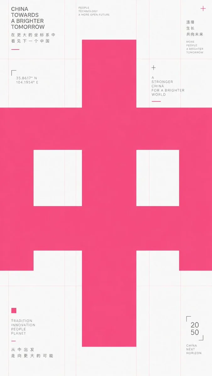
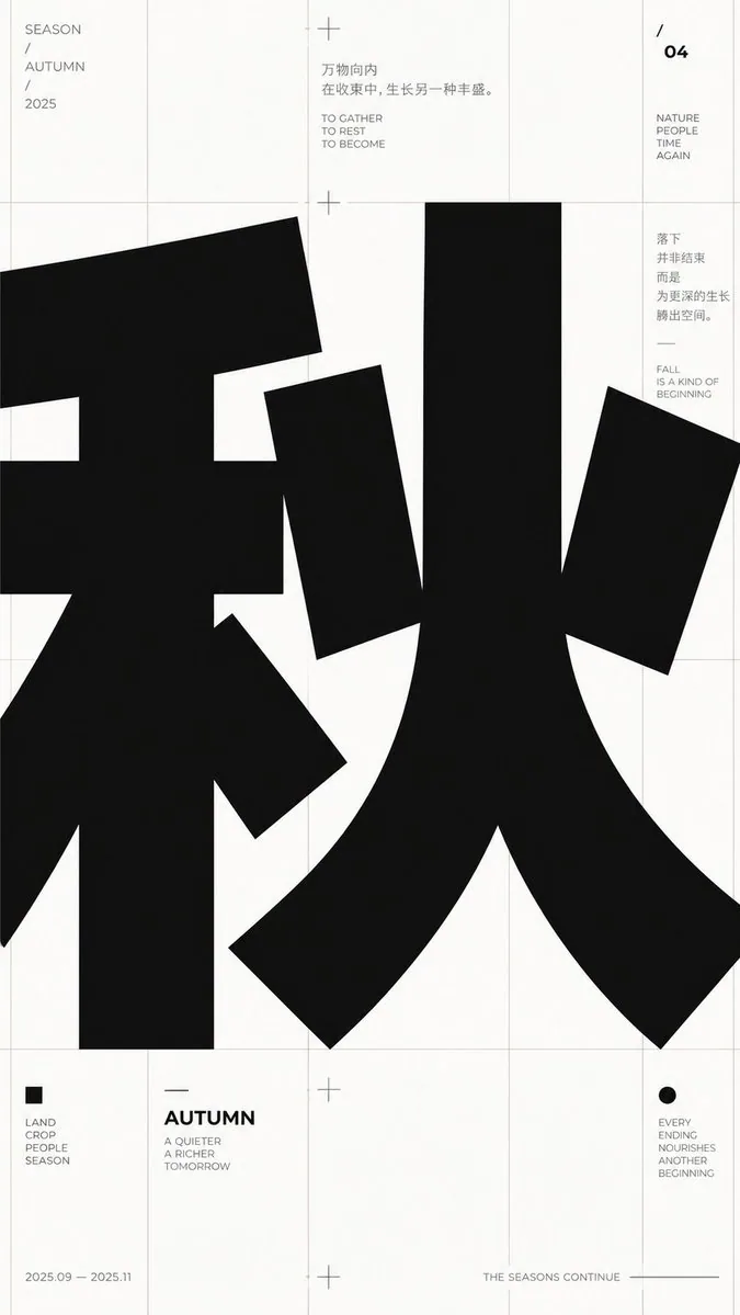
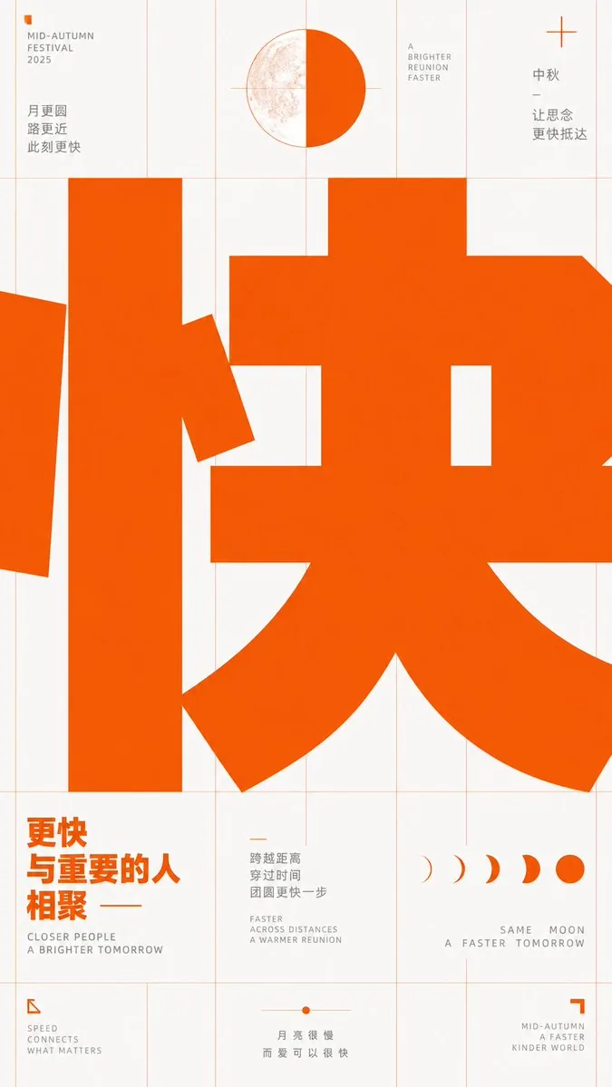
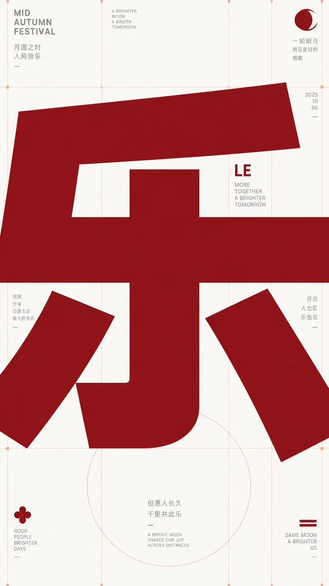
プロンプト
Take any futuristic theme providing core concepts, short phrases, and minor auxiliary notes, and translate the theme into an extremely enlarged text or symbol subject: The first impression must be heavy, bold sans-serif glyphs filling almost the entire frame, pressed horizontally into the layout, with the character body occupying the center like structural beams, partially cropped or overflowing, making reading first become a strong form event before reading subtitles at its edges. Keep the background largely empty with cool white space, overlaid with extremely thin, light warm-colored composition lines, baselines, and vertical column lines; these lines should look like unhidden skeletons of a design draft rather than decoration. Use only high-saturation orange-red as the primary color to carry all visual weight, gray for small explanatory text, avoiding multi-colors and gradients. Information modules are sparsely placed at grid intersections and edges: small icons composed of simple geometric angles, dots, and short dashes; titles are short and bold; body text is in narrow columns and light gray. The overall presentation should have a precise, restrained, experimental typographic educational feel. Glyph construction requires low contrast, thick strokes, large open counters, flat terminals, tight tracking; punctuation and auxiliary symbols also follow the grid rhythm. If switching to other writing systems, maintain equivalent block volume, inner/outer spatial relationships, cropping pressure, and horizontal reading momentum. Prohibit illustrative backgrounds, shadows, paper textures, centered cards, rounded cuteness, commercial poster lighting effects, and over-packed information.

——————
Theme: {argument name="theme_en" default="Joy"}
Aspect Ratio: {argument name="aspect_ratio_en" default="9:16"}
Note: Appropriate Mid-Autumn elements
Font Color: {argument name="font_color_en" default="Gucci Ancora Red"}
日本語訳
未来感のある任意のテーマ(中核となる概念、短いフレーズ、補助的な小さな注記を提供するもの)を受け取り、そのテーマを極端に拡大した文字または記号の主題へと変換する。第一印象は、フレームのほぼ全体を埋め尽くす重く太いサンセリフのグリフでなければならず、レイアウトへ水平方向に押し込まれ、文字の本体が構造梁のように中央を占め、部分的にクロップされるか溢れ出し、読むことがまず強い形態的出来事となり、その後に縁のサブタイトルを読むことになる。背景は大きく空けて冷たいホワイトスペースとし、極細で明るい暖色の構成線、ベースライン、縦のコラム線を重ねる。これらの線は装飾ではなく、デザインラフの隠されていない骨組みのように見えること。高彩度のオレンジレッドだけを主要色として使い、すべての視覚的な重みを担わせ、小さな説明文にはグレーを使い、多色使いとグラデーションは避ける。情報モジュールはグリッドの交点と縁にまばらに配置する: 単純な幾何学的な角度、点、短いダッシュで構成された小さなアイコン。タイトルは短く太く、本文は狭い段組でライトグレー。全体の提示は、精密で抑制の効いた、実験的なタイポグラフィ教育のような感触であること。グリフの造形には低コントラスト、太いストローク、大きく開いたカウンター、フラットなターミナル、詰めたトラッキングが必要で、句読点や補助記号もグリッドのリズムに従う。他の文字体系に切り替える場合も、同等のブロックのボリューム、内外の空間関係、クロップの圧力、水平方向の読みの勢いを保つ。イラスト的な背景、影、紙のテクスチャ、中央寄せのカード、丸みのある可愛らしさ、商業ポスター的なライティング効果、情報の詰め込みすぎを禁止する。

——————
テーマ: {argument name="theme_en" default="喜び"}
アスペクト比: {argument name="aspect_ratio_en" default="9:16"}
注記: 中秋節にふさわしい要素
フォントの色: {argument name="font_color_en" default="Gucci Ancora Red"}
テンプレート変数
置換可能なパラメータを含みます。角括弧内は既定値です
theme_en = Joyaspect_ratio_en = 9:16font_color_en = Gucci Ancora Red
出典
- 原作者
- 小小东
- 公開日
- 2026-09-17
- 原典
- 元の投稿を見る ↗
- 収録元
- YouMind-OpenLab/awesome-gpt-image-2 · 34929 · CC-BY-4.0