Mid-Autumn Festival Typography Poster Prompt
用於生成極簡主義、實驗性排版海報的提示詞,以中秋節爲主題,特色爲大號無襯線字體和 Gucci 紅色點綴。
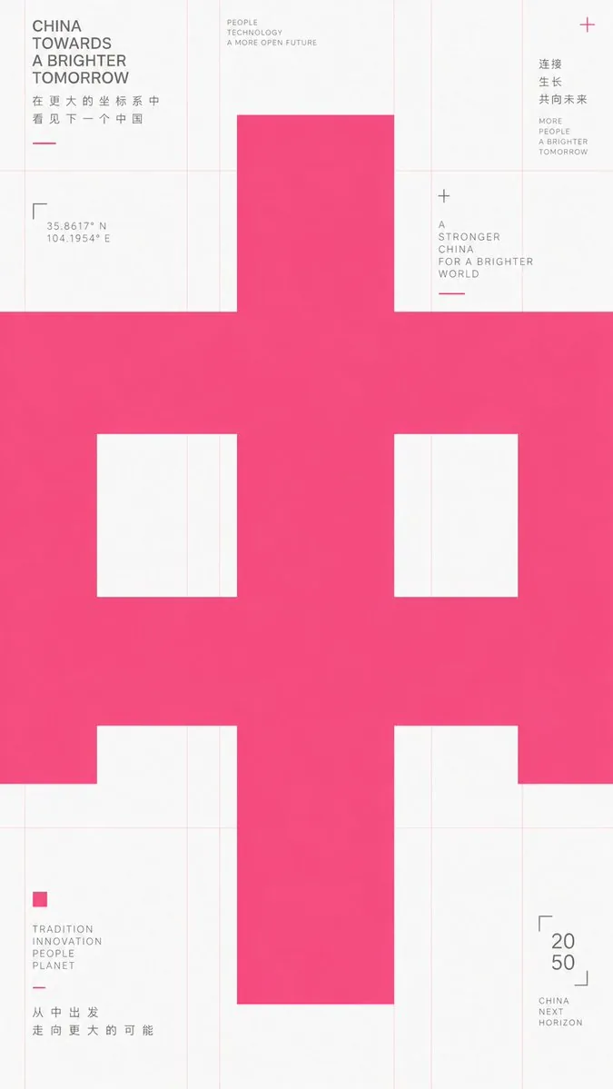
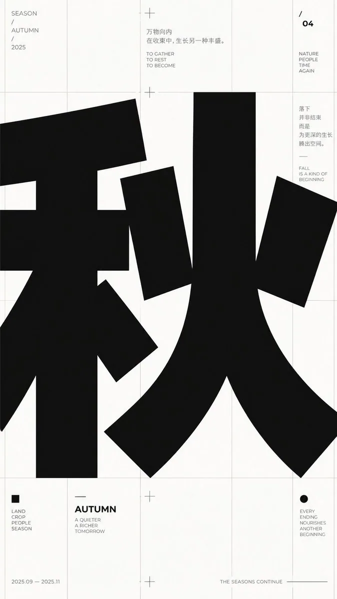
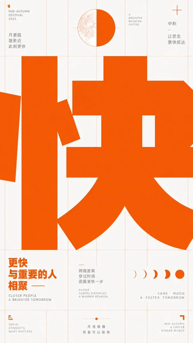
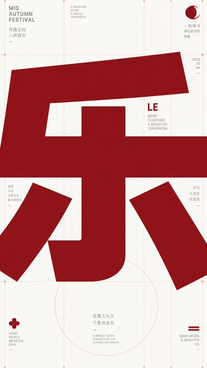
提示詞
Take any futuristic theme providing core concepts, short phrases, and minor auxiliary notes, and translate the theme into an extremely enlarged text or symbol subject: The first impression must be heavy, bold sans-serif glyphs filling almost the entire frame, pressed horizontally into the layout, with the character body occupying the center like structural beams, partially cropped or overflowing, making reading first become a strong form event before reading subtitles at its edges. Keep the background largely empty with cool white space, overlaid with extremely thin, light warm-colored composition lines, baselines, and vertical column lines; these lines should look like unhidden skeletons of a design draft rather than decoration. Use only high-saturation orange-red as the primary color to carry all visual weight, gray for small explanatory text, avoiding multi-colors and gradients. Information modules are sparsely placed at grid intersections and edges: small icons composed of simple geometric angles, dots, and short dashes; titles are short and bold; body text is in narrow columns and light gray. The overall presentation should have a precise, restrained, experimental typographic educational feel. Glyph construction requires low contrast, thick strokes, large open counters, flat terminals, tight tracking; punctuation and auxiliary symbols also follow the grid rhythm. If switching to other writing systems, maintain equivalent block volume, inner/outer spatial relationships, cropping pressure, and horizontal reading momentum. Prohibit illustrative backgrounds, shadows, paper textures, centered cards, rounded cuteness, commercial poster lighting effects, and over-packed information.

——————
Theme: {argument name="theme_en" default="Joy"}
Aspect Ratio: {argument name="aspect_ratio_en" default="9:16"}
Note: Appropriate Mid-Autumn elements
Font Color: {argument name="font_color_en" default="Gucci Ancora Red"}
中文翻譯
選取任何未來主義主題,提供核心概念、簡短短語和次要輔助註釋,並將該主題轉化爲極度放大的文字或符號主體:第一印象必須強烈,粗體無襯線字形幾乎填滿整個畫面,水平壓入佈局中,字符主體像結構梁一樣佔據中心位置,部分被裁剪或溢出,使閱讀首先成爲一種強烈的形式體驗,隨後纔是閱讀邊緣處的副標題。背景大部分保持空白,呈現冷色調留白,疊加極細、淺暖色的構圖線、基線和垂直欄線;這些線條應看起來像是設計稿中未隱藏的骨架,而非裝飾。僅使用高飽和度的橙紅色作爲主色來承載所有視覺重量,灰色用於小號說明文字,避免多色和漸變。信息模塊稀疏地放置在網格交點和邊緣:由簡單幾何角度、圓點和短破折號組成的小圖標;標題簡短且加粗;正文採用窄欄和淺灰色。整體呈現應具有精確、剋制、實驗性的排版教育感。字形構建要求低對比度、粗筆畫、大開口字懷、平直末端、緊湊字距;標點符號和輔助符號也遵循網格節奏。如果切換到其他書寫系統,請保持等效的塊狀體積、內部/外部空間關係、裁剪壓力和水平閱讀動勢。禁止使用插圖背景、陰影、紙張紋理、居中卡片、圓潤可愛風格、商業海報燈光效果以及過度擁擠的信息。

——————
主題:{argument name="theme_en" default="Joy"}
寬高比:{argument name="aspect_ratio_en" default="9:16"}
備註:適當融入中秋節元素
字體顏色:{argument name="font_color_en" default="Gucci Ancora Red"}
模板變數
該提示詞含可替換參數,方括號內為預設值
theme_en = Joyaspect_ratio_en = 9:16font_color_en = Gucci Ancora Red
溯源
- 原作者
- 小小东
- 發佈日期
- 2026-09-17
- 原始出處
- 查看原帖 ↗
- 收錄來源
- YouMind-OpenLab/awesome-gpt-image-2 · 34929 · CC-BY-4.0