추석 타이포그래피 포스터 프롬프트
미니멀하고 실험적인 타이포그래피 포스터 생성용 프롬프트로, 추석을 주제로 하며 큰 산세리프 서체와 Gucci 레드 포인트가 특징입니다.
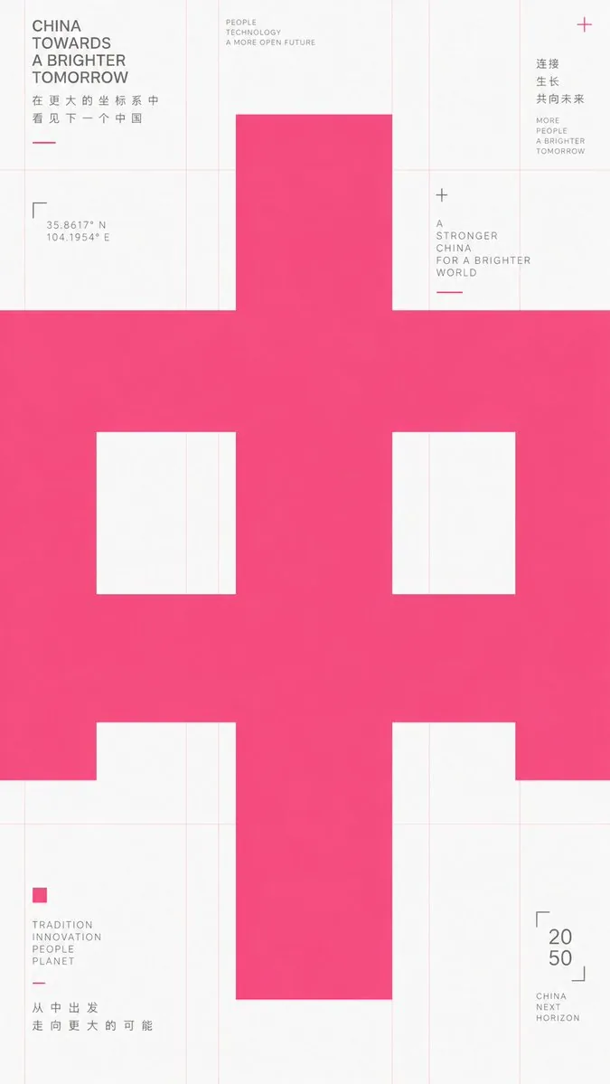
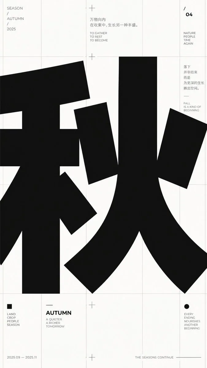
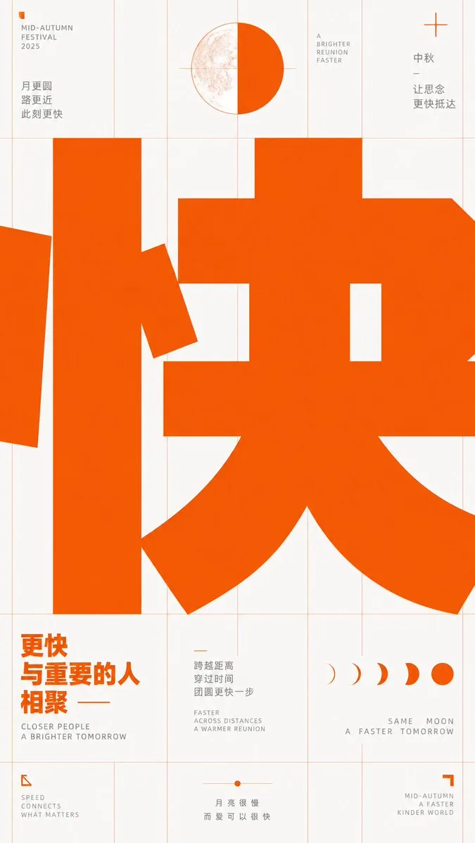
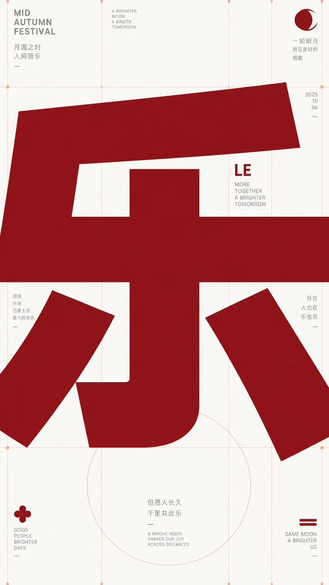
프롬프트
Take any futuristic theme providing core concepts, short phrases, and minor auxiliary notes, and translate the theme into an extremely enlarged text or symbol subject: The first impression must be heavy, bold sans-serif glyphs filling almost the entire frame, pressed horizontally into the layout, with the character body occupying the center like structural beams, partially cropped or overflowing, making reading first become a strong form event before reading subtitles at its edges. Keep the background largely empty with cool white space, overlaid with extremely thin, light warm-colored composition lines, baselines, and vertical column lines; these lines should look like unhidden skeletons of a design draft rather than decoration. Use only high-saturation orange-red as the primary color to carry all visual weight, gray for small explanatory text, avoiding multi-colors and gradients. Information modules are sparsely placed at grid intersections and edges: small icons composed of simple geometric angles, dots, and short dashes; titles are short and bold; body text is in narrow columns and light gray. The overall presentation should have a precise, restrained, experimental typographic educational feel. Glyph construction requires low contrast, thick strokes, large open counters, flat terminals, tight tracking; punctuation and auxiliary symbols also follow the grid rhythm. If switching to other writing systems, maintain equivalent block volume, inner/outer spatial relationships, cropping pressure, and horizontal reading momentum. Prohibit illustrative backgrounds, shadows, paper textures, centered cards, rounded cuteness, commercial poster lighting effects, and over-packed information.

——————
Theme: {argument name="theme_en" default="Joy"}
Aspect Ratio: {argument name="aspect_ratio_en" default="9:16"}
Note: Appropriate Mid-Autumn elements
Font Color: {argument name="font_color_en" default="Gucci Ancora Red"}
한국어 번역
핵심 개념, 짧은 구문, 작은 보조 설명을 제공하는 어떤 미래적 주제든 받아들여, 그 주제를 극도로 확대된 텍스트 또는 기호 주체로 변환하세요: 첫인상은 거의 전체 프레임을 채우는 묵직하고 굵은 산세리프 글리프여야 하며, 레이아웃에 가로로 압착되어 글자 몸체가 구조용 들보처럼 중앙을 차지하고, 부분적으로 잘리거나 넘쳐서 읽기가 먼저 강력한 형태적 사건이 되고 그다음 가장자리의 부제를 읽게 되어야 합니다. 배경은 대체로 비워 차가운 화이트 스페이스를 유지하고, 그 위에 극도로 가늘고 밝은 난색 계열의 구성선, 기준선, 세로 단선을 겹치세요. 이 선들은 장식이 아니라 디자인 시안의 숨기지 않은 골격처럼 보여야 합니다. 모든 시각적 무게를 지는 주색으로 고채도 주황빨강만 사용하고, 작은 설명 텍스트에는 회색을 사용하며, 여러 색과 그라데이션은 피하세요. 정보 모듈은 그리드 교차점과 가장자리에 드문드문 배치합니다: 단순한 기하학적 각도, 점, 짧은 대시로 구성된 작은 아이콘, 제목은 짧고 굵게, 본문은 좁은 단으로 밝은 회색으로. 전체 표현은 정밀하고 절제된 실험적 타이포그래피 교육 느낌이어야 합니다. 글리프 구성은 낮은 대비, 굵은 획, 크게 열린 카운터, 평평한 획 끝, 좁은 자간을 요구합니다. 문장부호와 보조 기호도 그리드 리듬을 따릅니다. 다른 문자 체계로 바꿀 경우 동등한 블록 부피, 내외부 공간 관계, 잘림의 압박, 가로 읽기 추진력을 유지하세요. 삽화적 배경, 그림자, 종이 질감, 중앙 카드, 둥글둥글한 귀여움, 상업 포스터 조명 효과, 정보 과밀을 금지합니다.

——————
주제: {argument name="theme_en" default="기쁨"}
화면 비율: {argument name="aspect_ratio_en" default="9:16"}
참고: 적절한 추석 요소
글꼴 색상: {argument name="font_color_en" default="Gucci Ancora Red"}
템플릿 변수
치환 가능한 매개변수가 있으며, 대괄호 안이 기본값입니다
theme_en = Joyaspect_ratio_en = 9:16font_color_en = Gucci Ancora Red
출처
- 원작자
- 小小东
- 게시일
- 2026-09-17
- 원문 출처
- 원문 보기 ↗
- 수록 출처
- YouMind-OpenLab/awesome-gpt-image-2 · 34929 · CC-BY-4.0