ペーパーカットポスター四連作:一枚切り開くと小さな世界
CUT TO MOVE / BELOW THE SURFACE / AFTERLIGHT / SPACES BETWEEN——大きなシルエットの中に6〜9層の紙を重ね、深部に物語を隠す。展覧会/文化ポスターのレシピでスロットを差し替え可能。
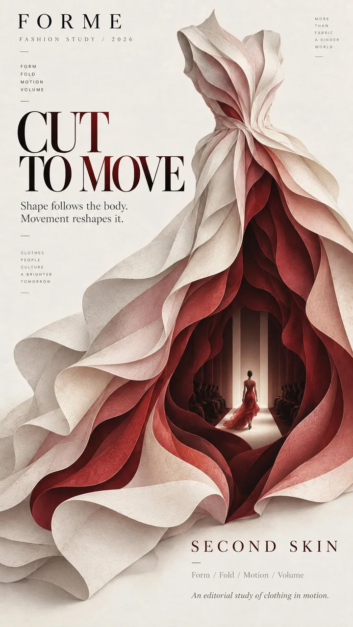
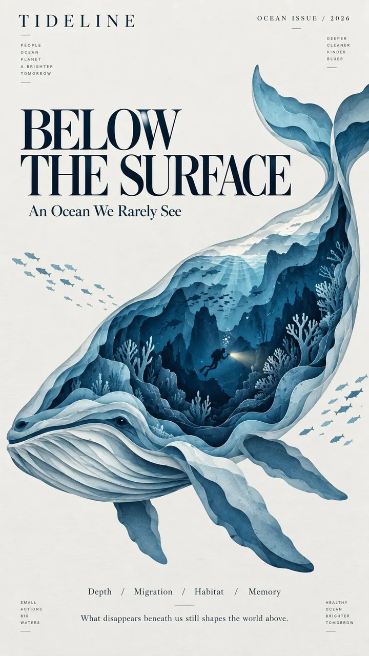
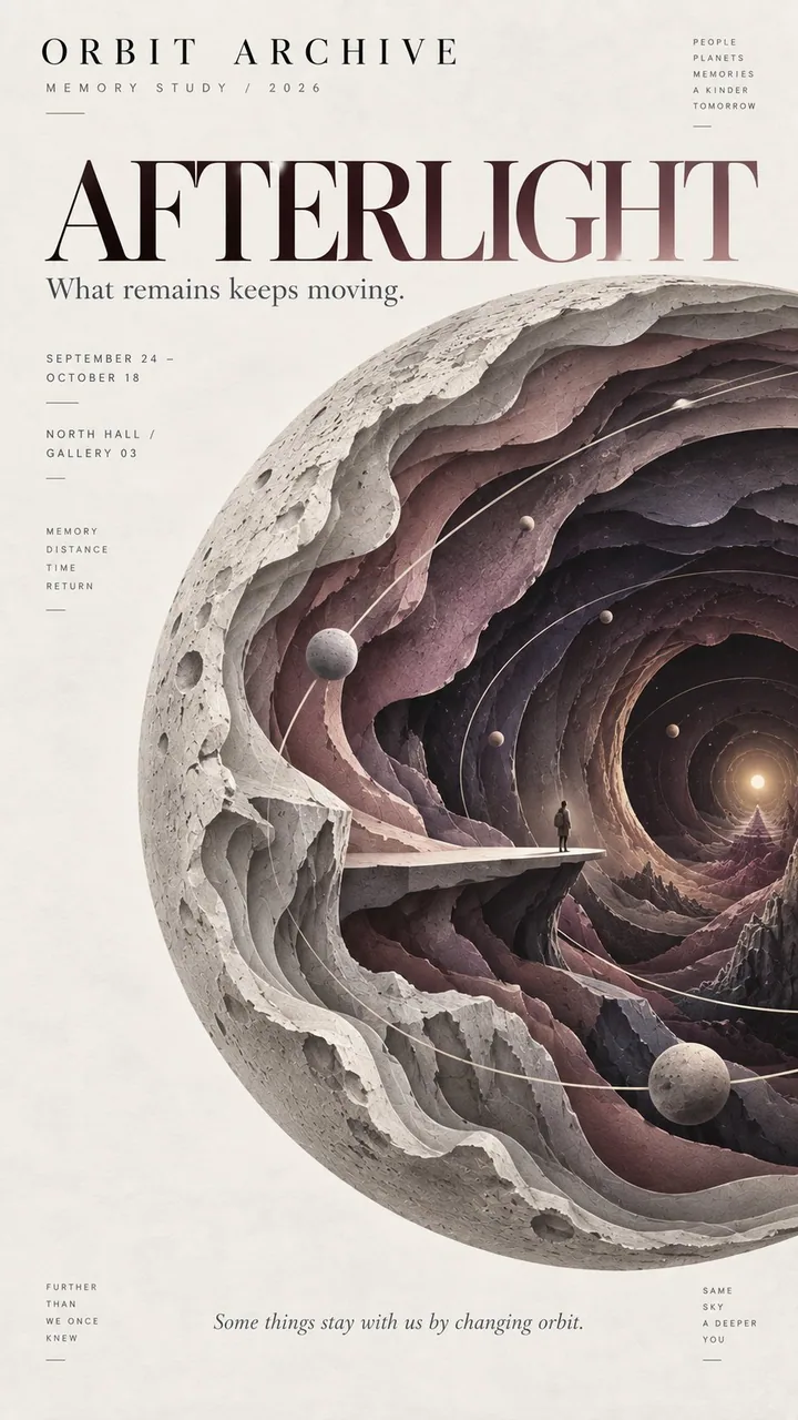
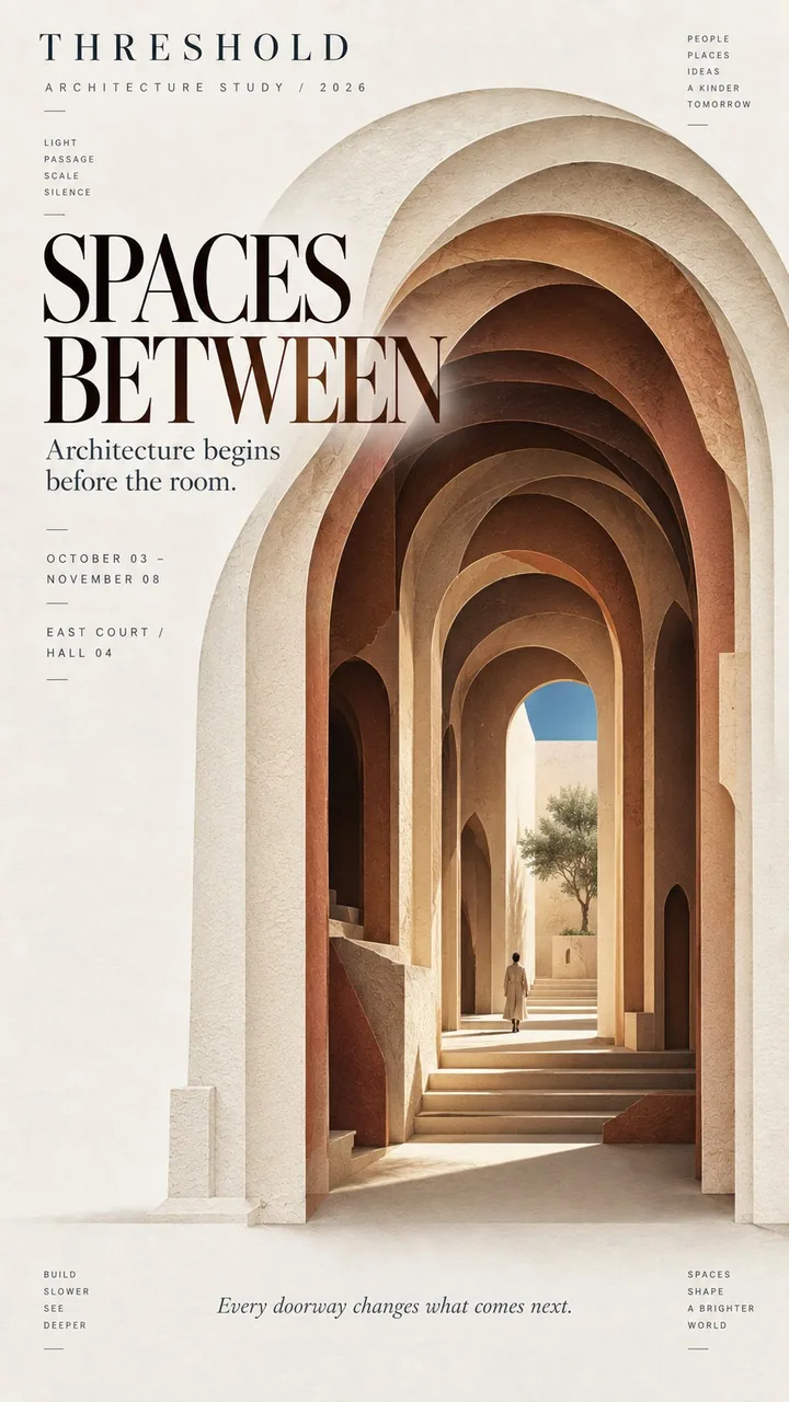
プロンプト
Theme: {fashion / ocean / memory / architecture / other}
Title: {main title}
Main silhouette: {dress / whale / planet / arch / other bold shape}
Inner world: {runway / deep ocean / memory space / courtyard / other scene}
Color palette: {3–5 restrained colors}
Editorial tone: {fashion / cultural / artistic / architectural}
Aspect ratio: 9:16

Create a refined layered paper-cut editorial poster built around one bold, instantly recognizable silhouette.

Let the main silhouette occupy around 60–70% of the composition. Inside it, create 6–9 layers of cut paper that gradually open into a deeper space. Each layer should follow the overall shape while changing naturally in scale, direction, and contour. Avoid perfectly even or mechanical concentric layers.

At the deepest point, reveal a small narrative scene related to the theme, such as a runway, underwater world, observation platform, courtyard, or another meaningful environment. Add one very small human figure when appropriate to create scale and a sense of discovery.

Use matte art-paper textures, clean cut edges, subtle natural paper fibers, and soft shallow shadows between layers. Keep the result visually flat and editorial rather than heavy 3D, foam-board, plastic, or CGI.

Use a restrained palette of 3–5 colors, moving from lighter outer layers to deeper, darker inner layers. Keep colors clean, solid, and consistent rather than using digital gradients or distressed textures.

Leave generous negative space for typography. Use a clear editorial hierarchy with one strong title, a small project or issue name, and only a few supporting details. The typography should feel like an art magazine, exhibition poster, fashion editorial, or cultural publication.

The visual rhythm should be: bold silhouette first, layered depth second, hidden inner world third.

From a distance, the poster should read as one strong shape. Up close, the viewer should discover the layered paper structure and the small world hidden inside.
日本語訳
Theme: {ファッション / 海洋 / 記憶 / 建築 / その他}
Title: {メインタイトル}
Main silhouette: {ドレス / クジラ / 惑星 / アーチ / その他の大胆な形}
Inner world: {ランウェイ / 深海 / 記憶の空間 / 中庭 / その他のシーン}
Color palette: {抑制された3〜5色}
Editorial tone: {ファッション / カルチャー / アート / 建築}
Aspect ratio: 9:16

大胆で一目でそれと分かるシルエットを中心に据えた、洗練されたレイヤード・ペーパーカットのエディトリアルポスターを制作する。

メインのシルエットを構図の約60〜70%占めさせる。その内部に、次第により深い空間へと開いていく6〜9層の切り紙を作る。各層は全体の形に従いつつ、大きさ・方向・輪郭が自然に変化すること。完全に均等な、あるいは機械的な同心円状の層は避ける。

最も深い地点で、テーマに関連する小さな物語のシーンを現す。たとえばランウェイ、海中世界、展望台、中庭など、意味のある環境。適切な場合はごく小さな人物を1人加え、スケール感と発見の感覚を生む。

マットなアートペーパーのテクスチャ、きれいな切断面、繊細な自然の紙の繊維、層間の柔らかく浅い影を使う。重い3D、発泡スチロールボード、プラスチック、CGI ではなく、視覚的にフラットでエディトリアルな結果に保つ。

抑制された3〜5色のパレットを使い、明るい外層から深く暗い内層へ移行する。デジタルグラデーションやダメージ加工テクスチャではなく、色はクリーンでソリッド、一貫性を保つ。

タイポグラフィのためにゆとりあるネガティブスペースを残す。強いタイトル1つ、小さなプロジェクト名または号数、ごく少数の補足ディテールという明確なエディトリアルヒエラルキーを使う。タイポグラフィはアート雑誌、展覧会ポスター、ファッションエディトリアル、文化出版物的に感じられること。

視覚的リズムは:まず大胆なシルエット、次に重なりの深さ、三番目に隠された内なる世界。

遠くから見ると、ポスターは1つの強い形として読めるべき。近くで見ると、鑑賞者は重なった紙の構造と、内部に隠された小さな世界を発見する。
出典
- 原作者
- MrLarus
- 公開日
- 2026-09-11
- 原典
- 元の投稿を見る ↗
- 収録元
- xianyu110/awesome-gpt-image2.5 · 2098408977008676918 · MIT