종이 오려내기 포스터 4연작: 한 겹을 자르면 작은 세계가 나온다
CUT TO MOVE / BELOW THE SURFACE / AFTERLIGHT / SPACES BETWEEN——큰 실루엣 안에 종이 6–9겹을 쌓고, 깊은 곳에 서사를 숨긴다. 전시/문화 포스터 레시피로 슬롯 교체 가능.
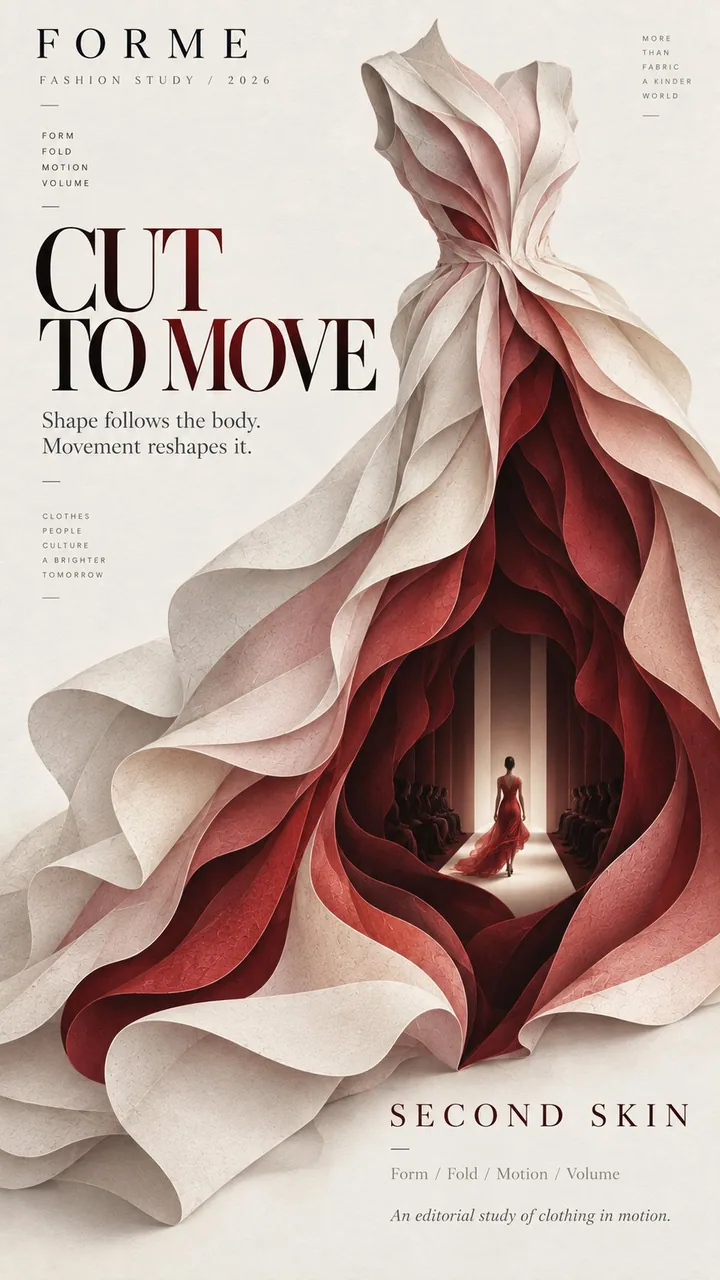
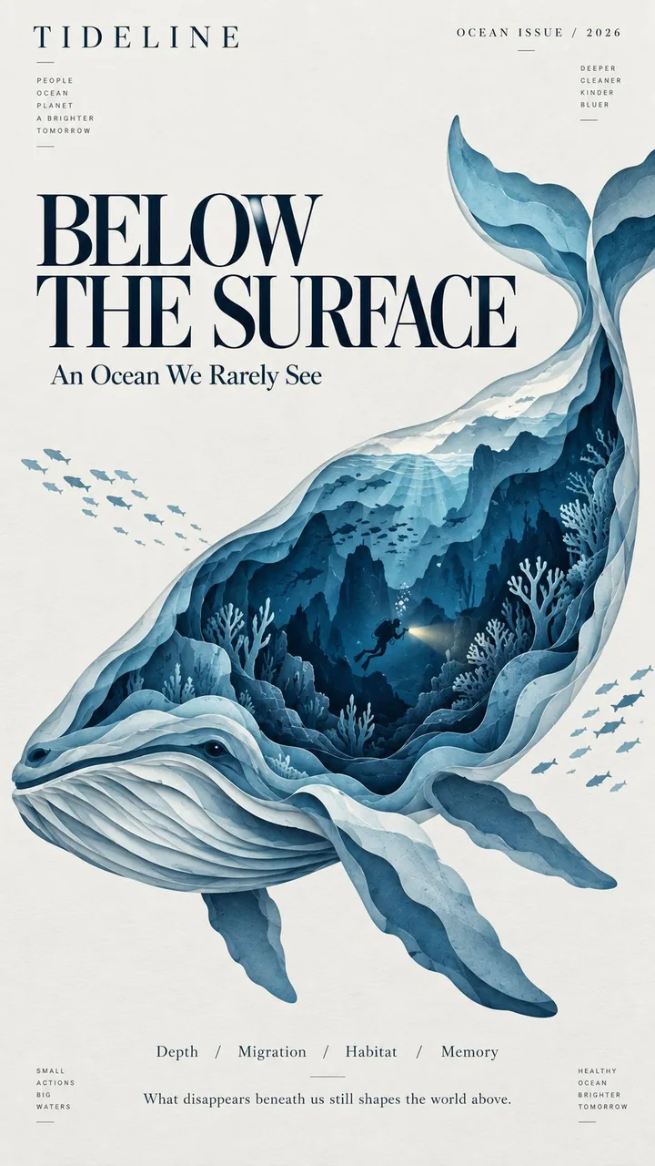
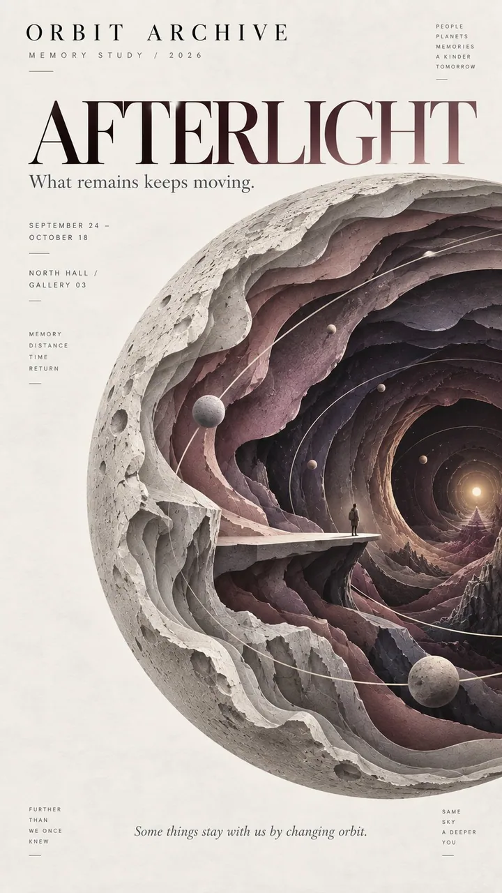
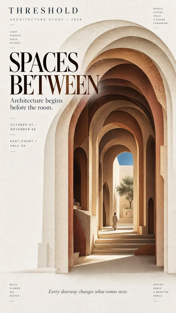
프롬프트
Theme: {fashion / ocean / memory / architecture / other}
Title: {main title}
Main silhouette: {dress / whale / planet / arch / other bold shape}
Inner world: {runway / deep ocean / memory space / courtyard / other scene}
Color palette: {3–5 restrained colors}
Editorial tone: {fashion / cultural / artistic / architectural}
Aspect ratio: 9:16

Create a refined layered paper-cut editorial poster built around one bold, instantly recognizable silhouette.

Let the main silhouette occupy around 60–70% of the composition. Inside it, create 6–9 layers of cut paper that gradually open into a deeper space. Each layer should follow the overall shape while changing naturally in scale, direction, and contour. Avoid perfectly even or mechanical concentric layers.

At the deepest point, reveal a small narrative scene related to the theme, such as a runway, underwater world, observation platform, courtyard, or another meaningful environment. Add one very small human figure when appropriate to create scale and a sense of discovery.

Use matte art-paper textures, clean cut edges, subtle natural paper fibers, and soft shallow shadows between layers. Keep the result visually flat and editorial rather than heavy 3D, foam-board, plastic, or CGI.

Use a restrained palette of 3–5 colors, moving from lighter outer layers to deeper, darker inner layers. Keep colors clean, solid, and consistent rather than using digital gradients or distressed textures.

Leave generous negative space for typography. Use a clear editorial hierarchy with one strong title, a small project or issue name, and only a few supporting details. The typography should feel like an art magazine, exhibition poster, fashion editorial, or cultural publication.

The visual rhythm should be: bold silhouette first, layered depth second, hidden inner world third.

From a distance, the poster should read as one strong shape. Up close, the viewer should discover the layered paper structure and the small world hidden inside.
한국어 번역
Theme: {패션 / 바다 / 기억 / 건축 / 기타}
Title: {메인 타이틀}
Main silhouette: {드레스 / 고래 / 행성 / 아치 / 기타 대담한 형태}
Inner world: {런웨이 / 심해 / 기억 공간 / 안뜰 / 기타 장면}
Color palette: {3–5가지 절제된 색}
Editorial tone: {패션 / 문화 / 예술 / 건축}
Aspect ratio: 9:16

하나의 대담하고 즉시 알아볼 수 있는 실루엣을 중심으로 세련된 레이어드 종이 오려내기 에디토리얼 포스터를 만들어라.

메인 실루엣이 구도의 약 60–70%를 차지하게 하라. 그 안에 점차 더 깊은 공간으로 열리는 오려낸 종이 6–9겹을 만들어라. 각 겹은 전체 형태를 따르되 크기, 방향, 윤곽이 자연스럽게 달라져야 한다. 완벽하게 균일하거나 기계적인 동심원 레이어는 피하라.

가장 깊은 지점에서 주제와 관련된 작은 서사 장면을 드러내라. 예를 들어 런웨이, 수중 세계, 전망대, 안뜰 또는 다른 의미 있는 환경. 적절할 때 아주 작은 인물 하나를 더해 스케일과 발견의 느낌을 만들어라.

무광 아트지 질감, 깔끔한 절단면, 은은한 천연 종이 섬유, 레이어 사이의 부드럽고 얕은 그림자를 사용하라. 결과물은 무겁게 3D 같거나 폼보드, 플라스틱, CGI 같지 않고 시각적으로 평면적이고 에디토리얼하게 유지하라.

3–5가지 색의 절제된 팔레트를 사용해 밝은 바깥 레이어에서 더 깊고 어두운 안쪽 레이어로 이동하라. 디지털 그라디언트나 거친 질감 대신 색을 깨끗하고 단색이며 일관되게 유지하라.

타이포그래피를 위해 넉넉한 여백을 남겨라. 강한 타이틀 하나, 작은 프로젝트나 호(號) 이름, 그리고 몇 가지 보조 디테일만 있는 명확한 에디토리얼 위계를 사용하라. 타이포그래피는 아트 매거진, 전시 포스터, 패션 에디토리얼, 문화 출판물처럼 느껴져야 한다.

시각적 리듬은 다음과 같아야 한다: 대담한 실루엣이 먼저, 레이어드 깊이가 둘째, 숨겨진 내면 세계가 셋째.

멀리서 보면 포스터는 하나의 강한 형태로 읽혀야 한다. 가까이서 보면 보는 사람이 레이어드 종이 구조와 그 안에 숨겨진 작은 세계를 발견해야 한다.
출처
- 원작자
- MrLarus
- 게시일
- 2026-09-11
- 원문 출처
- 원문 보기 ↗
- 수록 출처
- xianyu110/awesome-gpt-image2.5 · 2098408977008676918 · MIT