巨大バケツ都市ポスター:スケールの錯覚はミニチュア街区で固定する
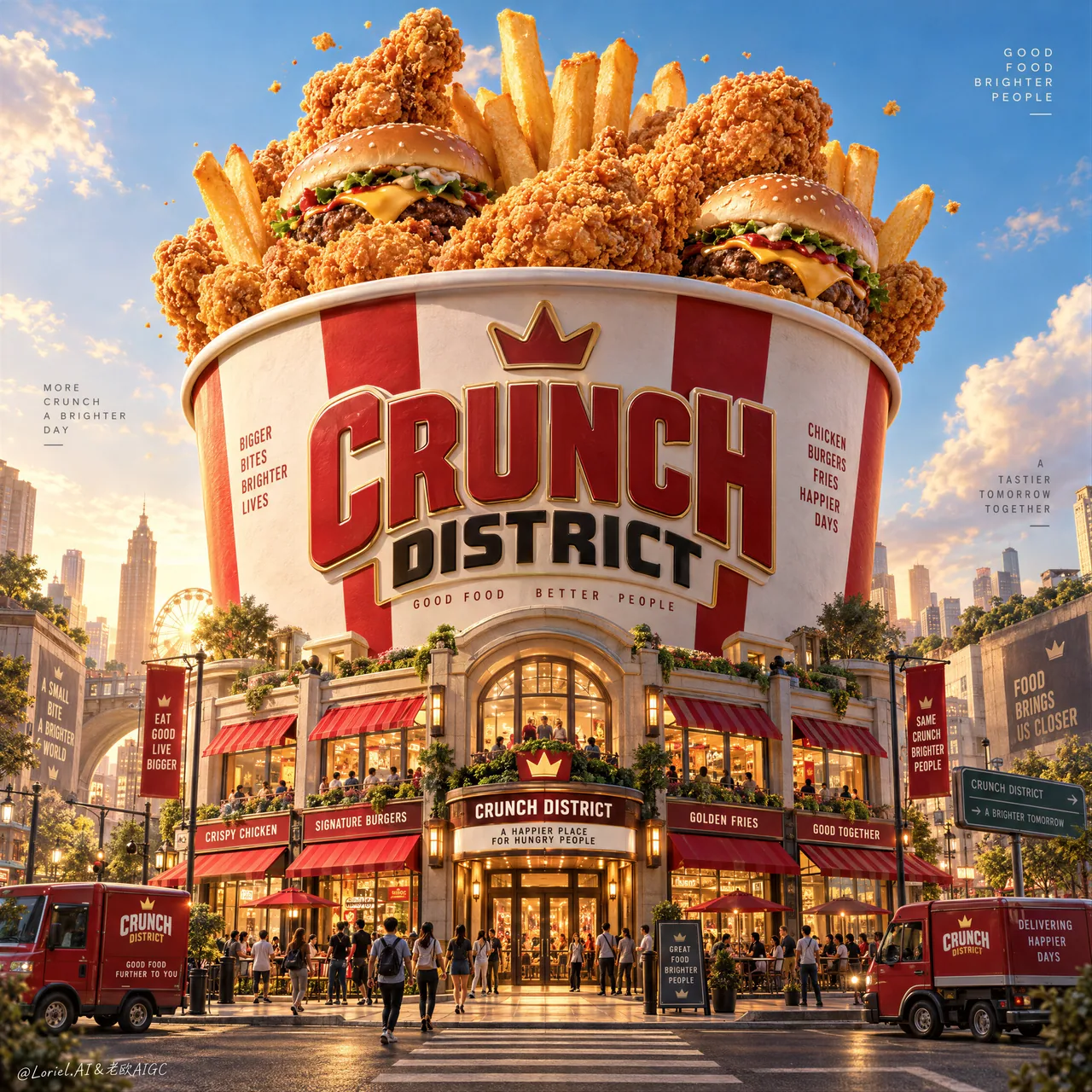
街角から見上げる巨大フライドチキンバケツ、その土台からミニ店舗街が生える。建築で商品のスケールを測るファストフードKVの教科書。
プロンプト
Create a Cannes-level ultra-premium fast-food advertising poster for a fictional brand called CRUNCH DISTRICT, preserving the exact structural logic of a monumental bucket-city campaign while merging narrative spectacle, forensic food realism, and curatorial restraint into one resolved image. The composition is vertical and cinematic: one colossal fried-chicken bucket rises in the center like an urban landmark, overflowing with hero fast-food items, while its lower structure transforms into a compact branded street district with storefronts, awnings, food kiosks, tiny pedestrians, and a few parked delivery vehicles. The image must feel like an entire city built around appetite, yet remain clean, disciplined, and unmistakably product-led.

Core composition: use a low street-level perspective looking slightly upward so the bucket dominates the skyline from lower frame to upper-middle frame. The giant bucket must be perfectly centered and visually stable, with premium dimensional branding integrated on the front as the main architectural identity mark, such as “CRUNCH DISTRICT”. From the bucket opening, let oversized fried chicken pieces, upright fries, and a small number of burgers emerge like a celebratory edible skyline. Keep the upper sky open and breathable, with only a few sculptural cloud forms and a sparse scattering of tiny crumbs or coating particles. The bucket remains the unquestioned hero; the surrounding city only reinforces its myth.

Orbit atmosphere: the poster should feel like a legendary fast-food district at the height of its golden-hour energy, as if the city has gathered around a sacred monument of crunch. The streets below suggest excitement, gathering, and ritual, but not chaos. Tiny figures, storefront lights, and food trucks create the emotional impression of a living destination, while the oversized foods above feel like a dream of abundance made real. The tone should be joyful, larger-than-life, and cinematic, yet mature enough to feel like an international award-winning campaign rather than a theme-park illustration.

Transit realism: render every food and architectural surface with commercial-grade precision. The fried chicken must show layered craggy crust, realistic breading granules, warm oil-sheen glints, crackled edges, and dense golden-orange browning with deeper amber shadows in the creases. The fries should stand upright with believable rigidity, lightly salted surfaces, faint blistering, and clear potato structure. The burgers should show soft glossy buns, seared patties, clean cheese melt, and minimal but readable fillings. The bucket itself must feel like premium printed packaging at enormous scale, with crisp label edges, subtle paperboard texture, smooth curvature, and believable structural volume. The street-level district must carry refined storefront materials, striped awnings, glass reflections, painted trims, asphalt texture, signage relief, and small vehicle detail that all feel physically grounded.

Port restraint: simplify the visual system so the grandeur feels curated rather than overloaded. Keep only the giant bucket, a select number of floating hero foods, a handful of cloud shapes, a compact but rich architectural base, and a few sparse atmospheric crumbs. Reduce excessive signage, over-busy urban clutter, and random decorative elements. Let the contrast between monumental object and miniature city create the intelligence of the composition. The poster should feel more like a luxury exhibition image for fast food culture than a noisy retail ad.

Street-district design: build the base of the bucket into an elegant branded neighborhood with 4–6 visible storefront fronts, a central entrance, a few lit windows, one or two delivery vans, and a controlled number of tiny pedestrians interacting naturally in the street. Include a crosswalk or narrow roadway in the foreground to ground the viewer in the city scale. The small architecture should feel lively and precise, but still secondary to the giant bucket and hero foods above.

Lighting: use high-end warm daylight with slight golden-hour character. The upper food elements catch the brightest sunlight, creating premium highlights on chicken crust, fry edges, and burger buns. The bucket surface should carry soft sculptural shading and subtle frontal readability. At street level, introduce slightly warmer reflected light and refined storefront glows to deepen the sense of place. Keep shadows rich but never muddy, and avoid dead black areas.

Material and texture: emphasize crunchy crust topography, fry salt crystals, burger bun gloss, soft paperboard bucket finish, sign lettering depth, glass storefront reflections, painted architectural trims, tiny street objects, and subtle atmospheric dust. Every material must feel photographically plausible and luxuriously retouched.

Color hierarchy: 60% fried-gold, creamy bucket white, and luminous sky blue; 30% ketchup red, warm caramel browns, and urban neutral shadows; 10% green, teal, and sign-light accents in tiny controlled touches. The palette must feel appetizing, festive, and internationally premium.

Design intent: the final poster must preserve the exact impact logic of a giant central bucket monument, overflowing hero food, a miniature branded city at its base, and a clean sky-framed vertical composition, while merging Orbit atmosphere, Transit realism, and Port curatorial restraint into one complete fast-food myth image. The bucket is the city, the city is the brand, and the brand is the appetite.

Rendering style: ultra-photoreal luxury fast-food advertising, cinematic branded food-world architecture, premium packaging monument, highly detailed miniature urban district, world-class commercial retouching, clean graphic hierarchy, appetizing hero-food realism, print-ready finish.

Negative prompt: copied source text, real brand names, cartoon food, plastic-looking chicken, low-detail fries, cheap burger styling, cluttered signage, unreadable main logo, warped bucket geometry, muddy colors, distorted street perspective, excessive crumbs, chaotic crowds, dirty shadows, black blotches, watermark
日本語訳
CRUNCH DISTRICT という架空ブランドのための、カンヌ級の超プレミアムなファストフード広告ポスターを制作する。記念碑的なバケツ都市キャンペーンの構造論理を正確に保ちつつ、物語的なスペクタクル、緻密なフードリアリズム、キュレーション的な抑制を一つの完成されたイメージに融合させる。構図は垂直でシネマティック:巨大なフライドチキンバケツが都市のランドマークのように中央にそびえ、ヒーローとなるファストフードアイテムが溢れ出す。一方、その下部構造は、店舗、オーニング、フードキオスク、小さな通行人、駐車した数台の配送車を備えたコンパクトなブランド街街区へと変容する。イメージは食欲を中心に築かれた一つの都市のように感じられなければならないが、同時にクリーンで、規律正しく、紛れもなく商品主導であり続けること。

コア構図:低い街路レベルの視点からやや見上げるようにし、バケツが下フレームから中段上部までスカイラインを支配するようにする。巨大なバケツは完全に中央に配置され、視覚的に安定していること。前面にはプレミアムな立体ブランディングを主要な建築的アイデンティティマークとして統合する(例:“CRUNCH DISTRICT”)。バケツの開口部からは、特大のフライドチキン、直立したフライドポテト、少数のバーガーが、祝福の食べられるスカイラインのように現れる。上部の空は開放的で呼吸できるように保ち、彫刻的な雲の形をわずかに、そして小さなパン粉や衣の粒子をまばらに散らすだけにする。バケツは疑いなく主役であり続け、周囲の都市はその神話を補強するだけにする。

オービットの雰囲気:ポスターは、黄金時刻のエネルギーが最高潮にある伝説的なファストフード街区のように感じられるべきで、まるで都市がクランチの聖なる記念碑の周りに集まったかのよう。下の通りは興奮、集い、儀式を感じさせるが、混沌ではない。小さな人物、店舗の灯り、フードトラックが生きた目的地という感情的印象を生み出し、上方の特大フードは豊かさの夢が現実になったように感じられる。トーンは喜びに満ち、人生より大きく、シネマティックでありながら、テーマパークのイラストではなく国際的な受賞キャンペーンと感じられるほど成熟していること。

トランジット・リアリズム:すべての食べ物と建築表面を商業グレードの精度で描画する。フライドチキンは層状のゴツゴツした衣、リアルな衣の粒、温かい油の艶のきらめき、ひび割れた縁、濃い黄金オレンジの焼き色、折り目に深い琥珀色の影を示すこと。フライドポテトは説得力のある硬さで直立し、軽く塩をふられた表面、かすかな膨れ、明確なジャガイモの構造を示すこと。バーガーは柔らかく光沢のあるバンズ、炙られたパティ、きれいに溶けたチーズ、最小限だが読み取れるフィリングを示すこと。バケツ自体は、巨大なスケールのプレミアム印刷パッケージのように感じられ、くっきりしたラベルの縁、繊細な板紙のテクスチャ、滑らかな湾曲、説得力のある構造的ボリュームを備えること。街路レベルの街区は、洗練された店舗素材、縞模様のオーニング、ガラスの反射、塗装されたトリム、アスファルトのテクスチャ、看板の浮き彫り、小さな車両のディテールを備え、すべてが物理的に地に足がついていると感じられること。

ポートの抑制:視覚システムを単純化し、壮大さが過負荷ではなくキュレーションされたものと感じられるようにする。巨大なバケツ、厳選された数の浮かぶヒーローフード、いくつかの雲の形、コンパクトだが豊かな建築的基盤、そしてまばらな雰囲気のパン粉のみを残す。過剰な看板、雑然とした都市の要素、ランダムな装飾要素を減らす。記念碑的オブジェクトとミニチュア都市のコントラストが構図の知性を生むようにする。ポスターは騒がしい小売広告よりも、ファストフード文化のための高級展覧会イメージのように感じられるべき。

街街区のデザイン:バケツの基部を、4〜6の見える店舗正面、中央入口、いくつかの灯りがついた窓、1〜2台の配送バン、そして通りで自然に交流する制御された数の小さな通行人を備えた、エレガントなブランド地区として構築する。前景に横断歩道または狭い車道を入れ、見る者を都市スケールに接地させる。小さな建築は生き生きと精密に感じられるべきだが、それでも上方の巨大なバケツとヒーローフードに対して二次的であること。

ライティング:ハイエンドで温かい昼光を使い、わずかに黄金時刻の性格を持たせる。上方のフード要素は最も明るい日光を受け、チキンの衣、ポテトの縁、バーガーバンズにプレミアムなハイライトを生む。バケツ表面は柔らかな彫刻的陰影と、控えめな正面からの読みやすさを備えること。街路レベルでは、やや温かい反射光と洗練された店舗の輝きを導入し、場所の感覚を深める。影は豊かに、しかし決して濁らせず、死んだ黒い領域を避ける。

マテリアルとテクスチャ:クリスピーな衣の起伏、ポテトの塩の結晶、バーガーバンズの艶、柔らかな板紙バケツの仕上げ、看板の文字の立体感、ガラス店舗の反射、塗装された建築トリム、小さな街のオブジェクト、かすかな大気の塵を強調する。すべての素材は写真的にもっともらしく、贅沢にレタッチされていると感じられること。

色彩階層:60%のフライドゴールド、クリーミーなバケツの白、輝く空の青。30%のケチャップレッド、温かいキャラメルブラウン、都市的な中立の影。10%の緑、ティール、看板の光のアクセントを小さく制御されたタッチで。パレットは食欲をそそり、祝祭的で、国際的にプレミアムに感じられること。

デザイン意図:最終ポスターは、中央の巨大バケツ記念碑、溢れ出すヒーローフード、その基部のミニチュアブランド都市、清潔な空に縁取られた垂直構図という正確なインパクト論理を保ちつつ、オービットの雰囲気、トランジットのリアリズム、ポートのキュレーション的抑制を一つの完全なファストフード神話イメージに融合すること。バケツは都市であり、都市はブランドであり、ブランドは食欲である。

レンダリングスタイル:超写実的な高級ファストフード広告、シネマティックなブランドフード世界の建築、プレミアムパッケージ記念碑、高精細なミニチュア都市街区、世界クラスの商業レタッチ、クリーンなグラフィック階層、食欲をそそるヒーローフードのリアリズム、印刷対応の仕上げ。

ネガティブプロンプト:コピー元テキスト、実在ブランド名、カートゥーンの食べ物、プラスチックのようなチキン、低ディテールのポテト、安っぽいバーガースタイリング、雑然とした看板、読み取れないメインロゴ、歪んだバケツ形状、濁った色、歪んだ街路パース、過剰なパン粉、混沌とした群衆、汚い影、黒い染み、ウォーターマーク
出典
- 原作者
- ou_zhen599
- 公開日
- 2026-09-14
- 原典
- 元の投稿を見る ↗
- 収録元
- xianyu110/awesome-gpt-image2.5 · 2099489998882177205 · MIT