거대한 통 도시 포스터: 스케일 착시는 미니어처 거리로 못 박는다
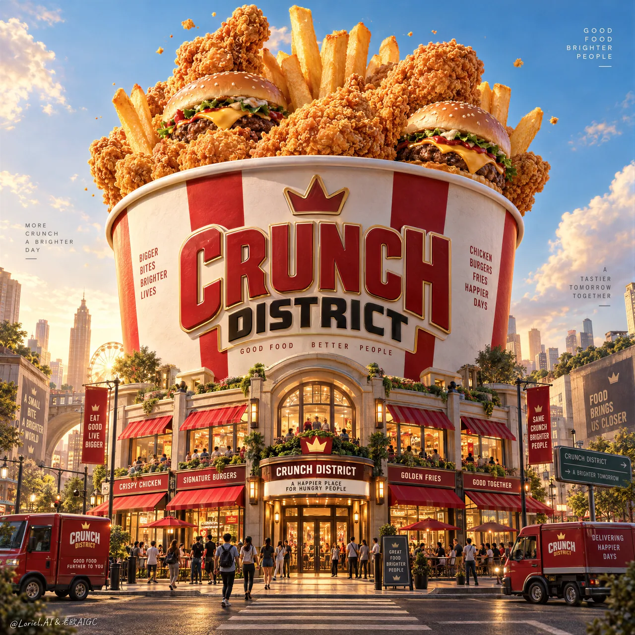
길모퉁이에서 올려다본 거대한 프라이드치킨 통, 밑동에는 미니 매장가가 자라난다. 건축으로 제품의 스케일을 재는 패스트푸드 KV 교과서.
프롬프트
Create a Cannes-level ultra-premium fast-food advertising poster for a fictional brand called CRUNCH DISTRICT, preserving the exact structural logic of a monumental bucket-city campaign while merging narrative spectacle, forensic food realism, and curatorial restraint into one resolved image. The composition is vertical and cinematic: one colossal fried-chicken bucket rises in the center like an urban landmark, overflowing with hero fast-food items, while its lower structure transforms into a compact branded street district with storefronts, awnings, food kiosks, tiny pedestrians, and a few parked delivery vehicles. The image must feel like an entire city built around appetite, yet remain clean, disciplined, and unmistakably product-led.

Core composition: use a low street-level perspective looking slightly upward so the bucket dominates the skyline from lower frame to upper-middle frame. The giant bucket must be perfectly centered and visually stable, with premium dimensional branding integrated on the front as the main architectural identity mark, such as “CRUNCH DISTRICT”. From the bucket opening, let oversized fried chicken pieces, upright fries, and a small number of burgers emerge like a celebratory edible skyline. Keep the upper sky open and breathable, with only a few sculptural cloud forms and a sparse scattering of tiny crumbs or coating particles. The bucket remains the unquestioned hero; the surrounding city only reinforces its myth.

Orbit atmosphere: the poster should feel like a legendary fast-food district at the height of its golden-hour energy, as if the city has gathered around a sacred monument of crunch. The streets below suggest excitement, gathering, and ritual, but not chaos. Tiny figures, storefront lights, and food trucks create the emotional impression of a living destination, while the oversized foods above feel like a dream of abundance made real. The tone should be joyful, larger-than-life, and cinematic, yet mature enough to feel like an international award-winning campaign rather than a theme-park illustration.

Transit realism: render every food and architectural surface with commercial-grade precision. The fried chicken must show layered craggy crust, realistic breading granules, warm oil-sheen glints, crackled edges, and dense golden-orange browning with deeper amber shadows in the creases. The fries should stand upright with believable rigidity, lightly salted surfaces, faint blistering, and clear potato structure. The burgers should show soft glossy buns, seared patties, clean cheese melt, and minimal but readable fillings. The bucket itself must feel like premium printed packaging at enormous scale, with crisp label edges, subtle paperboard texture, smooth curvature, and believable structural volume. The street-level district must carry refined storefront materials, striped awnings, glass reflections, painted trims, asphalt texture, signage relief, and small vehicle detail that all feel physically grounded.

Port restraint: simplify the visual system so the grandeur feels curated rather than overloaded. Keep only the giant bucket, a select number of floating hero foods, a handful of cloud shapes, a compact but rich architectural base, and a few sparse atmospheric crumbs. Reduce excessive signage, over-busy urban clutter, and random decorative elements. Let the contrast between monumental object and miniature city create the intelligence of the composition. The poster should feel more like a luxury exhibition image for fast food culture than a noisy retail ad.

Street-district design: build the base of the bucket into an elegant branded neighborhood with 4–6 visible storefront fronts, a central entrance, a few lit windows, one or two delivery vans, and a controlled number of tiny pedestrians interacting naturally in the street. Include a crosswalk or narrow roadway in the foreground to ground the viewer in the city scale. The small architecture should feel lively and precise, but still secondary to the giant bucket and hero foods above.

Lighting: use high-end warm daylight with slight golden-hour character. The upper food elements catch the brightest sunlight, creating premium highlights on chicken crust, fry edges, and burger buns. The bucket surface should carry soft sculptural shading and subtle frontal readability. At street level, introduce slightly warmer reflected light and refined storefront glows to deepen the sense of place. Keep shadows rich but never muddy, and avoid dead black areas.

Material and texture: emphasize crunchy crust topography, fry salt crystals, burger bun gloss, soft paperboard bucket finish, sign lettering depth, glass storefront reflections, painted architectural trims, tiny street objects, and subtle atmospheric dust. Every material must feel photographically plausible and luxuriously retouched.

Color hierarchy: 60% fried-gold, creamy bucket white, and luminous sky blue; 30% ketchup red, warm caramel browns, and urban neutral shadows; 10% green, teal, and sign-light accents in tiny controlled touches. The palette must feel appetizing, festive, and internationally premium.

Design intent: the final poster must preserve the exact impact logic of a giant central bucket monument, overflowing hero food, a miniature branded city at its base, and a clean sky-framed vertical composition, while merging Orbit atmosphere, Transit realism, and Port curatorial restraint into one complete fast-food myth image. The bucket is the city, the city is the brand, and the brand is the appetite.

Rendering style: ultra-photoreal luxury fast-food advertising, cinematic branded food-world architecture, premium packaging monument, highly detailed miniature urban district, world-class commercial retouching, clean graphic hierarchy, appetizing hero-food realism, print-ready finish.

Negative prompt: copied source text, real brand names, cartoon food, plastic-looking chicken, low-detail fries, cheap burger styling, cluttered signage, unreadable main logo, warped bucket geometry, muddy colors, distorted street perspective, excessive crumbs, chaotic crowds, dirty shadows, black blotches, watermark
한국어 번역
CRUNCH DISTRICT라는 가상 브랜드를 위한 칸 수준의 초프리미엄 패스트푸드 광고 포스터를 제작하라. 거대한 버킷 도시 캠페인의 정확한 구조 논리를 그대로 유지하면서, 서사적 스펙터클과 포렌식 수준의 음식 사실주의, 큐레토리얼한 절제를 하나의 완성된 이미지로 융합하라. 구도는 수직적이고 영화적이다: 하나의 거대한 프라이드치킨 통이 도시의 랜드마크처럼 중앙에 솟아오르고, 히어로 패스트푸드 아이템들이 넘쳐흐르며, 그 하부 구조는 매장 정면, 어닝, 푸드 키오스크, 작은 보행자들, 주차된 배달 차량 몇 대가 있는 콤팩트한 브랜드 거리 지구로 변모한다. 이미지는 식욕을 중심으로 지어진 하나의 도시처럼 느껴져야 하지만, 동시에 깔끔하고 절제되어 있으며 명백히 제품 중심이어야 한다.

핵심 구도: 낮은 거리 시점에서 약간 위를 올려다보는 원근을 사용해, 버킷이 화면 하단부터 중상단까지 스카이라인을 지배하게 하라. 거대한 버킷은 완벽하게 중앙에 정렬되고 시각적으로 안정되어야 하며, 전면에는 “CRUNCH DISTRICT”와 같은 프리미엄 입체 브랜딩이 주요 건축적 아이덴티티 표식으로 통합되어야 한다. 버킷 입구에서는 오버사이즈 프라이드치킨 조각, 세워진 감자튀김, 소량의 버거가 축제처럼 먹을 수 있는 스카이라인을 이루며 솟아오르게 하라. 상단 하늘은 열린 상태로 여유 있게 유지하고, 조형적인 구름 형태 몇 개와 흩어진 미세한 부스러기나 튀김옷 입자만 드물게 배치하라. 버킷은 의심할 바 없는 주인공으로 남고, 주변 도시는 그 신화를 강화할 뿐이다.

Orbit 분위기: 포스터는 골든아워 에너지가 절정에 달한 전설적인 패스트푸드 지구처럼 느껴져야 하며, 마치 도시가 바삭함의 신성한 기념비 주위에 모여든 듯해야 한다. 아래의 거리들은 흥분과 모임, 의식을 암시하되 혼란은 아니어야 한다. 작은 인물들, 매장 불빛, 푸드트럭은 살아 있는 목적지라는 정서적 인상을 만들고, 위쪽의 거대한 음식들은 풍요의 꿈이 현실이 된 것처럼 느껴져야 한다. 톤은 즐겁고, 실물보다 크고, 영화적이어야 하지만, 테마파크 일러스트가 아니라 국제적인 수상 캠페인처럼 느껴질 만큼 성숙해야 한다.

Transit 사실주의: 모든 음식과 건축 표면을 상업용 등급의 정밀도로 렌더링하라. 프라이드치킨은 층층이 거친 껍질, 사실적인 튀김옷 알갱이, 따뜻한 기름 광택, 갈라진 가장자리, 그리고 주름 속에 더 깊은 호박색 그림자가 있는 짙은 황금빛 주황 노릇함을 보여야 한다. 감자튀김은 믿을 만한 강직함으로 똑바로 서 있어야 하며, 살짝 소금이 뿌려진 표면, 희미한 물집, 또렷한 감자 조직을 보여야 한다. 버거는 부드럽고 윤기 나는 번, 잘 구워진 패티, 깔끔하게 녹은 치즈, 최소하지만 읽히는 속재료를 보여야 한다. 버킷 자체는 거대한 스케일의 프리미엄 인쇄 패키지처럼 느껴져야 하며, 또렷한 라벨 가장자리, 미세한 판지 질감, 매끄러운 곡률, 믿을 만한 구조적 부피감을 갖춰야 한다. 거리 수준의 지구는 세련된 매장 소재, 줄무늬 어닝, 유리 반사, 도장된 몰딩, 아스팔트 질감, 간판의 부조, 그리고 모두 물리적으로 접지된 느낌을 주는 작은 차량 디테일을 담아야 한다.

Port 절제: 시각 체계를 단순화하여 웅장함이 과부하가 아니라 큐레이션된 것처럼 느껴지게 하라. 거대한 버킷, 선택된 소수의 떠 있는 히어로 음식, 몇 개의 구름 형태, 콤팩트하지만 풍부한 건축적 기단, 그리고 드문드문한 대기 중 부스러기만 남겨라. 과도한 간판, 지나치게 번잡한 도시 잡동사니, 무작위 장식 요소를 줄여라. 기념비적 오브제와 미니어처 도시의 대비가 구도의 지성을 만들어내게 하라. 포스터는 시끄러운 소매 광고보다 패스트푸드 문화를 위한 럭셔리 전시 이미지처럼 느껴져야 한다.

거리 지구 디자인: 버킷의 기단을 4~6개의 보이는 매장 정면, 중앙 출입구, 불이 켜진 창문 몇 개, 배달 밴 한두 대, 그리고 거리에서 자연스럽게 상호작용하는 통제된 수의 작은 보행자들이 있는 우아한 브랜드 동네로 만들어라. 전경에 횡단보도나 좁은 차도를 포함해 관람자를 도시 스케일에 접지시켜라. 작은 건축은 생기 있고 정밀하게 느껴져야 하지만, 위의 거대한 버킷과 히어로 음식보다는 여전히 부차적이어야 한다.

조명: 약간 골든아워 성격이 있는 하이엔드의 따뜻한 주광을 사용하라. 상부의 음식 요소들은 가장 밝은 햇빛을 받아 치킨 껍질, 튀김 가장자리, 버거 번에 프리미엄 하이라이트를 만든다. 버킷 표면은 부드러운 조형적 명암과 은은한 정면 가독성을 지녀야 한다. 거리 수준에서는 약간 더 따뜻한 반사광과 세련된 매장 불빛을 도입해 장소감을 깊게 하라. 그림자는 풍부하되 결코 탁하지 않게 유지하고, 죽은 검은 영역을 피하라.

재질과 질감: 바삭한 껍질의 지형, 감자튀김의 소금 결정, 버거 번의 광택, 부드러운 판지 버킷 마감, 간판 글자의 깊이, 유리 매장 반사, 도장된 건축 몰딩, 작은 거리 사물, 은은한 대기 먼지를 강조하라. 모든 재질은 사진적으로 그럴듯하고 럭셔리하게 리터칭된 느낌이어야 한다.

색 위계: 60% 프라이드 골드, 크리미한 버킷 화이트, 빛나는 하늘 블루; 30% 케첩 레드, 따뜻한 캐러멜 브라운, 도시적 중성 그림자; 10% 그린, 틸, 간판 불빛 악센트를 아주 작고 통제된 터치로. 팔레트는 식욕을 돋우고 축제적이며 국제적으로 프리미엄하게 느껴져야 한다.

디자인 의도: 최종 포스터는 거대한 중앙 버킷 기념비, 넘쳐흐르는 히어로 음식, 기단의 미니어처 브랜드 도시, 하늘을 프레임으로 한 깔끔한 수직 구도라는 정확한 임팩트 논리를 유지하면서, Orbit 분위기와 Transit 사실주의, Port의 큐레토리얼 절제를 하나의 완성된 패스트푸드 신화 이미지로 융합해야 한다. 버킷이 도시이고, 도시가 브랜드이며, 브랜드가 식욕이다.

렌더링 스타일: 울트라 포토리얼 럭셔리 패스트푸드 광고, 영화적 브랜드 푸드 월드 건축, 프리미엄 패키징 기념비, 고도로 디테일한 미니어처 도시 지구, 세계적 수준의 상업 리터칭, 깔끔한 그래픽 위계, 식욕을 돋우는 히어로 푸드 사실주의, 인쇄 준비 완료 마감.

네거티브 프롬프트: 복사된 원본 텍스트, 실제 브랜드 이름, 만화 같은 음식, 플라스틱처럼 보이는 치킨, 디테일이 부족한 감자튀김, 값싼 버거 스타일링, 어수선한 간판, 읽을 수 없는 메인 로고, 뒤틀린 버킷 형상, 탁한 색, 왜곡된 거리 원근, 과도한 부스러기, 혼란스러운 군중, 더러운 그림자, 검은 얼룩, 워터마크
출처
- 원작자
- ou_zhen599
- 게시일
- 2026-09-14
- 원문 출처
- 원문 보기 ↗
- 수록 출처
- xianyu110/awesome-gpt-image2.5 · 2099489998882177205 · MIT