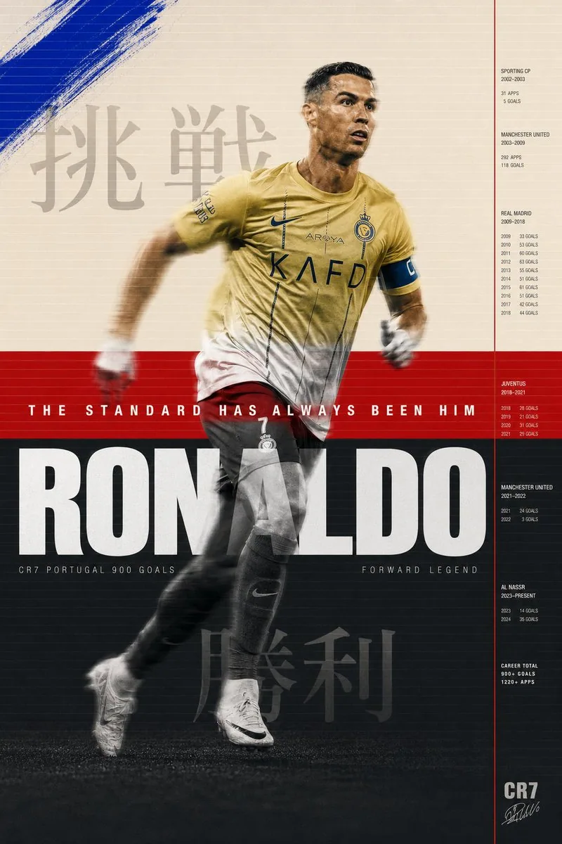
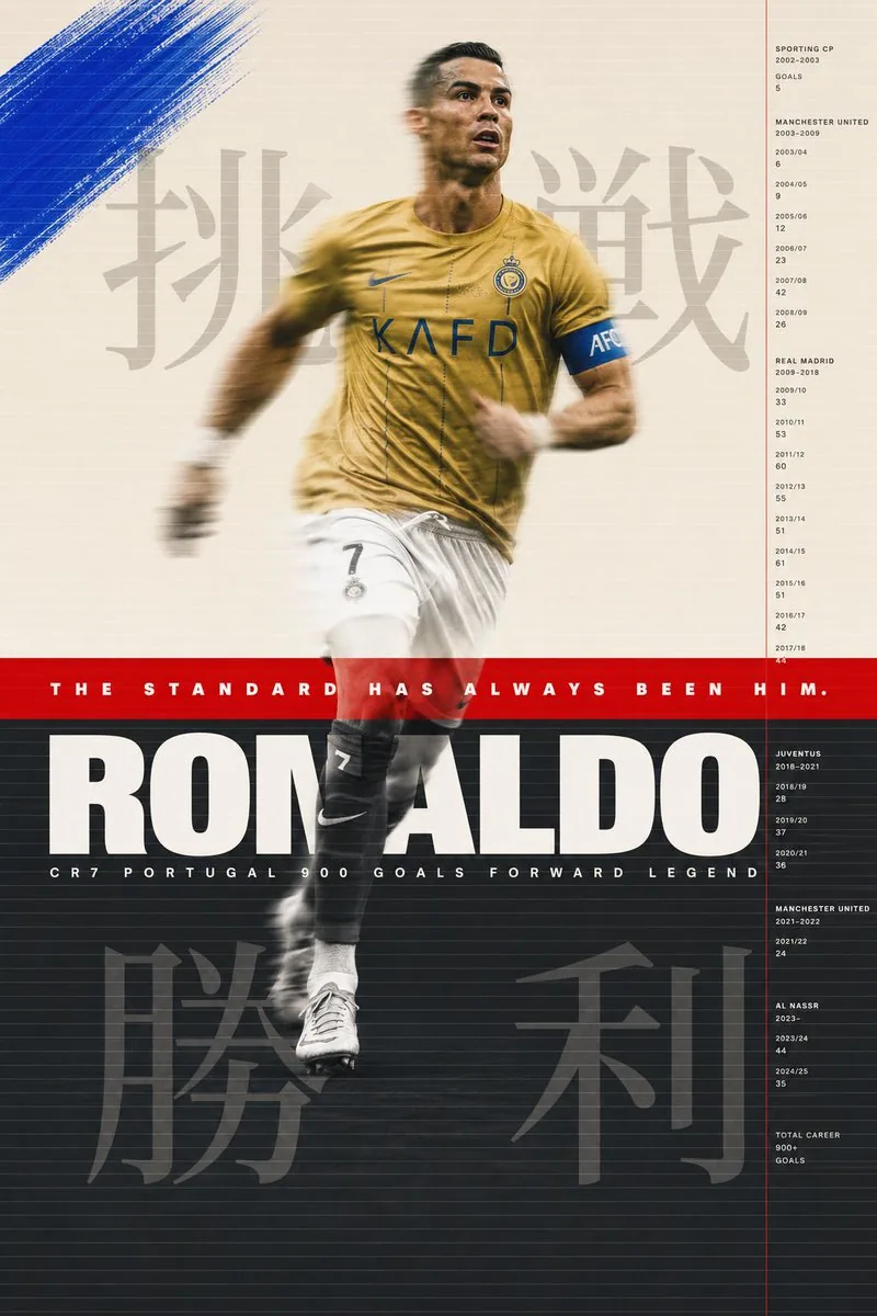
Cristiano Ronaldo sports poster. Background divided intothree horizontal zones. Top zone warm cream Pantone 9183Coccupying top 40% of poster. Middle zone signal redPantone 485C as a pure flat color band occupying exactly
8% of poster height at golden ratio point. Bottom zone
deep charcoal Pantone 432C occupying remaining 52%.
Three zones. Two colors and one neutral. The geometry
of the Portuguese flag deconstructed and reconstructedas graphic architecture.

His figure spans all three zones. Shot full body from
slight low angle. Al Nassr gold kit. Mid stride. Leftleg forward. Right arm back. The specific body positionof someone at absolute peak running velocity. Not a posedaction. A captured action. The body in the cream zonerendered in full color warm skin tones and gold kit. The
body in the red zone bleached to near white silhouette
where it intersects the red band. The body in the charcoal
zone rendered in black and white high contrast. Three color treatments on one continuous figure. The zones are notbackgrounds they are filters. Each one revealing a
different version of the same man.

Motion blur. His figure in slight motion blur at 1/250second shutter. The sharp elements his face his number 7his boot touching ground. The blurred elements his armsin motion his hair his loose kit fabric. The blurcommunicates what no still image can. The speed. The
relentlessness. The fact that he is never fully stopped.

Layered over the three zones across the full poster width.
A system of fine parallel horizontal lines. 0.3pt. Warm
white. At 25% opacity. Running edge to edge. Spaced 4mm
apart. The texture of a television scan line. Or a
printing registration grid. Or the lines on a ruledpage waiting to be written on. The lines are the sameacross all three zones changing color against each
background. White on cream barely visible. White on red
glowing. White on charcoal clear and strong. The same
line behaving differently in different worlds.

Paint intervention. In the cream zone only. Upper left
quadrant. Raw gestural brushstroke in cobalt blue
Pantone 2728C. A single mark. Applied with a wide brush
at 45 degrees. The blue unexpected against the cream.
Not part of the flag system. A disruption. An intervention
from outside the established color logic. The color of
a sky he is always looking toward.

Japanese typography. Large scale. Behind photograph layer.
In cream zone behind his upper body. 挑戦 pronounced
chōsen meaning challenge. Rendered at 200pt Noto Serif
CJK deep charcoal at 15% opacity. The kanji visible
through the photographic layer like a thought behind
a face. In charcoal zone behind his lower body.
勝利 pronounced shōri meaning victory. Same scale
same treatment. Beginning and end. Challenge and victory.
Above and below.

Information system. Right side of poster. Thin vertical
rule signal red 1px running full height. To its right
a column of data in Helvetica Neue Light 6pt tracking
200 bone white on charcoal and cream on red adjusting
for legibility. Club career timeline. Years at each
club. Goals per season. The data as a river running
parallel to the figure. The career in numbers beside
the career in motion.

Typography primary. Across the red zone. Full poster
width. The red band is a stage for one typographic event.
Futura PT Heavy. All caps. White. 36pt. Tracking 300.
Perfectly centered vertically in the red band. THE
STANDARD HAS ALWAYS BEEN HIM. The red band exists to
hold this sentence. Everything else in the poster exists
to justify it.

Below the red band entering the charcoal zone. Full width.
Helvetica Neue Black Extended. White. 96pt. Tracking minus
10. RONALDO. The letters occupying the full width exactly
tracked to fit. The name as the foundation of the
charcoal zone. Below the name in same charcoal zone.
Helvetica Neue Light. 8pt. Tracking 600. Bone white.
CR7 PORTUGAL 900 GOALS FORWARD LEGEND. One line. All
the context needed. None of the decoration.

Art direction M/M Paris conceptual intelligence. Bureau
Borsche typographic sophistication. Wieden Kennedy
Amsterdam emotional directness. Nike Brand Design
production quality. All four present simultaneously
at their absolute peak.

Shot aesthetic Misan Harriman color and dignity. Ernst
Haas motion blur mastery. Gregory Heisler technical
perfection. Three photographers whose combined vision
makes something none of them would make alone.

Print format 70x100cm. 10K resolution. HDR. The three
zones printed in three separate ink passes on a
Heidelberg offset press. The red band overprinted twice
for maximum saturation. The charcoal zone with 7 color
process for maximum depth. The cream zone with minimum
ink for maximum paper feel.
日本語訳
クリスティアーノ・ロナウドのスポーツポスター。背景は3つの水平ゾーンに分割されている。上部ゾーンは温かみのあるクリーム色 Pantone 9183C で、ポスター上部の40%を占める。中央ゾーンはシグナルレッド Pantone 485C で、純粋なフラットカラーの帯として、黄金比の位置にポスター高さのちょうど8%を占める。下部ゾーンは深いチャコール Pantone 432C で、残りの52%を占める。3つのゾーン。2色と1つの中性色。ポルトガル国旗の幾何学を解体し、グラフィックアーキテクチャとして再構築したもの。

彼の姿は3つのゾーンすべてにまたがる。ややローアングルからの全身ショット。アル・ナスルのゴールドキット。走行の途中。左脚が前、右腕が後ろ。絶対的な最高速度で走る人の特有の身体の位置。ポーズをとった動作ではなく、切り取られた動作。クリーム色ゾーンにある身体はフルカラーの温かい肌の色調とゴールドキットで描画される。レッドゾーンにある身体は、赤い帯と交差する部分でほぼ白いシルエットにまで飛ばされる。チャコールゾーンにある身体は白黒のハイコントラストで描画される。1つの連続した人物に3つのカラートリートメント。ゾーンは背景ではなくフィルターである。それぞれが同じ男の異なるバージョンを明らかにする。

モーションブラー。彼の姿は1/250秒のシャッターでわずかなモーションブラーがかかっている。シャープな要素は、顔、背番号7、地面に触れるスパイク。ブレた要素は、動く腕、髪、ゆったりしたキットの生地。このブレは、静止画には決して伝えられないものを伝える。スピード。容赦のなさ。彼が決して完全には止まらないという事実。

ポスター全幅にわたり、3つのゾーンの上に重ねられる。細い平行な水平線のシステム。0.3pt。ウォームホワイト。不透明度25%。端から端まで走る。間隔は4mm。テレビの走査線の質感。あるいは印刷の見当合わせグリッド。あるいは、これから書き込まれるのを待つ罫線ページの線。線は3つのゾーンすべてで同一でありながら、それぞれの背景に対して色を変える。クリーム上の白はほとんど見えない。赤の上の白は発光する。チャコール上の白は明瞭で強い。同じ線が異なる世界で異なる振る舞いをする。

絵具による介入。クリームゾーンのみ。左上の象限。コバルトブルー Pantone 2728C による生々しいジェスチャー的な筆致。単一のマーク。幅広の筆で45度に適用。クリームに対して予期しない青。国旗のシステムの一部ではない。攪乱。確立された色彩論理の外側からの介入。彼がいつも見つめている空の色。

日本語タイポグラフィ。大サイズ。写真レイヤーの背後。クリームゾーンでは彼の上半身の背後に。挑戦(chōsen、意味は challenge)。200pt の Noto Serif CJK、深いチャコール、不透明度15%で描画。漢字は写真レイヤーを通して見え、顔の背後にある思考のように響く。チャコールゾーンでは下半身の背後に。勝利(shōri、意味は victory)。同じサイズ、同じ処理。始まりと終わり。挑戦と勝利。上と下。

情報システム。ポスターの右側。細い垂直罫線、シグナルレッド1px、全高にわたって走る。その右側にデータの列、Helvetica Neue Light 6pt、トラッキング200、チャコール上はボーンホワイト、赤上はクリーム(可読性のために調整)。クラブキャリアのタイムライン。各クラブでの年数。シーズンごとのゴール数。データは人物と平行に流れる川のように。数字で表されたキャリアが、動きの中のキャリアの隣に。

メインタイポグラフィ。レッドゾーンを横切る。ポスター全幅。赤い帯は1つのタイポグラフィックな出来事のための舞台。Futura PT Heavy。すべて大文字。白。36pt。トラッキング300。赤い帯の中で垂直方向に完全に中央揃え。THE STANDARD HAS ALWAYS BEEN HIM。赤い帯はこの一文を載せるために存在する。ポスターの他のすべては、それを正当化するために存在する。

赤い帯の下、チャコールゾーンに入る。全幅。Helvetica Neue Black Extended。白。96pt。トラッキング -10。RONALDO。文字は全幅を占め、ぴったり収まるようにトラッキングされる。名前はチャコールゾーンの基盤として。名前の下、同じチャコールゾーンに。Helvetica Neue Light。8pt。トラッキング600。ボーンホワイト。CR7 PORTUGAL 900 GOALS FORWARD LEGEND。一行。必要な文脈はすべて。装飾は一切なし。

アートディレクションは M/M Paris のコンセプチュアルな知性。Bureau Borsche のタイポグラフィックな洗練。Wieden Kennedy Amsterdam の感情的な率直さ。Nike Brand Design の制作品質。4つすべてが同時に、それぞれの絶頂で存在する。

撮影美学は Misan Harriman の色彩と品格。Ernst Haas のモーションブラーの熟達。Gregory Heisler の技術的完璧さ。3人の写真家の組み合わさった視点が、彼らの誰も単独では作らない何かを生み出す。

印刷フォーマット 70x100cm。10K解像度。HDR。3つのゾーンは Heidelberg オフセット印刷機で3回の別々のインキパスで印刷される。赤い帯は最大の彩度のために2回重ね刷り。チャコールゾーンは最大の深みのために7色プロセス。クリームゾーンは紙の質感を最大限に感じさせるために最小限のインキ。