Ronaldo 3존 스포츠 포스터
프롬프트
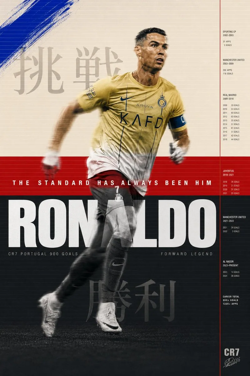
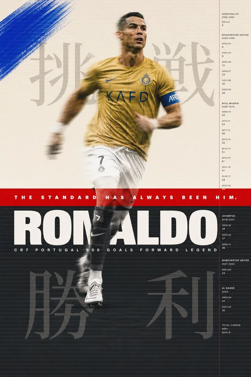
Cristiano Ronaldo sports poster. Background divided intothree horizontal zones. Top zone warm cream Pantone 9183Coccupying top 40% of poster. Middle zone signal redPantone 485C as a pure flat color band occupying exactly
8% of poster height at golden ratio point. Bottom zone
deep charcoal Pantone 432C occupying remaining 52%.
Three zones. Two colors and one neutral. The geometry
of the Portuguese flag deconstructed and reconstructedas graphic architecture.

His figure spans all three zones. Shot full body from
slight low angle. Al Nassr gold kit. Mid stride. Leftleg forward. Right arm back. The specific body positionof someone at absolute peak running velocity. Not a posedaction. A captured action. The body in the cream zonerendered in full color warm skin tones and gold kit. The
body in the red zone bleached to near white silhouette
where it intersects the red band. The body in the charcoal
zone rendered in black and white high contrast. Three color treatments on one continuous figure. The zones are notbackgrounds they are filters. Each one revealing a
different version of the same man.

Motion blur. His figure in slight motion blur at 1/250second shutter. The sharp elements his face his number 7his boot touching ground. The blurred elements his armsin motion his hair his loose kit fabric. The blurcommunicates what no still image can. The speed. The
relentlessness. The fact that he is never fully stopped.

Layered over the three zones across the full poster width.
A system of fine parallel horizontal lines. 0.3pt. Warm
white. At 25% opacity. Running edge to edge. Spaced 4mm
apart. The texture of a television scan line. Or a
printing registration grid. Or the lines on a ruledpage waiting to be written on. The lines are the sameacross all three zones changing color against each
background. White on cream barely visible. White on red
glowing. White on charcoal clear and strong. The same
line behaving differently in different worlds.

Paint intervention. In the cream zone only. Upper left
quadrant. Raw gestural brushstroke in cobalt blue
Pantone 2728C. A single mark. Applied with a wide brush
at 45 degrees. The blue unexpected against the cream.
Not part of the flag system. A disruption. An intervention
from outside the established color logic. The color of
a sky he is always looking toward.

Japanese typography. Large scale. Behind photograph layer.
In cream zone behind his upper body. 挑戦 pronounced
chōsen meaning challenge. Rendered at 200pt Noto Serif
CJK deep charcoal at 15% opacity. The kanji visible
through the photographic layer like a thought behind
a face. In charcoal zone behind his lower body.
勝利 pronounced shōri meaning victory. Same scale
same treatment. Beginning and end. Challenge and victory.
Above and below.

Information system. Right side of poster. Thin vertical
rule signal red 1px running full height. To its right
a column of data in Helvetica Neue Light 6pt tracking
200 bone white on charcoal and cream on red adjusting
for legibility. Club career timeline. Years at each
club. Goals per season. The data as a river running
parallel to the figure. The career in numbers beside
the career in motion.

Typography primary. Across the red zone. Full poster
width. The red band is a stage for one typographic event.
Futura PT Heavy. All caps. White. 36pt. Tracking 300.
Perfectly centered vertically in the red band. THE
STANDARD HAS ALWAYS BEEN HIM. The red band exists to
hold this sentence. Everything else in the poster exists
to justify it.

Below the red band entering the charcoal zone. Full width.
Helvetica Neue Black Extended. White. 96pt. Tracking minus
10. RONALDO. The letters occupying the full width exactly
tracked to fit. The name as the foundation of the
charcoal zone. Below the name in same charcoal zone.
Helvetica Neue Light. 8pt. Tracking 600. Bone white.
CR7 PORTUGAL 900 GOALS FORWARD LEGEND. One line. All
the context needed. None of the decoration.

Art direction M/M Paris conceptual intelligence. Bureau
Borsche typographic sophistication. Wieden Kennedy
Amsterdam emotional directness. Nike Brand Design
production quality. All four present simultaneously
at their absolute peak.

Shot aesthetic Misan Harriman color and dignity. Ernst
Haas motion blur mastery. Gregory Heisler technical
perfection. Three photographers whose combined vision
makes something none of them would make alone.

Print format 70x100cm. 10K resolution. HDR. The three
zones printed in three separate ink passes on a
Heidelberg offset press. The red band overprinted twice
for maximum saturation. The charcoal zone with 7 color
process for maximum depth. The cream zone with minimum
ink for maximum paper feel.
한국어 번역
Cristiano Ronaldo 스포츠 포스터. 배경은 세 개의 가로 존으로 나뉜다. 상단 존은 따뜻한 크림색 Pantone 9183C로 포스터 상단 40%를 차지한다. 중간 존은 시그널 레드 Pantone 485C로, 황금비 지점에서 포스터 높이의 정확히 8%를 차지하는 순수한 플랫 컬러 밴드다. 하단 존은 딥 차콜 Pantone 432C로 나머지 52%를 차지한다. 세 개의 존. 두 가지 색과 하나의 뉴트럴. 포르투갈 국기의 기하학을 해체하고 그래픽 건축으로 재구성한 것.

그의 형체는 세 존에 걸쳐 있다. 약간 낮은 앵글에서 촬영한 전신. Al Nassr 골드 유니폼. 달리는 도중의 자세. 왼발이 앞으로. 오른팔은 뒤로. 절정의 주속으로 달리는 사람 특유의 신체 위치. 포즈를 취한 동작이 아니라 포착된 동작. 크림 존에 있는 몸은 따뜻한 피부 톤과 골드 유니폼이 온전한 컬러로 렌더링된다. 레드 존에 있는 몸은 레드 밴드와 교차하는 부분에서 거의 흰색 실루엣으로 탈색된다. 차콜 존에 있는 몸은 흑백 고대비로 렌더링된다. 하나의 연속된 형체에 적용된 세 가지 색 처리. 존은 배경이 아니라 필터다. 각각이 같은 남자의 다른 버전을 드러낸다.

모션 블러. 1/250초 셔터에서 그의 형체는 약간의 모션 블러 상태다. 선명한 요소는 얼굴, 등번호 7, 지면에 닿는 축구화. 흐려진 요소는 움직이는 팔, 머리카락, 흘러내린 유니폼 천. 블러는 정지 이미지가 전할 수 없는 것을 전달한다. 속도. 멈추지 않음. 그가 결코 완전히 멈추지 않는다는 사실.

세 개의 존 위에 포스터 전체 폭으로 겹쳐진다. 가늘고 평행한 수평선 체계. 0.3pt. 따뜻한 화이트. 25% 불투명도. 가장자리에서 가장자리까지 이어진다. 4mm 간격. 텔레비전 주사선의 질감. 또는 인쇄 정합 그리드. 또는 아직 쓰이지 않은 줄 노트의 선. 선은 세 존 모두 동일하지만 각 배경에 따라 색이 달라진다. 크림 위의 화이트는 거의 보이지 않는다. 레드 위의 화이트는 빛난다. 차콜 위의 화이트는 선명하고 강하다. 같은 선이 서로 다른 세계에서 다르게 행동한다.

페인트 개입. 크림 존에만. 좌상단 사분면. 코발트 블루 Pantone 2728C의 거친 제스처 붓터치. 단 하나의 표시. 넓은 붓으로 45도로 적용. 크림색과 대비되는 예상 밖의 블루. 국기 시스템의 일부가 아니다. 파괴. 확립된 색 논리 바깥에서 온 개입. 그가 언제나 바라보는 하늘의 색.

일본어 타이포그래피. 대형 스케일. 사진 레이어 뒤. 그의 상반신 뒤 크림 존에. 挑戦, 발음은 chōsen, 도전을 의미한다. 200pt Noto Serif CJK로 딥 차콜 15% 불투명도. 한자는 사진 레이어를 통해 마치 얼굴 뒤의 생각처럼 보인다. 차콜 존, 그의 하반신 뒤에. 勝利, 발음은 shōri, 승리를 의미한다. 같은 스케일, 같은 처리. 시작과 끝. 도전과 승리. 위와 아래.

정보 시스템. 포스터 오른쪽. 가느다란 세로 괘선 시그널 레드 1px가 전체 높이를 따라 이어진다. 그 오른쪽에 Helvetica Neue Light 6pt, 자간 200으로 된 데이터 열이 차콜 위 본 화이트와 레드 위 크림색으로, 가독성에 맞춰 조정된다. 클럽 커리어 타임라인. 각 클럽에서의 연도. 시즌별 골. 형체와 나란히 흐르는 강으로서의 데이터. 움직임 속 커리어 옆에 숫자로 된 커리어.

주 타이포그래피. 레드 존을 가로질러. 포스터 전체 폭. 레드 밴드는 하나의 타이포그래피 이벤트를 위한 무대다. Futura PT Heavy. 모두 대문자. 화이트. 36pt. 자간 300. 레드 밴드 안에서 수직으로 완벽하게 중앙 정렬. THE STANDARD HAS ALWAYS BEEN HIM. 레드 밴드는 이 문장을 담기 위해 존재한다. 포스터의 다른 모든 것은 그것을 정당화하기 위해 존재한다.

레드 밴드 아래 차콜 존으로 들어간다. 전체 폭. Helvetica Neue Black Extended. 화이트. 96pt. 자간 -10. RONALDO. 글자가 전체 폭을 정확히 채우도록 자간이 조정된다. 차콜 존의 토대로서의 이름. 같은 차콜 존에서 이름 아래. Helvetica Neue Light. 8pt. 자간 600. 본 화이트. CR7 PORTUGAL 900 GOALS FORWARD LEGEND. 한 줄. 필요한 모든 맥락. 장식은 전혀 없음.

아트 디렉션 M/M Paris의 개념적 지성. Bureau Borsche의 타이포그래피 정교함. Wieden Kennedy Amsterdam의 감정적 직설성. Nike Brand Design의 프로덕션 퀄리티. 네 가지가 동시에 각자의 절정에서 존재한다.

촬영 미학 Misan Harriman의 색과 품위. Ernst Haas의 모션 블러 숙달. Gregory Heisler의 기술적 완벽. 세 사진작가의 결합된 비전이 어느 한 사람도 혼자서는 만들 수 없는 무언가를 만들어낸다.

인쇄 포맷 70x100cm. 10K 해상도. HDR. 세 개의 존은 Heidelberg 옵셋 인쇄기에서 세 번의 별도 잉크 패스로 인쇄된다. 레드 밴드는 최대 채도를 위해 두 번 중복 인쇄된다. 차콜 존은 최대 깊이를 위해 7색 프로세스로. 크림 존은 최대한의 종이 질감을 위해 최소 잉크로.
출처
- 원작자
- vireonixx
- 게시일
- 2026-06-22(由推文 ID 反解)
- 원문 출처
- 원문 보기 ↗
- 수록 출처
- EvoLinkAI/awesome-gpt-image-2-API-and-Prompts · 2068870555349246242 · CC0-1.0