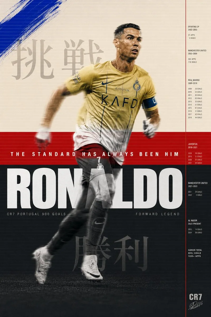
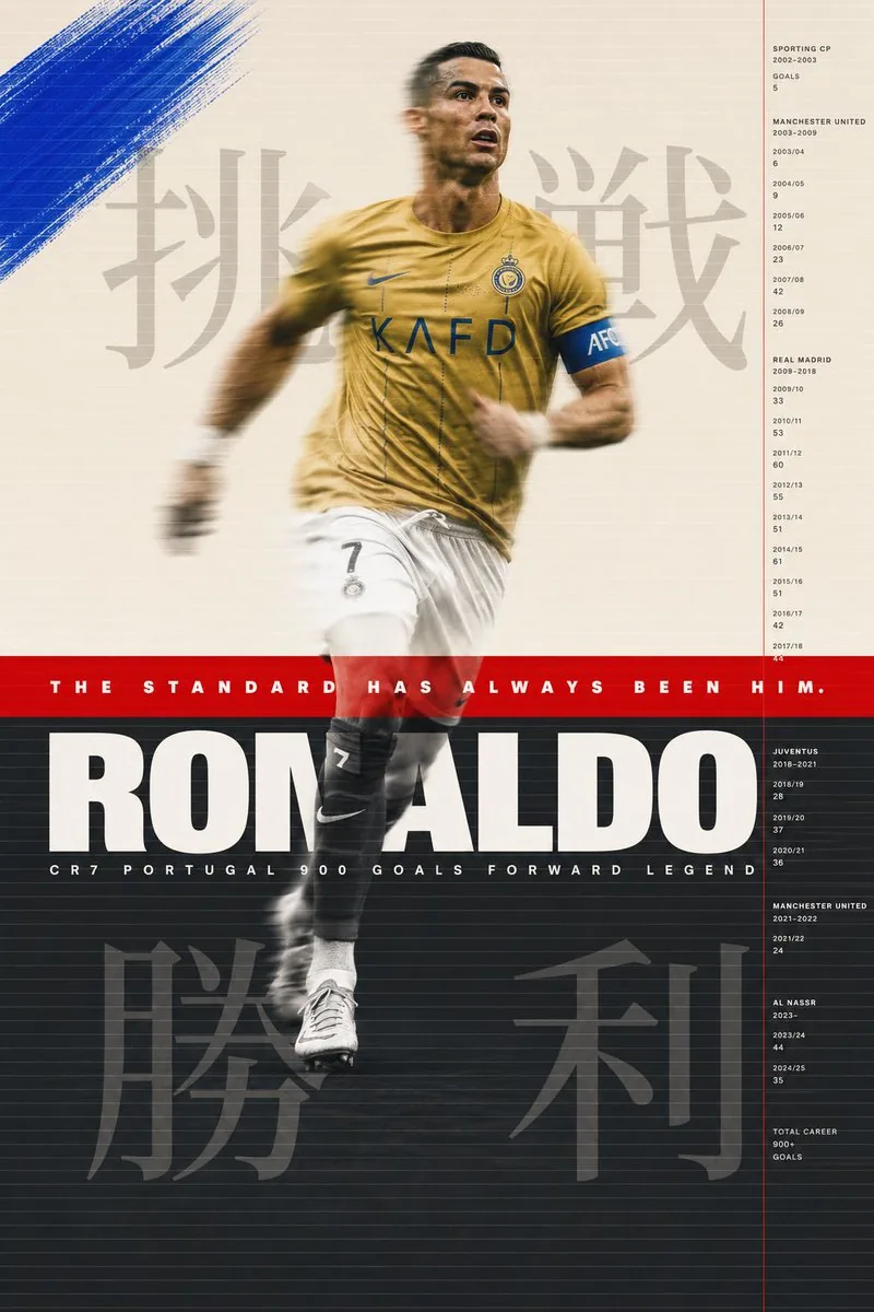
Cristiano Ronaldo sports poster. Background divided intothree horizontal zones. Top zone warm cream Pantone 9183Coccupying top 40% of poster. Middle zone signal redPantone 485C as a pure flat color band occupying exactly
8% of poster height at golden ratio point. Bottom zone
deep charcoal Pantone 432C occupying remaining 52%.
Three zones. Two colors and one neutral. The geometry
of the Portuguese flag deconstructed and reconstructedas graphic architecture.

His figure spans all three zones. Shot full body from
slight low angle. Al Nassr gold kit. Mid stride. Leftleg forward. Right arm back. The specific body positionof someone at absolute peak running velocity. Not a posedaction. A captured action. The body in the cream zonerendered in full color warm skin tones and gold kit. The
body in the red zone bleached to near white silhouette
where it intersects the red band. The body in the charcoal
zone rendered in black and white high contrast. Three color treatments on one continuous figure. The zones are notbackgrounds they are filters. Each one revealing a
different version of the same man.

Motion blur. His figure in slight motion blur at 1/250second shutter. The sharp elements his face his number 7his boot touching ground. The blurred elements his armsin motion his hair his loose kit fabric. The blurcommunicates what no still image can. The speed. The
relentlessness. The fact that he is never fully stopped.

Layered over the three zones across the full poster width.
A system of fine parallel horizontal lines. 0.3pt. Warm
white. At 25% opacity. Running edge to edge. Spaced 4mm
apart. The texture of a television scan line. Or a
printing registration grid. Or the lines on a ruledpage waiting to be written on. The lines are the sameacross all three zones changing color against each
background. White on cream barely visible. White on red
glowing. White on charcoal clear and strong. The same
line behaving differently in different worlds.

Paint intervention. In the cream zone only. Upper left
quadrant. Raw gestural brushstroke in cobalt blue
Pantone 2728C. A single mark. Applied with a wide brush
at 45 degrees. The blue unexpected against the cream.
Not part of the flag system. A disruption. An intervention
from outside the established color logic. The color of
a sky he is always looking toward.

Japanese typography. Large scale. Behind photograph layer.
In cream zone behind his upper body. 挑戦 pronounced
chōsen meaning challenge. Rendered at 200pt Noto Serif
CJK deep charcoal at 15% opacity. The kanji visible
through the photographic layer like a thought behind
a face. In charcoal zone behind his lower body.
勝利 pronounced shōri meaning victory. Same scale
same treatment. Beginning and end. Challenge and victory.
Above and below.

Information system. Right side of poster. Thin vertical
rule signal red 1px running full height. To its right
a column of data in Helvetica Neue Light 6pt tracking
200 bone white on charcoal and cream on red adjusting
for legibility. Club career timeline. Years at each
club. Goals per season. The data as a river running
parallel to the figure. The career in numbers beside
the career in motion.

Typography primary. Across the red zone. Full poster
width. The red band is a stage for one typographic event.
Futura PT Heavy. All caps. White. 36pt. Tracking 300.
Perfectly centered vertically in the red band. THE
STANDARD HAS ALWAYS BEEN HIM. The red band exists to
hold this sentence. Everything else in the poster exists
to justify it.

Below the red band entering the charcoal zone. Full width.
Helvetica Neue Black Extended. White. 96pt. Tracking minus
10. RONALDO. The letters occupying the full width exactly
tracked to fit. The name as the foundation of the
charcoal zone. Below the name in same charcoal zone.
Helvetica Neue Light. 8pt. Tracking 600. Bone white.
CR7 PORTUGAL 900 GOALS FORWARD LEGEND. One line. All
the context needed. None of the decoration.

Art direction M/M Paris conceptual intelligence. Bureau
Borsche typographic sophistication. Wieden Kennedy
Amsterdam emotional directness. Nike Brand Design
production quality. All four present simultaneously
at their absolute peak.

Shot aesthetic Misan Harriman color and dignity. Ernst
Haas motion blur mastery. Gregory Heisler technical
perfection. Three photographers whose combined vision
makes something none of them would make alone.

Print format 70x100cm. 10K resolution. HDR. The three
zones printed in three separate ink passes on a
Heidelberg offset press. The red band overprinted twice
for maximum saturation. The charcoal zone with 7 color
process for maximum depth. The cream zone with minimum
ink for maximum paper feel.