写真→水彩紙の表紙:上下分割・コラージュ改変の禁止
アップロード写真からは輪郭と物語だけを抽出し、画面全体を手描き水彩の表紙に。よくある「上下半分」の失敗を修正。表紙/自主出版向けの完全な英語 prompt。
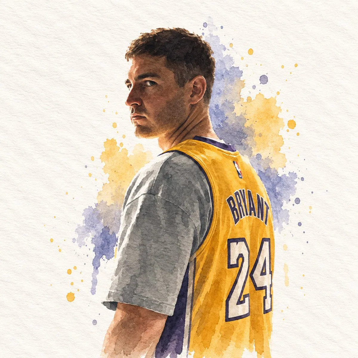
プロンプト
## DIRECTIVE
Generate a single watercolor paper-cover illustration. Use the attached reference image only as a source to extract subject, silhouette, pose, objects, colors, and canvas proportion. Do not place, collage, overlay, split, or attach the original photograph anywhere in the frame. The entire canvas is the illustration.

## FORMAT
Match the exact aspect ratio and orientation of the attached reference image.
If the reference is horizontal, the illustration is horizontal.
If the reference is vertical, the illustration is vertical.
If the reference is square, the illustration is square.
One full-bleed handmade paper illustration.
No top/bottom split.
No photographic insert.
No diptych.
No letterboxing or added bars.

## ASPECT RATIO ADAPTATION
The output canvas must inherit the size relationship of the reference image.
Recompose the extracted elements to occupy that same proportion with intention.
Do not stretch, squash, or pad the drawing to fake another format.
Do not keep the original photograph's empty margins as dead space.
Use the full reference proportion as an editorial page: subject, a few supporting shapes, and paper ground arranged for that specific width and height.

## SUBJECT EXTRACTION
Study the attached reference image.
Preserve only:
- the most recognizable subject
- essential silhouette and proportions
- key pose or gesture
- important objects
- the core narrative relationship between people and objects

Highly simplify.
Remove unnecessary details.
Retain only the visual information needed for immediate recognition.

Never copy photographic texture, pores, lens blur, or camera grain into the illustration.
Never redraw the photograph as a painted photo.
Never keep the original photo visible.

## MEDIUM
Minimalist hand-drawn watercolor on paper.

Use:
- delicate, slightly imperfect hand-drawn lines
- transparent watercolor washes
- a small number of bold, clearly defined flat color shapes
- rough paper texture
- visible handmade brush marks
- slightly irregular, organic edges
- subtle pooling, bloom, and pigment granulation
- slight imperfections that make it feel genuinely handmade

The main illustrated subject should be small and carefully composed, occupying approximately 20–35% of the canvas.
Leave a large amount of negative space around the illustration, distributed according to the reference proportion.

## PAPER GROUND
The background should primarily resemble:
- rough white paper
- warm off-white paper
- pale natural paper
- minimal editorial book-cover stock

Use only a few lines or small watercolor shapes to suggest the surrounding environment.
Do not fill the page with a full scene.
Do not paint a photographic background.

## COLOR PALETTE
Extract the dominant colors directly from the attached reference image.
Compress the palette into no more than 4 main colors.
Keep the colors restrained, sophisticated, and harmonious.
Use bold but controlled flat watercolor blocks.
Avoid excessive color variation.
Preserve subtle paper grain and handmade brush texture.
The illustration should feel like a simplified watercolor interpretation of the reference, not a copy of it.

## TYPOGRAPHY
A small amount of simple typography may be included when it naturally fits.
Possible elements: a short title, keyword, object name, location, year, number, or short phrase.
Text should be minimal, understated, and editorial.
Place type in the negative space created by the reference proportion.
Do not force text into the composition if it does not naturally fit the subject.
No logos. No watermarks. No captions describing the image.

## VISUAL LANGUAGE
Quiet. Poetic. Refined. Minimal. Innocent. Relaxed. Artistic. Thoughtful. High-recognition. Premium.
Art-book cover. Independent publishing. Contemporary editorial design. Thoughtful picture book.

## NEGATIVE PROMPT
No original photograph in the frame, no split layout, no top photo / bottom drawing, no collage, no photomontage, no attached reference image, no photorealism, no camera look, no lens blur, no cinematic portrait, no beauty retouch, no extra people, no identity-heavy realism, no crowded composition, no full-bleed painted scene, no forced 3:4, no forced square, no letterboxing, no black bars, no stretched or squashed drawing, no unused margins copied from the photograph, no excessive detail, no more than four main colors, no loud typography, no logos, no watermarks, no HUD.
日本語訳
## 指示
単一の水彩紙の表紙イラストを生成する。添付の参照画像は、被写体、シルエット、ポーズ、オブジェクト、色彩、キャンバスの比率を抽出するための情報源としてのみ使用すること。元の写真をフレーム内のどこにも配置、コラージュ、重ね合わせ、分割、貼り付けしないこと。キャンバス全体がイラストである。

## フォーマット
添付の参照画像と正確に同じアスペクト比と向きに合わせること。
参照画像が横長なら、イラストも横長にする。
参照画像が縦長なら、イラストも縦長にする。
参照画像が正方形なら、イラストも正方形にする。
フルブリードの手作り紙イラストを一点。
上下分割は禁止。
写真の挿入は禁止。
ディプティクは禁止。
レターボックスや追加の帯は禁止。

## アスペクト比の適応
出力キャンバスは参照画像のサイズ関係を継承すること。
抽出した要素を意図をもって再構成し、同じ比率を占めるようにする。
別のフォーマットに見せかけるために描画を引き伸ばしたり、押しつぶしたり、パディングを加えたりしないこと。
元の写真の空いた余白をデッドスペースとして残さないこと。
参照画像の比率全体をエディトリアルなページとして使う:被写体、少数の補助的な形、紙の地を、その特定の幅と高さに合わせて配置する。

## 被写体の抽出
添付の参照画像をよく観察する。
保持するのは以下のみ:
- 最も認識しやすい被写体
- 本質的なシルエットとプロポーション
- 主要なポーズや仕草
- 重要なオブジェクト
- 人と物の間の核となる物語的関係

高度に単純化する。
不要なディテールは取り除く。
即座に認識するために必要な視覚情報だけを残す。

写真の質感、毛穴、レンズボケ、カメラの粒子をイラストに決してコピーしないこと。
写真を絵画化した写真として描き直さないこと。
元の写真を決して見える状態にしないこと。

## 画材
紙の上のミニマルな手描き水彩。

使用するもの:
- 繊細でわずかに不完全な手描きの線
- 透明な水彩のウォッシュ
- 大胆で明確に定義されたフラットな色面を少数
- 粗い紙の質感
- 目に見える手描きの筆致
- わずかに不規則で有機的なエッジ
- 繊細な溜まり、にじみ、顔料の粒状感
- 本物の手作り感を生むわずかな不完全さ

主要なイラストの被写体は小さく丁寧に構成し、キャンバスのおよそ 20~35% を占めるようにする。
イラストの周囲に大きなネガティブスペースを残し、参照画像の比率に従って配分する。

## 紙の地
背景は主に以下のように見えること:
- 粗い白い紙
- 温かみのあるオフホワイトの紙
- 淡い自然な紙
- ミニマルなエディトリアル書籍向けの紙

周囲の環境をほのめかすために、数本の線か小さな水彩の形だけを使う。
ページ全体を完全な情景で埋めないこと。
写真のような背景を描かないこと。

## カラーパレット
添付の参照画像から主要な色を直接抽出する。
パレットは最大 4 色までに圧縮する。
色は抑制が効いて洗練され、調和していること。
大胆だが制御されたフラットな水彩のブロックを使う。
過度な色の変化は避ける。
繊細な紙の粒子と手描きの筆致のテクスチャを保つ。
イラストは参照画像のコピーではなく、簡略化された水彩の解釈だと感じられるようにする。

## タイポグラフィ
自然に合う場合に限り、少量のシンプルなタイポグラフィを含めてもよい。
考えられる要素:短いタイトル、キーワード、オブジェクト名、場所、年、数字、短いフレーズ。
テキストは最小限で控えめ、エディトリアルであること。
参照画像の比率によって生まれたネガティブスペースに文字を配置する。
被写体に自然に合わない場合は、無理にテキストを構図に組み込まないこと。
ロゴなし。ウォーターマークなし。画像を説明するキャプションなし。

## ビジュアル言語
静か。詩的。洗練。ミニマル。無垢。リラックス。芸術的。思慮深い。高い認知度。プレミアム。
アートブックの表紙。インディペンデント出版。現代のエディトリアルデザイン。思慮深い絵本。

## ネガティブプロンプト
フレーム内に元の写真なし、分割レイアウトなし、上に写真/下に描画なし、コラージュなし、フォトモンタージュなし、添付参照画像の貼り付けなし、フォトリアリズムなし、カメラルックなし、レンズボケなし、シネマティックなポートレートなし、美容レタッチなし、余分な人物なし、アイデンティティ偏重のリアリズムなし、混雑した構図なし、フルブリードで描かれた情景なし、無理な 3:4 なし、無理な正方形なし、レターボックスなし、黒帯なし、引き伸ばしや押しつぶしの描画なし、写真からコピーした未使用の余白なし、過剰なディテールなし、主要 4 色超なし、騒がしいタイポグラフィなし、ロゴなし、ウォーターマークなし、HUD なし。
出典
- 原作者
- impaulxyz
- 公開日
- 2026-09-15
- 原典
- 元の投稿を見る ↗
- 収録元
- xianyu110/awesome-gpt-image2.5 · 2099770443808821443 · MIT