사진→수채화 종이 표지: 상하 분할 콜라주 금지 각색
업로드한 사진에서는 윤곽과 서사만 추출하고 전체를 수작업 수채화 표지로 만듭니다. 흔한 '상하 반쪽' 실패를 바로잡습니다. 표지/독립출판용 전체 영어 프롬프트.
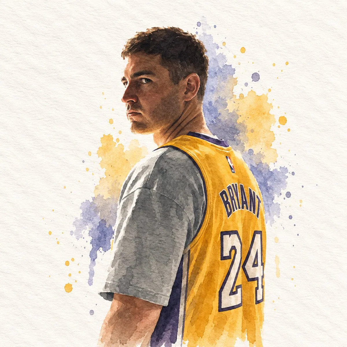
프롬프트
## DIRECTIVE
Generate a single watercolor paper-cover illustration. Use the attached reference image only as a source to extract subject, silhouette, pose, objects, colors, and canvas proportion. Do not place, collage, overlay, split, or attach the original photograph anywhere in the frame. The entire canvas is the illustration.

## FORMAT
Match the exact aspect ratio and orientation of the attached reference image.
If the reference is horizontal, the illustration is horizontal.
If the reference is vertical, the illustration is vertical.
If the reference is square, the illustration is square.
One full-bleed handmade paper illustration.
No top/bottom split.
No photographic insert.
No diptych.
No letterboxing or added bars.

## ASPECT RATIO ADAPTATION
The output canvas must inherit the size relationship of the reference image.
Recompose the extracted elements to occupy that same proportion with intention.
Do not stretch, squash, or pad the drawing to fake another format.
Do not keep the original photograph's empty margins as dead space.
Use the full reference proportion as an editorial page: subject, a few supporting shapes, and paper ground arranged for that specific width and height.

## SUBJECT EXTRACTION
Study the attached reference image.
Preserve only:
- the most recognizable subject
- essential silhouette and proportions
- key pose or gesture
- important objects
- the core narrative relationship between people and objects

Highly simplify.
Remove unnecessary details.
Retain only the visual information needed for immediate recognition.

Never copy photographic texture, pores, lens blur, or camera grain into the illustration.
Never redraw the photograph as a painted photo.
Never keep the original photo visible.

## MEDIUM
Minimalist hand-drawn watercolor on paper.

Use:
- delicate, slightly imperfect hand-drawn lines
- transparent watercolor washes
- a small number of bold, clearly defined flat color shapes
- rough paper texture
- visible handmade brush marks
- slightly irregular, organic edges
- subtle pooling, bloom, and pigment granulation
- slight imperfections that make it feel genuinely handmade

The main illustrated subject should be small and carefully composed, occupying approximately 20–35% of the canvas.
Leave a large amount of negative space around the illustration, distributed according to the reference proportion.

## PAPER GROUND
The background should primarily resemble:
- rough white paper
- warm off-white paper
- pale natural paper
- minimal editorial book-cover stock

Use only a few lines or small watercolor shapes to suggest the surrounding environment.
Do not fill the page with a full scene.
Do not paint a photographic background.

## COLOR PALETTE
Extract the dominant colors directly from the attached reference image.
Compress the palette into no more than 4 main colors.
Keep the colors restrained, sophisticated, and harmonious.
Use bold but controlled flat watercolor blocks.
Avoid excessive color variation.
Preserve subtle paper grain and handmade brush texture.
The illustration should feel like a simplified watercolor interpretation of the reference, not a copy of it.

## TYPOGRAPHY
A small amount of simple typography may be included when it naturally fits.
Possible elements: a short title, keyword, object name, location, year, number, or short phrase.
Text should be minimal, understated, and editorial.
Place type in the negative space created by the reference proportion.
Do not force text into the composition if it does not naturally fit the subject.
No logos. No watermarks. No captions describing the image.

## VISUAL LANGUAGE
Quiet. Poetic. Refined. Minimal. Innocent. Relaxed. Artistic. Thoughtful. High-recognition. Premium.
Art-book cover. Independent publishing. Contemporary editorial design. Thoughtful picture book.

## NEGATIVE PROMPT
No original photograph in the frame, no split layout, no top photo / bottom drawing, no collage, no photomontage, no attached reference image, no photorealism, no camera look, no lens blur, no cinematic portrait, no beauty retouch, no extra people, no identity-heavy realism, no crowded composition, no full-bleed painted scene, no forced 3:4, no forced square, no letterboxing, no black bars, no stretched or squashed drawing, no unused margins copied from the photograph, no excessive detail, no more than four main colors, no loud typography, no logos, no watermarks, no HUD.
한국어 번역
## DIRECTIVE
수채화 종이 표지 일러스트 한 장을 생성하세요. 첨부된 참조 이미지는 피사체, 실루엣, 포즈, 사물, 색상, 캔버스 비율을 추출하는 소스로만 사용하세요. 원본 사진을 프레임 어디에도 배치, 콜라주, 오버레이, 분할, 첨부하지 마세요. 캔버스 전체가 일러스트입니다.

## FORMAT
첨부된 참조 이미지의 정확한 화면 비율과 방향을 따르세요.
참조가 가로형이면 일러스트도 가로형입니다.
참조가 세로형이면 일러스트도 세로형입니다.
참조가 정사각형이면 일러스트도 정사각형입니다.
풀블리드 수작업 종이 일러스트 한 장.
상/하 분할 없음.
사진 삽입 없음.
이폭(diptych) 없음.
레터박싱이나 추가 바 없음.

## ASPECT RATIO ADAPTATION
출력 캔버스는 참조 이미지의 크기 관계를 그대로 이어받아야 합니다.
추출한 요소를 같은 비율에 의도적으로 맞게 재구성하세요.
다른 형식을 흉내 내려고 그림을 늘리거나 찌그러뜨리거나 여백으로 채우지 마세요.
원본 사진의 빈 여백을 죽은 공간으로 남기지 마세요.
참조 비율 전체를 편집 페이지처럼 사용하세요: 그 특정 너비와 높이에 맞춰 피사체, 몇 개의 보조 도형, 종이 바탕을 배치합니다.

## SUBJECT EXTRACTION
첨부된 참조 이미지를 관찰하세요.
다음만 보존하세요:
- 가장 알아보기 쉬운 피사체
- 필수적인 실루엣과 비례
- 핵심 포즈나 제스처
- 중요한 사물
- 인물과 사물 사이의 핵심 서사 관계

최대한 단순화하세요.
불필요한 디테일을 제거하세요.
즉시 알아보는 데 필요한 시각 정보만 남기세요.

사진 질감, 모공, 렌즈 블러, 카메라 그레인을 일러스트에 절대 복사하지 마세요.
사진을 회화풍 사진으로 다시 그리지 마세요.
원본 사진을 보이게 남기지 마세요.

## MEDIUM
종이 위의 미니멀한 손그림 수채화.

사용:
- 섬세하고 약간 불완전한 손그림 선
- 투명한 수채화 워시
- 소수의 대담하고 또렷한 플랫 컬러 면
- 거친 종이 질감
- 눈에 보이는 수작업 붓 자국
- 약간 불규칙하고 유기적인 가장자리
- 은은한 물웅덩이, 번짐, 안료 입자감
- 진짜 수작업처럼 느껴지게 하는 약간의 불완전함

주요 일러스트 피사체는 작고 정교하게 구성되어 캔버스의 약 20–35%를 차지해야 합니다.
일러스트 주변에 많은 여백을 남기고, 참조 비율에 따라 분배하세요.

## PAPER GROUND
배경은 주로 다음처럼 보여야 합니다:
- 거친 흰 종이
- 따뜻한 미색 종이
- 옅은 자연색 종이
- 미니멀한 편집용 북커버 용지

주변 환경을 암시하는 데 몇 개의 선이나 작은 수채화 형태만 사용하세요.
페이지를 전체 장면으로 채우지 마세요.
사진 같은 배경을 그리지 마세요.

## COLOR PALETTE
첨부된 참조 이미지에서 주조색을 직접 추출하세요.
팔레트를 4가지 주요 색상 이내로 압축하세요.
색상은 절제되고 세련되며 조화롭게 유지하세요.
대담하지만 통제된 플랫 수채화 블록을 사용하세요.
과도한 색상 변화는 피하세요.
은은한 종이 결감과 수작업 붓 질감을 유지하세요.
일러스트는 참조의 복사본이 아니라 단순화된 수채화 해석처럼 느껴져야 합니다.

## TYPOGRAPHY
자연스럽게 어울릴 때 소량의 단순한 타이포그래피를 포함할 수 있습니다.
가능한 요소: 짧은 제목, 키워드, 사물 이름, 위치, 연도, 숫자, 짧은 문구.
텍스트는 최소한이고 절제되며 편집 디자인풍이어야 합니다.
참조 비율이 만들어낸 여백에 활자를 배치하세요.
피사체와 자연스럽게 어울리지 않으면 텍스트를 구도에 억지로 넣지 마세요.
로고 없음. 워터마크 없음. 이미지를 설명하는 캡션 없음.

## VISUAL LANGUAGE
조용함. 시적임. 세련됨. 미니멀. 순수함. 편안함. 예술적. 사려 깊음. 높은 인지도. 프리미엄.
아트북 표지. 독립 출판. 현대 편집 디자인. 사려 깊은 그림책.

## NEGATIVE PROMPT
프레임 안의 원본 사진 없음, 분할 레이아웃 없음, 상단 사진/하단 그림 없음, 콜라주 없음, 포토몽타주 없음, 첨부 참조 이미지 없음, 포토리얼리즘 없음, 카메라 느낌 없음, 렌즈 블러 없음, 시네마틱 초상 없음, 뷰티 리터치 없음, 추가 인물 없음, 신원 강조 리얼리즘 없음, 빽빽한 구도 없음, 풀블리드 회화 장면 없음, 강제 3:4 없음, 강제 정사각형 없음, 레터박싱 없음, 검은 바 없음, 늘리거나 찌그러뜨린 그림 없음, 사진에서 복사한 미사용 여백 없음, 과도한 디테일 없음, 주요 색상 4가지 초과 없음, 요란한 타이포그래피 없음, 로고 없음, 워터마크 없음, HUD 없음.
출처
- 원작자
- impaulxyz
- 게시일
- 2026-09-15
- 원문 출처
- 원문 보기 ↗
- 수록 출처
- xianyu110/awesome-gpt-image2.5 · 2099770443808821443 · MIT