寫真→水彩紙面封面:禁對半拼貼改編
上傳照片只抽輪廓與敘事,整幅變成手工水彩封面;修正常見「上下對半」翻車。封面/獨立出版向完整英文 prompt。
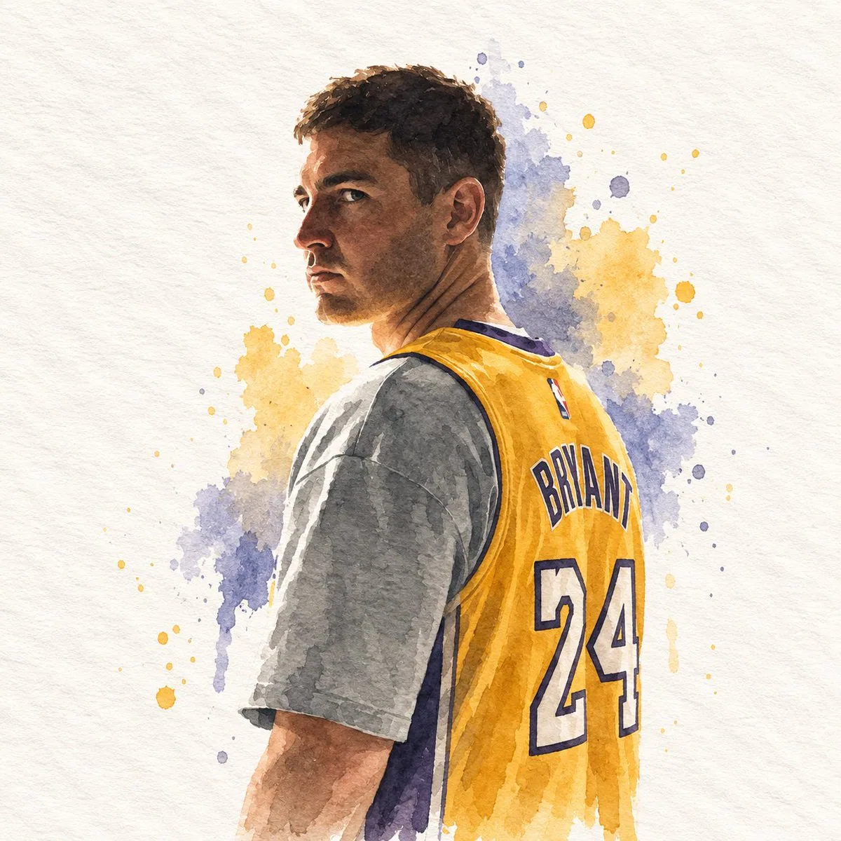
提示詞
## DIRECTIVE
Generate a single watercolor paper-cover illustration. Use the attached reference image only as a source to extract subject, silhouette, pose, objects, colors, and canvas proportion. Do not place, collage, overlay, split, or attach the original photograph anywhere in the frame. The entire canvas is the illustration.

## FORMAT
Match the exact aspect ratio and orientation of the attached reference image.
If the reference is horizontal, the illustration is horizontal.
If the reference is vertical, the illustration is vertical.
If the reference is square, the illustration is square.
One full-bleed handmade paper illustration.
No top/bottom split.
No photographic insert.
No diptych.
No letterboxing or added bars.

## ASPECT RATIO ADAPTATION
The output canvas must inherit the size relationship of the reference image.
Recompose the extracted elements to occupy that same proportion with intention.
Do not stretch, squash, or pad the drawing to fake another format.
Do not keep the original photograph's empty margins as dead space.
Use the full reference proportion as an editorial page: subject, a few supporting shapes, and paper ground arranged for that specific width and height.

## SUBJECT EXTRACTION
Study the attached reference image.
Preserve only:
- the most recognizable subject
- essential silhouette and proportions
- key pose or gesture
- important objects
- the core narrative relationship between people and objects

Highly simplify.
Remove unnecessary details.
Retain only the visual information needed for immediate recognition.

Never copy photographic texture, pores, lens blur, or camera grain into the illustration.
Never redraw the photograph as a painted photo.
Never keep the original photo visible.

## MEDIUM
Minimalist hand-drawn watercolor on paper.

Use:
- delicate, slightly imperfect hand-drawn lines
- transparent watercolor washes
- a small number of bold, clearly defined flat color shapes
- rough paper texture
- visible handmade brush marks
- slightly irregular, organic edges
- subtle pooling, bloom, and pigment granulation
- slight imperfections that make it feel genuinely handmade

The main illustrated subject should be small and carefully composed, occupying approximately 20–35% of the canvas.
Leave a large amount of negative space around the illustration, distributed according to the reference proportion.

## PAPER GROUND
The background should primarily resemble:
- rough white paper
- warm off-white paper
- pale natural paper
- minimal editorial book-cover stock

Use only a few lines or small watercolor shapes to suggest the surrounding environment.
Do not fill the page with a full scene.
Do not paint a photographic background.

## COLOR PALETTE
Extract the dominant colors directly from the attached reference image.
Compress the palette into no more than 4 main colors.
Keep the colors restrained, sophisticated, and harmonious.
Use bold but controlled flat watercolor blocks.
Avoid excessive color variation.
Preserve subtle paper grain and handmade brush texture.
The illustration should feel like a simplified watercolor interpretation of the reference, not a copy of it.

## TYPOGRAPHY
A small amount of simple typography may be included when it naturally fits.
Possible elements: a short title, keyword, object name, location, year, number, or short phrase.
Text should be minimal, understated, and editorial.
Place type in the negative space created by the reference proportion.
Do not force text into the composition if it does not naturally fit the subject.
No logos. No watermarks. No captions describing the image.

## VISUAL LANGUAGE
Quiet. Poetic. Refined. Minimal. Innocent. Relaxed. Artistic. Thoughtful. High-recognition. Premium.
Art-book cover. Independent publishing. Contemporary editorial design. Thoughtful picture book.

## NEGATIVE PROMPT
No original photograph in the frame, no split layout, no top photo / bottom drawing, no collage, no photomontage, no attached reference image, no photorealism, no camera look, no lens blur, no cinematic portrait, no beauty retouch, no extra people, no identity-heavy realism, no crowded composition, no full-bleed painted scene, no forced 3:4, no forced square, no letterboxing, no black bars, no stretched or squashed drawing, no unused margins copied from the photograph, no excessive detail, no more than four main colors, no loud typography, no logos, no watermarks, no HUD.
中文翻譯
## 指令
生成一張水彩紙面封面插畫。僅將所附參考圖作爲素材來源,用於提取主體、剪影、姿態、物件、色彩和畫布比例。不得將原始照片放置、拼貼、疊加、分割或貼附在畫面中的任何位置。整塊畫布就是這張插畫。

## 格式
與所附參考圖保持完全一致的長寬比與方向。
若參考圖爲橫向,插畫即爲橫向。
若參考圖爲縱向,插畫即爲縱向。
若參考圖爲正方形,插畫即爲正方形。
一張滿版(full-bleed)手工紙插畫。
無上下分欄。
無照片嵌入。
無雙聯畫。
無加黑邊或額外邊框。

## 長寬比適配
輸出畫布必須繼承參考圖的尺寸關係。
重新構圖,讓提取出的元素有意圖地佔據同一比例。
不得拉伸、壓扁或補邊來僞造另一種畫幅。
不得保留原始照片的空白邊緣作爲死區。
把參考圖的完整比例當作一個編輯版面來使用:主體、少量輔助形狀與紙質底紋,按該特定寬高進行排布。

## 主體提取
研究所附參考圖。
僅保留:
- 最具辨識度的主體
- 必要的剪影與比例
- 關鍵姿態或動作
- 重要物件
- 人與物之間核心的敘事關係

高度簡化。
去除不必要的細節。
僅保留實現即時識別所需的視覺信息。

切勿將照片質感、毛孔、鏡頭虛化或相機顆粒複製到插畫中。
切勿把照片重繪成一張畫出來的照片。
切勿讓原始照片可見。

## 媒介
紙上極簡手繪水彩。

使用:
- 纖細、略帶不完美的手繪線條
- 透明的水彩暈染
- 少量大膽、邊界清晰的平塗色塊
- 粗糙的紙張紋理
- 可見的手工筆觸痕跡
- 略不規則、有機的邊緣
- 細微的積水、水痕與顏料顆粒沉澱
- 輕微的不完美,讓它顯得真正是手工製作

主要插畫主體應小巧而精心構圖,約佔畫布的 20–35%。
在插畫周圍留出大量負空間,按參考圖比例進行分佈。

## 紙張底紋
背景主要應呈現爲:
- 粗糙白紙
- 暖調米白紙
- 淺色自然紙張
- 極簡編輯書籍封面用紙

僅用少量線條或小幅水彩色塊來暗示周圍環境。
不要用完整場景填滿頁面。
不要繪製照片式背景。

## 配色
直接從所附參考圖中提取主導色。
將色板壓縮到不超過 4 種主色。
保持色彩剋制、高級且和諧。
使用大膽但受控的水彩平塗色塊。
避免過多的色彩變化。
保留細微的紙張肌理與手工筆觸質感。
插畫應像是對參考圖的簡化水彩詮釋,而非對它的複製。

## 文字排版
當文字能自然融入時,可加入少量簡單排版。
可能的元素:簡短標題、關鍵詞、物件名稱、地點、年份、數字或短語。
文字應極簡、低調、具編輯感。
將文字置於由參考圖比例所形成的負空間中。
若文字與主體不自然契合,不要強行加入構圖。
無 logo。無水印。無描述畫面的說明文字。

## 視覺語言
安靜。詩意。精緻。極簡。純真。鬆弛。藝術性。深思。高辨識度。高級感。
藝術書封面。獨立出版。當代編輯設計。有思想的繪本。

## 負面提示詞
畫面中無原始照片、無分欄佈局、無上照片/下繪畫、無拼貼、無照片蒙太奇、無貼附的參考圖、無照片寫實、無相機感、無鏡頭虛化、無電影感人像、無美顏修圖、無多餘人物、無身份感過重的寫實、無擁擠構圖、無滿版繪製場景、無強制 3:4、無強制正方形、無加黑邊、無黑色橫條、無拉伸或壓扁的繪畫、無照搬照片的空白邊緣、無過度細節、主色不超過四種、無喧鬧的字體排版、無 logo、無水印、無 HUD。
溯源
- 原作者
- impaulxyz
- 發佈日期
- 2026-09-15
- 原始出處
- 查看原帖 ↗
- 收錄來源
- xianyu110/awesome-gpt-image2.5 · 2099770443808821443 · MIT