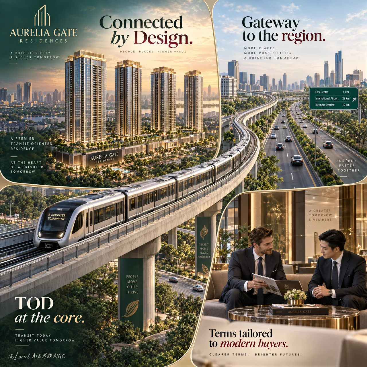
地下鉄が斜めに貫く連結性:四分割の不動産ポスターを一息で仕上げる
四つの枠で設備を説明しない——高架の地下鉄を区分を斜めに横切らせ、視線を物件へ落とす。連結性のセリングポイントを空間関係として書き、真似できる構造にする。
プロンプト
Create a Cannes-level ultra-premium real estate advertising poster for a fictional development brand called AURELIA GATE RESIDENCES, preserving the exact structural logic of a multi-panel infrastructure-led property campaign: a square or near-square luxury real estate poster divided into four integrated visual zones with softly curved page-like corner framing, where the top-left panel presents the hero residential towers rising above the city, the top-right panel highlights a major expressway corridor, the lower-left and center are dramatically crossed by an elevated metro line in perspective, and the bottom-right panel shows a refined private consultation meeting in an elegant sales-lounge interior. The final image must communicate that this development is defined by strategic connectivity, transit-oriented value, and premium urban lifestyle.

Core composition: structure the poster as a refined four-zone collage with thin elegant dividing lines and subtle curved panel edges, preserving the same premium brochure-meets-commercial-ad language as the reference. Top-left: one aerial oblique view of the hero residential project, with 3 to 4 slender luxury towers standing prominently above a dense low-rise city fabric, warm sunset light, and a discreet location tag integrated near the site. Top-right: one wide, clean view of a modern multi-lane expressway with landscaped medians, smooth traffic flow, and urban skyline in the distance, representing regional access. Lower-left/center: one modern elevated metro train sweeps diagonally across the composition toward the viewer, occupying strong foreground dominance and visually linking the top property panels to the lifestyle promise below. Bottom-right: one premium sales or negotiation lounge with two well-dressed business professionals seated at a round table in a polished interior, reviewing documents in a calm high-end environment. All four zones must feel part of one coherent brand story.

Hero project design: create a premium urban residential development for AURELIA GATE RESIDENCES with elegant glass-and-stone towers, warm architectural lighting, podium greenery, and a sophisticated city-integration concept. The tower cluster should feel financially aspirational, architecturally credible, and highly sellable, with clean facade rhythm, realistic balcony or glazing repetition, refined rooftop crowns, and believable urban scale. The development must remain the conceptual hero even though the transit line is visually dramatic.

Transit-oriented narrative: the metro line is a major storytelling device. Render one sleek modern elevated train with realistic carriage proportions, reflective glazing, subtle interior hints, and premium metallic finish, traveling on an elevated viaduct that cuts diagonally through the composition. The train must feel fast, clean, and future-forward, visually symbolizing convenience, rising value, and metropolitan momentum. The viaduct structure should be engineered and convincing, with support detail, guard rails, and proper perspective depth. This transit element should strengthen the real estate value proposition rather than overpower the towers.

Expressway and access panel: the top-right infrastructure panel must show a broad, elegant arterial highway or national corridor under soft daylight, with landscaped edges, a few realistic vehicles, and a clean urban horizon. The shot should communicate regional mobility, strategic access, and development upside. Avoid traffic chaos, dirty roads, or generic stock-photo feel.

Lifestyle and trust panel: the bottom-right consultation scene should communicate investment confidence and premium service. Show two adult male professionals or sales executives in tailored suits seated in a luxurious lobby or sales gallery with warm stone, wood, glass, and soft neutral furnishings. Their posture should suggest focused conversation, trust, and deal-making rather than casual chatting. Keep anatomy, hands, and facial proportions realistic and understated. This panel should feel aspirational, polished, and calm.

Typography and layout: preserve the source image’s same-type panel-based property-sales hierarchy but rewrite all wording into original English. In the top-left or upper central visual field, place a strong campaign line such as “Two Frontages. One Strategic Address.” In the top-right panel, include a concise infrastructure callout like “Gateway to Route 13” or “Connected to the City’s Main Artery.” In the lower-left or over the train zone, place a compact premium callout such as “First-Mover TOD Advantage.” In the bottom-right panel, add a short trust message like “Flexible Terms for Modern Buyers.” Typography must be elegant, highly legible, and spatially integrated into each panel, using premium serif and modern sans-serif combinations. Do not overcrowd the poster with dense brochure text.

Branding: place a small refined AURELIA GATE RESIDENCES logo lockup in the upper-left corner, with a minimal developer or partner mark if needed. Branding should feel premium, corporate, and internationally polished, not loud or crowded.

Lighting: use refined golden-hour-to-soft-daylight transitions across the panels while keeping one unified visual grade. The residential towers should glow with aspirational sunset warmth. The expressway panel should feel clear, clean, and daylight-balanced. The train should carry polished highlights and forward energy. The consultation panel should use soft interior luxury lighting with warm reflections on marble, metal, and glass. Keep contrast rich but controlled, with no muddy green shadows or dead black blocks.

Material and texture: emphasize tower facade realism, metro train metal and glass surfaces, highway asphalt and planted medians, polished sales-lounge marble and upholstery, and the crisp graphic finish of a high-end real estate poster. Every panel should feel photographically believable while still maintaining unified commercial art direction.

Color hierarchy: 50% premium deep green, ivory, and soft urban neutrals; 25% warm sunset gold and champagne architectural highlights; 15% cool steel, metro silver, and highway grey; 10% muted rose-magenta or burgundy typographic accents for premium contrast. The palette must feel upscale, strategic, modern, and trustworthy.

Design intent: the final poster must preserve the source image’s exact impact logic of panel-based real estate storytelling, transit-led motion, infrastructure access, and investor-service messaging, while elevating it into a more original, more luxurious, and more internationally art-directed property campaign. The project is not sold merely as a building, but as a strategically connected urban asset anchored by mobility, visibility, and premium sales confidence.

Rendering style: ultra-photoreal luxury real estate advertising, premium urban development campaign, transit-oriented property poster, high-end architectural visualization merged with commercial editorial design, polished infrastructure storytelling, world-class property marketing finish, print-ready realism.

Negative prompt: copied source text, real developer names, generic brochure clutter, low-detail towers, warped metro geometry, fake highway perspective, malformed hands, extra fingers, stiff business poses, muddy urban haze, overpacked text blocks, cheap condo flyer styling, distorted panel layout, black blotches, watermark
日本語訳
AURELIA GATE RESIDENCES という架空のデベロッパーブランド向けに、カンヌ級の超プレミアムな不動産広告ポスターを制作する。複数パネルのインフラ主導型物件キャンペーンの構造論理を正確に保つこと。すなわち、正方形またはほぼ正方形の高級不動産ポスターを、柔らかく湾曲したページのようなコーナーフレームを備えた四つの統合された視覚ゾーンに分割し、左上のパネルでは都市の上にそびえ立つ主役の住宅タワーを提示し、右上のパネルでは主要高速道路の回廊を強調し、左下と中央は遠近法で高架の地下鉄路線が劇的に横切り、右下のパネルではエレガントなセールスラウンジの内装で洗練された個別相談の様子を見せる。最終的な画像は、この開発が戦略的な連結性、TOD(交通指向型開発)の価値、プレミアムな都市型ライフスタイルによって定義されることを伝えなければならない。

主要な構図:ポスターを、細くエレガントな区切り線と繊細な湾曲パネルエッジを備えた洗練された四ゾーンのコラージュとして構成し、参照画像と同じ「高級パンフレット×商業広告」の言語を保つ。左上:主役の住宅プロジェクトの斜め俯瞰を1点。密集した低層の市街地の上に、3〜4棟の細身の高級タワーが際立って立ち、暖かな夕日の光が差し、敷地付近に控えめなロケーションタグが統合されている。右上:近代的な多車線高速道路の広くクリーンな眺めを1点。植栽された中央分離帯、滑らかな交通の流れ、遠景の都市スカイラインで、広域アクセスを表す。左下/中央:近代的な高架の地下鉄列車を1両、構図を斜めに横切って手前へ向かって走らせる。力強い前景の支配力を持たせ、上部の物件パネルと下部のライフスタイルの約束を視覚的につなぐ。右下:プレミアムな商談・セールスラウンジを1点。身なりの良いビジネスパーソン2名が円卓に着き、磨き上げられた内装の落ち着いたハイエンドな環境で書類を確認している。四つのゾーンすべてが、一つの首尾一貫したブランドストーリーの一部と感じられなければならない。

主役プロジェクトのデザイン:AURELIA GATE RESIDENCES 向けに、エレガントなガラスと石のタワー、暖かな建築照明、低層部の緑地、洗練された都市統合コンセプトを備えたプレミアムな都市型住宅開発を制作する。タワーの群れは、経済的な憧れを抱かせ、建築的に信頼でき、非常に売りやすいと感じられるものにすること。クリーンなファサードのリズム、現実的なバルコニーやガラスの反復、洗練されたルーフトップのクラウン、説得力のある都市スケールを備える。地下鉄路線が視覚的に劇的であっても、開発そのものが概念上の主役であり続けなければならない。

TODのナラティブ:地下鉄路線は主要なストーリーテリングの装置である。現実的な車両プロポーション、反射するガラス、さりげない車内の気配、プレミアムな金属仕上げを備えた、流麗で近代的な高架列車を1両描く。その列車は構図を斜めに横切る高架橋の上を走る。列車は高速でクリーン、未来志向に感じられ、利便性、上昇する価値、大都市の勢いを視覚的に象徴しなければならない。高架橋の構造は、支持部のディテール、ガードレール、正しい遠近感を備え、工学的に説得力があること。この交通要素はタワーを圧倒するのではなく、不動産の価値提案を強めるものでなければならない。

高速道路とアクセスのパネル:右上のインフラパネルでは、柔らかな日光の下、植栽された縁を持つ広くエレガントな幹線道路または国土の回廊を示すこと。現実的な車両を数台、クリーンな都市の地平線を入れる。このショットは広域モビリティ、戦略的アクセス、開発の上昇余地を伝えるべきである。交通の混乱、汚れた道路、凡庸なストックフォト感は避ける。

ライフスタイルと信頼のパネル:右下の商談シーンは投資への自信とプレミアムなサービスを伝えるべきである。仕立ての良いスーツを着た成人男性のビジネスパーソンまたは営業担当者2名が、暖かな石、木、ガラス、柔らかなニュートラル系の家具を備えた豪華なロビーまたはセールスギャラリーに着席している。その姿勢は、軽い雑談ではなく、集中した会話、信頼、成約を示唆するものにすること。解剖、手、顔のプロポーションは現実的で控えめに保つ。このパネルは、憧れを抱かせ、洗練され、穏やかに感じられるべきである。

タイポグラフィとレイアウト:参照画像と同じタイプのパネル型物件販売ヒエラルキーを保ちつつ、すべての文言をオリジナルの英語に書き換える。左上または上部中央の視覚領域に、「Two Frontages. One Strategic Address.」のような力強いキャンペーンコピーを配置する。右上のパネルには、「Gateway to Route 13」や「Connected to the City’s Main Artery」のような簡潔なインフラの呼びかけを入れる。左下または列車ゾーンの上に、「First-Mover TOD Advantage」のようなコンパクトでプレミアムな呼びかけを配置する。右下のパネルには、「Flexible Terms for Modern Buyers」のような短い信頼のメッセージを加える。タイポグラフィはエレガントで非常に読みやすく、各パネルに空間的に統合されていること。プレミアムなセリフ体とモダンなサンセリフ体の組み合わせを使う。ポスターを詰め込んだパンフレットのようなテキストで埋め尽くさないこと。

ブランディング:左上隅に、小さく洗練された AURELIA GATE RESIDENCES のロゴロックアップを配置し、必要なら最小限のデベロッパーまたはパートナーのマークを添える。ブランディングは派手すぎず混雑せず、プレミアムでコーポレート、国際的に洗練されて感じられるべきである。

ライティング:パネル全体で、洗練されたゴールデンアワーから柔らかなデイライトへの移行を用いつつ、統一された一つのビジュアルグレーディングを保つ。住宅タワーは憧れを誘う夕日の暖かさで輝くこと。高速道路パネルはクリアで清潔、デイライトのバランスが取れていること。列車は磨かれたハイライトと前進するエネルギーを帯びること。商談パネルは柔らかな室内のラグジュアリー照明を使い、大理石、金属、ガラスに暖かな反射を落とすこと。コントラストは豊かに保ちつつ制御し、濁った緑の影や死んだ黒い塊を出さないこと。

素材とテクスチャ:タワーのファサードのリアリズム、地下鉄車両の金属とガラスの表面、高速道路のアスファルトと植栽された中央分離帯、磨かれたセールスラウンジの大理石と張り地、そしてハイエンド不動産ポスターのくっきりとしたグラフィック仕上げを強調する。すべてのパネルは、統一された商業アートディレクションを保ちながら、写真的に信憑性があると感じられるべきである。

色の階層:50% はプレミアムなディープグリーン、アイボリー、柔らかな都会のニュートラル。25% は暖かな夕日のゴールドとシャンパンの建築ハイライト。15% はクールなスチール、地下鉄のシルバー、高速道路のグレー。10% は落ち着いたローズマゼンタまたはバーガンディのタイポグラフィックなアクセントで、プレミアムなコントラストを作る。パレットは高級感があり、戦略的で、現代的で、信頼できると感じられなければならない。

デザイン意図:最終的なポスターは、パネル型の不動産ストーリーテリング、交通主導の動き、インフラへのアクセス、投資家向けサービスのメッセージングという参照画像のインパクト論理を正確に保ちつつ、それをよりオリジナルで、よりラグジュアリーで、より国際的なアートディレクションの物件キャンペーンへと高めるものでなければならない。このプロジェクトは単なる建物としてではなく、モビリティ、視認性、プレミアムな販売への自信に支えられた、戦略的につながった都市資産として売り込まれる。

レンダリングスタイル:超写真写実的な高級不動産広告、プレミアムな都市開発キャンペーン、TOD型物件ポスター、ハイエンドな建築ビジュアライゼーションと商業エディトリアルデザインの融合、洗練されたインフラのストーリーテリング、世界水準の物件マーケティング仕上げ、印刷対応のリアリズム。

ネガティブプロンプト:コピーされた参照テキスト、実在のデベロッパー名、凡庸なパンフレットの雑然さ、ディテールの乏しいタワー、歪んだ地下鉄の形状、偽物の高速道路の遠近感、崩れた手、余分な指、硬いビジネスポーズ、濁った都市の霞、詰め込みすぎたテキストブロック、安っぽいコンドフライヤーのスタイル、歪んだパネルレイアウト、黒い染み、ウォーターマーク
出典
- 原作者
- ou_zhen599
- 公開日
- 2026-09-16
- 原典
- 元の投稿を見る ↗
- 収録元
- xianyu110/awesome-gpt-image2.5 · 2100223219383124188 · MIT