地鐵斜穿連通性:四區房產海報一氣呵成
別用四個框解釋配套——讓高架地鐵斜穿分區,視線落到樓盤。連通性賣點寫成空間關係的可抄結構。
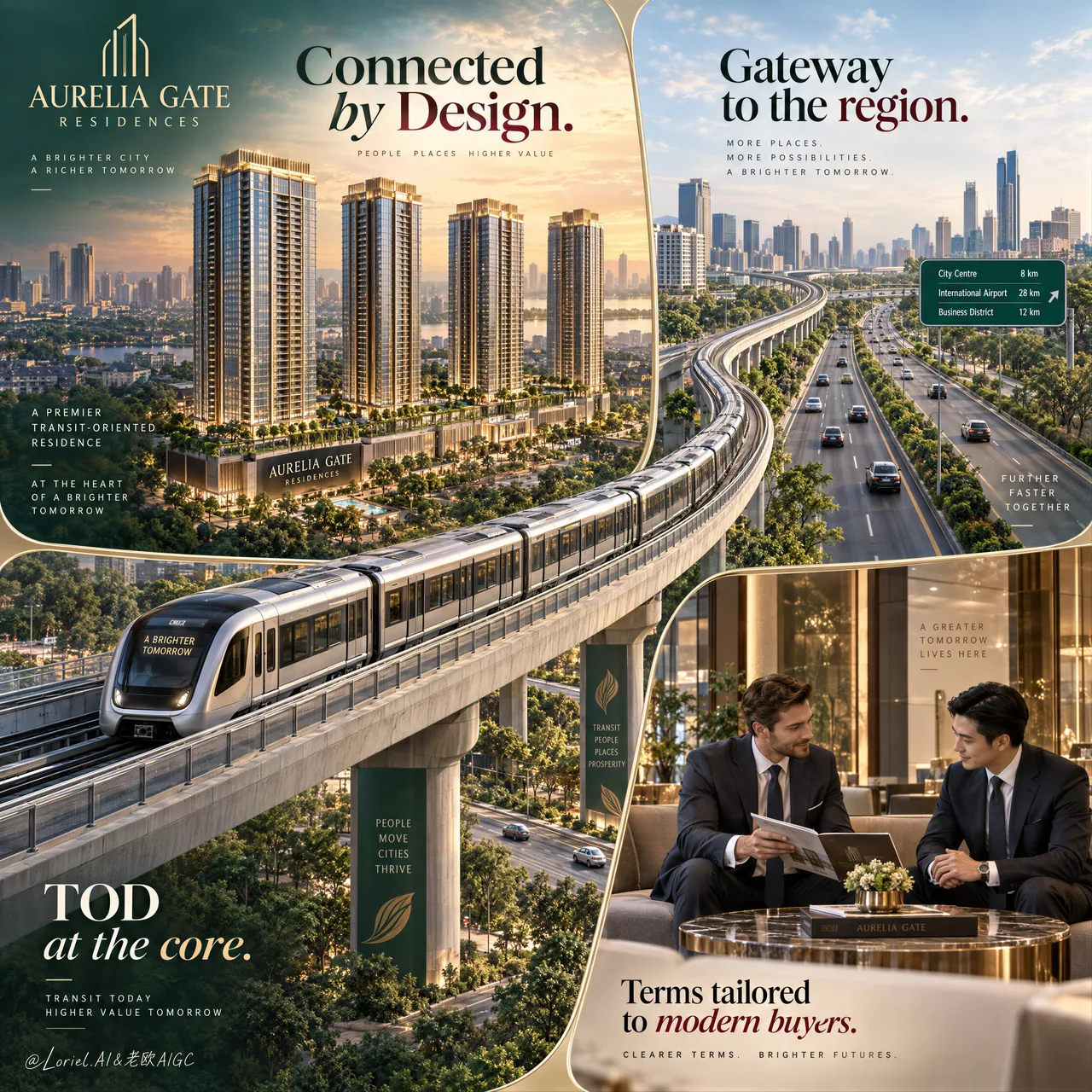
提示詞
Create a Cannes-level ultra-premium real estate advertising poster for a fictional development brand called AURELIA GATE RESIDENCES, preserving the exact structural logic of a multi-panel infrastructure-led property campaign: a square or near-square luxury real estate poster divided into four integrated visual zones with softly curved page-like corner framing, where the top-left panel presents the hero residential towers rising above the city, the top-right panel highlights a major expressway corridor, the lower-left and center are dramatically crossed by an elevated metro line in perspective, and the bottom-right panel shows a refined private consultation meeting in an elegant sales-lounge interior. The final image must communicate that this development is defined by strategic connectivity, transit-oriented value, and premium urban lifestyle.

Core composition: structure the poster as a refined four-zone collage with thin elegant dividing lines and subtle curved panel edges, preserving the same premium brochure-meets-commercial-ad language as the reference. Top-left: one aerial oblique view of the hero residential project, with 3 to 4 slender luxury towers standing prominently above a dense low-rise city fabric, warm sunset light, and a discreet location tag integrated near the site. Top-right: one wide, clean view of a modern multi-lane expressway with landscaped medians, smooth traffic flow, and urban skyline in the distance, representing regional access. Lower-left/center: one modern elevated metro train sweeps diagonally across the composition toward the viewer, occupying strong foreground dominance and visually linking the top property panels to the lifestyle promise below. Bottom-right: one premium sales or negotiation lounge with two well-dressed business professionals seated at a round table in a polished interior, reviewing documents in a calm high-end environment. All four zones must feel part of one coherent brand story.

Hero project design: create a premium urban residential development for AURELIA GATE RESIDENCES with elegant glass-and-stone towers, warm architectural lighting, podium greenery, and a sophisticated city-integration concept. The tower cluster should feel financially aspirational, architecturally credible, and highly sellable, with clean facade rhythm, realistic balcony or glazing repetition, refined rooftop crowns, and believable urban scale. The development must remain the conceptual hero even though the transit line is visually dramatic.

Transit-oriented narrative: the metro line is a major storytelling device. Render one sleek modern elevated train with realistic carriage proportions, reflective glazing, subtle interior hints, and premium metallic finish, traveling on an elevated viaduct that cuts diagonally through the composition. The train must feel fast, clean, and future-forward, visually symbolizing convenience, rising value, and metropolitan momentum. The viaduct structure should be engineered and convincing, with support detail, guard rails, and proper perspective depth. This transit element should strengthen the real estate value proposition rather than overpower the towers.

Expressway and access panel: the top-right infrastructure panel must show a broad, elegant arterial highway or national corridor under soft daylight, with landscaped edges, a few realistic vehicles, and a clean urban horizon. The shot should communicate regional mobility, strategic access, and development upside. Avoid traffic chaos, dirty roads, or generic stock-photo feel.

Lifestyle and trust panel: the bottom-right consultation scene should communicate investment confidence and premium service. Show two adult male professionals or sales executives in tailored suits seated in a luxurious lobby or sales gallery with warm stone, wood, glass, and soft neutral furnishings. Their posture should suggest focused conversation, trust, and deal-making rather than casual chatting. Keep anatomy, hands, and facial proportions realistic and understated. This panel should feel aspirational, polished, and calm.

Typography and layout: preserve the source image’s same-type panel-based property-sales hierarchy but rewrite all wording into original English. In the top-left or upper central visual field, place a strong campaign line such as “Two Frontages. One Strategic Address.” In the top-right panel, include a concise infrastructure callout like “Gateway to Route 13” or “Connected to the City’s Main Artery.” In the lower-left or over the train zone, place a compact premium callout such as “First-Mover TOD Advantage.” In the bottom-right panel, add a short trust message like “Flexible Terms for Modern Buyers.” Typography must be elegant, highly legible, and spatially integrated into each panel, using premium serif and modern sans-serif combinations. Do not overcrowd the poster with dense brochure text.

Branding: place a small refined AURELIA GATE RESIDENCES logo lockup in the upper-left corner, with a minimal developer or partner mark if needed. Branding should feel premium, corporate, and internationally polished, not loud or crowded.

Lighting: use refined golden-hour-to-soft-daylight transitions across the panels while keeping one unified visual grade. The residential towers should glow with aspirational sunset warmth. The expressway panel should feel clear, clean, and daylight-balanced. The train should carry polished highlights and forward energy. The consultation panel should use soft interior luxury lighting with warm reflections on marble, metal, and glass. Keep contrast rich but controlled, with no muddy green shadows or dead black blocks.

Material and texture: emphasize tower facade realism, metro train metal and glass surfaces, highway asphalt and planted medians, polished sales-lounge marble and upholstery, and the crisp graphic finish of a high-end real estate poster. Every panel should feel photographically believable while still maintaining unified commercial art direction.

Color hierarchy: 50% premium deep green, ivory, and soft urban neutrals; 25% warm sunset gold and champagne architectural highlights; 15% cool steel, metro silver, and highway grey; 10% muted rose-magenta or burgundy typographic accents for premium contrast. The palette must feel upscale, strategic, modern, and trustworthy.

Design intent: the final poster must preserve the source image’s exact impact logic of panel-based real estate storytelling, transit-led motion, infrastructure access, and investor-service messaging, while elevating it into a more original, more luxurious, and more internationally art-directed property campaign. The project is not sold merely as a building, but as a strategically connected urban asset anchored by mobility, visibility, and premium sales confidence.

Rendering style: ultra-photoreal luxury real estate advertising, premium urban development campaign, transit-oriented property poster, high-end architectural visualization merged with commercial editorial design, polished infrastructure storytelling, world-class property marketing finish, print-ready realism.

Negative prompt: copied source text, real developer names, generic brochure clutter, low-detail towers, warped metro geometry, fake highway perspective, malformed hands, extra fingers, stiff business poses, muddy urban haze, overpacked text blocks, cheap condo flyer styling, distorted panel layout, black blotches, watermark
中文翻譯
爲虛構的開發品牌 AURELIA GATE RESIDENCES 創作一張戛納級別的超高端房地產廣告海報,保留多面板、基礎設施主導型樓盤宣傳的精確結構邏輯:一張正方形或接近正方形的豪宅海報,被劃分爲四個相互融合的視覺區域,並帶有柔和彎曲的、類似頁面邊角的框架;其中左上方面板呈現聳立於城市之上的主視覺住宅塔樓,右上方面板突出強調一條主要高速公路走廊,左下與中央區域被一條以透視角度斜穿畫面的高架地鐵線路戲劇性地切過,右下方面板則展示在優雅銷售休息室室內進行的一場精緻私密諮詢會面。最終畫面必須傳達:該開發項目以戰略性連通性、以交通爲導向的價值以及高端都市生活方式爲定義。

核心構圖:將海報構建爲精緻的四區拼貼,配以纖細優雅的分割線和微妙的彎曲面板邊緣,保留與參考圖相同的、兼具高端宣傳冊與商業廣告氣質的語言。左上:一張主視覺住宅項目的空中斜視全景,3 到 4 座纖細的奢華塔樓醒目地矗立在密集的低層城市肌理之上,暖色夕陽光線,並在場地附近融入一個低調的區位標籤。右上:一張寬闊、乾淨的現代多車道高速公路遠景,帶景觀化中央分隔帶、順暢的車流,以及遠方的城市天際線,代表區域可達性。左下/中央:一列現代高架地鐵列車沿對角線朝觀者方向掃過構圖,佔據強烈的前景主導地位,並在視覺上將上方的樓盤面板與下方的生活承諾連接起來。右下:一間高端銷售或洽談休息室,兩位衣着得體的商務專業人士坐在拋光室內空間的圓桌旁審閱文件,環境冷靜而高端。四個區域都必須讓人感覺屬於同一個連貫的品牌故事。

主視覺項目設計:爲 AURELIA GATE RESIDENCES 打造一個高端城市住宅開發項目,採用優雅的玻璃與石材塔樓、溫暖的建築燈光、裙樓綠化,以及精緻的城市融合理念。塔樓羣應傳遞出財務上的嚮往感、建築上的可信度與極強的可售性,具備乾淨的立面節奏、真實可信的陽臺或玻璃幕牆重複、精緻的屋頂冠部,以及可信的城市尺度。即便地鐵線在視覺上極具戲劇性,該開發項目仍必須是概念上的主角。

以交通爲導向的敘事:地鐵線是重要的敘事裝置。渲染一列流暢的現代高架列車,具備真實的車廂比例、反光玻璃、微妙的內部細節和高端的金屬質感,行駛在一條斜穿構圖的高架橋上。列車必須顯得快速、乾淨、面向未來,在視覺上象徵便利、價值上升與都市動能。高架橋結構應經過工程化推敲且令人信服,具備支撐細節、護欄和恰當的透視縱深。這一交通元素應強化房地產的價值主張,而不是蓋過塔樓。

高速公路與可達性面板:右上方的基建設施面板必須在柔和日光下展示一條寬闊、優雅的城市主幹道或國家級走廊,帶景觀化邊緣、少量真實車輛和乾淨的城市地平線。該畫面應傳達區域流動性、戰略性交通可達性與項目增值潛力。避免交通混亂、骯髒道路或通用圖庫照片般的感覺。

生活方式與信任面板:右下方諮詢場景應傳達投資信心與高端服務。展示兩位成年男性專業人士或銷售主管,身着定製西裝,坐在擁有溫暖石材、木材、玻璃和柔和中性色傢俱的豪華大堂或銷售展廳中。他們的姿態應暗示專注的交談、信任與促成交易,而非隨意的閒聊。保持人體結構、手部和麪部比例真實而剋制。這個面板應給人嚮往感、精緻感和冷靜感。

排版與佈局:保留源圖同類型的、基於面板的房產銷售層級結構,但將所有文案改寫爲原創英文。在左上方或上方中央視覺場內,放置一句有力的宣傳主標題,例如“Two Frontages. One Strategic Address.”。在右上面板中,加入一句簡潔的基建設施標註,如“Gateway to Route 13”或“Connected to the City’s Main Artery.”。在左下方或列車區域上方,放置一句緊湊的高端標註,如“First-Mover TOD Advantage.”。在右下方面板中,添加一句簡短的信任信息,如“Flexible Terms for Modern Buyers.”。排版必須優雅、高度清晰可讀,並在空間上融入每個面板,採用高端襯線體與現代無襯線體的組合。不要用密集的宣傳冊文字把海報塞得過滿。

品牌標識:在海報左上角放置一個小巧精緻的 AURELIA GATE RESIDENCES logo 組合標識,如有需要可配一個極簡的開發商或合作方標記。品牌呈現應顯得高端、企業化並具備國際化的精緻感,不要喧鬧或擁擠。

光照:在各面板之間使用從精緻黃金時刻到柔和日光的過渡,同時保持統一的視覺調色。住宅塔樓應散發令人嚮往的夕陽暖光。高速公路面板應顯得清澈、乾淨、日光平衡。列車應帶有拋光高光與向前推進的能量。諮詢面板應使用柔和的室內奢華燈光,在大理石、金屬和玻璃上形成溫暖反射。保持對比豐富但可控,不要渾濁的綠色陰影或死黑的色塊。

材質與紋理:強調塔樓立面的真實感、地鐵列車的金屬與玻璃表面、高速公路瀝青與綠化中央分隔帶、拋光銷售休息室的大理石與軟包傢俱,以及高端房地產海報那種利落的平面質感。每個面板都應顯得具有攝影般的可信度,同時仍保持統一的商業藝術指導。

色彩層級:50% 高端深綠、象牙白與柔和的城市中性色;25% 溫暖夕陽金與香檳色建築高光;15% 冷調鋼色、地鐵銀與高速灰;10% 低飽和玫瑰洋紅或酒紅色字體點綴,用於高端對比。整體配色必須顯得高檔、富有策略感、現代且值得信賴。

設計意圖:最終海報必須保留源圖基於面板的房地產敘事、交通主導的動態、基建設施可達性與投資者服務信息所構成的精確衝擊邏輯,同時將其提升爲一場更原創、更奢華、更具國際化藝術指導的樓盤宣傳。該項目不只是作爲一棟建築來銷售,而是作爲一個由流動性、可見度與高端銷售信心所錨定的、具備戰略連通性的城市資產。

渲染風格:超寫實奢華房地產廣告、高端城市開發宣傳、以交通爲導向的樓盤海報、融合商業編輯設計的高端建築可視化、精緻的基礎設施敘事、世界級房地產營銷完成度、可印刷級的真實感。

Negative prompt:複製的源文本、真實開發商名稱、通用的宣傳冊雜亂元素、低細節塔樓、扭曲的地鐵幾何結構、虛假的高速公路透視、畸形的手、多餘的手指、僵硬商務姿態、渾濁的城市霧霾、過度堆砌的文字塊、廉價公寓傳單風格、扭曲的面板佈局、黑色污塊、水印
溯源
- 原作者
- ou_zhen599
- 發佈日期
- 2026-09-16
- 原始出處
- 查看原帖 ↗
- 收錄來源
- xianyu110/awesome-gpt-image2.5 · 2100223219383124188 · MIT