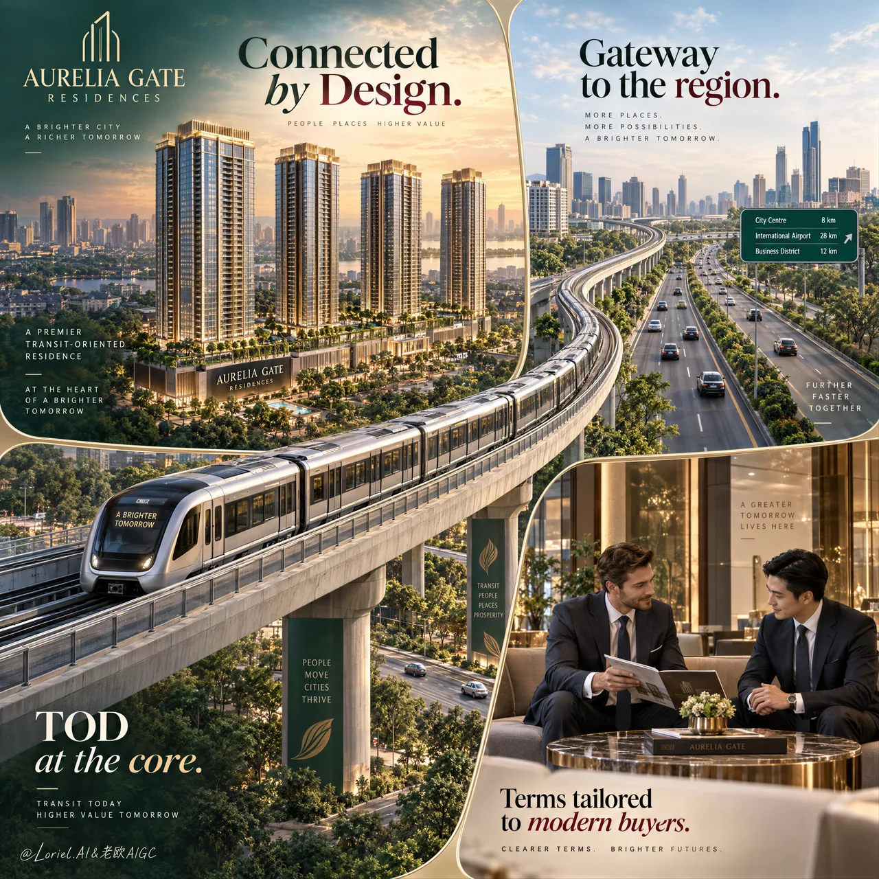
地铁斜穿连通性:四区房产海报一气呵成
别用四个框解释配套——让高架地铁斜穿分区,视线落到楼盘。连通性卖点写成空间关系的可抄结构。
提示词
Create a Cannes-level ultra-premium real estate advertising poster for a fictional development brand called AURELIA GATE RESIDENCES, preserving the exact structural logic of a multi-panel infrastructure-led property campaign: a square or near-square luxury real estate poster divided into four integrated visual zones with softly curved page-like corner framing, where the top-left panel presents the hero residential towers rising above the city, the top-right panel highlights a major expressway corridor, the lower-left and center are dramatically crossed by an elevated metro line in perspective, and the bottom-right panel shows a refined private consultation meeting in an elegant sales-lounge interior. The final image must communicate that this development is defined by strategic connectivity, transit-oriented value, and premium urban lifestyle.

Core composition: structure the poster as a refined four-zone collage with thin elegant dividing lines and subtle curved panel edges, preserving the same premium brochure-meets-commercial-ad language as the reference. Top-left: one aerial oblique view of the hero residential project, with 3 to 4 slender luxury towers standing prominently above a dense low-rise city fabric, warm sunset light, and a discreet location tag integrated near the site. Top-right: one wide, clean view of a modern multi-lane expressway with landscaped medians, smooth traffic flow, and urban skyline in the distance, representing regional access. Lower-left/center: one modern elevated metro train sweeps diagonally across the composition toward the viewer, occupying strong foreground dominance and visually linking the top property panels to the lifestyle promise below. Bottom-right: one premium sales or negotiation lounge with two well-dressed business professionals seated at a round table in a polished interior, reviewing documents in a calm high-end environment. All four zones must feel part of one coherent brand story.

Hero project design: create a premium urban residential development for AURELIA GATE RESIDENCES with elegant glass-and-stone towers, warm architectural lighting, podium greenery, and a sophisticated city-integration concept. The tower cluster should feel financially aspirational, architecturally credible, and highly sellable, with clean facade rhythm, realistic balcony or glazing repetition, refined rooftop crowns, and believable urban scale. The development must remain the conceptual hero even though the transit line is visually dramatic.

Transit-oriented narrative: the metro line is a major storytelling device. Render one sleek modern elevated train with realistic carriage proportions, reflective glazing, subtle interior hints, and premium metallic finish, traveling on an elevated viaduct that cuts diagonally through the composition. The train must feel fast, clean, and future-forward, visually symbolizing convenience, rising value, and metropolitan momentum. The viaduct structure should be engineered and convincing, with support detail, guard rails, and proper perspective depth. This transit element should strengthen the real estate value proposition rather than overpower the towers.

Expressway and access panel: the top-right infrastructure panel must show a broad, elegant arterial highway or national corridor under soft daylight, with landscaped edges, a few realistic vehicles, and a clean urban horizon. The shot should communicate regional mobility, strategic access, and development upside. Avoid traffic chaos, dirty roads, or generic stock-photo feel.

Lifestyle and trust panel: the bottom-right consultation scene should communicate investment confidence and premium service. Show two adult male professionals or sales executives in tailored suits seated in a luxurious lobby or sales gallery with warm stone, wood, glass, and soft neutral furnishings. Their posture should suggest focused conversation, trust, and deal-making rather than casual chatting. Keep anatomy, hands, and facial proportions realistic and understated. This panel should feel aspirational, polished, and calm.

Typography and layout: preserve the source image’s same-type panel-based property-sales hierarchy but rewrite all wording into original English. In the top-left or upper central visual field, place a strong campaign line such as “Two Frontages. One Strategic Address.” In the top-right panel, include a concise infrastructure callout like “Gateway to Route 13” or “Connected to the City’s Main Artery.” In the lower-left or over the train zone, place a compact premium callout such as “First-Mover TOD Advantage.” In the bottom-right panel, add a short trust message like “Flexible Terms for Modern Buyers.” Typography must be elegant, highly legible, and spatially integrated into each panel, using premium serif and modern sans-serif combinations. Do not overcrowd the poster with dense brochure text.

Branding: place a small refined AURELIA GATE RESIDENCES logo lockup in the upper-left corner, with a minimal developer or partner mark if needed. Branding should feel premium, corporate, and internationally polished, not loud or crowded.

Lighting: use refined golden-hour-to-soft-daylight transitions across the panels while keeping one unified visual grade. The residential towers should glow with aspirational sunset warmth. The expressway panel should feel clear, clean, and daylight-balanced. The train should carry polished highlights and forward energy. The consultation panel should use soft interior luxury lighting with warm reflections on marble, metal, and glass. Keep contrast rich but controlled, with no muddy green shadows or dead black blocks.

Material and texture: emphasize tower facade realism, metro train metal and glass surfaces, highway asphalt and planted medians, polished sales-lounge marble and upholstery, and the crisp graphic finish of a high-end real estate poster. Every panel should feel photographically believable while still maintaining unified commercial art direction.

Color hierarchy: 50% premium deep green, ivory, and soft urban neutrals; 25% warm sunset gold and champagne architectural highlights; 15% cool steel, metro silver, and highway grey; 10% muted rose-magenta or burgundy typographic accents for premium contrast. The palette must feel upscale, strategic, modern, and trustworthy.

Design intent: the final poster must preserve the source image’s exact impact logic of panel-based real estate storytelling, transit-led motion, infrastructure access, and investor-service messaging, while elevating it into a more original, more luxurious, and more internationally art-directed property campaign. The project is not sold merely as a building, but as a strategically connected urban asset anchored by mobility, visibility, and premium sales confidence.

Rendering style: ultra-photoreal luxury real estate advertising, premium urban development campaign, transit-oriented property poster, high-end architectural visualization merged with commercial editorial design, polished infrastructure storytelling, world-class property marketing finish, print-ready realism.

Negative prompt: copied source text, real developer names, generic brochure clutter, low-detail towers, warped metro geometry, fake highway perspective, malformed hands, extra fingers, stiff business poses, muddy urban haze, overpacked text blocks, cheap condo flyer styling, distorted panel layout, black blotches, watermark
中文译文
为虚构的开发品牌 AURELIA GATE RESIDENCES 创作一张戛纳级别的超高端房地产广告海报,保留多面板、基础设施主导型楼盘宣传的精确结构逻辑:一张正方形或接近正方形的豪宅海报,被划分为四个相互融合的视觉区域,并带有柔和弯曲的、类似页面边角的框架;其中左上方面板呈现耸立于城市之上的主视觉住宅塔楼,右上方面板突出强调一条主要高速公路走廊,左下与中央区域被一条以透视角度斜穿画面的高架地铁线路戏剧性地切过,右下方面板则展示在优雅销售休息室室内进行的一场精致私密咨询会面。最终画面必须传达:该开发项目以战略性连通性、以交通为导向的价值以及高端都市生活方式为定义。

核心构图:将海报构建为精致的四区拼贴,配以纤细优雅的分割线和微妙的弯曲面板边缘,保留与参考图相同的、兼具高端宣传册与商业广告气质的语言。左上:一张主视觉住宅项目的空中斜视全景,3 到 4 座纤细的奢华塔楼醒目地矗立在密集的低层城市肌理之上,暖色夕阳光线,并在场地附近融入一个低调的区位标签。右上:一张宽阔、干净的现代多车道高速公路远景,带景观化中央分隔带、顺畅的车流,以及远方的城市天际线,代表区域可达性。左下/中央:一列现代高架地铁列车沿对角线朝观者方向扫过构图,占据强烈的前景主导地位,并在视觉上将上方的楼盘面板与下方的生活承诺连接起来。右下:一间高端销售或洽谈休息室,两位衣着得体的商务专业人士坐在抛光室内空间的圆桌旁审阅文件,环境冷静而高端。四个区域都必须让人感觉属于同一个连贯的品牌故事。

主视觉项目设计:为 AURELIA GATE RESIDENCES 打造一个高端城市住宅开发项目,采用优雅的玻璃与石材塔楼、温暖的建筑灯光、裙楼绿化,以及精致的城市融合理念。塔楼群应传递出财务上的向往感、建筑上的可信度与极强的可售性,具备干净的立面节奏、真实可信的阳台或玻璃幕墙重复、精致的屋顶冠部,以及可信的城市尺度。即便地铁线在视觉上极具戏剧性,该开发项目仍必须是概念上的主角。

以交通为导向的叙事:地铁线是重要的叙事装置。渲染一列流畅的现代高架列车,具备真实的车厢比例、反光玻璃、微妙的内部细节和高端的金属质感,行驶在一条斜穿构图的高架桥上。列车必须显得快速、干净、面向未来,在视觉上象征便利、价值上升与都市动能。高架桥结构应经过工程化推敲且令人信服,具备支撑细节、护栏和恰当的透视纵深。这一交通元素应强化房地产的价值主张,而不是盖过塔楼。

高速公路与可达性面板:右上方的基建设施面板必须在柔和日光下展示一条宽阔、优雅的城市主干道或国家级走廊,带景观化边缘、少量真实车辆和干净的城市地平线。该画面应传达区域流动性、战略性交通可达性与项目增值潜力。避免交通混乱、肮脏道路或通用图库照片般的感觉。

生活方式与信任面板:右下方咨询场景应传达投资信心与高端服务。展示两位成年男性专业人士或销售主管,身着定制西装,坐在拥有温暖石材、木材、玻璃和柔和中性色家具的豪华大堂或销售展厅中。他们的姿态应暗示专注的交谈、信任与促成交易,而非随意的闲聊。保持人体结构、手部和面部比例真实而克制。这个面板应给人向往感、精致感和冷静感。

排版与布局:保留源图同类型的、基于面板的房产销售层级结构,但将所有文案改写为原创英文。在左上方或上方中央视觉场内,放置一句有力的宣传主标题,例如“Two Frontages. One Strategic Address.”。在右上面板中,加入一句简洁的基建设施标注,如“Gateway to Route 13”或“Connected to the City’s Main Artery.”。在左下方或列车区域上方,放置一句紧凑的高端标注,如“First-Mover TOD Advantage.”。在右下方面板中,添加一句简短的信任信息,如“Flexible Terms for Modern Buyers.”。排版必须优雅、高度清晰可读,并在空间上融入每个面板,采用高端衬线体与现代无衬线体的组合。不要用密集的宣传册文字把海报塞得过满。

品牌标识:在海报左上角放置一个小巧精致的 AURELIA GATE RESIDENCES logo 组合标识,如有需要可配一个极简的开发商或合作方标记。品牌呈现应显得高端、企业化并具备国际化的精致感,不要喧闹或拥挤。

光照:在各面板之间使用从精致黄金时刻到柔和日光的过渡,同时保持统一的视觉调色。住宅塔楼应散发令人向往的夕阳暖光。高速公路面板应显得清澈、干净、日光平衡。列车应带有抛光高光与向前推进的能量。咨询面板应使用柔和的室内奢华灯光,在大理石、金属和玻璃上形成温暖反射。保持对比丰富但可控,不要浑浊的绿色阴影或死黑的色块。

材质与纹理:强调塔楼立面的真实感、地铁列车的金属与玻璃表面、高速公路沥青与绿化中央分隔带、抛光销售休息室的大理石与软包家具,以及高端房地产海报那种利落的平面质感。每个面板都应显得具有摄影般的可信度,同时仍保持统一的商业艺术指导。

色彩层级:50% 高端深绿、象牙白与柔和的城市中性色;25% 温暖夕阳金与香槟色建筑高光;15% 冷调钢色、地铁银与高速灰;10% 低饱和玫瑰洋红或酒红色字体点缀,用于高端对比。整体配色必须显得高档、富有策略感、现代且值得信赖。

设计意图:最终海报必须保留源图基于面板的房地产叙事、交通主导的动态、基建设施可达性与投资者服务信息所构成的精确冲击逻辑,同时将其提升为一场更原创、更奢华、更具国际化艺术指导的楼盘宣传。该项目不只是作为一栋建筑来销售,而是作为一个由流动性、可见度与高端销售信心所锚定的、具备战略连通性的城市资产。

渲染风格:超写实奢华房地产广告、高端城市开发宣传、以交通为导向的楼盘海报、融合商业编辑设计的高端建筑可视化、精致的基础设施叙事、世界级房地产营销完成度、可印刷级的真实感。

Negative prompt:复制的源文本、真实开发商名称、通用的宣传册杂乱元素、低细节塔楼、扭曲的地铁几何结构、虚假的高速公路透视、畸形的手、多余的手指、僵硬商务姿态、浑浊的城市雾霾、过度堆砌的文字块、廉价公寓传单风格、扭曲的面板布局、黑色污块、水印
溯源
- 原作者
- ou_zhen599
- 发布日期
- 2026-09-16
- 原始出处
- 查看原帖 ↗
- 收录来源
- xianyu110/awesome-gpt-image2.5 · 2100223219383124188 · MIT