지하철 대각선 관통 연결성: 4분할 부동산 포스터를 한 번에
네 개의 프레임으로 인프라를 설명하지 말 것——고가 지하철이 구획을 대각선으로 관통하게 하고 시선을 프로젝트로 떨어뜨려라. 연결성 셀링 포인트를 공간 관계로 풀어낸, 따라 쓸 수 있는 구조.
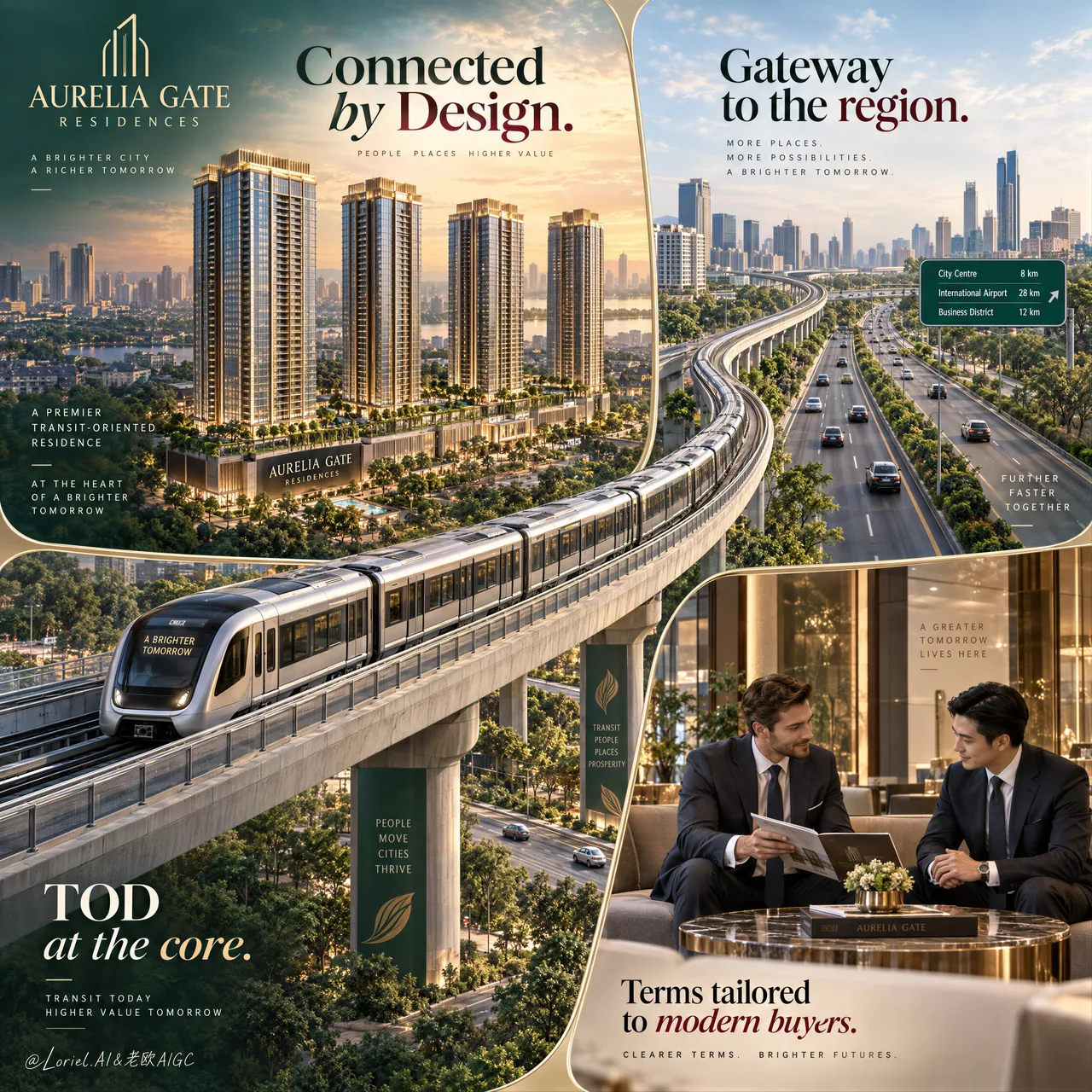
프롬프트
Create a Cannes-level ultra-premium real estate advertising poster for a fictional development brand called AURELIA GATE RESIDENCES, preserving the exact structural logic of a multi-panel infrastructure-led property campaign: a square or near-square luxury real estate poster divided into four integrated visual zones with softly curved page-like corner framing, where the top-left panel presents the hero residential towers rising above the city, the top-right panel highlights a major expressway corridor, the lower-left and center are dramatically crossed by an elevated metro line in perspective, and the bottom-right panel shows a refined private consultation meeting in an elegant sales-lounge interior. The final image must communicate that this development is defined by strategic connectivity, transit-oriented value, and premium urban lifestyle.

Core composition: structure the poster as a refined four-zone collage with thin elegant dividing lines and subtle curved panel edges, preserving the same premium brochure-meets-commercial-ad language as the reference. Top-left: one aerial oblique view of the hero residential project, with 3 to 4 slender luxury towers standing prominently above a dense low-rise city fabric, warm sunset light, and a discreet location tag integrated near the site. Top-right: one wide, clean view of a modern multi-lane expressway with landscaped medians, smooth traffic flow, and urban skyline in the distance, representing regional access. Lower-left/center: one modern elevated metro train sweeps diagonally across the composition toward the viewer, occupying strong foreground dominance and visually linking the top property panels to the lifestyle promise below. Bottom-right: one premium sales or negotiation lounge with two well-dressed business professionals seated at a round table in a polished interior, reviewing documents in a calm high-end environment. All four zones must feel part of one coherent brand story.

Hero project design: create a premium urban residential development for AURELIA GATE RESIDENCES with elegant glass-and-stone towers, warm architectural lighting, podium greenery, and a sophisticated city-integration concept. The tower cluster should feel financially aspirational, architecturally credible, and highly sellable, with clean facade rhythm, realistic balcony or glazing repetition, refined rooftop crowns, and believable urban scale. The development must remain the conceptual hero even though the transit line is visually dramatic.

Transit-oriented narrative: the metro line is a major storytelling device. Render one sleek modern elevated train with realistic carriage proportions, reflective glazing, subtle interior hints, and premium metallic finish, traveling on an elevated viaduct that cuts diagonally through the composition. The train must feel fast, clean, and future-forward, visually symbolizing convenience, rising value, and metropolitan momentum. The viaduct structure should be engineered and convincing, with support detail, guard rails, and proper perspective depth. This transit element should strengthen the real estate value proposition rather than overpower the towers.

Expressway and access panel: the top-right infrastructure panel must show a broad, elegant arterial highway or national corridor under soft daylight, with landscaped edges, a few realistic vehicles, and a clean urban horizon. The shot should communicate regional mobility, strategic access, and development upside. Avoid traffic chaos, dirty roads, or generic stock-photo feel.

Lifestyle and trust panel: the bottom-right consultation scene should communicate investment confidence and premium service. Show two adult male professionals or sales executives in tailored suits seated in a luxurious lobby or sales gallery with warm stone, wood, glass, and soft neutral furnishings. Their posture should suggest focused conversation, trust, and deal-making rather than casual chatting. Keep anatomy, hands, and facial proportions realistic and understated. This panel should feel aspirational, polished, and calm.

Typography and layout: preserve the source image’s same-type panel-based property-sales hierarchy but rewrite all wording into original English. In the top-left or upper central visual field, place a strong campaign line such as “Two Frontages. One Strategic Address.” In the top-right panel, include a concise infrastructure callout like “Gateway to Route 13” or “Connected to the City’s Main Artery.” In the lower-left or over the train zone, place a compact premium callout such as “First-Mover TOD Advantage.” In the bottom-right panel, add a short trust message like “Flexible Terms for Modern Buyers.” Typography must be elegant, highly legible, and spatially integrated into each panel, using premium serif and modern sans-serif combinations. Do not overcrowd the poster with dense brochure text.

Branding: place a small refined AURELIA GATE RESIDENCES logo lockup in the upper-left corner, with a minimal developer or partner mark if needed. Branding should feel premium, corporate, and internationally polished, not loud or crowded.

Lighting: use refined golden-hour-to-soft-daylight transitions across the panels while keeping one unified visual grade. The residential towers should glow with aspirational sunset warmth. The expressway panel should feel clear, clean, and daylight-balanced. The train should carry polished highlights and forward energy. The consultation panel should use soft interior luxury lighting with warm reflections on marble, metal, and glass. Keep contrast rich but controlled, with no muddy green shadows or dead black blocks.

Material and texture: emphasize tower facade realism, metro train metal and glass surfaces, highway asphalt and planted medians, polished sales-lounge marble and upholstery, and the crisp graphic finish of a high-end real estate poster. Every panel should feel photographically believable while still maintaining unified commercial art direction.

Color hierarchy: 50% premium deep green, ivory, and soft urban neutrals; 25% warm sunset gold and champagne architectural highlights; 15% cool steel, metro silver, and highway grey; 10% muted rose-magenta or burgundy typographic accents for premium contrast. The palette must feel upscale, strategic, modern, and trustworthy.

Design intent: the final poster must preserve the source image’s exact impact logic of panel-based real estate storytelling, transit-led motion, infrastructure access, and investor-service messaging, while elevating it into a more original, more luxurious, and more internationally art-directed property campaign. The project is not sold merely as a building, but as a strategically connected urban asset anchored by mobility, visibility, and premium sales confidence.

Rendering style: ultra-photoreal luxury real estate advertising, premium urban development campaign, transit-oriented property poster, high-end architectural visualization merged with commercial editorial design, polished infrastructure storytelling, world-class property marketing finish, print-ready realism.

Negative prompt: copied source text, real developer names, generic brochure clutter, low-detail towers, warped metro geometry, fake highway perspective, malformed hands, extra fingers, stiff business poses, muddy urban haze, overpacked text blocks, cheap condo flyer styling, distorted panel layout, black blotches, watermark
한국어 번역
AURELIA GATE RESIDENCES라는 가상 개발 브랜드를 위한 칸 수준의 초프리미엄 부동산 광고 포스터를 제작하되, 다중 패널 인프라 중심 부동산 캠페인의 정확한 구조 논리를 그대로 유지하라: 정사각형 또는 거의 정사각형인 럭셔리 부동산 포스터를 네 개의 통합된 비주얼 존으로 나누고, 페이지처럼 부드럽게 휘어진 모서리 프레이밍을 적용한다. 왼쪽 상단 패널은 도시 위로 솟아오른 주력 주거 타워를, 오른쪽 상단 패널은 주요 고속도로 축을 강조하고, 왼쪽 하단과 중앙은 원근법 속 고가 지하철 노선이 극적으로 가로지르며, 오른쪽 하단 패널은 우아한 세일즈 라운지 인테리어에서 진행되는 세련된 개인 상담 장면을 보여준다. 최종 이미지는 이 개발이 전략적 연결성, 역세권 중심 가치, 프리미엄 도시 라이프스타일로 정의된다는 점을 전달해야 한다.

핵심 구성: 포스터를 얇고 우아한 구분선과 은은하게 휘어진 패널 가장자리를 지닌 세련된 4존 콜라주로 구성하고, 레퍼런스와 동일한 프리미엄 브로슈어와 상업 광고가 결합된 언어를 유지하라. 왼쪽 상단: 주력 주거 프로젝트의 항공 사선 뷰 하나, 3~4개의 가느다란 럭셔리 타워가 밀집한 저층 도시 조직 위로 두드러지게 서 있고, 따뜻한 노을빛이 감돌며, 부지 근처에 절제되게 통합된 위치 태그. 오른쪽 상단: 조경된 중앙분리대와 원활한 교통 흐름, 멀리 도시 스카이라인이 있는 현대적인 다차선 고속도로의 넓고 깔끔한 뷰 하나로, 광역 접근성을 나타낸다. 왼쪽 하단/중앙: 현대적인 고가 지하철 열차 하나가 관람자 쪽을 향해 구성면을 대각선으로 가로지르며, 강한 전경 지배력을 차지하고 위쪽 부동산 패널들을 아래의 라이프스타일 약속과 시각적으로 연결한다. 오른쪽 하단: 정돈된 인테리어의 원형 테이블에 두 명의 잘 차려입은 비즈니스 전문가가 앉아 문서를 검토하는 프리미엄 세일즈 또는 협상 라운지, 차분한 하이엔드 환경. 네 개의 존 모두 하나의 일관된 브랜드 스토리의 일부처럼 느껴져야 한다.

주력 프로젝트 디자인: AURELIA GATE RESIDENCES를 위한 프리미엄 도시 주거 개발을 우아한 유리와 석재 타워, 따뜻한 건축 조명, 포디움 녹지, 세련된 도시 통합 컨셉으로 만들어라. 타워 클러스터는 재정적 열망을 자아내고, 건축적으로 신뢰할 수 있으며, 매우 판매하기 좋게 느껴져야 하고, 깔끔한 파사드 리듬, 사실적인 발코니 또는 글레이징 반복, 세련된 옥상 크라운, 믿을 만한 도시적 스케일을 갖춘다. 지하철 노선이 시각적으로 극적이더라도 이 개발이 개념적 주인공으로 남아야 한다.

역세권 내러티브: 지하철 노선은 주요 스토리텔링 장치다. 사실적인 차량 비례, 반사되는 글레이징, 은은한 내부 암시, 프리미엄 금속 마감을 갖춘 매끈한 현대 고가 열차 하나가 구성면을 대각선으로 가로지르는 고가 구조물 위를 달린다. 열차는 빠르고 깨끗하며 미래지향적으로 느껴져야 하고, 편의성, 상승하는 가치, 대도시의 추진력을 시각적으로 상징한다. 고가 구조물은 지지대 디테일, 가드레일, 적절한 원근 깊이를 갖춰 설계되고 설득력 있게 보여야 한다. 이 교통 요소는 타워를 압도하기보다 부동산 가치 제안을 강화해야 한다.

고속도로 및 접근성 패널: 오른쪽 상단 인프라 패널은 부드러운 일광 아래 넓고 우아한 간선도로 또는 국가 교통 축을 보여주어야 하며, 조경된 가장자리, 몇 대의 사실적인 차량, 깨끗한 도시 지평선을 담는다. 이 컷은 광역 이동성, 전략적 접근성, 개발 상승 여력을 전달해야 한다. 교통 혼잡, 지저분한 도로, 일반적인 스톡 사진 느낌은 피하라.

라이프스타일 및 신뢰 패널: 오른쪽 하단 상담 장면은 투자 신뢰와 프리미엄 서비스를 전달해야 한다. 따뜻한 석재, 목재, 유리, 부드러운 뉴트럴 가구가 있는 럭셔리 로비나 세일즈 갤러리에 앉아 있는, 맞춤 정장을 차려입은 두 명의 성인 남성 전문가 또는 세일즈 임원을 보여줘라. 그들의 자세는 캐주얼한 잡담이 아니라 집중된 대화, 신뢰, 딜 성사를 암시해야 한다. 해부학, 손, 얼굴 비례는 사실적이고 절제되게 유지하라. 이 패널은 열망을 자아내고 세련되며 차분하게 느껴져야 한다.

타이포그래피 및 레이아웃: 원본 이미지의 동일한 유형의 패널 기반 부동산 판매 위계를 유지하되 모든 문구를 독자적인 영어로 다시 써라. 왼쪽 상단 또는 상단 중앙 비주얼 필드에 “Two Frontages. One Strategic Address.”와 같은 강력한 캠페인 문구를 배치하라. 오른쪽 상단 패널에는 “Gateway to Route 13” 또는 “Connected to the City’s Main Artery.”처럼 간결한 인프라 콜아웃을 포함하라. 왼쪽 하단 또는 열차 존 위에는 “First-Mover TOD Advantage”처럼 압축된 프리미엄 콜아웃을 배치하라. 오른쪽 하단 패널에는 “Flexible Terms for Modern Buyers”처럼 짧은 신뢰 메시지를 추가하라. 타이포그래피는 우아하고 가독성이 높으며 각 패널에 공간적으로 통합되어야 하고, 프리미엄 세리프와 현대 산세리프 조합을 사용하라. 빽빽한 브로슈어 텍스트로 포스터를 과밀하게 만들지 마라.

브랜딩: 왼쪽 상단 모서리에 작고 세련된 AURELIA GATE RESIDENCES 로고 락업을 배치하고, 필요하면 최소한의 개발사 또는 파트너 마크를 넣어라. 브랜딩은 시끄럽거나 붐비지 않고 프리미엄하고 기업적이며 국제적으로 세련되게 느껴져야 한다.

조명: 패널 전반에 걸쳐 세련된 골든아워에서 부드러운 일광으로의 전환을 사용하되 하나의 통일된 비주얼 그레이드를 유지하라. 주거 타워는 열망을 담은 노을의 따뜻함으로 빛나야 한다. 고속도로 패널은 맑고 깨끗하며 일광에 균형 잡힌 느낌이어야 한다. 열차는 세련된 하이라이트와 전진 에너지를 담아야 한다. 상담 패널은 대리석, 금속, 유리에 따뜻한 반사가 맺히는 부드러운 실내 럭셔리 조명을 사용하라. 대비는 풍부하되 통제되게 유지하고, 탁한 녹색 그림자나 죽은 검은 덩어리는 없어야 한다.

재질과 텍스처: 타워 파사드의 사실감, 지하철 열차의 금속과 유리 표면, 고속도로 아스팔트와 식재된 중앙분리대, 세련된 세일즈 라운지의 대리석과 실내 장식, 하이엔드 부동산 포스터의 또렷한 그래픽 마감을 강조하라. 모든 패널은 통일된 상업 아트 디렉션을 유지하면서도 사진처럼 믿을 만하게 느껴져야 한다.

색상 위계: 50% 프리미엄 딥 그린, 아이보리, 부드러운 도시 뉴트럴; 25% 따뜻한 노을 골드와 샴페인 건축 하이라이트; 15% 쿨 스틸, 지하철 실버, 고속도로 그레이; 10% 프리미엄 대비를 위한 절제된 로즈 마젠타 또는 버건디 타이포그래피 악센트. 팔레트는 고급스럽고 전략적이며 현대적이고 신뢰감 있게 느껴져야 한다.

디자인 의도: 최종 포스터는 패널 기반 부동산 스토리텔링, 교통이 이끄는 움직임, 인프라 접근성, 투자자 서비스 메시징이라는 원본 이미지의 정확한 임팩트 논리를 유지하면서, 더 독창적이고 더 럭셔리하며 더 국제적으로 아트 디렉션된 부동산 캠페인으로 격상시켜야 한다. 이 프로젝트는 단순한 건물이 아니라 이동성, 가시성, 프리미엄 세일즈 신뢰를 축으로 하는 전략적으로 연결된 도시 자산으로 팔린다.

렌더링 스타일: 울트라 포토리얼 럭셔리 부동산 광고, 프리미엄 도시 개발 캠페인, 역세권 부동산 포스터, 하이엔드 건축 시각화와 상업 편집 디자인의 결합, 세련된 인프라 스토리텔링, 세계적 수준의 부동산 마케팅 마감, 인쇄 가능한 사실감.

네거티브 프롬프트: 복사된 원본 텍스트, 실제 개발사 이름, 일반적인 브로슈어 잡동사니, 디테일이 부족한 타워, 뒤틀린 지하철 형상, 가짜 고속도로 원근, 잘못 만들어진 손, 여분의 손가락, 경직된 비즈니스 포즈, 탁한 도시 안개, 과도하게 채워진 텍스트 블록, 값싼 콘도 전단지 스타일, 왜곡된 패널 레이아웃, 검은 얼룩, 워터마크
출처
- 원작자
- ou_zhen599
- 게시일
- 2026-09-16
- 원문 출처
- 원문 보기 ↗
- 수록 출처
- xianyu110/awesome-gpt-image2.5 · 2100223219383124188 · MIT